animated_slideover 1.0.13
SDKflutter
Platformandroidioswindowslinuxmacosweb
Create dynamic and responsive slide-over sidebars effortlessly with our Flutter package. Inspired by the fluidity of Tailwind CSS, this widget is designed for easy integration into your Flutter applications.
About AnimatedSlideOver

"Create dynamic and responsive slide-over sidebars effortlessly with our Flutter package. Inspired by the fluidity of Tailwind CSS, this widget is designed for easy integration into your Flutter applications"
Tailwind's component :
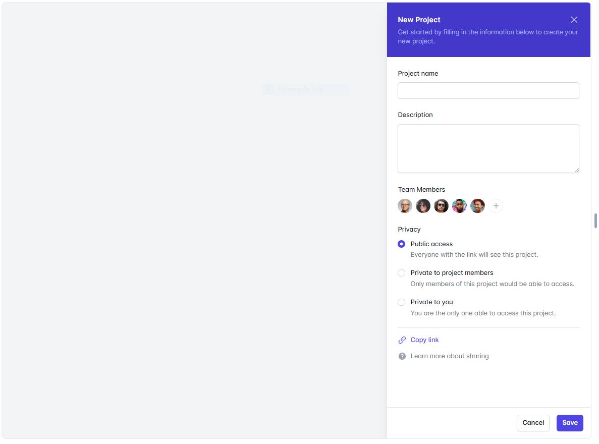
Usage :
import 'package:animated_slideover/animated_slideover.dart';

class TestScreen extends StatefulWidget {
  const TestScreen({Key? key}) : super(key: key);

  @override
  State<TestScreen> createState() => _TestScreenState();
}

class _TestScreenState extends State<TestScreen> {


  Widget hehe(){
    return AppAnimatedSideBar
      (

        onDispose: (){

        },

        buttonsWidgetList: [
          ElevatedButton(
            onPressed: () {
              Navigator.pop(context);
            },
            style: ButtonStyle(
              backgroundColor:
              MaterialStateProperty.all(
                  Colors.white), // Background color
              foregroundColor:
              MaterialStateProperty.all(
                  Colors.black), // Text color
              side: MaterialStateProperty.all(const BorderSide(
                  color: Colors.grey,
                  width:
                  0.5)), // Border color and width
              shape: MaterialStateProperty.all(
                  RoundedRectangleBorder(
                      borderRadius:
                      BorderRadius.circular(
                          8.0))), // Rounded corners
              padding: MaterialStateProperty.all(
                  const EdgeInsets.all(
                      16.0)), // Padding around the button content
            ),
            child: const Text(
              'Cancel',
              style: TextStyle(
                  fontWeight: FontWeight.w400),
            ),
          ),
          const SizedBox(
            width: 10,
          ),
          ElevatedButton(
            onPressed: () {
              // Handle button press

            },
            style: ButtonStyle(
              backgroundColor:
              MaterialStateProperty.all(const Color(0xFF4338ca)), // Background color
              foregroundColor:
              MaterialStateProperty.all(
                  Colors.white), // Text color
              side: MaterialStateProperty.all(const BorderSide(
                  color: Colors.grey,
                  width:
                  0.5)), // Border color and width
              shape: MaterialStateProperty.all(
                  RoundedRectangleBorder(
                      borderRadius:
                      BorderRadius.circular(
                          8.0))), // Rounded corners
              padding: MaterialStateProperty.all(
                  const EdgeInsets.all(
                      16.0)), // Padding around the button content
            ),
            child: const Text(
              'Save',
              style: TextStyle(
                  fontWeight: FontWeight.w400,
                  color: Colors.white),
            ),
          )
        ],


        subtileText: Text(
          'Create dynamic and responsive slide-over sidebars effortlessly with our Flutter package.'
              'Inspired by the fluidity of Tailwind CSS, this widget is designed for easy integration into your Flutter applications.',
          style: TextStyle(
            fontSize: 15,
            color: Colors.white.withOpacity(0.8),
          ),
        ),

        contentWidgetList: const [
          Padding(
            padding: EdgeInsets.all(10.0),
            child: Column(
              crossAxisAlignment: CrossAxisAlignment.start,
              children: [

                Text('Your Content Widget List')
              ],
            ),
          )
        ],

        titleText: const Text(
          'Animated SlideOver',
          style: TextStyle(
            fontSize: 20,
            color: Colors.white,
          ),
        ),

        headerBgColor: const Color(0xFF4338ca),

        headerIcon: IconButton(
            onPressed: () {
              Navigator.pop(context);
            },
            icon: const Icon(
              Icons.close,
              color: Colors.white,
            )));
  }

  @override
  Widget build(BuildContext context) {
    return Scaffold(
      body: GestureDetector(
        onTap: (){

          showDialog(
            context: context,
            builder: (BuildContext context) {
              return hehe();
            },
          );


        },
        child: Container(
          decoration: BoxDecoration(
            image: DecorationImage(
              image: NetworkImage('https://images.pexels.com/photos/640781/pexels-photo-640781.jpeg?auto=compress&cs=tinysrgb&w=1260&h=750&dpr=1'),
              fit: BoxFit.cover,
            ),
          ),
        ),
      )
    );
  }

}
| Properties | Type | Description |
|---|---|---|
onDispose | function | A callback function that is invoked when the sidebar is disposed of or closed. |
headerIcon | IconButton | An IconButton widget representing the header icon. It's typically used for closing the sidebar. |
buttonsWidgetList | List<Widget>? | A list of widgets representing buttons or actions to be displayed in the sidebar. |
headerBgColor | Color? | The background color of the header section. If not provided, it uses the default background color. |
subtitleText | Text? | The subtitle text widget displayed below the title, providing additional information. |
titleText | Text? | The title text widget displayed at the top of the animated sidebar. |
contentWidgetList | List<Widget> | A list of widgets representing the content to be displayed within the animated sidebar. |