awesome_alert 1.1.5
SDKflutter
Platformandroidioswindowslinuxmacos
This package allows you to create your alerts in a customized and simple way. There are ready-made templates such as loading or image loading, but you can also create your own custom alert.
Features
Simply display alerts to the user, or create your own custom alerts.
Images
Getting started
Just import the package.
import 'package:awesome_alert/awesome_alert.dart';
And init the class whit your valid context
AwesomeAlert awesomeAlert = AwesomeAlert(context: context);
Enjoy.
Usage
This a simple stateless screen with usage example.
import 'package:flutter/material.dart';
import 'package:awesome_alert/awesome_alert.dart';

class AwesomeAlertExample extends StatelessWidget {
  const AwesomeAlertExample({super.key});

  @override
  Widget build(BuildContext context) {
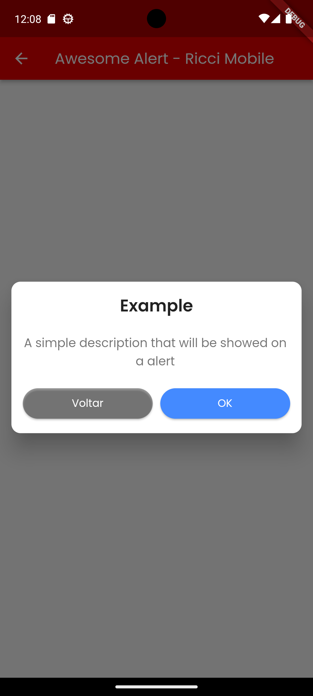
    //How to show a simple exemple with a title and description
    _simpleAlert() {
      AwesomeAlert awesomeAlert = AwesomeAlert(context: context);
      awesomeAlert.showAlert(
        title: "Example",
        description: "A simple description that will be showed on a alert",
        confirmText: "OK",
        confirmAction: () {
          ScaffoldMessenger.of(context).clearSnackBars();
          ScaffoldMessenger.of(context).showSnackBar(const SnackBar(content: Text("Pressed")));
          awesomeAlert.hideAlert();
        },
        cancelText: "Back",
        cancelAction: () {
          awesomeAlert.hideAlert();
        },
        cancelButtonTextStyle: const TextStyle(
          fontSize: 14,
          color: Colors.white,
          fontWeight: FontWeight.w400,
        ),
      );
    }

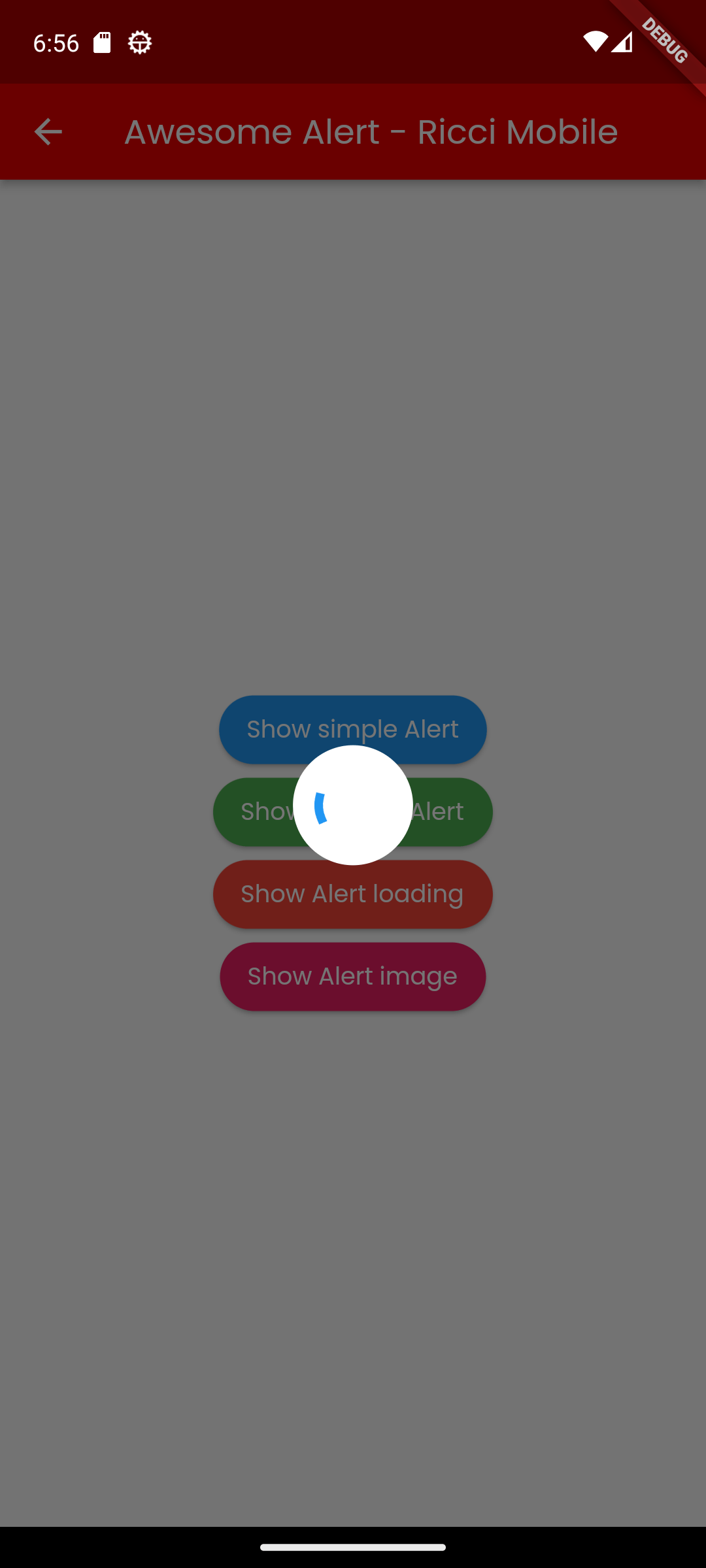
//How to show a simple exemple of an loading alert
    _alertLoading() {
      AwesomeAlert awesomeAlert = AwesomeAlert(context: context);
      awesomeAlert.alertLoading(
          sizeProgress: 40,
          paddingFromProgress: 15,
          onComplete: () {
            ScaffoldMessenger.of(context).clearSnackBars();
            ScaffoldMessenger.of(context).showSnackBar(
                const SnackBar(content: Text("Alert hidded")));
          });
    }

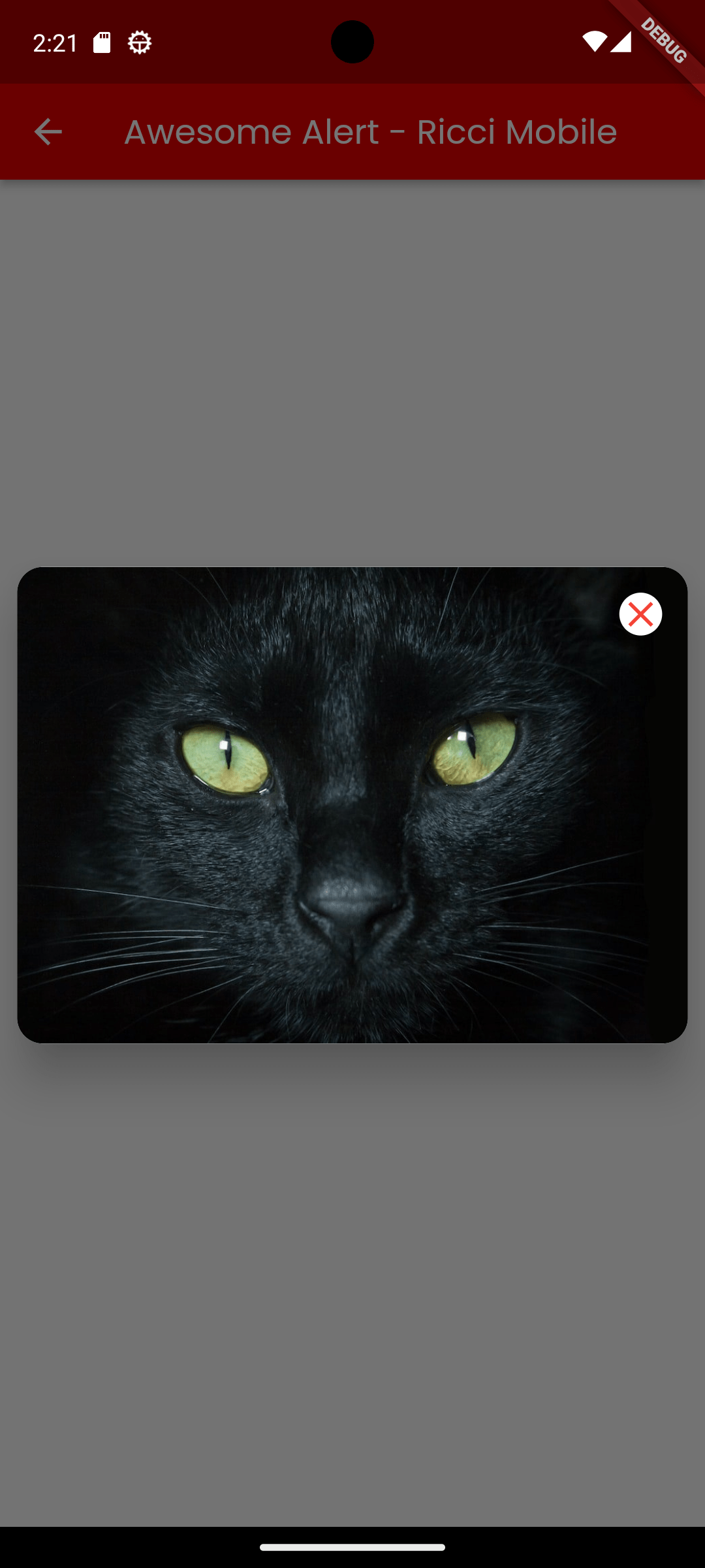
    //How to show an image with alert
    _alertImage() {
      AwesomeAlert awesomeAlert = AwesomeAlert(context: context);
      awesomeAlert.alertImage(
        cancelable: true,
        type: ImageType.imageFromWeb,
        path: "https://riccimobile.com.br/github/flutter/awsomealert/cat.jpeg",
        borderRadius: 15,
        fit: BoxFit.cover,
      );
    }

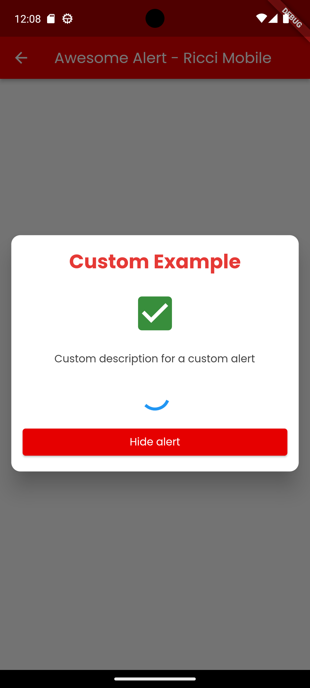
    //How to create a custom body for an alert
    _customAlert() {
      AwesomeAlert awesomeAlert = AwesomeAlert(context: context);
      awesomeAlert.showCustomAlert(
        body: Padding(
          padding: const EdgeInsets.all(15),
          child: Column(
            mainAxisSize: MainAxisSize.min,
            children: [
              Text(
                "Custom Example",
                style: TextStyle(
                  color: Colors.red[600],
                  fontSize: 26,
                  fontWeight: FontWeight.bold,
                ),
              ),
              const SizedBox(height: 20),
              Icon(
                Icons.check_box,
                color: Colors.green[700],
                size: 60,
              ),
              const SizedBox(height: 20),
              Text(
                "Custom description for a custom alert",
                style: TextStyle(
                  color: Colors.grey[800],
                  fontSize: 14,
                  fontWeight: FontWeight.w400,
                ),
              ),
              const SizedBox(height: 20),
              const CircularProgressIndicator(color: Colors.blue),
              const SizedBox(height: 20),
              Row(
                children: [
                  Expanded(
                    child: ElevatedButton(
                      onPressed: () {
                        awesomeAlert.hideAlert();
                      },
                      child: const Text("Hide alert"),
                    ),
                  )
                ],
              )
            ],
          ),
        ),
      );
    }

    //Example page
    return Scaffold(
      appBar: AppBar(title: const Text("Awesome Alert - Ricci Mobile")),
      body: Center(
        child: Column(
          mainAxisSize: MainAxisSize.min,
          children: [
            MaterialButton(
              onPressed: _simpleAlert,
              color: Colors.blue,
              height: 40,
              shape: RoundedRectangleBorder(
                borderRadius: BorderRadius.circular(50),
              ),
              child: const Text(
                "Show simple Alert",
                style: TextStyle(
                  color: Colors.white,
                ),
              ),
            ),
            MaterialButton(
              onPressed: _customAlert,
              color: Colors.green,
              height: 40,
              shape: RoundedRectangleBorder(
                borderRadius: BorderRadius.circular(50),
              ),
              child: const Text(
                "Show custom Alert",
                style: TextStyle(
                  color: Colors.white,
                ),
              ),
            ),
            MaterialButton(
              onPressed: _alertLoading,
              color: Colors.red,
              height: 40,
              shape: RoundedRectangleBorder(
                borderRadius: BorderRadius.circular(50),
              ),
              child: const Text(
                "Show Alert loading",
                style: TextStyle(
                  color: Colors.white,
                ),
              ),
            ),
            MaterialButton(
              onPressed: _alertImage,
              color: Colors.pink,
              height: 40,
              shape: RoundedRectangleBorder(
                borderRadius: BorderRadius.circular(50),
              ),
              child: const Text(
                "Show Alert image",
                style: TextStyle(
                  color: Colors.white,
                ),
              ),
            ),
          ],
        ),
      ),
    );
  }
}
Credits
- Created by Ricci Mobile