buttons_tabbar 1.3.7%2B1
A Flutter package that implements a TabBar where each label is a toggle button.
Buttons TabBar

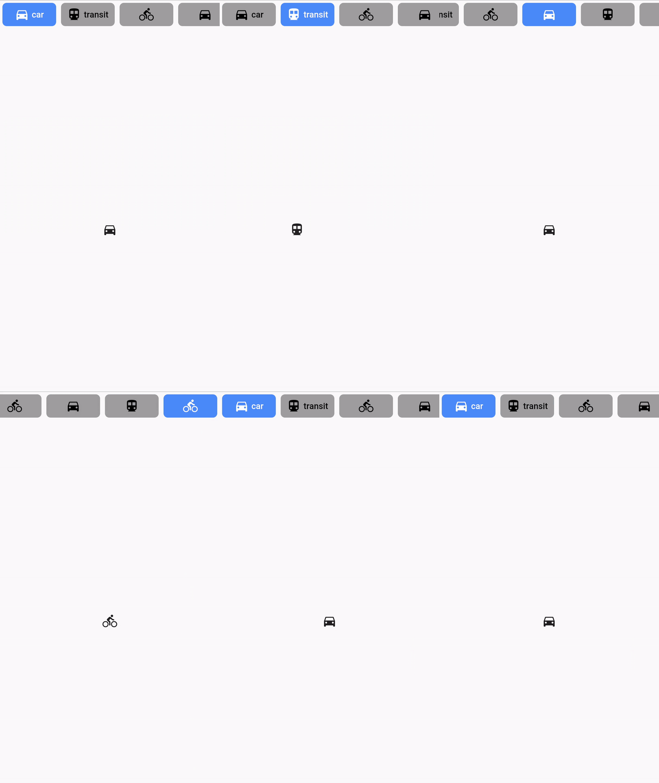
Buttons TabBar is an open-source Flutter package that provides a tabbar where each tab indicator is a toggle button. It allows you to create interactive and customizable tab bars for your Flutter applications.
Features
✨ Each tab indicator is a toggle button
🎨 Customizable appearance and behavior
🖌️ Supports various styling options, including background color, border color, label style, icon color, and more
🚀 Smooth transition animations
📱 Works like a native TabBar
⚙️ Simple and easy to use configuration with a wide range of parameters
Installation
To use Buttons TabBar in your Flutter project, follow these steps:
- Add the dependency to your
pubspec.yamlfile:
dependencies:
  flutter:
    sdk: flutter
  buttons_tabbar: ^1.3.7+1
- Run
flutter pub getto install the package.
Usage
Import the package in your Dart file and customize the tab bar according to your needs:
import 'package:buttons_tabbar/buttons_tabbar.dart';

DefaultTabController(
  length: ...,
  child: Column(
    children: <Widget>[
      ButtonsTabBar(
        // Customize the appearance and behavior of the tab bar
        backgroundColor: Colors.red,
        borderWidth: 2,
        borderColor: Colors.black,
        labelStyle: TextStyle(
          color: Colors.white,
          fontWeight: FontWeight.bold,
        ),
        unselectedLabelStyle: TextStyle(
          color: Colors.black,
          fontWeight: FontWeight.bold,
        ),
        // Add your tabs here
        tabs: ...,
      ),
      Expanded(
        child: TabBarView(
          children: ...,
        ),
      ),
    ],
  ),
)
Examples
Here are a few examples of how you can use Buttons TabBar:
Example #1
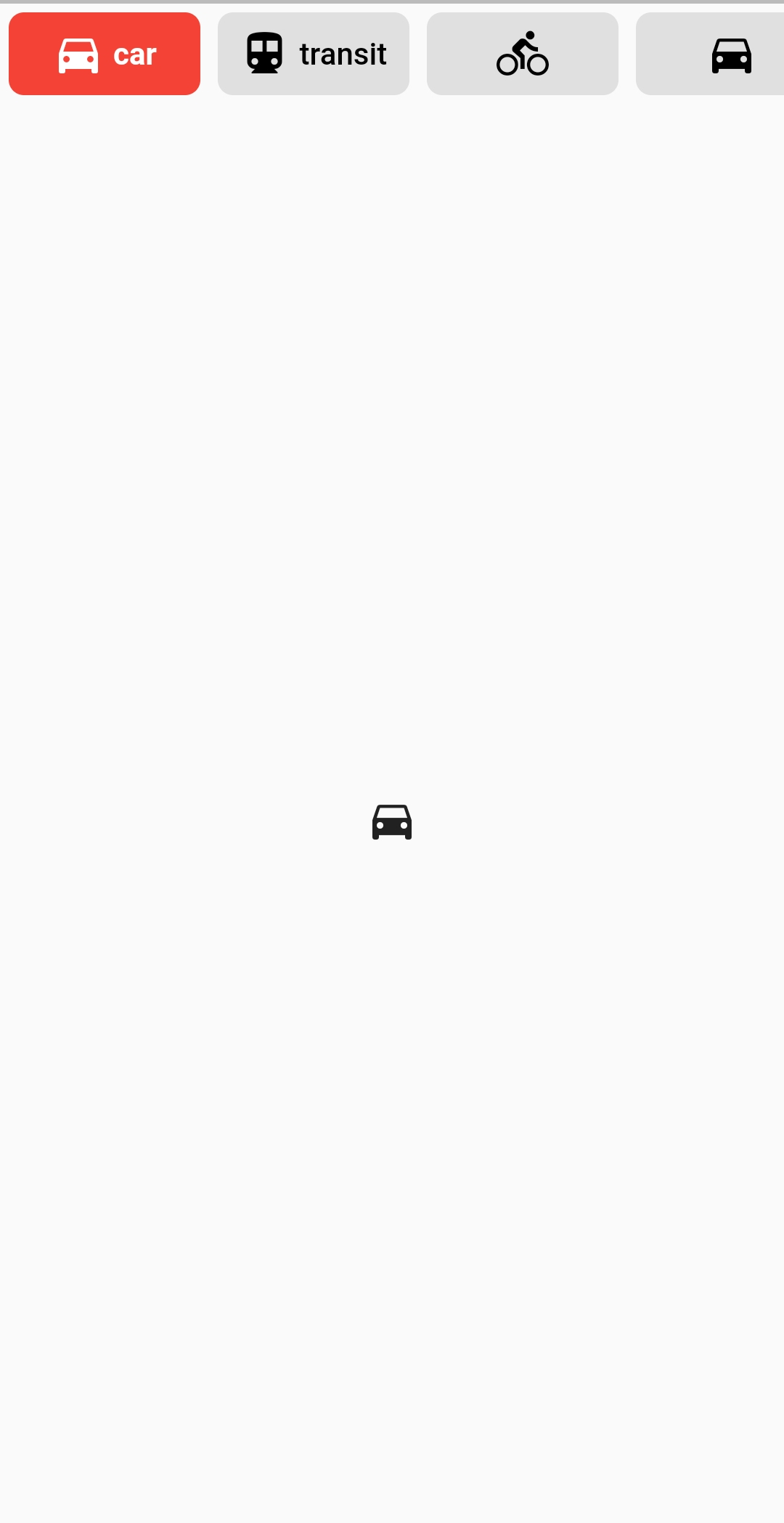
DefaultTabController(
  length: ...,
  child: Column(
    children: <Widget>[
      ButtonsTabBar(
        backgroundColor: Colors.red,
        tabs: ...,
      ),
      Expanded(
        child: TabBarView(
          children: ...,
        ),
      ),
    ],
  ),
)
Example #2
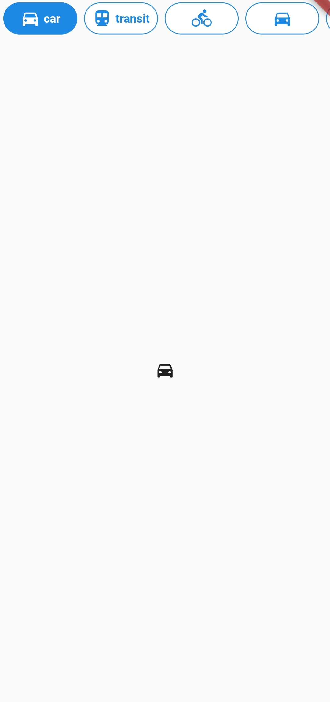
DefaultTabController(
  length: ...,
  child: Column(
    children: <Widget>[
      ButtonsTabBar(
        backgroundColor: Colors.blue[600],
        unselectedBackgroundColor: Colors.white,
        labelStyle: TextStyle(
          color: Colors.white,
          fontWeight: FontWeight.bold,
        ),
        unselectedLabelStyle: TextStyle(
          color: Colors.blue[600],
          fontWeight: FontWeight.bold,
        ),
        borderWidth: 1,
        unselectedBorderColor: Colors.blue[600],
        radius: 100,
        tabs: ...,
      ),
      Expanded(
        child: TabBarView(
          children: ...,
        ),
      ),
    ],
  ),
)
Example #3
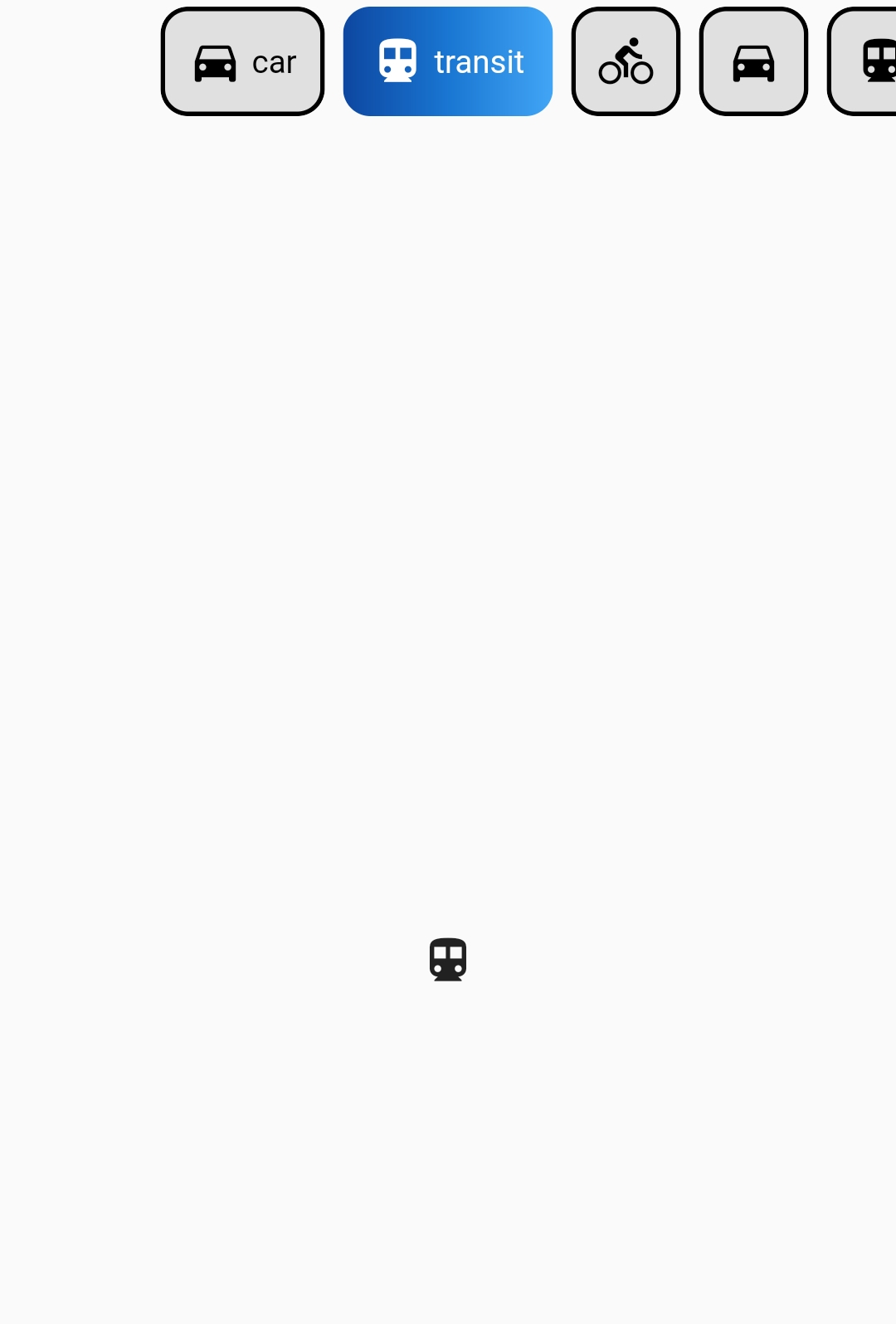
DefaultTabController(
  length: 6,
  child: Column(
    children: <Widget>[
      ButtonsTabBar(
        radius: 12,
        contentPadding: EdgeInsets.symmetric(horizontal: 12),
        borderWidth: 2,
        borderColor: Colors.transparent,
        center: true,
        decoration: BoxDecoration(
          gradient: LinearGradient(
            colors: <Color>[
              Color(0xFF0D47A1),
              Color(0xFF1976D2),
              Color(0xFF42A5F5),
            ],
          ),
        ),
        unselectedLabelStyle: TextStyle(color: Colors.black),
        labelStyle: TextStyle(color: Colors.white),
        height: 56,
        tabs: ...,
      ),
      Expanded(
        child: TabBarView(
          children: ...,
        ),
      ),
    ],
  ),
)
For more examples, please refer to the example.dart file.
Properties
Below are the properties available for customizing the ButtonsTabBar. For more detailed information, check the API reference.
| Property | Type | Description | Default |
|---|---|---|---|
| backgroundColor | Color | The background color of the button on its selected state. | Theme.of(context).accentColor |
| borderColor | Color | The border color of the button on its selected state. | Colors.black |
| borderWidth | double | The width of the solid border for each button. | 0 |
| buttonMargin | EdgeInsets | The EdgeInsets used for the margin of the buttons. | EdgeInsets.all(4.0) |
| center | bool | Center the tab buttons. | false |
| contentPadding | EdgeInsets | The EdgeInsets used for the padding of the buttons' content. | EdgeInsets.symmetric(horizontal: 4.0) |
| controller | TabController | This widget's selection and animation state. | DefaultTabController.of |
| decoration | BoxDecoration | The BoxDecoration of the button on its selected state. | null |
| duration | int | The duration in milliseconds of the transition animation. | 250 |
| elevation | double | The value of elevation applied to each button. | 0 |
| height | double? | Override the default height. | 46.0 |
| labelSpacing | double | The spacing between the icon and the text. If only one of those is provided, no spacing is applied. | 4.0 |
| labelStyle | TextStyle | The TextStyle of the button's text on its selected state. The color provided on the TextStyle will be used for the icon's color. | TextStyle(color: Colors.white) |
| onTap | void Function(int)? | An optional callback that's called when the TabBar is tapped. | null |
| physics | ScrollPhysics | The physics used for the ScrollController of the tabs list. | BouncingScrollPhysics() |
| radius | double | The value of the BorderRadius.circular applied to each button. | 7.0 |
| splashColor | Color? | The splash color of the button. | null |
| tabs | List<Widget> | The tabs to display. Typically a list of two or more Tab widgets. | @required |
| unselectedBackgroundColor | Color | The background color of the button on its unselected state. | Colors.grey[300] |
| unselectedBorderColor | Color | The border color of the button on its unselected state. If it's value is null, the Color of borderColor is used. | null |
| unselectedDecoration | BoxDecoration | The BoxDecoration of the button on its unselected state. | null |
| unselectedLabelStyle | TextStyle | The TextStyle of the button's text on its unselected state. The color provided on the TextStyle will be used for the icon's color. | TextStyle(color: Colors.black) |
Apps Using Buttons TabBar
Here are some apps that are using Buttons TabBar to create engaging and interactive tab bars:
- Spotube - Open source Spotify client that doesn't require Premium nor uses Electron! Available for both desktop & mobile!

If you are using Buttons TabBar in your app and would like to showcase it here, please let us know. We would be happy to feature your app as well.
Please note that the above apps are provided as examples and may not be actively maintained or associated with the Buttons TabBar package.
Future Development
If you have any suggestions or encounter any issues, feel free to let me know. I am committed to improving and maintaining this package.
License
This package is licensed under the MIT License. For more information, see the LICENSE.md file.
More Information
For more information, visit the Buttons TabBar GitHub repository or the author's website.