calendar_date_picker2 2.0.1
A lightweight and customizable calendar picker based on Flutter CalendarDatePicker, with support for single date picker, range picker and multi picker.
CalendarDatePicker2



A lightweight and customizable calendar picker based on Flutter CalendarDatePicker, with support for single date picker, range picker and multi picker.
 |  |  | 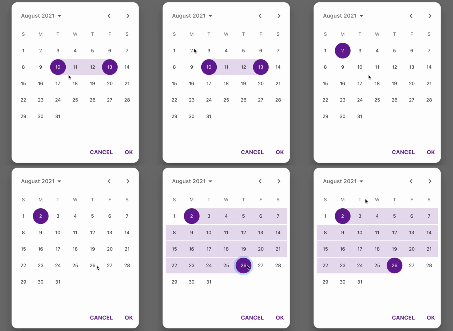 |
|---|---|---|---|
| single mode | multi mode | range mode | dialog function |
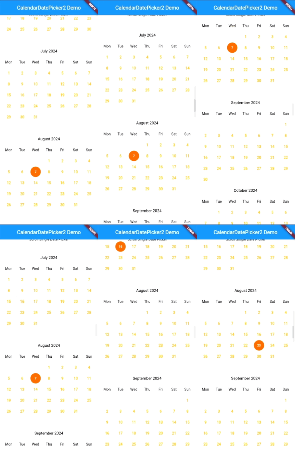 | 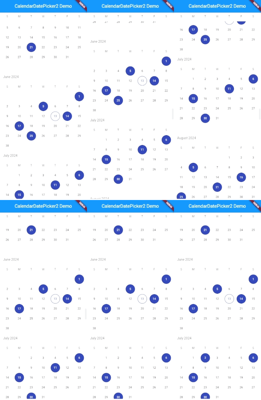 | 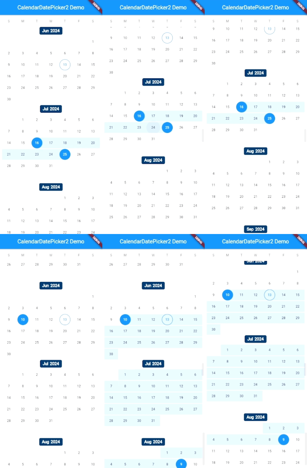 | 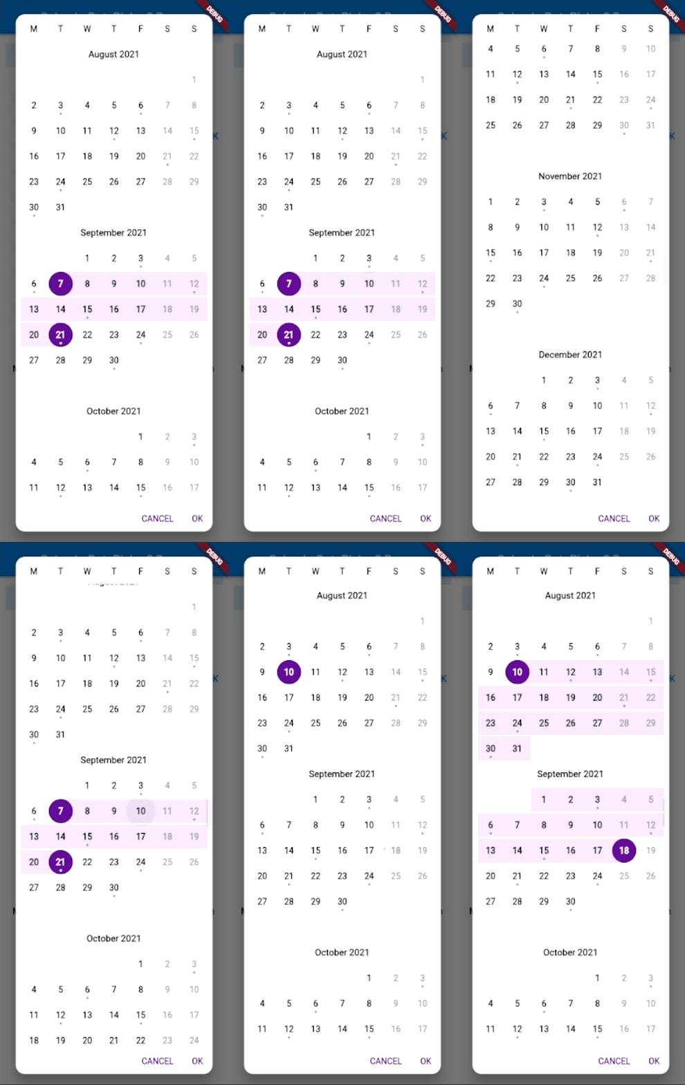 |
|---|---|---|---|
| single scroll | multi scroll | range scroll | dialog scroll |
Intro
CalendarDatePicker2 consists of two main widgets:
CalendarDatePicker2, this widget only includes the calendar UI and will emit event whenever user taps a different date.CalendarDatePicker2WithActionButtons, this widget includes calendar UI and the action buttons (CANCEL & OK). This widget will only emit the updated value when user taps 'OK' button.
Features
- Extended CalendarDatePicker allows
nullinitialDate - Highly Customizable UI
- Supports three modes: single, multi and range
- Supports four views: day, month, year and scroll
- Built-in
showCalendarDatePicker2Dialog - Multi-language supports
- Support of Material 3
Migrate from 0.x.x
Version 1.x.x will by default enable month picker. If you want to migrate to v1.x.x from v0.x.x and would like to keep the old behavior, you will need to set disableMonthPicker to true.
Migrate from 1.x.x
If your flutter SDK is above flutter SDK 3.27.0, you can safely migrate to v2.x.x. Otherwise you should use v1.x.x to avoid dependency issues.
How to use
Make sure to check out examples for more details.
Installation
Add the following line to pubspec.yaml:
dependencies:
calendar_date_picker2: ^2.0.1
Basic setup
The complete example is available here.
CalendarDatePicker2 requires you to provide config and value:
configcontains the configurations for your calendar setup and UI.valueis initial values passed into your calendar picker,valuemust be aList.
The minimum working sample
CalendarDatePicker2(
  config: CalendarDatePicker2Config(),
  value: _dates,
  onValueChanged: (dates) => _dates = dates,
);
Single Date Picker Configuration
During the initialization of CalendarDatePicker2Config the calendarType of the config instance will by default set to CalendarDatePicker2Type.single, so you don't have to set the calendar type specifically.
Multi Date Picker Configuration
In order to use multi mode date picker, you will need to set the calendarType of config to CalendarDatePicker2Type.multi:
CalendarDatePicker2(
  config: CalendarDatePicker2Config(
      calendarType: CalendarDatePicker2Type.multi,
  ),
  value: _dates,
  onValueChanged: (dates) => _dates = dates,
);
Range Date Picker Configuration
In order to use range mode date picker, you will need to set the calendarType of config to CalendarDatePicker2Type.range:
CalendarDatePicker2(
  config: CalendarDatePicker2Config(
      calendarType: CalendarDatePicker2Type.range,
  ),
  value: _dates,
  onValueChanged: (dates) => _dates = dates,
);
Use built-in dialog display method
This package includes built-in support to display calendar as a dialog. To use it, you will need to call showCalendarDatePicker2Dialog, which takes three required arguments: context, config, dialogSize:
...
var results = await showCalendarDatePicker2Dialog(
  context: context,
  config: CalendarDatePicker2WithActionButtonsConfig(),
  dialogSize: const Size(325, 400),
  value: _dates,
  borderRadius: BorderRadius.circular(15),
);
...
Config options
For CalendarDatePicker2 widget
| Argument | Type | Description |
|---|---|---|
| config | CalendarDatePicker2Config | Calendar UI related configurations |
| value | List<DateTime?> | The selected [DateTime]s that the picker should display. |
| onValueChanged | ValueChanged<List<DateTime>>? | Called when the selected dates changed |
| displayedMonthDate | DateTime? | Date to control calendar displayed month |
| onDisplayedMonthChanged | ValueChanged<DateTime>? | Called when the user navigates to a new month/year in the picker under non-scroll mode |
For CalendarDatePicker2Config:
| Option | Type | Description |
|---|---|---|
| calendarType | CalendarDatePicker2Type? | Calendar picker type, has 3 values: single, multi, range |
| rangeBidirectional | bool? | Flag to enable selecting dates range also in reverse-chronological order |
| firstDate | DateTime? | The earliest allowable DateTime user can select |
| lastDate | DateTime? | The latest allowable DateTime user can select |
| currentDate | DateTime? | The DateTime representing today which will be outlined in calendar |
| calendarViewMode | CalendarDatePicker2Mode? | The initially displayed view of the calendar picker, with four options available: day, month, year and scroll |
| calendarViewScrollPhysics | ScrollPhysics? | The scroll physics for the calendar month view |
| dynamicCalendarRows | bool? | Flag to enable dynamic calendar rows based on specific month |
| allowSameValueSelection | bool? | Flag to control [onValueChanged] behavior |
| animateToDisplayedMonthDate | bool? | Flag to always animate to the displayedMonthDate |
| semanticsDictionary | Map? | Custom dictionary for semantics labels |
| disableVibration | bool? | Flag to disable vibration on date selection |
| weekdayLabels | List<String>? | Custom weekday labels, should starts with Sunday |
| weekdayLabelTextStyle | TextStyle? | Custom text style for weekday labels |
| weekdayLabelBuilder | WeekdayLabelBuilder? | Function to provide full control over weekday label widget |
| firstDayOfWeek | int? | Index of the first day of week, where 0 points to Sunday, and 6 points to Saturday. |
| lastMonthIcon | Widget? | Custom icon for last month button control |
| hideLastMonthIcon | bool? | Flag to hide last month icon |
| nextMonthIcon | Widget? | Custom icon for next month button control |
| hideNextMonthIcon | bool? | Flag to hide next month icon |
| controlsHeight | double? | Custom height for calendar control toggle's height |
| controlsTextStyle | TextStyle? | Custom text style for calendar mode toggle control |
| centerAlignModePicker | bool? | Flag to centralize year and month text label in controls |
| modePickersGap | double? | Custom gap distance between month and year mode pickers |
| disableModePicker | bool? | Flag to disable mode picker and hide the toggle icon |
| modePickerTextHandler | ModePickerTextHandler? | Function to control mode picker displayed text |
| modePickerBuilder | ModePickerBuilder? | Function to provide full control over mode picker UI |
| customModePickerIcon | Widget? | Custom icon for the mode picker button icon |
| useAbbrLabelForMonthModePicker | bool? | Use Abbreviation label for month mode picker, only works when month picker is enabled |
| dayViewController | PageController? | Custom page controller for the calendar day view |
| dayMaxWidth | double? | Max width of day widget. When [dayMaxWidth] is not null, it will override default size settings |
| dayBorderRadius | BorderRadius? | Custom border radius for day indicator |
| dayTextStyle | TextStyle? | Custom text style for calendar day(s) |
| todayTextStyle | TextStyle? | Custom text style for current calendar day(s) |
| disabledDayTextStyle | TextStyle? | Custom text style for disabled calendar day(s) |
| dayTextStylePredicate | DayTextStylePredicate? | Function to provide full control over calendar day(s) text style |
| selectedDayHighlightColor | Color? | The highlight color selected day |
| selectedDayTextStyle | TextStyle? | Custom text style for selected calendar day(s) |
| selectableDayPredicate | SelectableDayPredicate? | Function to provide full control over which dates in the calendar can be selected |
| selectedRangeDayTextStyle | TextStyle? | Custom text style for selected range calendar day(s) |
| selectedRangeHighlightColor | Color? | The highlight color for day(s) included in the selected range |
| selectedRangeDecorationPredicate | SelectedRangeDecorationPredicate? | Predicate to determine the day widget box decoration for a day in selected range |
| selectedRangeHighlightBuilder | SelectedRangeHighlightBuilder? | Function to provide full control over range picker highlight |
| daySplashColor | Color? | The splash color of the day widget |
| dayBuilder | DayBuilder? | Function to provide full control over day widget UI |
| dayModeScrollDirection | Axis? | Axis scroll direction for [CalendarDatePicker2Mode.day] mode |
| monthViewController | ScrollController? | Custom scroll controller for the calendar month view |
| monthBuilder | MonthBuilder? | Function to provide full control over month widget UI |
| hideMonthPickerDividers | bool? | Flag to hide dividers on month picker |
| selectableMonthPredicate | SelectableMonthPredicate? | Function to provide full control over which month in the month list can be selected. |
| disableMonthPicker | bool? | Flag to disable month picker |
| monthTextStyle | TextStyle? | Custom text style for month(s) |
| selectedMonthTextStyle | TextStyle? | Custom text style for selected month(s) |
| disabledMonthTextStyle | TextStyle? | Custom text style for disabled month(s) |
| yearViewController | ScrollController? | Custom scroll controller for the calendar year view |
| yearBorderRadius | BorderRadius? | Custom border radius for year indicator |
| yearTextStyle | TextStyle? | Custom text style for year(s) |
| selectedYearTextStyle | TextStyle? | Custom text style for selected year(s) |
| disabledYearTextStyle | TextStyle? | Custom text style for disabled year(s) |
| selectableYearPredicate | SelectableYearPredicate? | Function to provide full control over which year in the year list be selected. |
| yearBuilder | YearBuilder? | Function to provide full control over year widget UI |
| hideYearPickerDividers | bool? | Flag to hide dividers on year picker |
| scrollViewTopHeaderTextStyle | TextStyle? | Custom text style for scroll view top week labels header |
| hideScrollViewTopHeader | bool? | Flag to hide top week labels header on scroll view picker |
| hideScrollViewTopHeaderDivider | bool? | Flag to hide top week labels header divider on scroll view |
| hideScrollViewMonthWeekHeader | bool? | Flag to hide month calendar week labels header on scroll view |
| scrollViewConstraints | BoxConstraints? | BoxConstraints for the scroll calendar view, only work for scroll mode |
| scrollViewMonthYearBuilder | ScrollViewMonthYearBuilder? | Function to provide full control over scroll calendar month year UI |
| scrollViewOnScrolling | ScrollViewOnScrolling? | Function to callback over scrolling on scroll view |
| scrollViewController | ScrollController? | Custom scroll controller to the scroll calendar view |
In addition to the configurations above, CalendarDatePicker2WithActionButtonsConfig has 9 extra options
| Option | Type | Description |
|---|---|---|
| gapBetweenCalendarAndButtons | double? | The gap between calendar and action buttons |
| cancelButtonTextStyle | TextStyle? | Text style for cancel button |
| cancelButton | Widget? | Custom cancel button |
| okButtonTextStyle | TextStyle? | Text style for ok button |
| okButton | Widget? | Custom ok button |
| openedFromDialog | bool? | Is the calendar opened from dialog |
| closeDialogOnCancelTapped | bool? | Close dialog after user taps the CANCEL button |
| closeDialogOnOkTapped | bool? | Close dialog after user taps the OK button |
| buttonPadding | EdgeInsets? | Custom wrapping padding for Ok & Cancel buttons |
Custom UI
By using the configs above, you could make your own custom calendar picker as your need.


CalendarDatePicker2WithActionButtons(
  config: CalendarDatePicker2WithActionButtonsConfig(
    firstDayOfWeek: 1,
    calendarType: CalendarDatePicker2Type.range,
    selectedDayTextStyle: TextStyle(color: Colors.white, fontWeight: FontWeight.w700),
    selectedDayHighlightColor: Colors.purple[800],
    centerAlignModePicker: true,
    customModePickerIcon: SizedBox(),
    dayBuilder: _yourDayBuilder,
    yearBuilder: _yourYearBuilder,
  ),
  value: _dates,
  onValueChanged: (dates) => _dates = dates,
);
Multi-language support
This package has multi-language supports. To enable it, add your Locale into the wrapping MaterialApp:
MaterialApp(
  localizationsDelegates: GlobalMaterialLocalizations.delegates,
  supportedLocales: const [
    Locale('en', ''),
    Locale('zh', ''),
    Locale('ru', ''),
    Locale('es', ''),
    Locale('hi', ''),
  ],
  ...
);
 |  |  |  |
|---|---|---|---|
| 中文 | русский | español | हिंदी |
Contributions
Feel free to contribute to this project. 🍺 Pull requests are welcome!
There are some tips before creating a PR:
- Please always create an issue/feature before raising a PR
- Please always create a minimum reproducible example for an issue
- Please use the official Dart Extension as your formatter or use
dart format . -l 80if you are not using VS Code - Please keep your changes to its minimum needed scope (avoid introducing unrelated changes)
- Please follow this git commit convention by adding
feat:orfix:to your PR commit