circlify 1.2.3
Circlify is a library for creating interactive pie charts and animated graphs with flexible customization and smooth animations.
Circlify



Circlify is a lightweight and powerful Flutter package for creating customizable circular charts with smooth animations. Perfect for visualizing data in dashboards or adding dynamic radial elements to your app.
📊 Demo
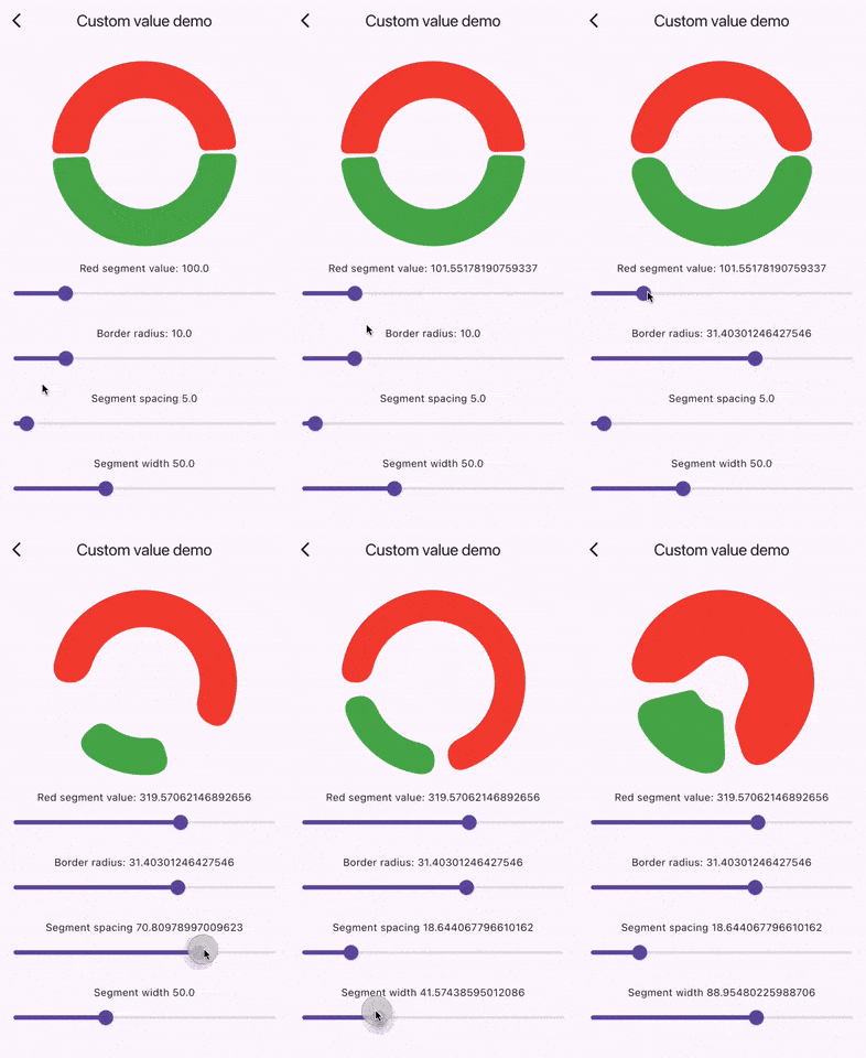
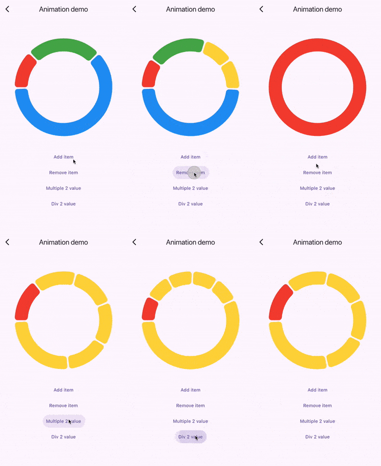
🌟 Features
- Highly customizable circular charts
- Smooth animations
- Supports interactive and dynamic updates
- Customizable
CirclifyItemsubclasses - Easy to integrate into any Flutter project
📦 Installation
Add circlify to your pubspec.yaml:
dependencies:
  circlify: ^<latest-version>
🚀 Usage
Here’s a quick example to get started:
class App extends StatelessWidget {
  const App({super.key});

  final List<CirclifyItem> = [
    CirclifyItem(color: Colors.red, value: 100),
    CirclifyItem(color: Colors.green, value: 100),
    CirclifyItem(color: Colors.blue, value: 100),
  ];

  @override
  Widget build(BuildContext context) {
    return Scaffold(
      body: Center(
        child: SizedBox(
          width: 200,
          height: 200,
          child: Circlify(
            items: items,
          ),
        ),
      ),
    );
  }
}
⚠️ Important Note: Proper Initialization of CirclifyItem
To ensure smooth performance, all CirclifyItem objects must be initialized only once if id is not provided. Avoid re-creating CirclifyItem instances on every rebuild. Below is an example of what not to do:
🚫 Incorrect Usage
Circlify(
  items: [
    CirclifyItem(color: Colors.red, value: 100),
    CirclifyItem(color: Colors.green, value: 100),
    CirclifyItem(color: Colors.blue, value: 100),
  ],
)
The issue with the above example is that new CirclifyItem objects are being created on each rebuild, causing unnecessary re-rendering and performance issues.
✅ Correct Usage
Instead, ensure that CirclifyItem objects are created once and reused, as shown in the following examples:
Example 1: Assign id to each item
Circlify(
  items: [
    CirclifyItem(id: '1', color: Colors.red, value: 100),
    CirclifyItem(id: '2', color: Colors.green, value: 100),
    CirclifyItem(id: '3', color: Colors.blue, value: 100),
  ],
)
Example 2: Define CirclifyItem list separately
List<CirclifyItem> items = [
  CirclifyItem(color: Colors.red, value: 100),
  CirclifyItem(color: Colors.green, value: 100),
  CirclifyItem(color: Colors.blue, value: 100),
];

Circlify(
  items: items,
)
By following these patterns, you ensure that your charts remain performant and efficient.
📏 Labels on Items
Add custom labels to each item using the label property. This feature allows for enhanced visual representation of each section in the circular chart.
🎨 Example with Labels
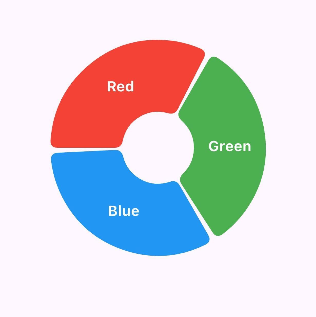
Circlify(
  segmentWidth: 100,
  labelStyle: const TextStyle(
    color: Colors.white,
    fontSize: 20,
    fontWeight: FontWeight.w700,
  ),
  items: [
    CirclifyItem(
      id: '1',
      color: Colors.red,
      value: 100,
      label: 'Red',
    ),
    CirclifyItem(
      id: '2',
      color: Colors.green,
      value: 100,
      label: 'Green',
    ),
    CirclifyItem(
      id: '3',
      color: Colors.blue,
      value: 100,
      label: 'Blue',
    ),
  ],
)
✨ Key Takeaways for Labels
- Use the
labelproperty to add descriptive text to each item. - Customize the appearance of labels using the
labelStyleproperty, which accepts aTextStyleobject. - Ensure each
CirclifyItemhas a uniqueidto optimize re-renders and maintain a consistent visual layout.
🛠 Custom CirclifyItem
You can also create your own CirclifyItem subclass and use it in the Circlify widget:
class CustomCircleChartItem extends CirclifyItem {
  final String name;

  CustomCircleChartItem({
    required super.color,
    required super.value,
    required super.id,
    required this.name,
  });
}

class CustomChartApp extends StatelessWidget {
  const CustomChartApp({super.key});

  @override
  Widget build(BuildContext context) {
    return Scaffold(
      body: Center(
        child: SizedBox(
          width: 200,
          height: 200,
          child: Circlify(
            items: [
              CustomCircleChartItem(
                color: Colors.purple,
                value: 150,
                id: 'item1',
                name: 'Custom Item 1',
              ),
              CustomCircleChartItem(
                color: Colors.orange,
                value: 100,
                id: 'item2',
                name: 'Custom Item 2',
              ),
            ],
          ),
        ),
      ),
    );
  }
}
⚙️ Circlify Parameters
| Parameter | Type | Description | Default |
|---|---|---|---|
items | List<CirclifyItem> | List of data points for the chart | Required |
borderRadius | BorderRadius | Border radius for chart segments | BorderRadius.all(Radius.circular(10)) |
segmentSpacing | double | Spacing between segments (must be ≥ 0 and < circle free space) | 5.0 |
segmentWidth | double | Width of chart segments (must be > 0 and < borderRadius) | 10.0 |
segmentDefaultColor | Color | Default color for empty chart segments | Colors.grey |
animationDuration | Duration | Duration of the animation | Duration(milliseconds: 150) |
animationCurve | Curve | Animation curve | Curves.easeIn |
labelStyle | TextStyle | TextStyle of label on CirclifyItem | Optional |
📝 CirclifyItem Parameters
| Parameter | Type | Description | Default |
|---|---|---|---|
id | String | Unique ID for the item (auto-generated if not provided) | Auto-generated |
color | Color | Color of the item | Required |
value | double | Value of the item (must be > 0) | Required |
label | String | The label of the item, drawn on center of the segment | Optional |
💬 Feedback and Contributions
If you encounter any issues or have suggestions, feel free to open an issue on GitHub. Contributions are welcome!
📝 License
This project is licensed under the BSD 3-Clause License - see the LICENSE file for details.
Made with ❤️ by zeffbtw.