clearable_dropdown 1.0.5
SDKflutter
Platformandroidioswindowslinuxmacosweb
DROP-DOWN MENU WITH BUTTON TO DELETE THE SELECTED VALUE
clearable_dropdown
A custom Flutter widget that extends DropdownMenu, allowing for a clean selection reset and additional customization, ideal for forms.
Preview
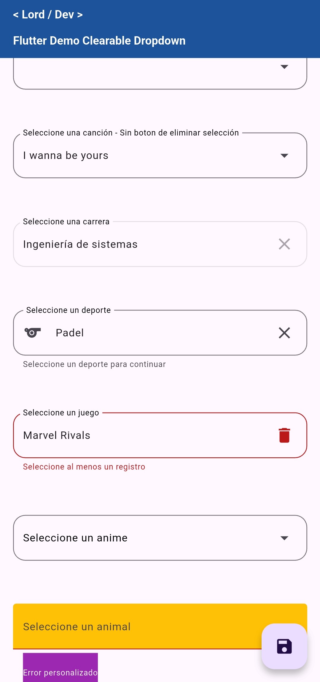
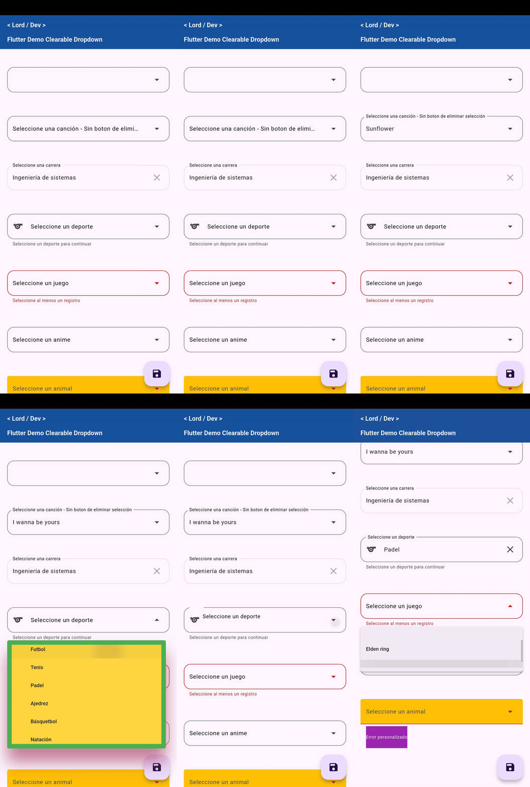
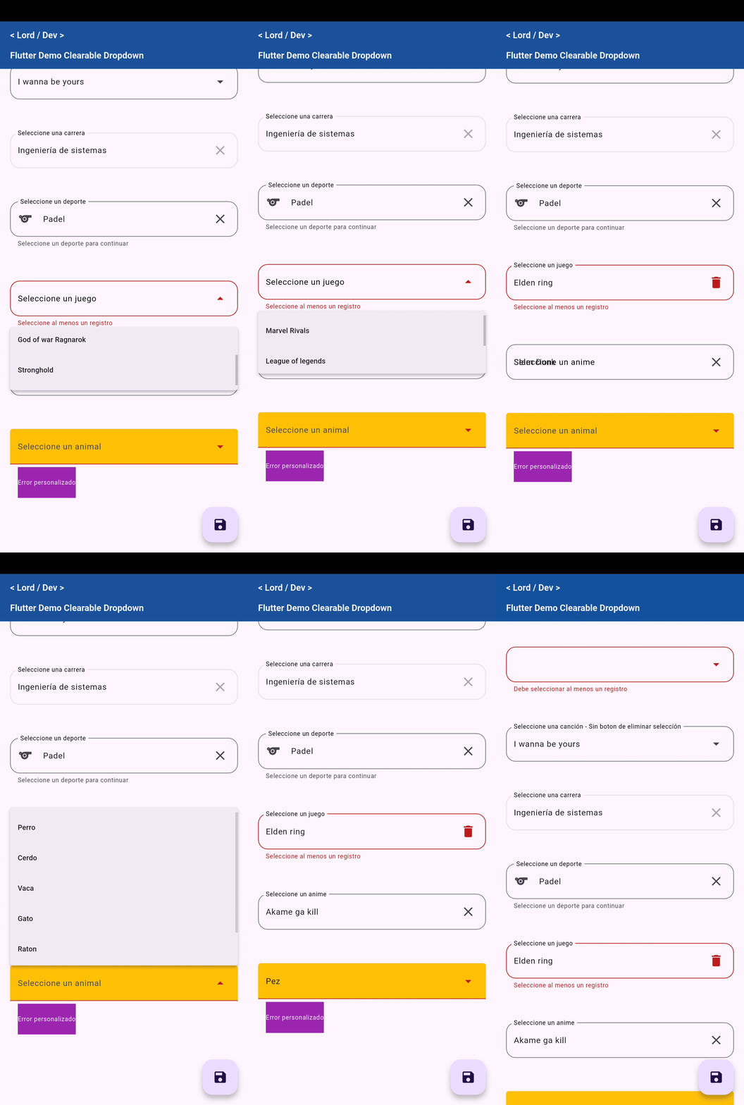
- Allows clearing the selection with a button (
onDeleteSelection) - Support for
FocusNode(useful for validations and navigation) - Style customization (
MenuStyle, icons, colors, margins, etc.) - Focus animation (optional)
- Easy to integrate and reuse
Installation | Usage | Features | Contributing
🚀 Installation
Add this line to your pubspec.yaml file:
dependencies:
  clearable_dropdown: ^1.0.0
Then run:
flutter pub get
🧪 Basic Usage
import 'package:clearable_dropdown/clearable_dropdown.dart';

SelectBox(
  listItems: [
    CatalogObject(id: 1, name: 'Manzana'),
    CatalogObject(id: 2, name: 'Naranja'),
  ],
  label: 'Fruta',
  onSelected: (value) {
    print('Seleccionaste $value');
  },
  onDeleteSelection: () {
    print('Selección eliminada');
  },
)
📂 Example
You can find a complete example in the example/ folder.
🧩 Properties of ClearableDropdown
| Property | Type | Description |
|---|---|---|
listItems | List<CatalogObject> | Required. List of items to be displayed in the dropdown. Each item must have an id and a name. |
label | String? | Optional label displayed above the field. |
hint | String? | Hint text displayed when no value is selected. |
valueInitial | String? | Initial selected value (should match one of the name values of the items). |
errorText | String? | Error text displayed below the field. |
helperText | String? | Helper text displayed below the field. |
enable | bool? | Defines if the dropdown is enabled or not. Defaults to true. |
focus | FocusNode? | Optional focus node to control the focus and trigger the scrolling animation. |
onSelected | void Function(String?)? | Callback triggered when an item is selected. Returns the id of the selected item as a string. |
onDeleteSelection | void Function()? | Callback triggered when the clear button is pressed. Also clears the field. |
margin | EdgeInsetsGeometry? | Outer margin of the container. Defaults to: EdgeInsets.only(left: 15, right: 15, bottom: 12.5). |
menuHeight | double? | Maximum height of the dropdown menu. Defaults to 250. |
inputDecorationTheme | InputDecorationTheme? | Decoration theme to customize the input field. |
colorLabel | Color? | Color of the label text. Defaults to Colors.black. |
leadingIcon | Icon? | Optional icon displayed at the beginning of the field. |
deleteIcon | Icon? | Custom icon for the clear button. Defaults to Icons.clear. |
menuStyle | MenuStyle? | Custom styles for the dropdown menu. |
🤝 Contributions
Contributions are welcome! You can open issues or make pull requests if you want to propose improvements.