dashed_circular_progress_bar 0.0.6
Dashed circular progress bar shows the progress of a task in a circle, which can be customized in color, style, and shape.
Dashed circular progress bar


Open source flutter package, Dashed circular progress bar for flutter apps.
Getting Started
Installing
Add this line to the pubspec.yaml file below the dependencies:
dependencies:
  dashed_circular_progress_bar: ^0.0.6
Now to use, import this package into the desired file as follows:
import 'package:dashed_circular_progress_bar/dashed_circular_progress_bar.dart';
Basic examples
Here are some simple examples you can use to create this package:
Example 1 - Simple progress bar
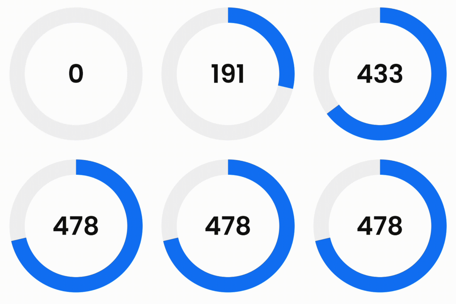
First of all, to access the amount of progress when doing animation, you need to define a ValueNotifier:
final ValueNotifier<double> _valueNotifier = ValueNotifier(0);
Then add it to the widget:
DashedCircularProgressBar.aspectRatio(
  aspectRatio: 1, // width ÷ height
  valueNotifier: _valueNotifier,
  progress: 478,
  maxProgress: 670,
  corners: StrokeCap.butt,
  foregroundColor: Colors.blue,
  backgroundColor: const Color(0xffeeeeee),
  foregroundStrokeWidth: 36,
  backgroundStrokeWidth: 36,
  animation: true,
  child: Center(
    child: ValueListenableBuilder(
      valueListenable: _valueNotifier,
      builder: (_, double value, __) => Text(
        '${value.toInt()}%',
        style: const TextStyle(
          color: Colors.black,
          fontWeight: FontWeight.w300,
          fontSize: 60
        ),
      ),
    ),
  ),
)
Example 2 - Dashed background progress bar
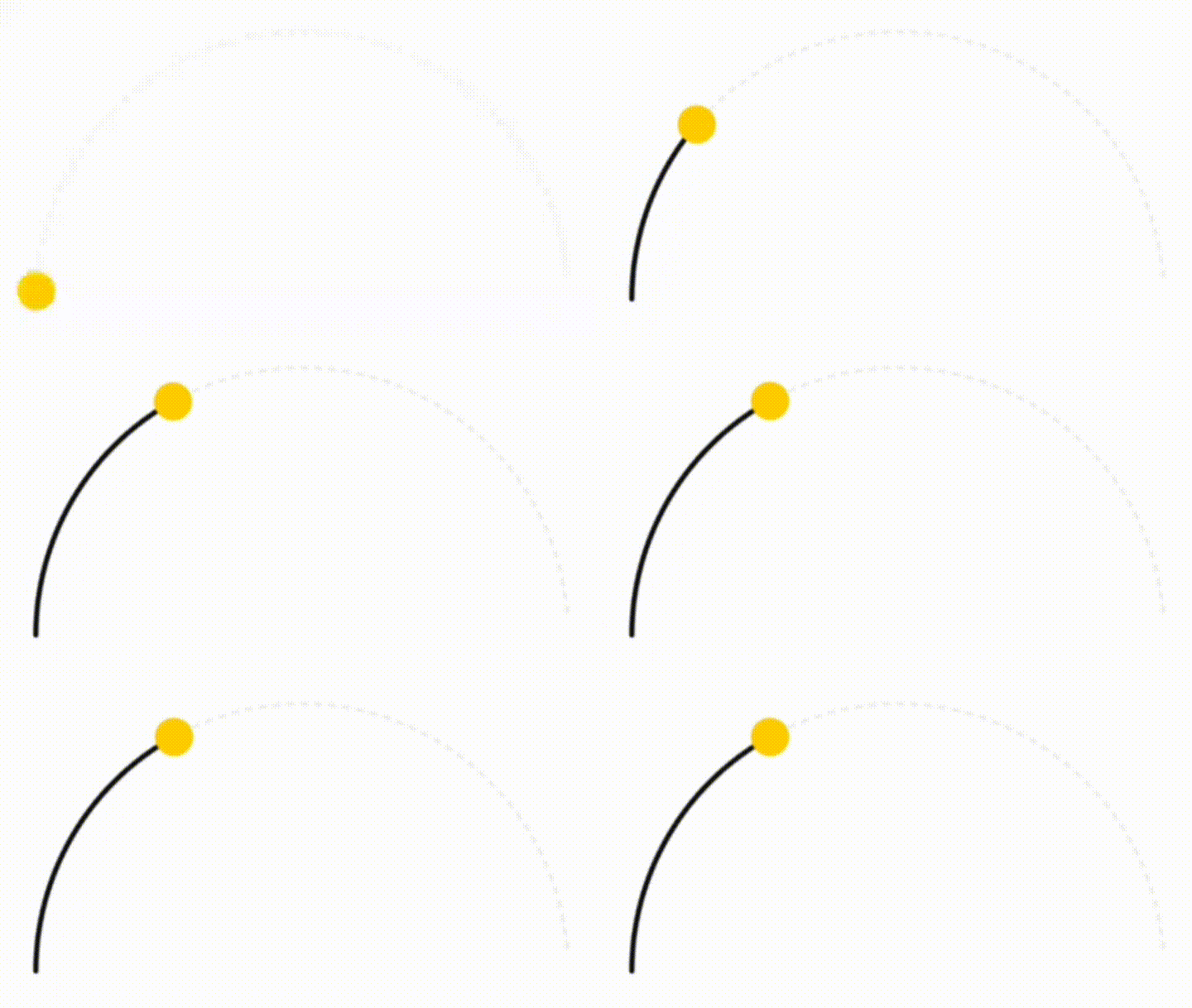
DashedCircularProgressBar.aspectRatio(
  aspectRatio: 2, // width ÷ height
  progress: 34,
  startAngle: 270,
  sweepAngle: 180,
  circleCenterAlignment: Alignment.bottomCenter,
  foregroundColor: Colors.black,
  backgroundColor: const Color(0xffeeeeee),
  foregroundStrokeWidth: 3,
  backgroundStrokeWidth: 2,
  backgroundGapSize: 2,
  backgroundDashSize: 1,
  seekColor: Colors.yellow,
  seekSize: 22,
  animation: true,
)
Example 3 - More complex progress bar
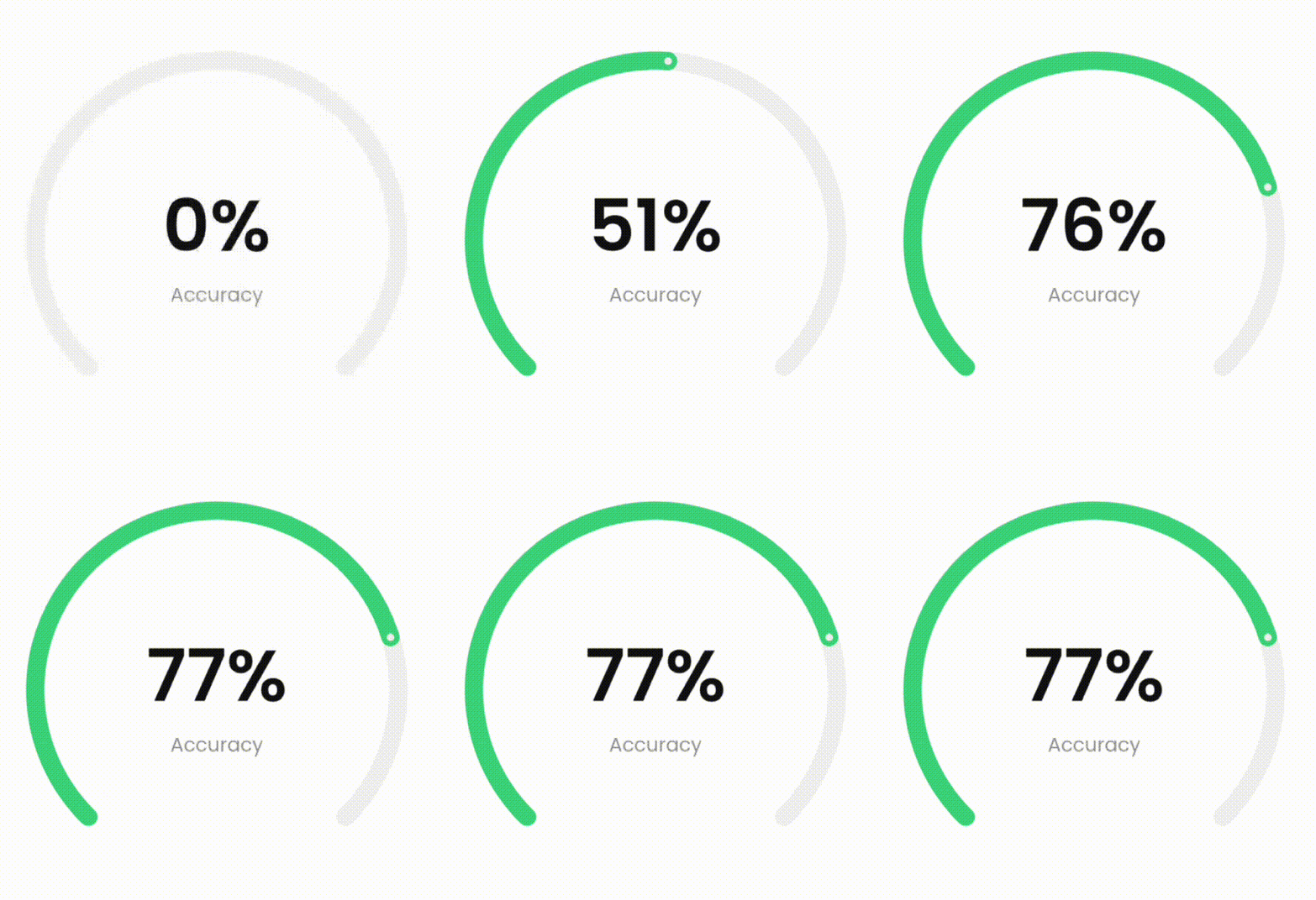
DashedCircularProgressBar.aspectRatio(
  aspectRatio: 1, // width ÷ height
  valueNotifier: _valueNotifier,
  progress: 37,
  startAngle: 225,
  sweepAngle: 270,
  foregroundColor: Colors.green,
  backgroundColor: const Color(0xffeeeeee),
  foregroundStrokeWidth: 15,
  backgroundStrokeWidth: 15,
  animation: true,
  seekSize: 6,
  seekColor: const Color(0xffeeeeee),
  child: Center(
    child: ValueListenableBuilder(
      valueListenable: _valueNotifier,
      builder: (_, double value, __) => Column(
        mainAxisSize: MainAxisSize.min,
        children: [
          Text(
            '${value.toInt()}%',
            style: const TextStyle(
              color: Colors.black,
              fontWeight: FontWeight.w300,
              fontSize: 60
            ),
          ),
          Text(
            'Accuracy',
            style: const TextStyle(
              color: Color(0xffeeeeee),
              fontWeight: FontWeight.w400,
              fontSize: 16
            ),
          ),
        ],
      )
    ),
  ),
)
Example 4 - Dashed progress bar
You can also use the desired dimensions instead of aspect ratio.

DashedCircularProgressBar.square(
  dimensions: 350,
  progress: 180,
  maxProgress: 360,
  startAngle: -27.5,
  foregroundColor: Colors.redAccent,
  backgroundColor: const Color(0xffeeeeee),
  foregroundStrokeWidth: 7,
  backgroundStrokeWidth: 7,
  foregroundGapSize: 5,
  foregroundDashSize: 55,
  backgroundGapSize: 5,
  backgroundDashSize: 55,
  animation: true,
  child: const Icon(
    Icons.favorite,
    color: Colors.redAccent,
    size: 126
  ),
)
Example 5 - Play with circle center alignment
By changing the center, you can specify the location of the progress bar.
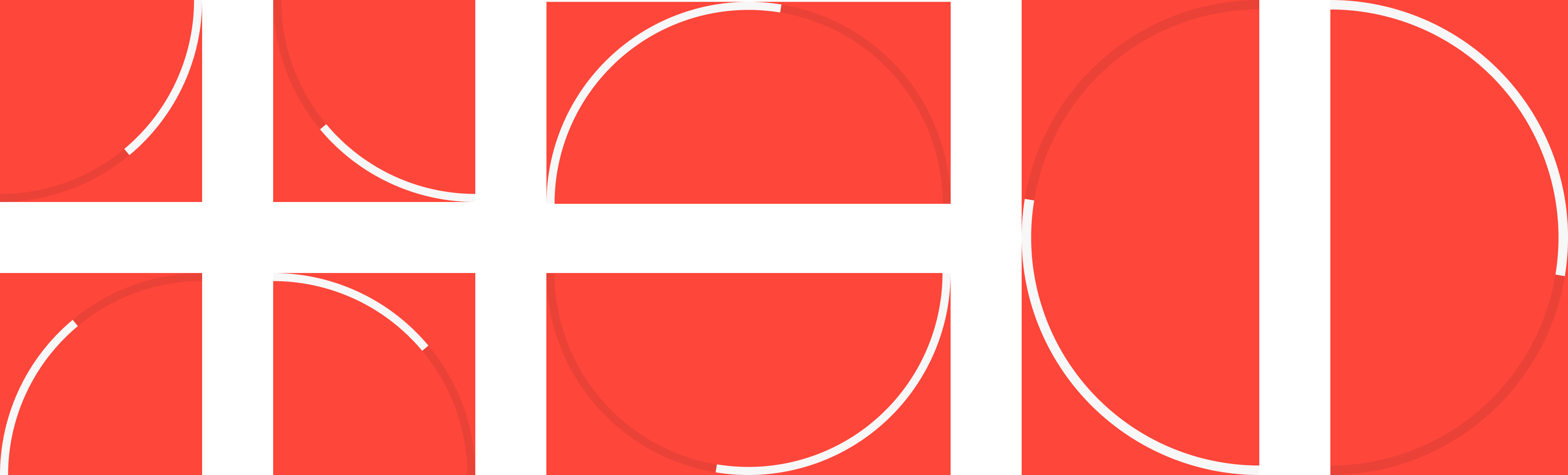
For example to make a progress bar in the shape of the first image (first row, first image from the left):
DashedCircularProgressBar.aspectRatio(
  aspectRatio: 1, // width / height
  progress: 60,
  startAngle: 90,
  sweepAngle: 90,
  corners: StrokeCap.butt,
  foregroundStrokeWidth: 7,
  backgroundStrokeWidth: 7,
  circleCenterAlignment: Alignment.topLeft,
  foregroundColor: Colors.white,
  backgroundColor: const Color(0x22000000),
  animation: true
)
Parameters description
| Parameter | Default | Description |
|---|---|---|
| width double | 0 | Progress bar width. |
| height double | 0 | Progress bar height. |
| aspectRatio double | 0 | Progress aspect ratio. |
| progress double | 0 | Current value of progress bar. |
| maxProgress double | 100 | Maximum value of progress. |
| startAngle double | 0 | The starting angle of the arc. |
| sweepAngle double | 360 | The sweep angle of the arc. |
| foregroundStrokeWidth double | 2 | Foreground arc thickness. |
| backgroundStrokeWidth double | 2 | Background arc thickness. |
| foregroundColor Color | Colors.blue | Foreground arc color. |
| backgroundColor Color | Colors.white | Background arc color. |
| corners StrokeCap | StrokeCap.round | Styles to use for arcs endings. |
| foregroundGapSize double | 0 | Foreground arc gap size. |
| foregroundDashSize double | 0 | Foreground arc dash size. |
| backgroundGapSize double | 0 | Background arc gap size. |
| backgroundDashSize double | 0 | Background arc dash size. |
| seekSize double | 0 | Progress bar seek size. |
| seekColor Color | Colors.blue | Progress bar seek color. |
| circleCenterAlignment Alignment | Alignment.center | Align center of progress bar. |
| animation bool | false | Active progress bar animation. |
| animationDuration Duration | Duration(seconds: 1) | Progress bar animation duration. |
| animationCurve Curve | Curves.easeOut | Progress bar animation curve. |
| onAnimationEnd void Function()? | null | This function is called when animation ended. |
| ltr bool | true | Specifies how to draw arcs from right to left or vice versa. |
| child Widget? | null | This widget is placed on the progress bar. |
| valueNotifier ValueNotifier? | null | Animated value notifier. |