easy_radio 0.0.3
EasyRadio is a customizable radio button widget for Flutter that offers consistent animation, easy customization of sizes, shape, inner dot shape.
EasyRadio




EasyRadio is a customizable radio button widget for Flutter that offers consistent animation, easy customization of sizes, shape, inner dot shape, and colors. It ensures a seamless user experience by utilizing the same animation as the regular radio button.
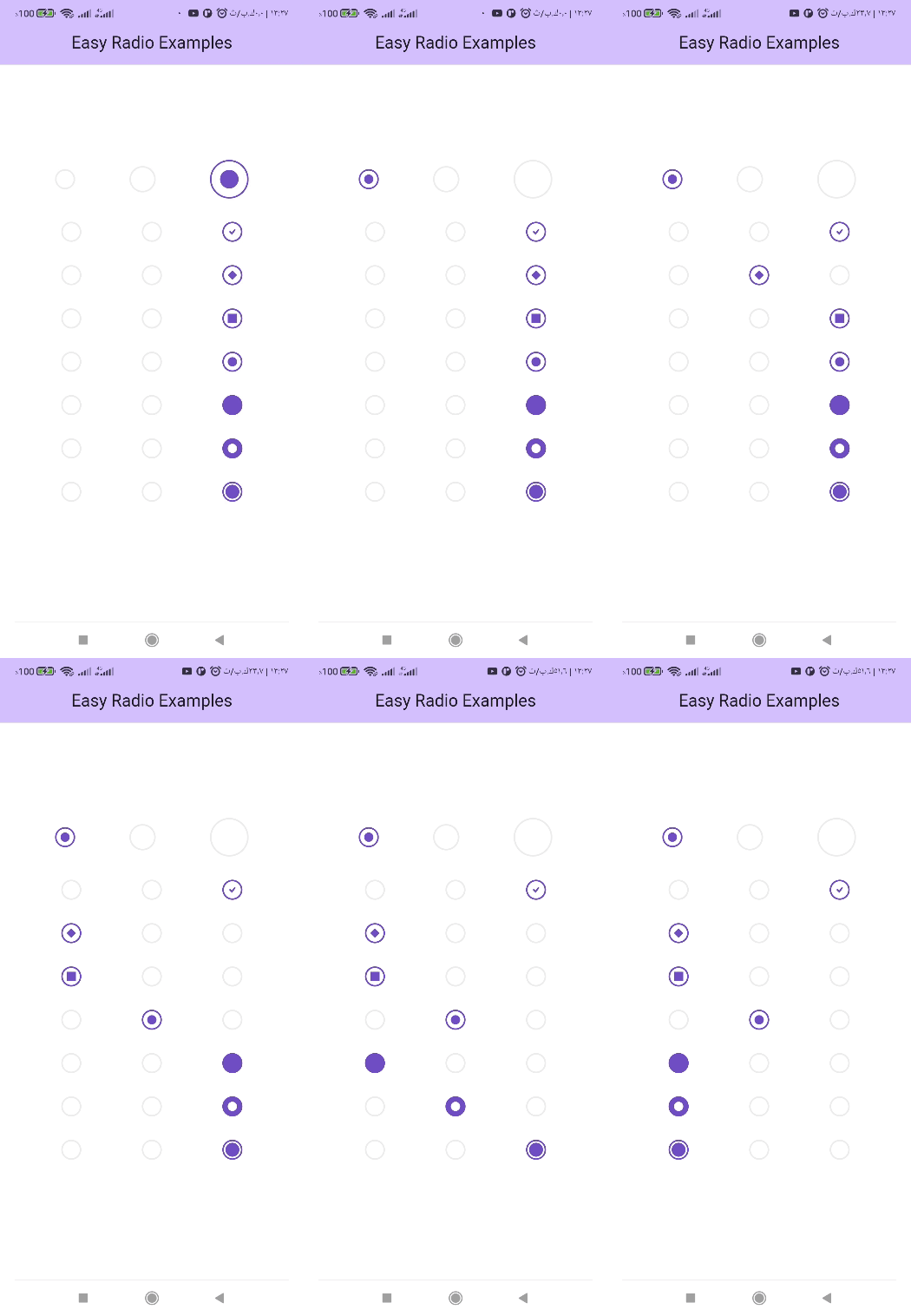
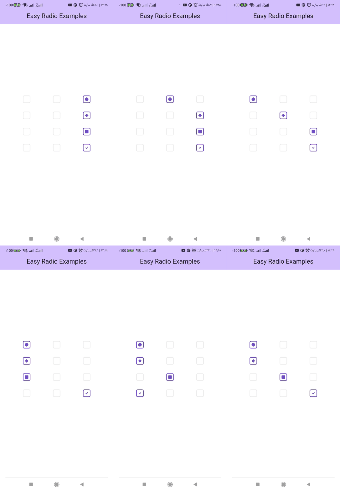
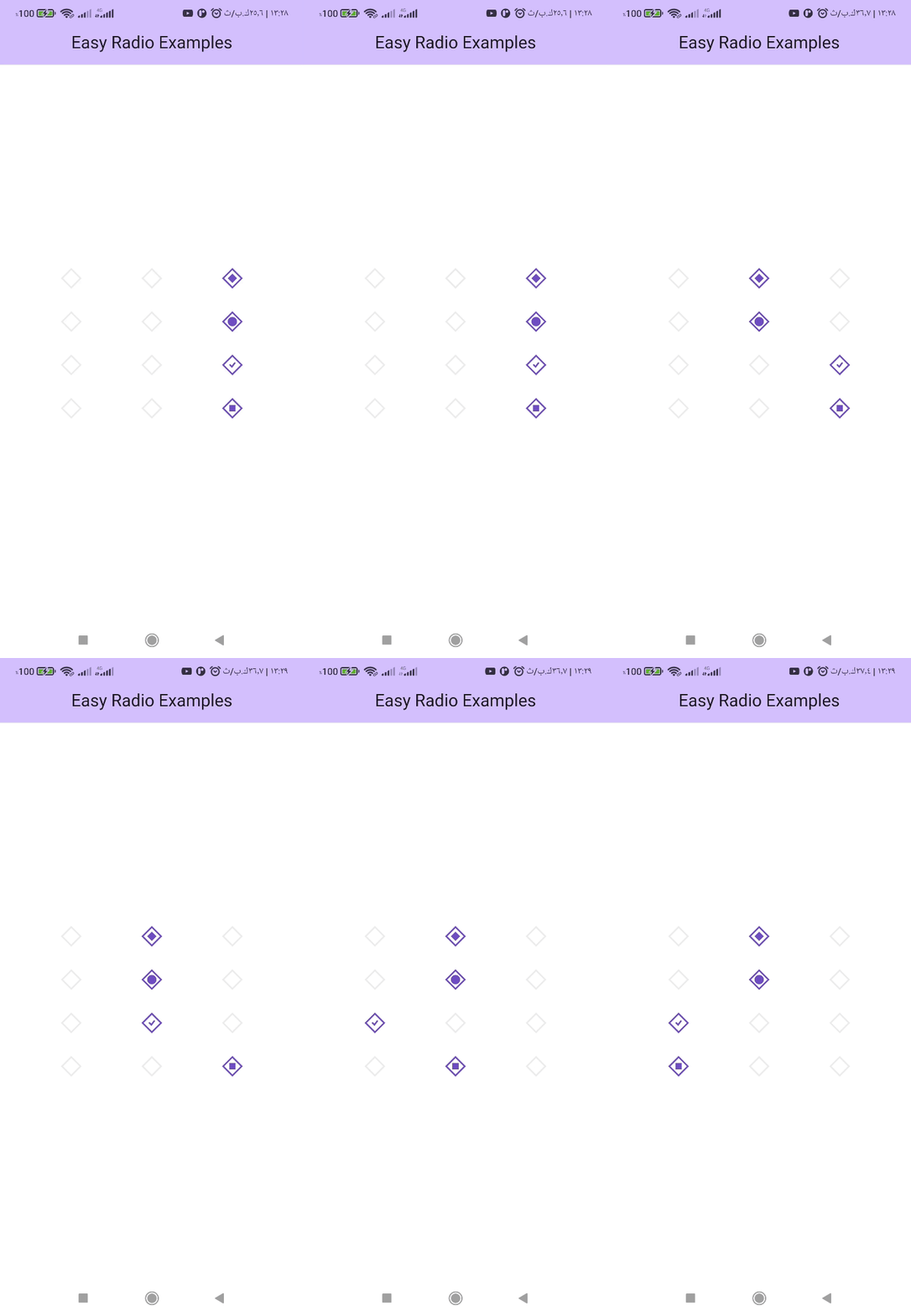
| Rounded Radio | Square Radio | Diamond Radio |
|---|---|---|
 |  |  |
Features
-
Consistent animation: EasyRadio utilizes the same animation as the regular radio button, ensuring a seamless user experience.
-
Easy customization of sizes: EasyRadio allows you to easily change the sizes of the radio button or the sizes of the inner dot. You can customize the size to fit your design requirements.
-
Easy to customize the shape: EasyRadio allows you to easily change the shape of the radio button between circle, square, and diamond. You can also customize the border radius to achieve the desired appearance.
-
Easy to customize the inner dot shape: EasyRadio allows you to easily change the shape of the inner dot between a check icon, regular dot, square, or diamond. You can choose the shape that best suits your design requirements.
-
Easy customization of colors: EasyRadio allows you to easily change the color of the radio button, inner dot, and background to match the design of your Flutter app. You can customize the colors to achieve the desired appearance.
How To Use EasyRadio
Import the following package in your dart file
import 'package:easy_radio/easy_radio.dart';
Usage
int? _groupValue = 1;
EasyRadio<int>(
    value: 1,
    groupValue: _groupValue,
    onChanged: (value) {
        setState(() {
            _groupValue = value;
        });
    },
),
EasyRadio API Reference
| Variable | Type | Description |
|---|---|---|
value | T | The value represented by this radio button. |
groupValue | T? | The currently selected value for a group of radio buttons. |
onChanged | ValueChanged<T?>? | Called when the radio button is selected. |
dotRadius | double | The radius of the dot inside the radio button. |
radius | double | The radius of the radio button. |
activeBorderColor | Color? | The border color of the radio button when selected. |
dotColor | Color? | The color of the dot inside the radio button. |
inactiveBorderColor | Color? | The border color of the radio button when not selected. |
inactiveFillColor | Color? | The fill color of the radio button when not selected. |
activeFillColor | Color? | The fill color of the radio button when selected. |
animateFillColor | bool | Determines whether the fill color of the radio button should animate when selected. |
dotStyle | DotStyle | The style of the dot inside the radio button. |
shape | RadioShape | The shape of the radio button. |
toggleable | bool | Determines whether the radio button can be toggled between selected and unselected states. |