emoji_picker_flutter 4.4.0
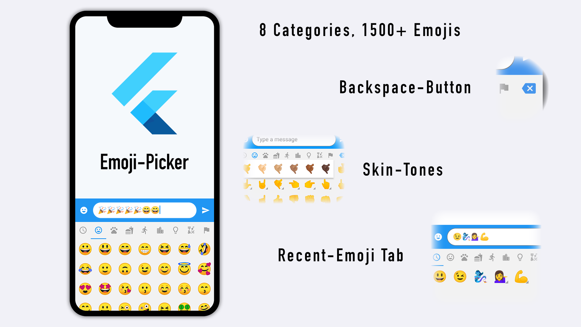
A Flutter package that provides an Emoji picker widget with 1500+ emojis in 8 categories.




emoji_picker_flutter
Yet another Emoji Picker for Flutter 🤩
Key features
- Lightweight Package
- Fast Loading
- Null-safety
- Completely customizable
- Material Design and Cupertino mode
- Emojis that cannot be displayed are filtered out (Android Only)
- Optional recently used emoji tab
- Skin Tone Support
- Custom-Font Support
- Search Option
- Localization (supporting 8 Languages)

Getting Started
import 'package:flutter/foundation.dart' as foundation;

EmojiPicker(
    onEmojiSelected: (Category category, Emoji emoji) {
        // Do something when emoji is tapped (optional)
    },
    onBackspacePressed: () {
        // Do something when the user taps the backspace button (optional)
        // Set it to null to hide the Backspace-Button
    },
    textEditingController: textEditingController, // pass here the same [TextEditingController] that is connected to your input field, usually a [TextFormField]
    config: Config(
        height: 256,
        bgColor: const Color(0xFFF2F2F2),
        checkPlatformCompatibility: true,
        emojiViewConfig: EmojiViewConfig(
        // Issue: https://github.com/flutter/flutter/issues/28894
        emojiSizeMax: 28 *
        (foundation.defaultTargetPlatform == TargetPlatform.iOS
            ?  1.20
            :  1.0),
        ),
        viewOrderConfig: const ViewOrderConfig(
            top: EmojiPickerItem.categoryBar,
            middle: EmojiPickerItem.emojiView,
            bottom: EmojiPickerItem.searchBar,
        ),
        skinToneConfig: const SkinToneConfig(),
        categoryViewConfig: const CategoryViewConfig(),
        bottomActionBarConfig: const BottomActionBarConfig(),
        searchViewConfig: const SearchViewConfig(),
    ),
)
Examples
All examples can be found here
-
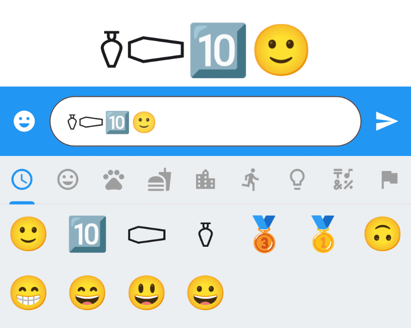
Default (Some Emoji might not be displayed correctly e.g. Frowning Face 🚨 Will be fixed with 3.17)
-
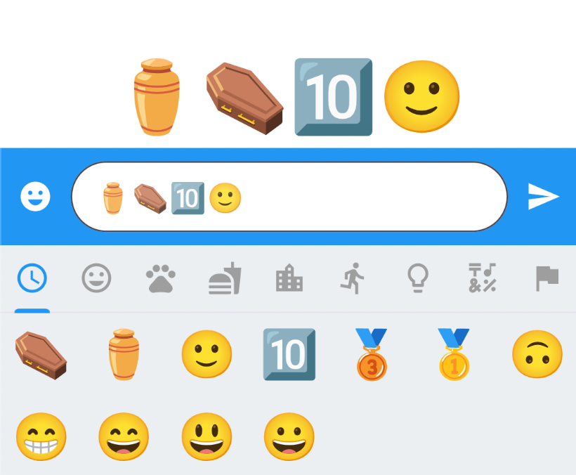
Custom Font (Display all emoji correctly in the style of the font, additional ~15mb e.g. with Google Fonts) - Might causes performance issues on iOS (see issue 205)
-
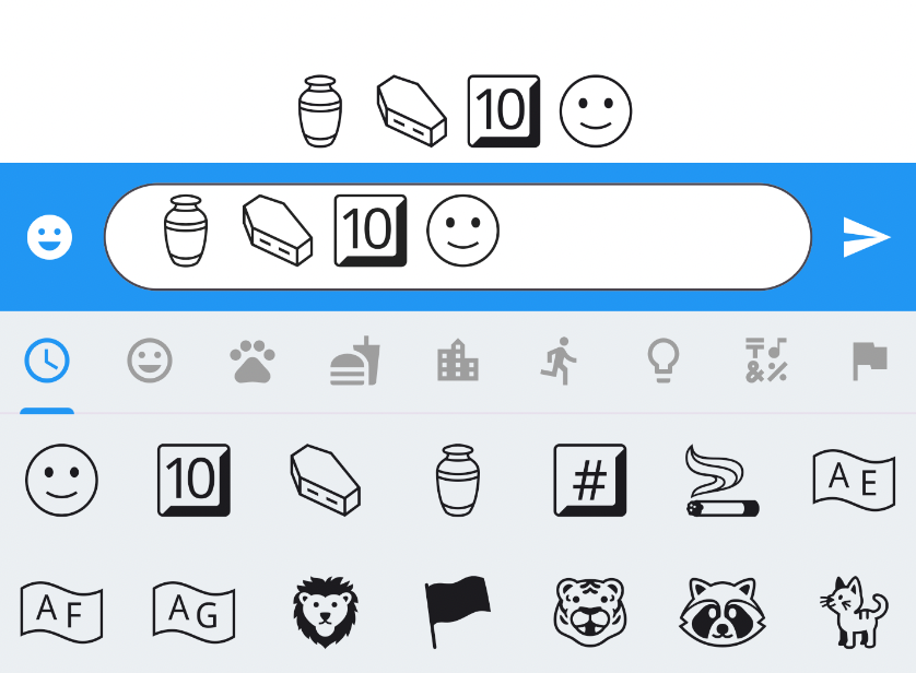
WhatsApp like customization
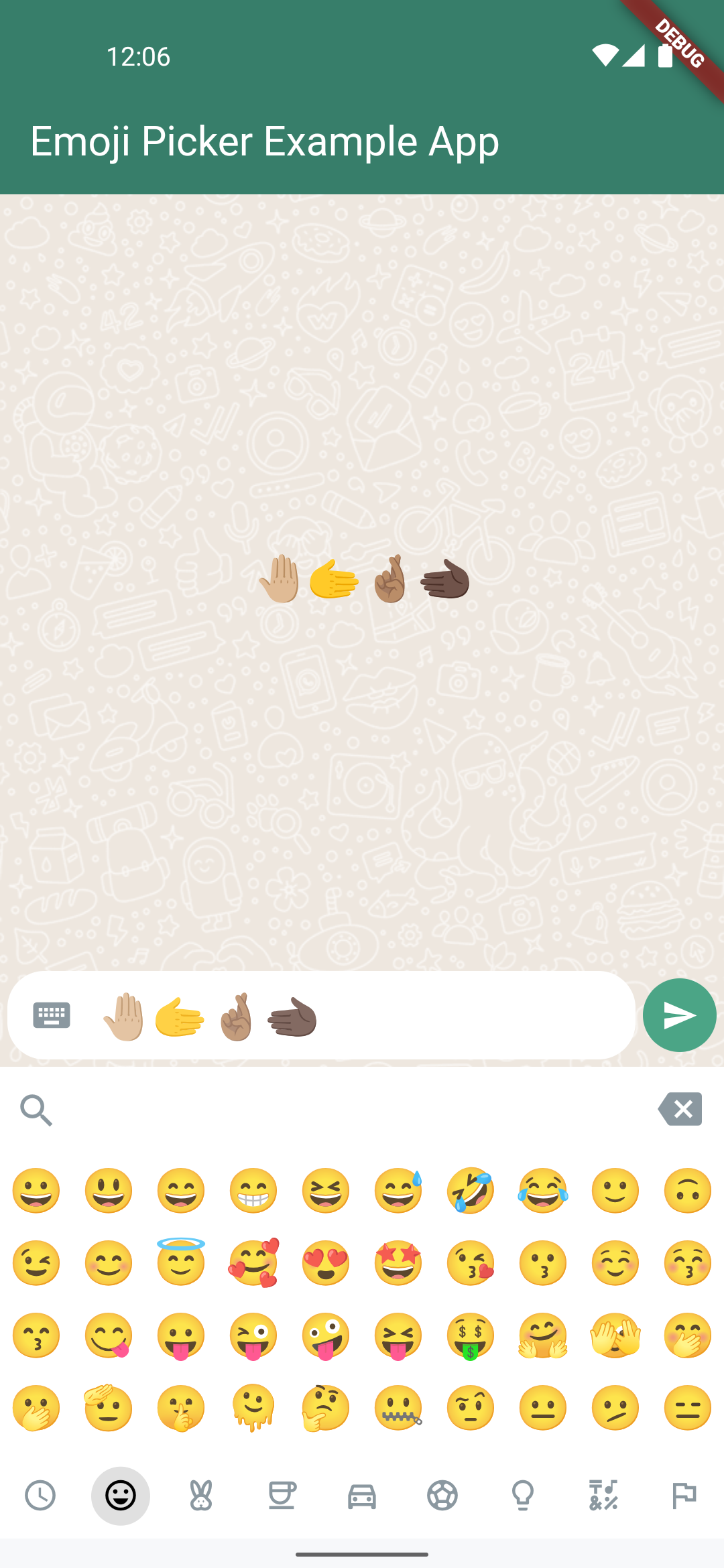
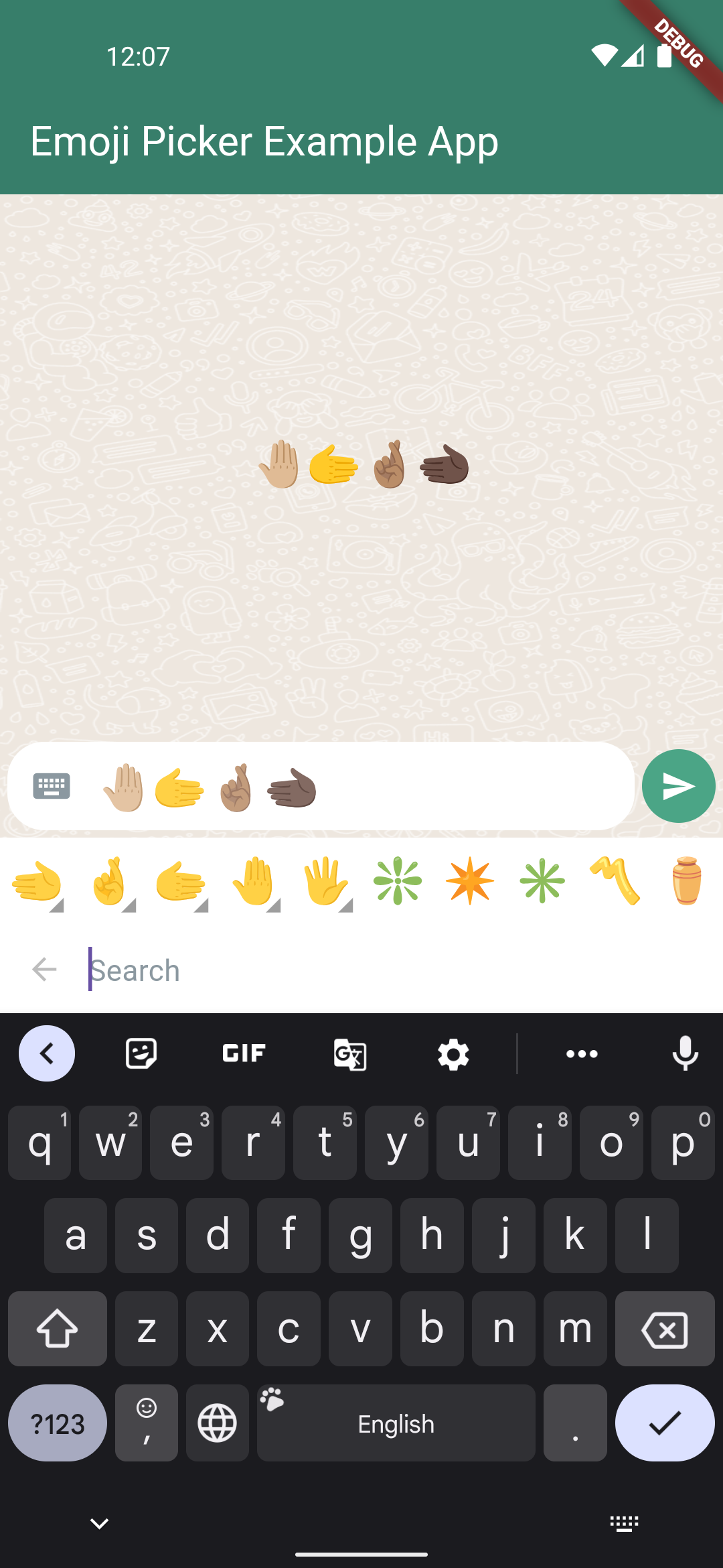
*All screenshots from Android. iOS displays by default most emoji correctly.
Config
| property | description | default |
|---|---|---|
| height | Height of Emoji Picker | 256 |
| viewOrderConfig | The exact order in which category view, emoji view and bottom bar appear | const ViewOrderConfig() |
| checkPlatformCompatibility | Whether to filter out glyphs that platform cannot render with the default font (Android). | true |
| emojiSet | Custom emoji set, can be built based on defaultEmojiSet provided by the library. | null |
| emojiTextStyle | Text style to apply to individual emoji icons. Can be used to define custom emoji font either with GoogleFonts library or bundled with the app. | null |
| customBackspaceIcon | Custom Icon for Backspace button | null |
| customSearchIcon | Custom Icon for Search button | null |
| emojiViewConfig | Emoji view config | const EmojiViewConfig() |
| skinToneConfig | Skin tone config | const SkinToneConfig |
| categoryViewConfig | Category view config | const CategoryViewConfig |
| bottomActionBarConfig | Bottom action bar config | const BottomActionBarConfig() |
| searchViewConfig | Search View config | const SearchViewConfig |
Emoji View Config
| property | description | default |
|---|---|---|
| columns | Number of emojis per row | 7 |
| emojiSizeMax | Width and height the emoji will be maximal displayed | 32.0 |
| backgroundColor | The background color of the emoji view | const Color(0xFFEBEFF2) |
| verticalSpacing | Vertical spacing between emojis | 0 |
| horizontalSpacing | Horizontal spacing between emojis | 0 |
| gridPadding | The padding of GridView | EdgeInsets.zero |
| recentsLimit | Limit of recently used emoji that will be saved | 28 |
| replaceEmojiOnLimitExceed | Replace latest emoji on recents list on limit exceed | false |
| noRecents | A widget (usually [Text]) to be displayed if no recent emojis to display. Needs to be const Widget! | Text('No Recents', style: TextStyle(fontSize: 20, color: Colors.black26), textAlign: TextAlign.center) |
| loadingIndicator | A widget to display while emoji picker is initializing. Needs to be const Widget! | SizedBox.shrink() |
| buttonMode | Choose between Material and Cupertino button style | ButtonMode.MATERIAL |
SkinTone Config
| property | description | default |
|---|---|---|
| enableSkinTones | Enable feature to select a skin tone of certain emoji's | true |
| dialogBackgroundColor | The background color of the skin tone dialog | Colors.white |
| indicatorColor | Color of the small triangle next to multiple skin tone emoji | Colors.grey |
Category View Config
| property | description | default |
|---|---|---|
| tabBarHeight | Height of category tab bar | 46.0 |
| tabIndicatorAnimDuration | Duration of tab indicator to animate to next category | Duration(milliseconds: 300) |
| initCategory | The initial Category that will be selected | Category.RECENT |
| recentTabBehavior | Show extra tab with recently / popular used emoji | RecentTabBehavior.RECENT |
| extraTab | Add extra tab to category tab bar for backspace or search button | CategoryExtraTab.NONE |
| backgroundColor | Background color of category tab bar | const Color(0xFFEBEFF2) |
| indicatorColor | The color of the category indicator | Colors.blue |
| iconColor | The color of the category icons | Colors.grey |
| iconColorSelected | The color of the category icon when selected | Colors.blue |
| backspaceColor | The color of the backspace icon button | Colors.blue |
| categoryIcons | Determines the icon to display for each Category. You can change icons by setting them in the constructor. | CategoryIcons() |
| customCategoryView | Customize the category widget | null |
Bottom Action Bar Config
| property | description | default |
|---|---|---|
| showBackspaceButton | Show backspace button in bottom action bar | true |
| showSearchViewButton | Show search-view button in bottom action bar | true |
| backgroundColor | Background color of bottom action bar | Colors.blue |
| buttonIconColor | Icon color of buttons | Colors.white |
| inputTextStyle | Custom TextStyle of TextField for input text | null |
| hintTextStyle | Custom TextStyle of TextField for hint | null |
| customBottomActionBar | Customize the bottom action bar widget | null |
Search View Config
| property | description | default |
|---|---|---|
| backgroundColor | Background color of search view | const Color(0xFFEBEFF2) |
| buttonColor | Fill color of hide search view button | Colors.transparent |
| buttonIconColor | Icon color of hide search view button | Colors.black26 |
| hintText | Custom hint text | 'Search' |
| customSearchView | Customize search view widget | null |
Backspace-Button
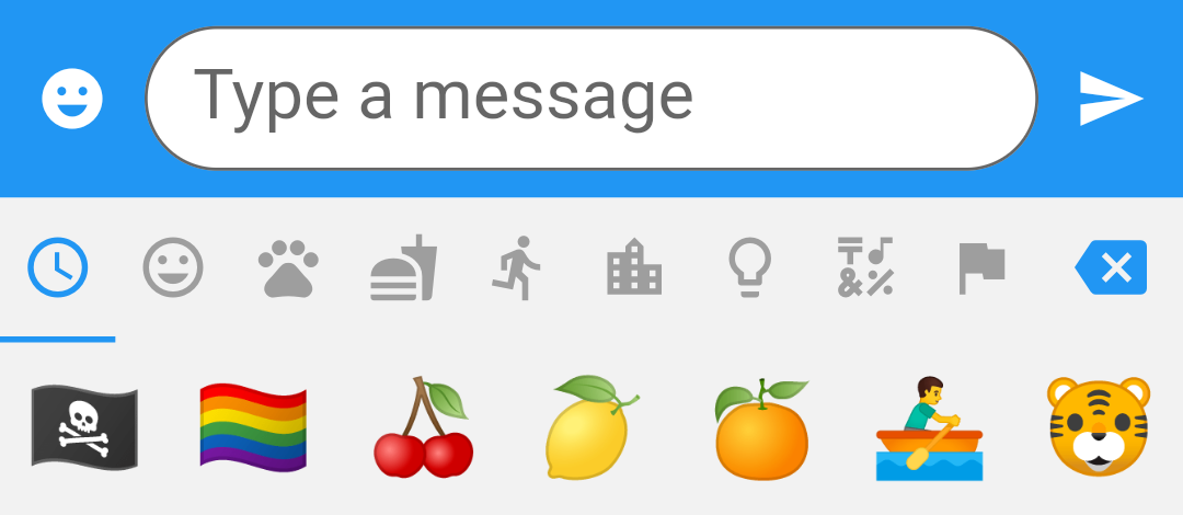
Backspace button is enabled by default on the bottom action bar. If you prefer to have the backspace button inside the category tab bar, you can enable it inside the CategoryViewConfig and then extraTab to CategoryExtraTab.BACKSPACE.
You can listen to the Backspace tap event by registering a callback inside onBackspacePressed: () { }. This will make it easier for your user to remove an added Emoji without showing the keyboard. Check out the example for more details about usage.
Bottom Backspace Button

Top Backspace Button
Custom view
The appearance is completely customizable by setting customWidget property. If properties in Config are not enough you can inherit from EmojiPickerView (recommended but not necessary) to make further adjustments.
class CustomView extends EmojiPickerView {
  CustomView(Config config, EmojiViewState state, VoidCallback showSearchBar,
      {super.key})
      : super(
          config,
          state,
          showSearchBar,
        );

  @override
  _CustomViewState createState() => _CustomViewState();
}

class _CustomViewState extends State<CustomView> {
  @override
  Widget build(BuildContext context) {
    // TODO: implement build
    // Access widget.config, widget.state and widget.showSearchBar
    return Container();
  }
}


EmojiPicker(
    onEmojiSelected: (category, emoji) {/* ...*/},
    config: Config(/* ...*/),
    customWidget: (config, state, showSearchView) => CustomView(
        config,
        state,
        showSearchView,
    ),
)
Each component can also be completely customized individually:
-
SearchViewConfig->customSearchView -
CategoryViewConfig->customCategoryView -
BottomActionBarConfig->customBottomActionBar
Localization
The package currently supports following languages: en, de, es, fr, hi, it, ja, pt, ru, zh. In order to let the EmojiPicker choose the right language you need to pass the locale to the config:
Config(
    locale: const Locale("ja"),
)
In case you want to support additional languages, you need to create a copy of a emoji set file (see /lib/locales), translate it (optional use /automation/create_emoji_set.sh to help you) and adjust the config for emojiSet:
EmojiPicker(
    config: Config(
         emojiSet: _getEmojiLocale,
    ),
)

List<CategoryEmoji> _getEmojiLocale(Locale locale) {
  switch (locale.languageCode) {
    case "ja":
      return emojiSetJapanese;
    case "de":
      return emojiSetGerman;
    default:
      return emojiSetEnglish;
  }
}
Example for using /automation/create_emoji_set.sh for generating translation in terminal:
- Fork the repository and open the directory from your terminal
- Run command below
cd automation && ./create_emoji_set.sh pt Portuguese
Feel free to create an issue if you think a specific language should be supported by default. We keep the languages limited for now to avoid the package size growing unnecesserily large.
In case you want to support only a single language you can just return the same EmojiSet for all locales.
List<CategoryEmoji> _getEmojiLocale(String locale) {
    return emojiSetEnglish;
}
Using a single EmojiSet will reduce the package size by about 2 MB.
If you prefer to use the old EmojiSet (version 3 and below), you can return defaultEmojiSet.
EmojiPickerController
The EmojiPickerController provides programmatic control over the emoji picker's category selection. This is particularly useful when you need to:
- Persist the selected category across widget rebuilds (e.g., theme changes)
- Change the category programmatically
- Listen to category changes
- Synchronize category state with other parts of your app
Basic Usage
// Create a controller
final controller = EmojiPickerController();

// Or with an initial category
final controller = EmojiPickerController(initialCategory: Category.SMILEYS);

// Use with EmojiPicker
EmojiPicker(
  controller: controller,
  textEditingController: textController,
  config: Config(
    // ... your config
  ),
)

// Change category programmatically
controller.setCategory(Category.ANIMALS);

// Listen to category changes
controller.addListener(() {
  print('Category changed to: ${controller.currentCategory.name}');
});

// Don't forget to dispose
controller.dispose();
See a full controller usage example in here.
Extended usage with EmojiPickerUtils
Find usage example here
// Get recently used emoji
final recentEmojis = await EmojiPickerUtils().getRecentEmojis();

// Search for related emoticons based on keywords
final filterEmojiEntities = await EmojiPickerUtils().searchEmoji("face", defaultEmojiSet);

// Add an emoji to recently used list or increase its counter
final newRecentEmojis = await EmojiPickerUtils().addEmojiToRecentlyUsed(key: key, emoji: emoji);
// Important: Needs same key instance of type GlobalKey<EmojiPickerState> here and for the EmojiPicker-Widget in order to work properly

// Highlight emojis with custom style spans
final textSpans = EmojiPickerUtils().setEmojiTextStyle('text', emojiStyle: style);

// Clear list of recent Emojis
EmojiPickerUtils().clearRecentEmojis(key: key);
Feel free to contribute to this package!! 🙇♂️
Always happy if anyone wants to help to improve this package!
If you need any features
Please open an issue so that we can discuss your feature request 🙏