expandable_datatable 0.0.8
SDKflutter
Platformandroidioswindowslinuxmacosweb
A flutter package for viewing and editing data in a table view with expandable rows.
ExpandableDataTable
ExpandableDataTable is a Flutter library for dealing with displaying and editing data in tabular view.
Features
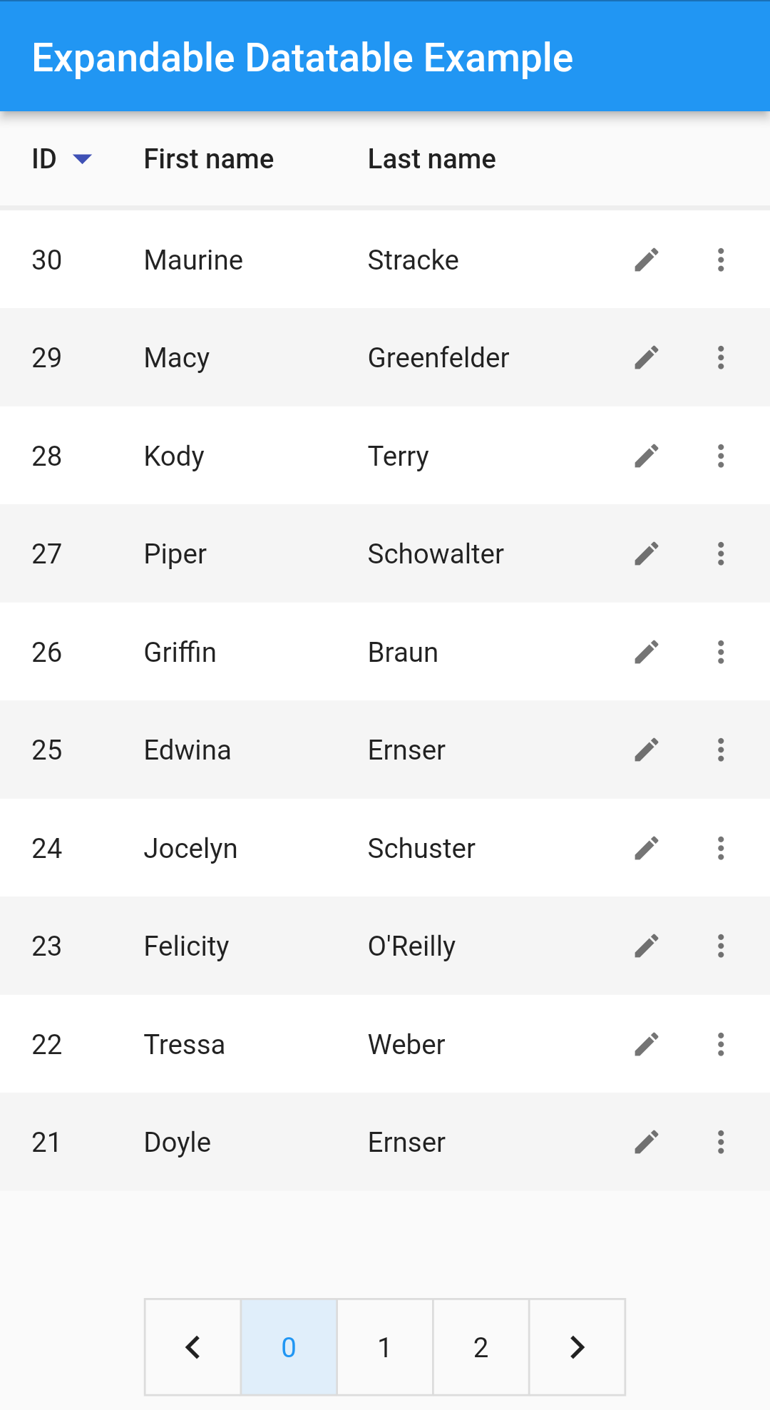
- Row sorting
- Flexible column sizes
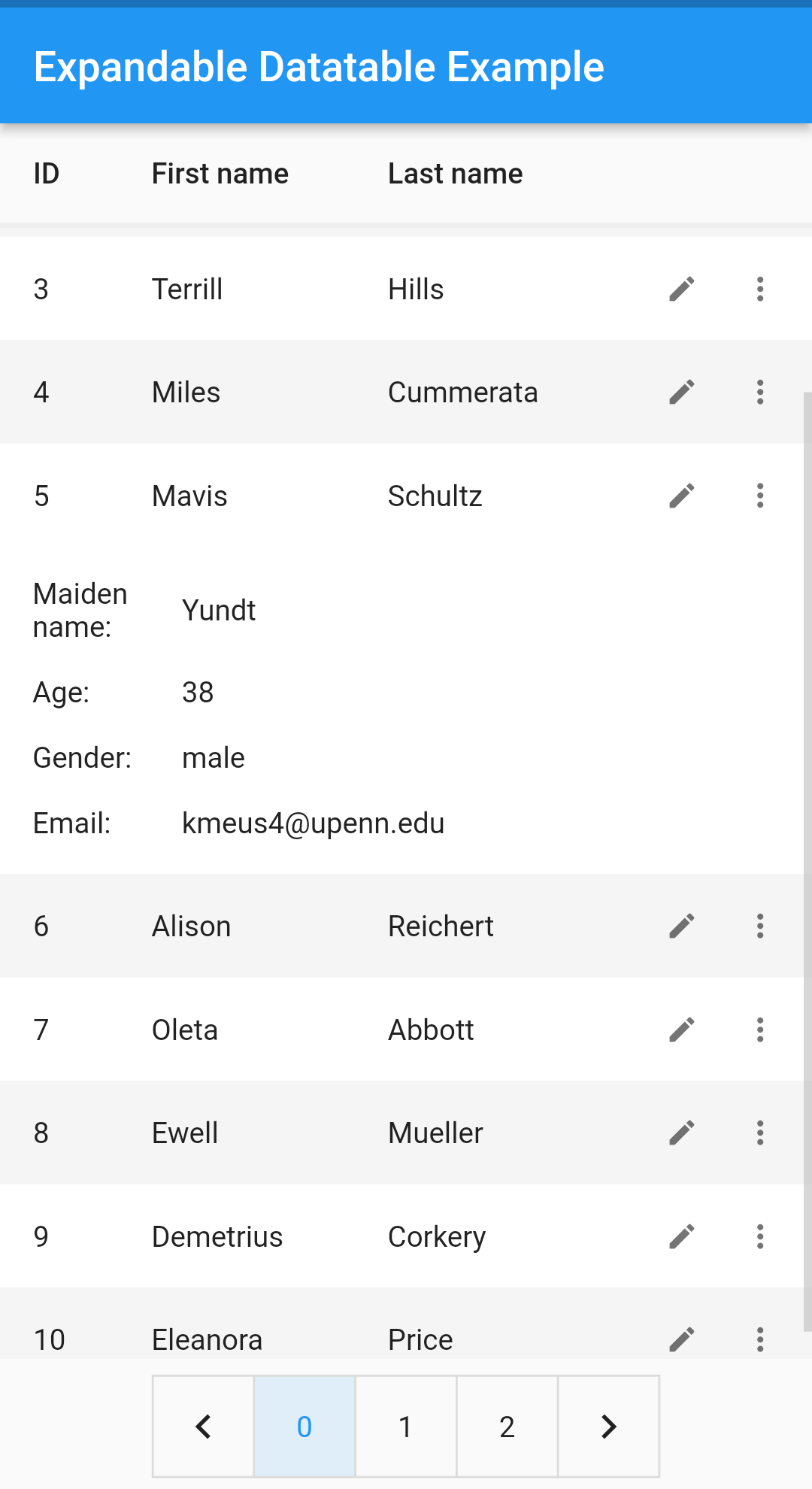
- Expandable rows
- Row pagination
- Editable rows
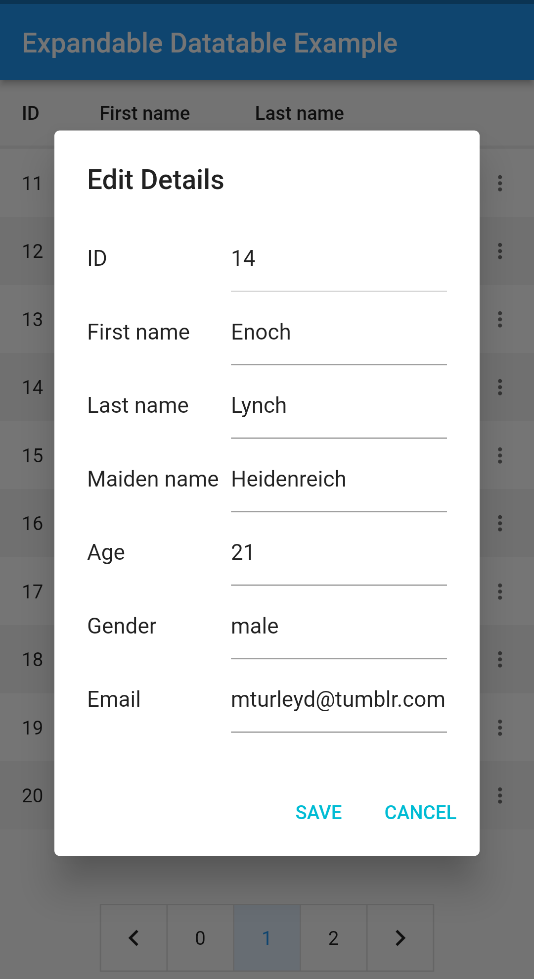
- Customizable edit dialogs
- Customizable pagination widget
- Customizable expansion content
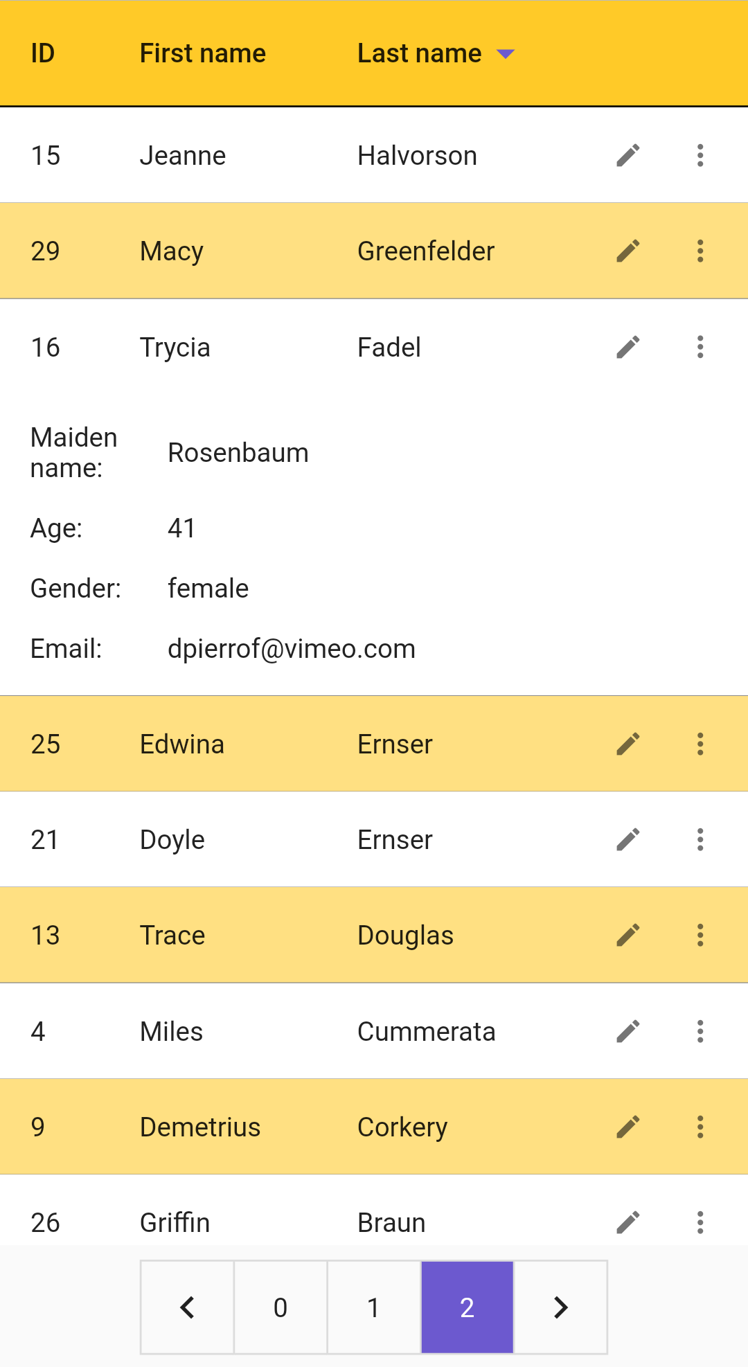
- Styling rows and header columns
ExpandableDataTable Parameters:
| Name | Description |
|---|---|
| headers | Header list of data columns |
| rows | List of the data rows |
| pageSize | Number of rows to be used on a single page |
| visibleColumnCount | Number of columns to show in the headers |
| multipleExpansion | Flag indicating that multiple expansions are enabled for rows |
| isEditable | Flag indicating whether the rows are editable |
| onRowChanged | The callback that is called when a row is changed with edit dialog |
| onPageChanged | The callback that is called when the page changed with pagination widget |
| renderEditDialog | Render function that builds a custom edit dialog widget |
| renderCustomPagination | Render function that builds a custom pagination widget |
| renderExpansionContent | Render function that builds custom expansion container for all rows |
ExpandableThemeData Parameters:
| Name | Description |
|---|---|
| headerTextStyle | Text style of header row |
| rowTextStyle | Text style of all rows |
| contentPadding | Padding for all header and data rows |
| headerTextMaxLines | Maximum number of lines for header text to span |
| rowTextMaxLines | Maximum number of lines for row text to span |
| rowTextOverflow | Visual overflow of the row's cell text |
| expandedTextStyle | Text style of expansion content |
| headerColor | Background color of header row |
| headerSortIconColor | Color of the header sort arrow icon |
| headerHeight | Height of the header widget |
| expandedBorderColor | Expansion border color |
| rowColor | Background color of rows |
| evenRowColor | Background color of the even indexed rows |
| oddRowColor | Background color of the odd indexed rows |
| rowBorder | Border style of all rows |
| editIcon | Icon image showing editing feature |
| expansionIcon | Icon image expanding expansion content |
| paginationSize | Size of the default pagination widget |
| paginationTextStyle | TextStyle of the page numbers for default pagination widget |
| paginationSelectedTextColor | Color of the selected cell's page number for default pagination widget |
| paginationUnselectedTextColor | Color of the unselected cells' page number for default pagination widget |
| paginationSelectedFillColor | Background fill color of the selected cell for default pagination widget |
| paginationBorderColor | Border color for default pagination widget |
| paginationBorderRadius | Border radius value for default pagination widget |
| paginationBorderWidth | Border width value for default pagination widget |
Usage
-
To use this package, add expandable_datatable as a dependency in your pubspec.yaml file.
-
Import the package
import ‘package:expandable_datatable/expandable_datatable.dart’;
- Create data to use in the data table
Create the list of the headers to be used in data table with types. Header list should be in a prioritized order, all columns have a flex value that all cells inside that column will be used.
  List<ExpandableColumn<dynamic>> headers = [
    ExpandableColumn<int>(columnTitle: "ID", columnFlex: 1),
    ExpandableColumn<String>(columnTitle: "First name", columnFlex: 2),
    ExpandableColumn<String>(columnTitle: "Last name", columnFlex: 2),
    ExpandableColumn<String>(columnTitle: "Maiden name", columnFlex: 2),
    ExpandableColumn<int>(columnTitle: "Age", columnFlex: 1),
    ExpandableColumn<String>(columnTitle: "Gender", columnFlex: 2),
    ExpandableColumn<String>(columnTitle: "Email", columnFlex: 4),
  ];
Create the list of the rows to be used in data table. All row list elements must contain all columns for lists.
  List<ExpandableRow> rows = userList.map<ExpandableRow>((e) {
    return ExpandableRow(cells: [
      ExpandableCell<int>(columnTitle: "ID", value: e.id),
      ExpandableCell<String>(columnTitle: "First name", value: e.firstName),
      ExpandableCell<String>(columnTitle: "Last name", value: e.lastName),
      ExpandableCell<String>(columnTitle: "Maiden name", value: e.maidenName),
      ExpandableCell<int>(columnTitle: "Age", value: e.age),
      ExpandableCell<String>(columnTitle: "Gender", value: e.gender),
      ExpandableCell<String>(columnTitle: "Email", value: e.email),
    ]);
  }).toList();
- Code
  void createDataSource() {...}

  @override
  Widget build(BuildContext context) {
    return Scaffold(
      appBar: AppBar(
        title: const Text("Expandable Datatable Example"),
      ),
      body: ExpandableTheme(
        data: ExpandableThemeData(
          context,
          rowBorder: const BorderSide(color: Colors.amber),
          expandedBorderColor: Colors.transparent,
          paginationSize: 48,
        ),
        child: ExpandableDataTable(
          rows: rows,
          headers: headers,
          visibleColumnCount: 4,
        ),
      ),
    );
  }
Screenshots
Sorting the rows
Expansion feature
Edit rows dialog (Customizable)
Styling