flutter_expandable_fab 2.5.2
The speed dial FAB (Floating Action Button) that can animate the display and hiding of multiple action buttons.
flutter_expandable_fab

flutter_expandable_fab is a speed dial FAB (Floating Action Button) that can animate the display and hiding of multiple action buttons.
It can be configured to display vertically, horizontally, or in a fan-shaped manner, on either side. It allows for fine-grained customization.
Migration from 1.x to 2.x
In version 2.x, I have made changes to enable free customization of the open/close buttons by setting builders.
Code before migration:
ExpandableFab(
  child: const Icon(Icons.account_box),
  foregroundColor: Colors.amber,
  backgroundColor: Colors.green,
  closeButtonStyle: const ExpandableFabCloseButtonStyle(
    child: Icon(Icons.abc),
    foregroundColor: Colors.deepOrangeAccent,
    backgroundColor: Colors.lightGreen,
  )
  expandedFabSize: ExpandedFabSize.small,
  collapsedFabSize: ExpandableFabSize.regular,
  expandedFabShape: const CircleBorder(),
  collapsedFabShape: const CircleBorder(),
)
Code after migration:
ExpandableFab(
  openButtonBuilder: RotateFloatingActionButtonBuilder(
    child: const Icon(Icons.account_box),
    fabSize: ExpandableFabSize.regular,
    foregroundColor: Colors.amber,
    backgroundColor: Colors.green,
    shape: const CircleBorder(),
  ),
  closeButtonBuilder: DefaultFloatingActionButtonBuilder(
    child: const Icon(Icons.close),
    fabSize: ExpandableFabSize.small,
    foregroundColor: Colors.deepOrangeAccent,
    backgroundColor: Colors.lightGreen,
    shape: const CircleBorder(),
  ),
)
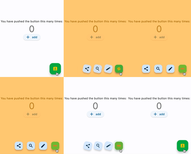
Showcase
Fan style & Blur overlay

Vertical style & Color overlay

Horizontal style & Custom buttons
Center Fan style

floatingActionButton: ExpandableFab(
  type: ExpandableFabType.fan,
  pos: ExpandableFabPos.center,
  fanAngle: 180,
Getting started
import 'package:flutter_expandable_fab/flutter_expandable_fab.dart';

Scaffold(
  floatingActionButtonLocation: ExpandableFab.location,
  floatingActionButton: ExpandableFab(
    children: [
      FloatingActionButton.small(
        heroTag: null,
        child: const Icon(Icons.edit),
        onPressed: () {},
      ),
      FloatingActionButton.small(
        heroTag: null,
        child: const Icon(Icons.search),
        onPressed: () {},
      ),
    ],
  ),
),
Open/Close programmatically
class _FirstPageState extends State<FirstPage> {
  final _key = GlobalKey<ExpandableFabState>();

  @override
  Widget build(BuildContext context) {
    return Scaffold(
      floatingActionButtonLocation: ExpandableFab.location,
      floatingActionButton: ExpandableFab(
        key: _key,
        children: [
          FloatingActionButton.small(
            child: const Icon(Icons.edit),
            onPressed: () {
              final state = _key.currentState;
              if (state != null) {
                debugPrint('isOpen:${state.isOpen}');
                state.toggle();
              }
            },
          ),
        ],
      ),
    );
  }
}
Customize
You can customize the open/close buttons with your preferred Widget using FloatingActionButtonBuilder. By using DefaultFloatingActionButtonBuilder, you can easily set up the FloatingActionButton. RotateFloatingActionButtonBuilder provides a FloatingActionButton with a rotating animation. Also, the items specified in children don't necessarily have to be FloatingActionButton; you can set any Widget freely.
ExpandableFab(
  openButtonBuilder: RotateFloatingActionButtonBuilder(
    child: const Icon(Icons.account_box),
    fabSize: ExpandableFabSize.regular,
    foregroundColor: Colors.amber,
    backgroundColor: Colors.green,
    shape: const CircleBorder(),
  ),
  closeButtonBuilder: FloatingActionButtonBuilder(
    size: 56,
    builder: (BuildContext context, void Function()? onPressed,
        Animation<double> progress) {
      return IconButton(
        onPressed: onPressed,
        icon: const Icon(
          Icons.check_circle_outline,
          size: 40,
        ),
      );
    },
  ),
  children: [
    FloatingActionButton.large(
      heroTag: null,
      child: const Icon(Icons.edit),
      onPressed: () {},
    ),
    IconButton(
      onPressed: () {
        final state = _key.currentState;
        if (state != null) {
          debugPrint('isOpen:${state.isOpen}');
          state.toggle();
        }
      },
      icon: const Icon(
        Icons.share,
        size: 30,
      ),
    ),
  ],
)
Since children is an array of widgets, you can place any widget you like, not limited to FloatingActionButton.
You can also create buttons with labels as shown below.

floatingActionButton: ExpandableFab(
  key: _key,
  type: ExpandableFabType.up,
  childrenAnimation: ExpandableFabAnimation.none,
  distance: 70,
  overlayStyle: ExpandableFabOverlayStyle(
    color: Colors.white.withOpacity(0.9),
  ),
  children: const [
    Row(
      children: [
        Text('Remind'),
        SizedBox(width: 20),
        FloatingActionButton.small(
          heroTag: null,
          onPressed: null,
          child: Icon(Icons.notifications),
        ),
      ],
    ),
    Row(
      children: [
        Text('Email'),
        SizedBox(width: 20),
        FloatingActionButton.small(
          heroTag: null,
          onPressed: null,
          child: Icon(Icons.email),
        ),
      ],
    ),
    Row(
      children: [
        Text('Star'),
        SizedBox(width: 20),
        FloatingActionButton.small(
          heroTag: null,
          onPressed: null,
          child: Icon(Icons.star),
        ),
      ],
    ),
    FloatingActionButton.small(
      heroTag: null,
      onPressed: null,
      child: Icon(Icons.add),
    ),
  ],
),
Properties
ExpandableFab
| Property | Description | Default |
|---|---|---|
| distance | Distance from children | 100 |
| duration | Animation duration | 250ms |
| fanAngle | Angle of opening when fan type | 90 |
| initialOpen | Open at initial display | false |
| type | The type of behavior of this widget | fan |
| pos | Position for displaying the widget | right |
| closeButtonBuilder | Builder for the close button | |
| openButtonBuilder | Builder for the open button | |
| childrenOffset | For positioning of children widgets | |
| childrenAnimation | Types of animations for Children | rotate |
| children | The widgets below this widget in the tree | |
| onOpen | Will be called before opening the menu | |
| afterOpen | Will be called after opening the menu | |
| onClose | Will be called before the menu closes | |
| afterClose | Will be called after the menu closes | |
| overlayStyle | Provides the style for overlay. No overlay when null. | |
| openCloseStackAlignment | Defines how [openButtonBuilder] and [closeButtonBuilder] are aligned in a [Stack] | Alignment.center |
FloatingActionButtonBuilder
| Property | Description | Default |
|---|---|---|
| builder | Callback to build the Widget | |
| size | Size of the Widget |
DefaultFloatingActionButtonBuilder
| Property | Description | Default |
|---|---|---|
| fabSize | Size of the button | regular |
| foregroundColor | Foreground color of the button | |
| backgroundColor | Background color of the button | |
| shape | Shape of the close button | |
| heroTag | Tag to apply to the [Hero] widget of the button | |
| child | Child widget of the button |
RotateFloatingActionButtonBuilder
| Property | Description | Default |
|---|---|---|
| angle | Angle of rotation (in radians) | math.pi / 2 |
| ... | Same as DefaultFloatingActionButtonBuilder |
Thanks
I referred to the code from this article: https://docs.flutter.dev/cookbook/effects/expandable-fab