flutter_multi_dropdown 0.0.6
SDKflutter
Platformandroidioswindowslinuxmacosweb
Flutter multi-select dropdown with checkboxes and built-in "Select All" option with search functionality.
Flutter Multi Dropdown 🚀


A highly customizable multi-select dropdown widget for Flutter with select-all functionality, type safety, and comprehensive decoration options.
✨ Features
- Multi-Selection Support - Intuitive interface for selecting multiple items
- Search Functionality - Built-in search to quickly find items in large lists
- Select All Option - Built-in "Select All" functionality with customizable text
- Full UI Control – Customize every part with itemBuilder & selectAllBuilder!
- Disabled Items – Mark items as non-selectable via DropDownMenuItemData.
- Visual Feedback - Clear checkbox indicators for selection state
- Type Safety - Generic implementation works with any data type
- Programmatic Control - Full control via
MultiDropdownController - Customizable UI - Extensive decoration options for complete visual control
📸 Screenshots & Demo
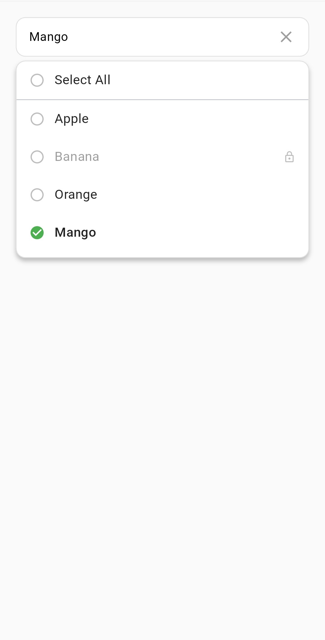

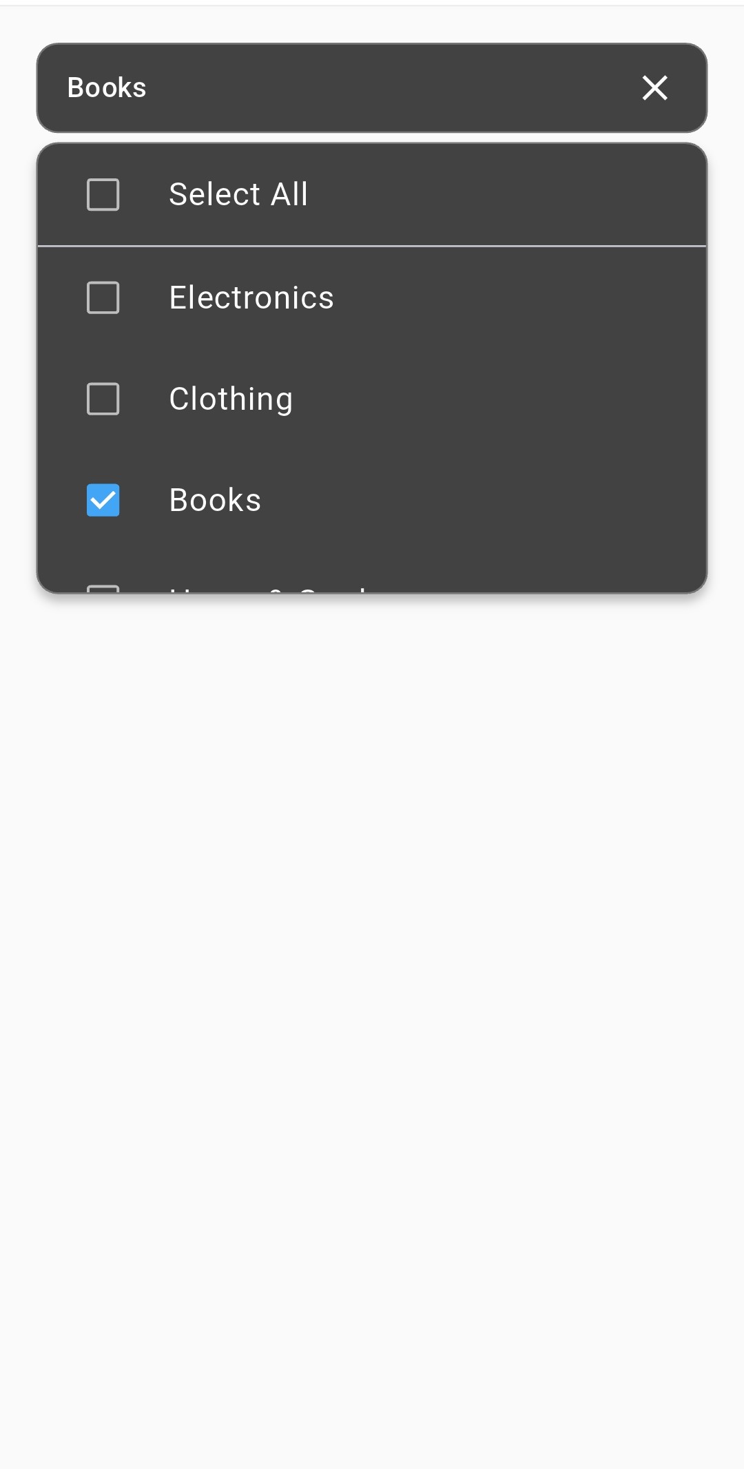
📦 Installation
Add the package to your pubspec.yaml:
dependencies:
  flutter_multi_dropdown: latest
Then run:
flutter pub get
🎮 Basic Usage
import 'package:flutter_multi_dropdown/flutter_multi_dropdown.dart';

// Simple usage with controller
final MultiDropdownController dropdownController = MultiDropdownController();

FlutterMultiDropdown<int>(
  controller: dropdownController,
  items: const [
    DropDownMenuItemData(name: 'Option 1', id: 1),
    DropDownMenuItemData(name: 'Option 2', id: 2),
    DropDownMenuItemData(name: 'Option 3', id: 3),
  ],
  onSelectionChanged: (selectedItems) {
    print('Selected items: $selectedItems');
  },
)
⚙️ Configuration
Widget Properties
| Property | Description | Type | Default |
|---|---|---|---|
items | List of selectable items | List<DropDownMenuItemData<T>> | Required |
onSelectionChanged | Callback when selection changes | Function(List<T>)? | null |
placeholder | Placeholder text | String? | 'Select Items' |
selectAllText | "Select All" option text | String? | 'Select All' |
itemBuilder | Custom item widget builder | Widget? | null |
selectAllBuilder | Custom select all widget builder | Widget? | null |
prefix | Widget before selected items | Widget? | null |
suffix | Widget after selected items | Widget? | null |
initialValue | Initially selected values | List<T>? | null |
controller | Programmatic control | MultiDropdownController<T>? | null |
showSelectedItemName | Show names vs count | bool | true |
showSelectAll | Show select all option | bool | true |
enableSearch | Enable search functionality | bool? | false |
isEmptyData | Show names vs count | bool | fase |
showLoading | Show loading indicator | bool | false |
loadingBuilder | Custom loading widget builder | Widget Function(BuildContext)? | null |
emptyBuilder | Custom empty state widget builder | Widget Function(BuildContext)? | null |
autoCloseOnItemTap | control dropdown close behavior after item selection | bool | false |
Decoration Properties
decoration: DropdownDecoration(
  borderRadius: 10,
  borderColor: Colors.blue,
  checkboxActiveColor: Colors.blueAccent,
  // See all options below
)
| Property | Description | Type | Default |
|---|---|---|---|
borderRadius | Border radius | double | 6.0 |
borderColor | Border color | Color | Colors.grey |
backgroundColor | Background color | Color | Colors.white |
contentPadding | Internal padding | EdgeInsets | EdgeInsets.symmetric(horizontal: 16, vertical: 12) |
elevation | Dropdown elevation | double | 4.0 |
maxHeight | Max dropdown height | double | 260 |
checkboxActiveColor | Active checkbox color | Color? | Theme primary |
checkboxInActiveColor | Inactive checkbox color | Color? | Colors.black |
closeDropdownIcon | Custom close icon | Widget? | null |
closeDropdownIconColor | Close Dropdown icon color | Color? | Colors.grey |
openDropdownIcon | Custom open icon | Widget? | null |
openDropdownIconColor | Open Dropdown icon color | Color? | Colors.grey |
searchDecoration | Search filed decoration | DropdownSearchDecoration | null |
🎛️ Controller Methods
// Get current selections
List<int> selected = controller.selectedIds;

// Update selections programmatically
controller.updateSelection([1, 2, 3]);

// Clear all selections
controller.clearSelection();
🎨 Complete Example
final MultiDropdownController fruitsController = MultiDropdownController();

final List<DropDownMenuItemData> fruitsItems = [
    DropDownMenuItemData(name: "Apple", id: 1),
    DropDownMenuItemData(name: "Banana", id: 2),
    DropDownMenuItemData(name: "Orange", id: 3),
    DropDownMenuItemData(name: "Mango", id: 4, isSelected: true),
    DropDownMenuItemData(name: "Grapes", id: 5, enabled: false),
];

 FlutterMultiDropdown(
     items: fruitsItems,
     controller: fruitsController,
     itemBuilder: (context, item, isSelected, onChanged) {
      return InkWell(
        onTap: () => onChanged!(!isSelected),
        child: Container(
          padding: const EdgeInsets.symmetric(horizontal: 16, vertical: 12),
          child: Row(
            children: [
              Icon(
                isSelected
                    ? Icons.check_circle
                    : Icons.circle_outlined,
                color: isSelected ? Colors.green : Colors.grey[400],
                size: 20,
              ),
              const SizedBox(width: 12),
              Expanded(
                child: Text(
                  item.name,
                  style: TextStyle(
                    color:item.enabled ? Colors.black87 : Colors.grey,
                    fontSize: 15,
                    fontWeight: isSelected
                        ? FontWeight.w500
                        : FontWeight.normal,
                  ),
                ),
              ),
              if (!item.enabled)
                Icon(Icons.lock_outline,size: 16, color: Colors.grey[400]),
            ],
          ),
        ),
      );
    },
    selectAllBuilder: (context, selectAll, onChanged) {
      return InkWell(
        onTap: () => onChanged!(!selectAll),
        child: Container(
          padding: const EdgeInsets.symmetric(
              horizontal: 16, vertical: 12),
          child: Row(
            children: [
              Icon(
                selectAll
                    ? Icons.check_circle
                    : Icons.circle_outlined,
                color: selectAll ? Colors.green : Colors.grey[400],
                size: 20,
              ),
              const SizedBox(width: 12),
              Expanded(
                child: Text(
                  "Select All",
                  style: TextStyle(
                    color: Colors.black87,
                    fontSize: 15,
                    fontWeight: FontWeight.normal,
                  ),
                ),
              ),
            ],
          ),
        ),
      );
    },
    onSelectionChanged: (selectedIds) {
      debugPrint("Selected Fruits: $selectedIds");
    },
    decoration: DropdownDecoration(
      backgroundColor: Colors.white,
      borderRadius: 12,
      borderColor: Colors.grey[300]!,
      maxHeight: 250,
    ),
    placeholder: 'Choose fruits...',
),
📜 License
This project is licensed under the MIT License - see the LICENSE file for details.