flutter_sliding_box 1.1.5
A draggable flutter widget (like bottom sheet panel) that makes it easier to use a SlidingBox for all platform.
SlidingBox for Flutter
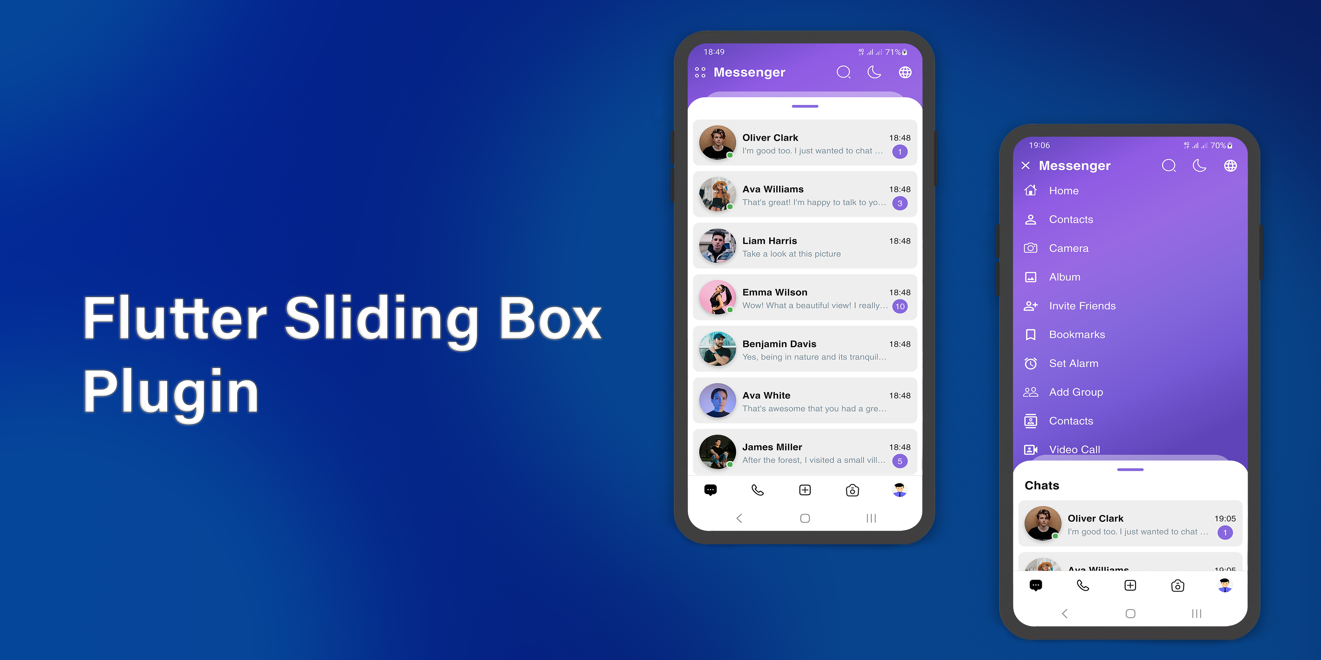





A draggable flutter widget (like bottom sheet panel) that makes it easier to use a SlidingBox for all platform. Boxes can be customized with your content and placed in your app.
To see example of the following SlidingBox on a device or simulator:
cd example/
flutter run --release
Demo
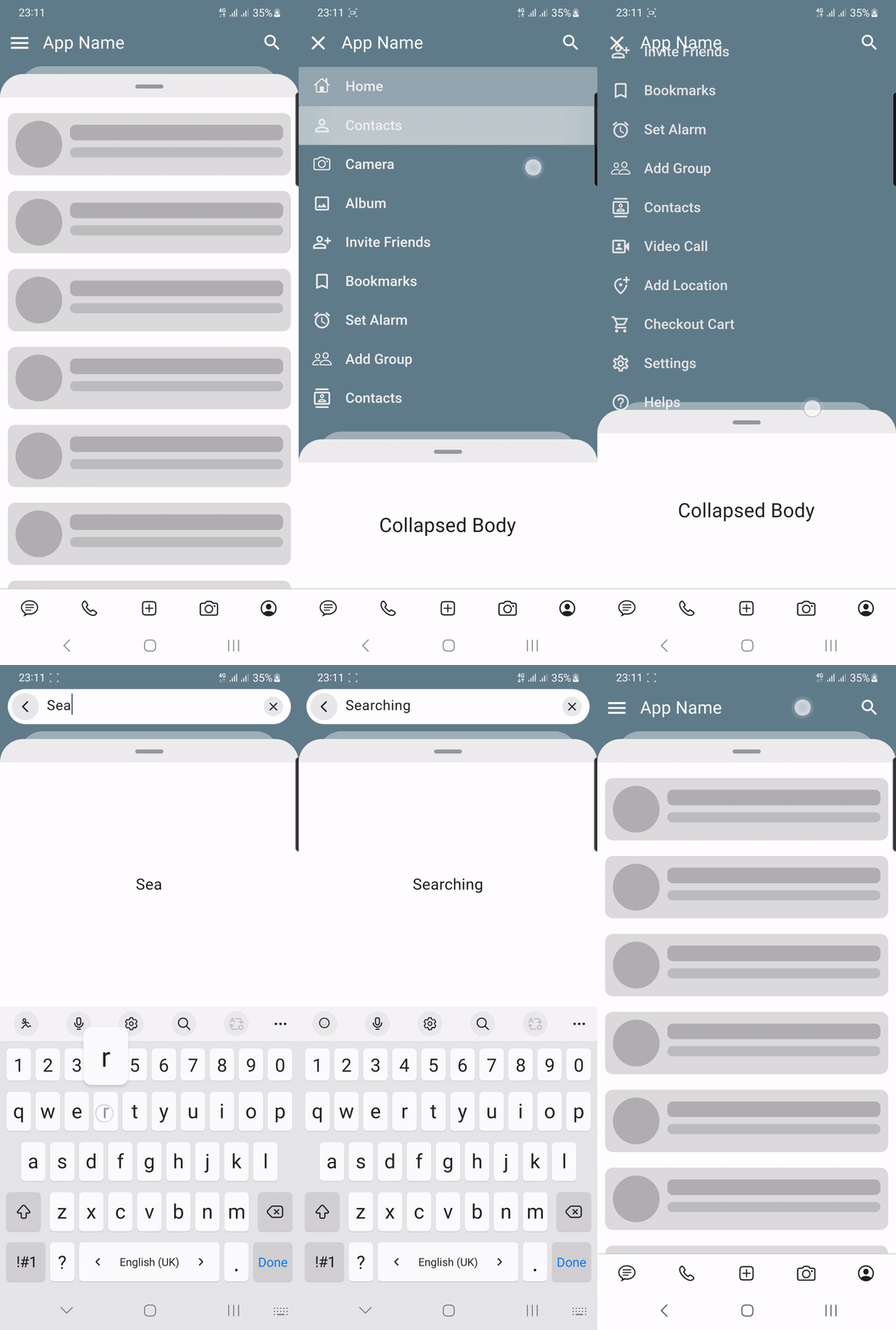
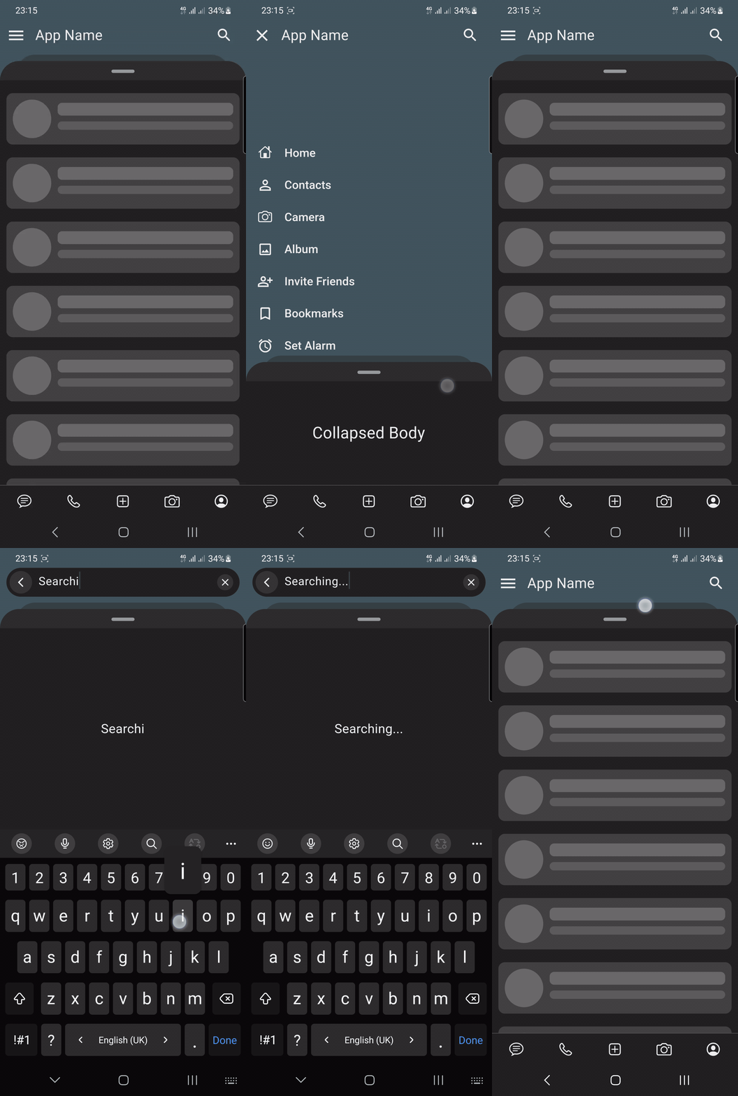
Simple
| Light | Dark |
|---|---|
 |  |
Source Link: example/lib/main.dart
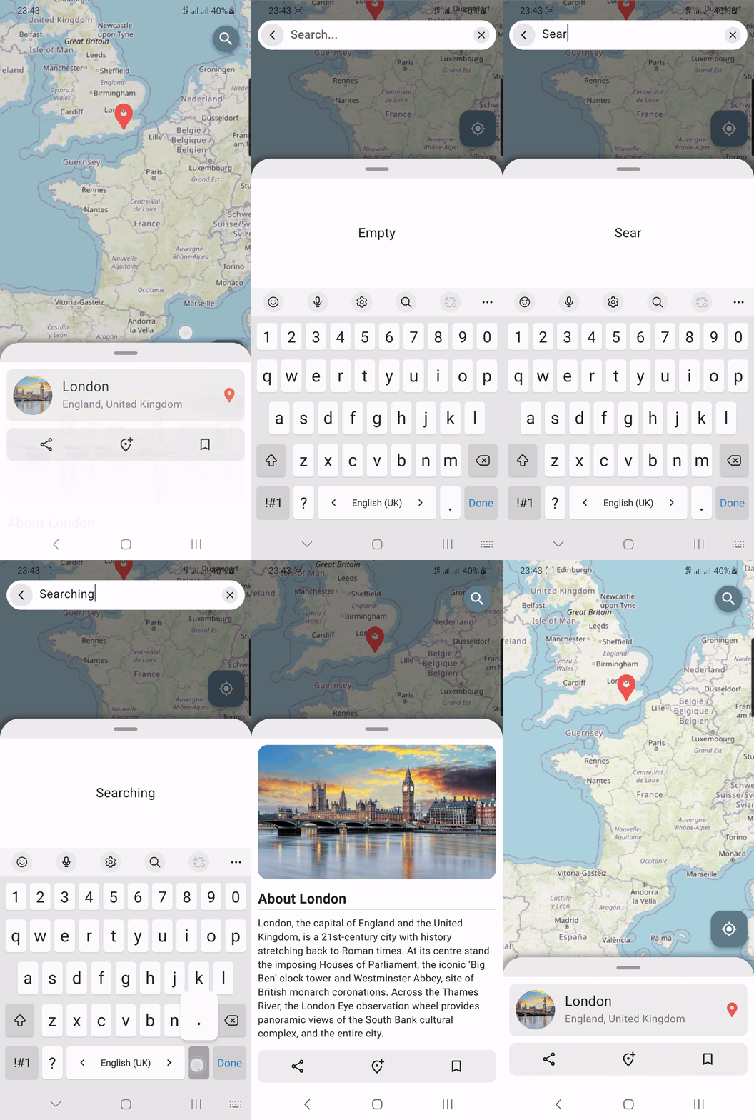
Map
| Light | Dark |
|---|---|
 | 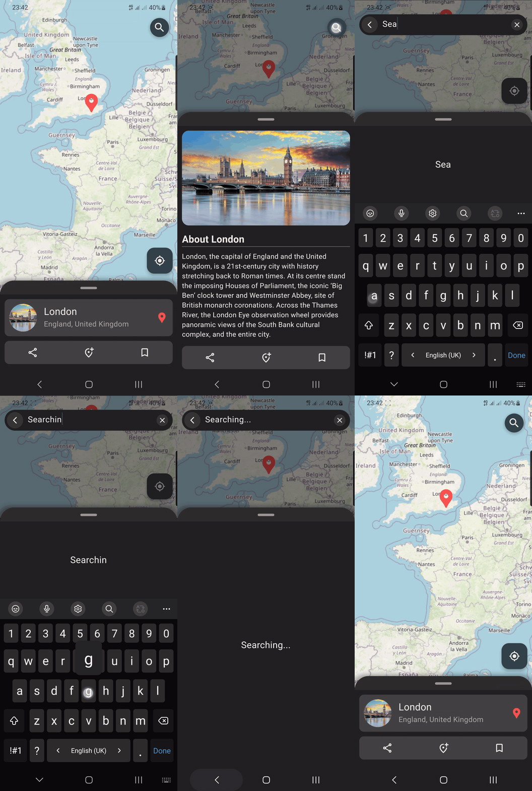 |
Source Link: example/lib/map_screen.dart
Music player
| Light | Dark |
|---|---|
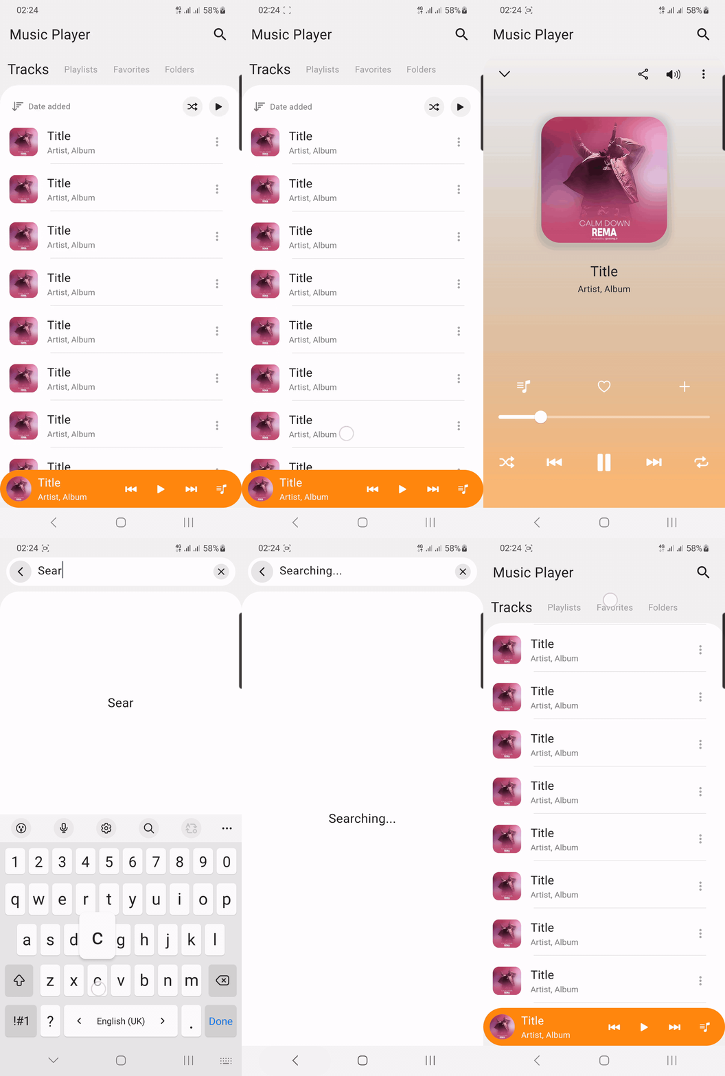 | 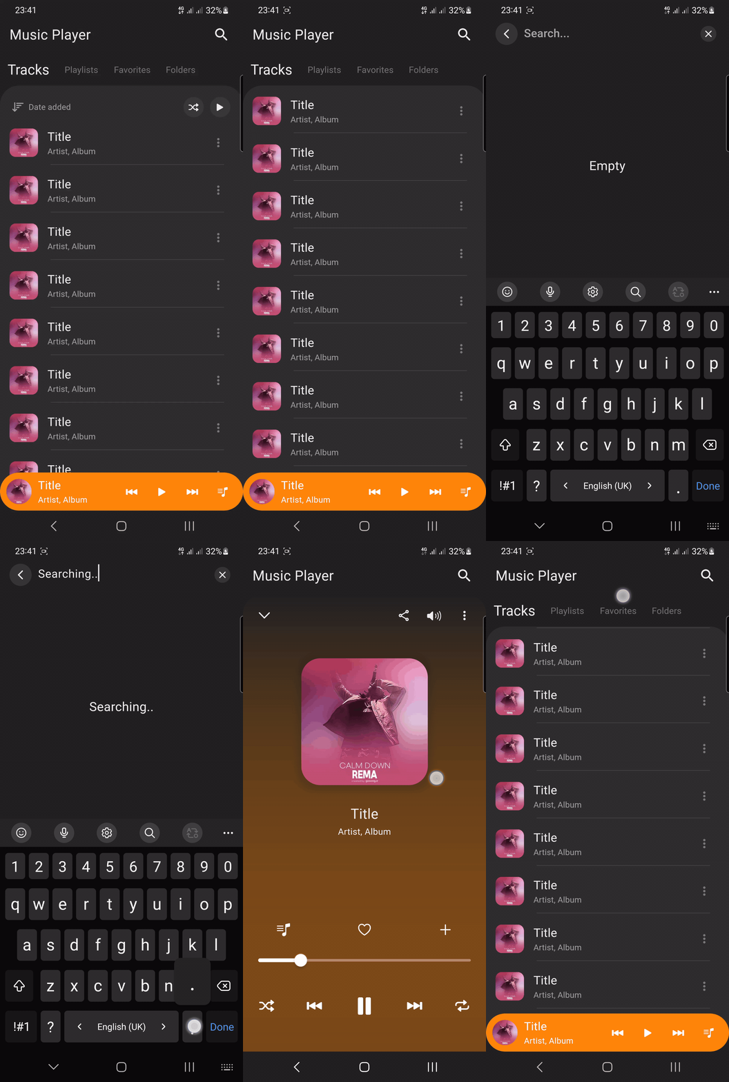 |
Source Link: example/lib/music_player_screen.dart
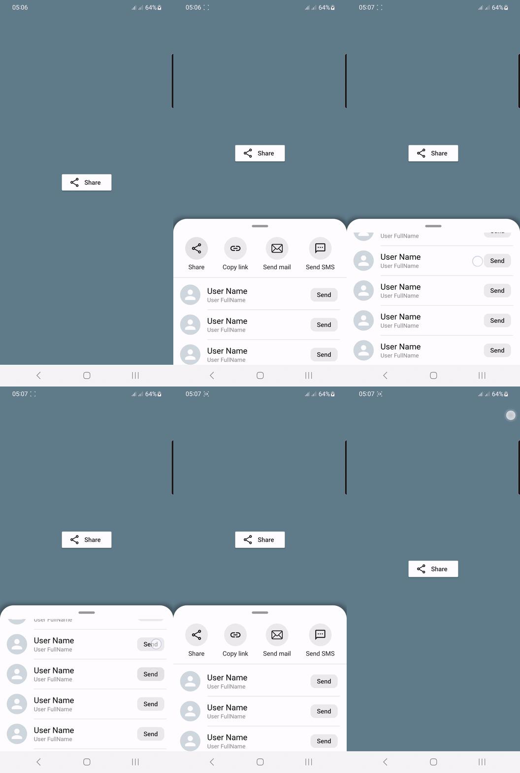
Share
 |
|---|
Source Link: example/lib/share_screen.dart
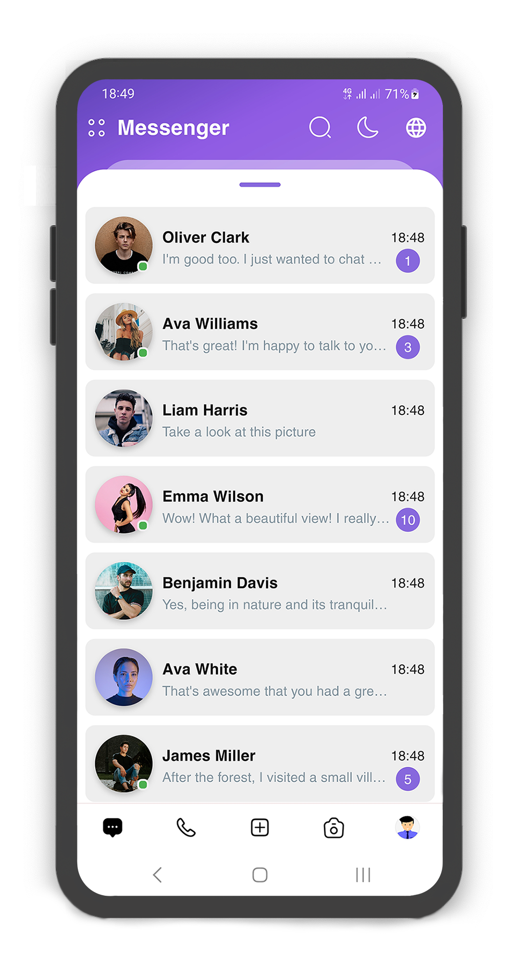
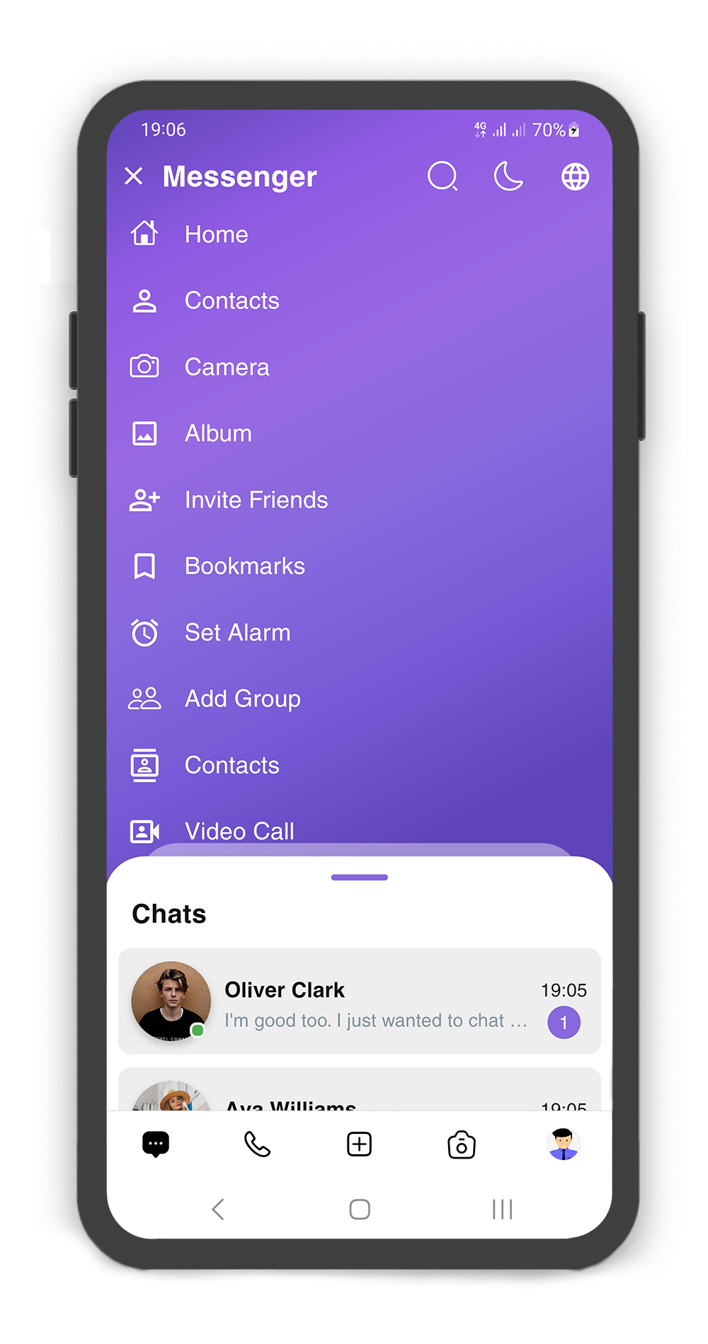
Messenger
 |
|---|
Source Link: Messenger application
Getting Started
- Installation
- Usage
- Custom Usage
- Backdrop Usage
- Backdrop AppBar Usage
- SearchBox Usage
- Box Controller
- Body Builder
- showSlidingBox Method
Installation
Add flutter_sliding_box as a dependency in your pubspec.yaml file:
dependencies:
  flutter_sliding_box: ^1.1.5
Import the plugin package to your dart code
import 'package:flutter_sliding_box/flutter_sliding_box.dart';
Usage
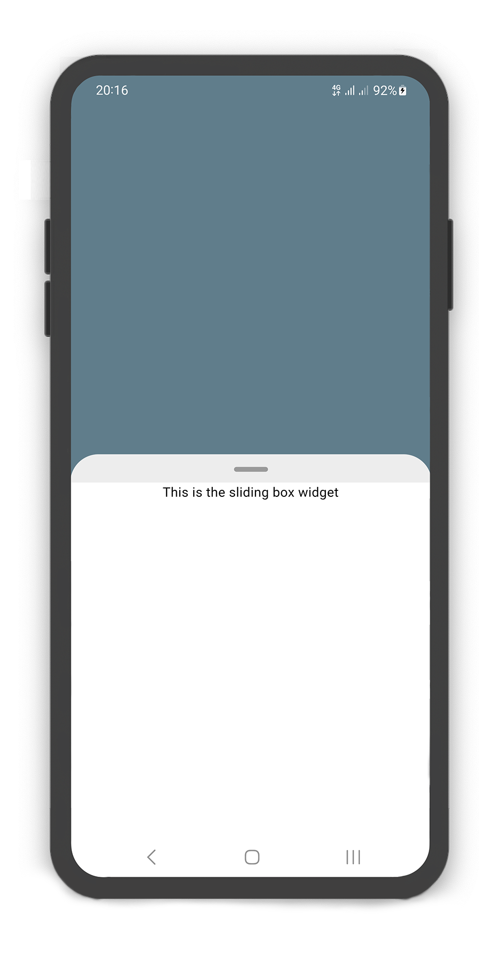
By default use SlidingBox as root widget for body (recommended)
@override
Widget build(BuildContext context) {
  return Scaffold(
    body: SlidingBox(
      body: const Center(
        child: Text("This is the sliding box widget",
          style: TextStyle(color: Colors.black),),
      ),
      backdrop: Backdrop(
        color: Colors.blueGrey,
      ),
    ),
  );
}
Custom Usage
There are several options that allow for more control:
| Properties | Data Type | Description |
|---|---|---|
body | Widget | A widget that slides from minHeight to maxHeight and is placed on the backdrop. |
bodyBuilder | Widget | Provides a ScrollController to attach to a scrollable widget in the box and current box position. If body and bodyBuilder are both non-null, body will be used. |
controller | BoxController | It can be used to control the state of sliding box and search box. |
collapsed | bool | If set to true, the state of the box is collapsed. |
collapsedBody | Widget | The Widget displayed overtop the box when collapsed. This fades out as the sliding box is opened. |
width | double | width of the sliding box. |
minHeight | double | The height of the sliding box when fully collapsed. |
maxHeight | double | The height of the sliding box when fully opened. |
color | Color | color to fill the background of the sliding box. |
borderRadius | BorderRadius | The corners of the sliding box are rounded by this. |
style | BoxStyle | The styles of the sliding box that includes shadow and sheet and none. |
physics | ScrollPhysics | Gets a ScrollPhysic, the physics determines how the scroll view continues to animate after the user stops dragging the scroll view. |
draggable | bool | Allows toggling of draggability of the sliding box. If set to false, the sliding box cannot be dragged up or down. |
draggableIcon | IconData | A Icon Widget that is placed in top of the box. Gets a IconData. |
draggableIconColor | Color | The color of the draggableIcon. |
draggableIconVisible | bool | If set to false, the draggableIcon hides. Use controller to open and close sliding box by taps. |
draggableIconBackColor | Color | The color to fill the background of the draggableIcon icon. The position of the icon is top of the box. |
onBoxSlide | ValueChanged<double> | This callback is called when the sliding box slides around with position of the box. The position is a double value between 0.0 and 1.0, where 0.0 is fully collapsed and 1.0 is fully opened. |
onBoxOpen | VoidCallback | This callback is called when the sliding box is fully opened. |
onBoxClose | VoidCallback | This callback is called when the sliding box is fully closed. |
onBoxShow | VoidCallback | This callback is called when the sliding box is visible. |
onBoxHide | VoidCallback | This callback is called when the sliding box is invisible. |
onSearchBoxShow | VoidCallback | This callback is called when the search box is visible. |
onSearchBoxHide | VoidCallback | This callback is called when the search box is invisible. |
animationCurve | Curve | animationCurve defines the easier behavior of the box animation. |
animationDuration | Duration | animationDuration defines the time for the box animation to complete. |
backdrop | Backdrop | A Widget that is placed behind of the box, filled with the Backdrop. |
Backdrop Usage
Using the Backdrop
Manually change the Backdrop properties.
| Properties | Data Type | Description |
|---|---|---|
color | Color | color to fill the background of the backdrop. |
width | double | width of the backdrop body. |
fading | bool | If set to true, the backdrop body fades out when the sliding box opened. |
moving | bool | If set to true, the backdrop body moving up when the sliding box opened. |
overlay | bool | If set to true, a dark layer displayed above of the backdrop and behind of the sliding box when is opened. |
overlayOpacity | double | Amount of dark overlay layer. a double value between 0.0 and 1.0. |
backgroundGradient | Gradient | The gradient color to fill the background of the backdrop. if color and backgroundGradient are both non-null, color will be used. |
body | Widget | A Widget that is placed in the backdrop and behind of the sliding box. |
appBar | BackdropAppBar | appBar to display at the top of the backdrop. |
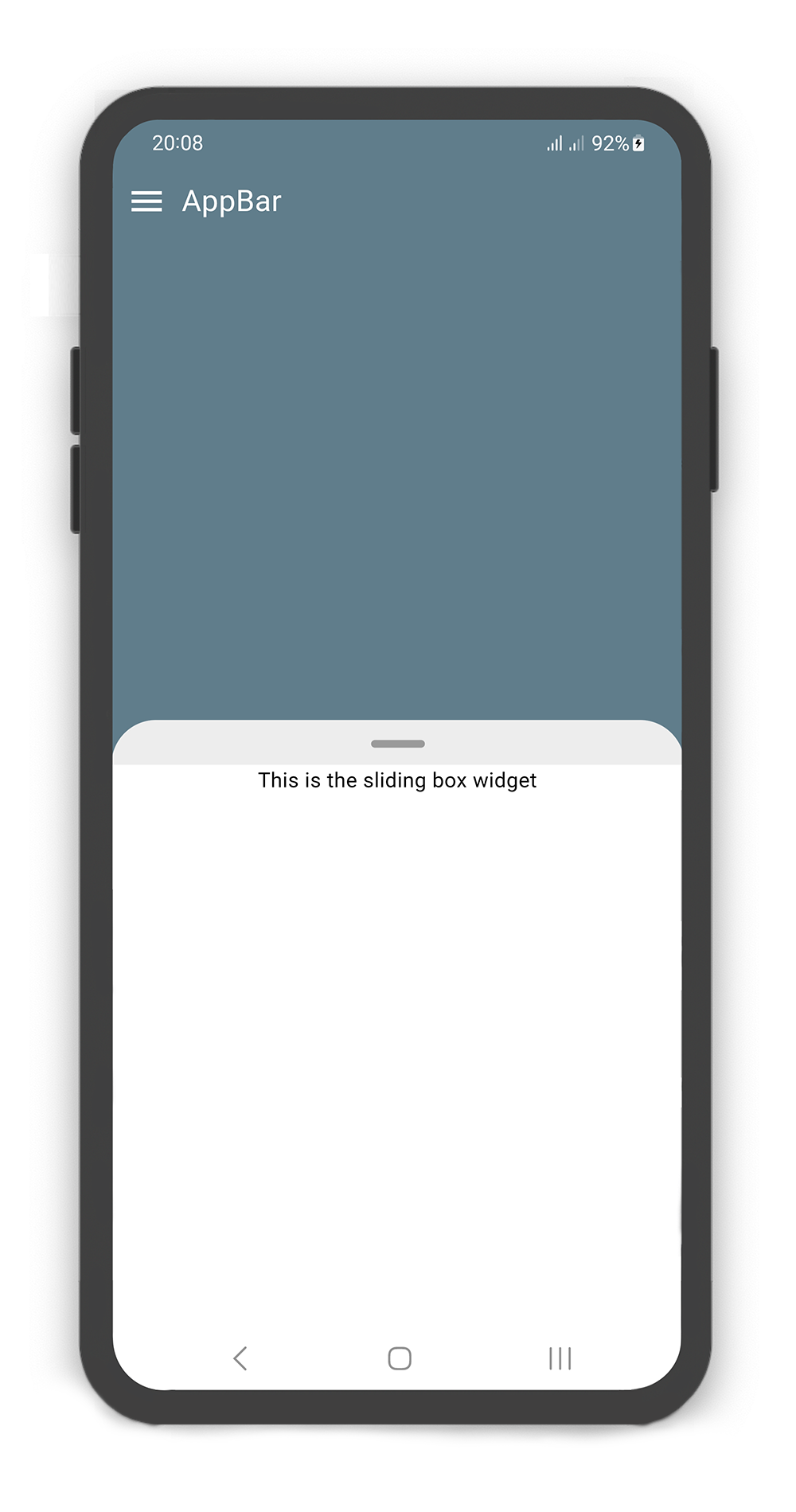
SlidingBox includes appBar: BackdropAppBar
BoxController boxController = BoxController();

@override
Widget build(BuildContext context) {
  return Scaffold(
    body: SlidingBox(
      controller: boxController,
      minHeight: 200,
      maxHeight: 400,
      body: Center(
        child: Text("This is the sliding box widget",
          style: TextStyle(color: Colors.black),),
      ),
      backdrop: Backdrop(
        color: Colors.blueGrey,
        appBar: BackdropAppBar(
          title: Padding(
              padding: EdgeInsets.all(10),
              child: Text("AppBar", style: TextStyle(fontSize: 20),)
          ),
          leading: Icon(Icons.menu, color: Colors.white, size: 27,),
        ),
      ),
    ),
  );
}
Backdrop AppBar Usage
Using the BackdropAppBar
Manually change the BackdropAppBar properties.
| Properties | Data Type | Description |
|---|---|---|
title | Widget | A Widget that is placed on the topLeft of the backdrop. |
leading | Icon | A Icon Widget that is placed in left of the title. |
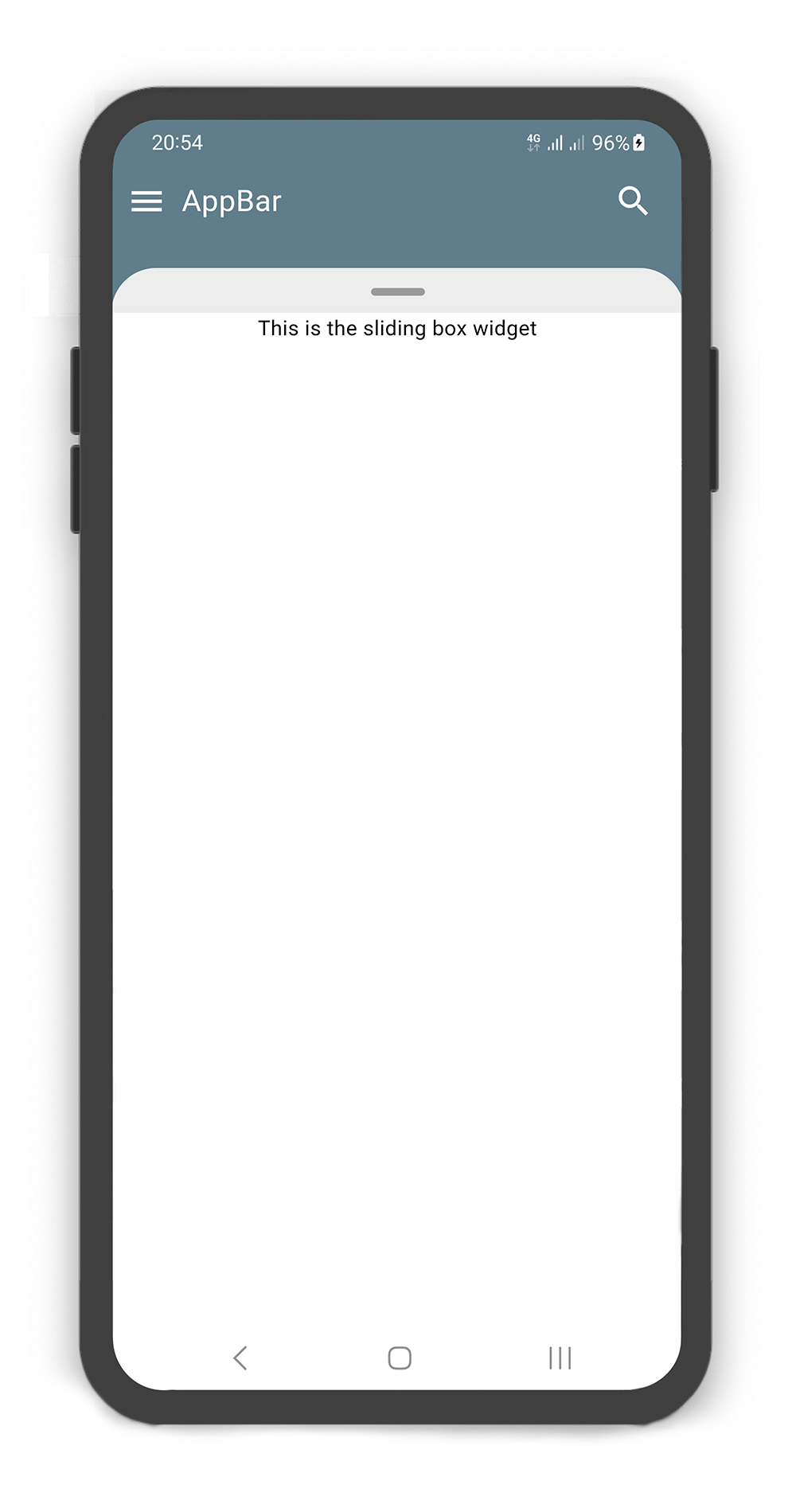
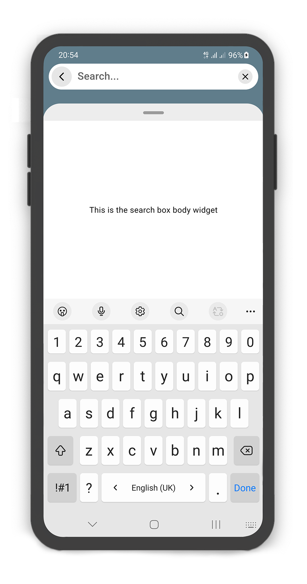
searchBox | SearchBox | A search box to display above backdrop. add a IconButton widget to actions and call boxController.showSearchBox() in onPressed method. see example. |
actions | List<Widget> | A list of Widgets placed on the topRight of the backdrop. |
 |  |
|---|
SlidingBox appBar includes searchBox: SearchBox
BoxController boxController = BoxController();
TextEditingController textEditingController = TextEditingController();

@override
Widget build(BuildContext context) {
  return Scaffold(
    body: SlidingBox(
      controller: boxController,
      minHeight: 200,
      maxHeight: MediaQuery
          .of(context)
          .size
          .height - 100,
      body: Center(
        child: Text("This is the sliding box widget",
          style: TextStyle(color: Colors.black),),
      ),
      backdrop: Backdrop(
        color: Colors.blueGrey,
        appBar: BackdropAppBar(
            title: Padding(
                padding: EdgeInsets.all(10),
                child: Text("AppBar", style: TextStyle(fontSize: 20),)
            ),
            leading: Icon(Icons.menu, color: Colors.white, size: 27,),
            searchBox: SearchBox(
              controller: textEditingController,
              body: Center(
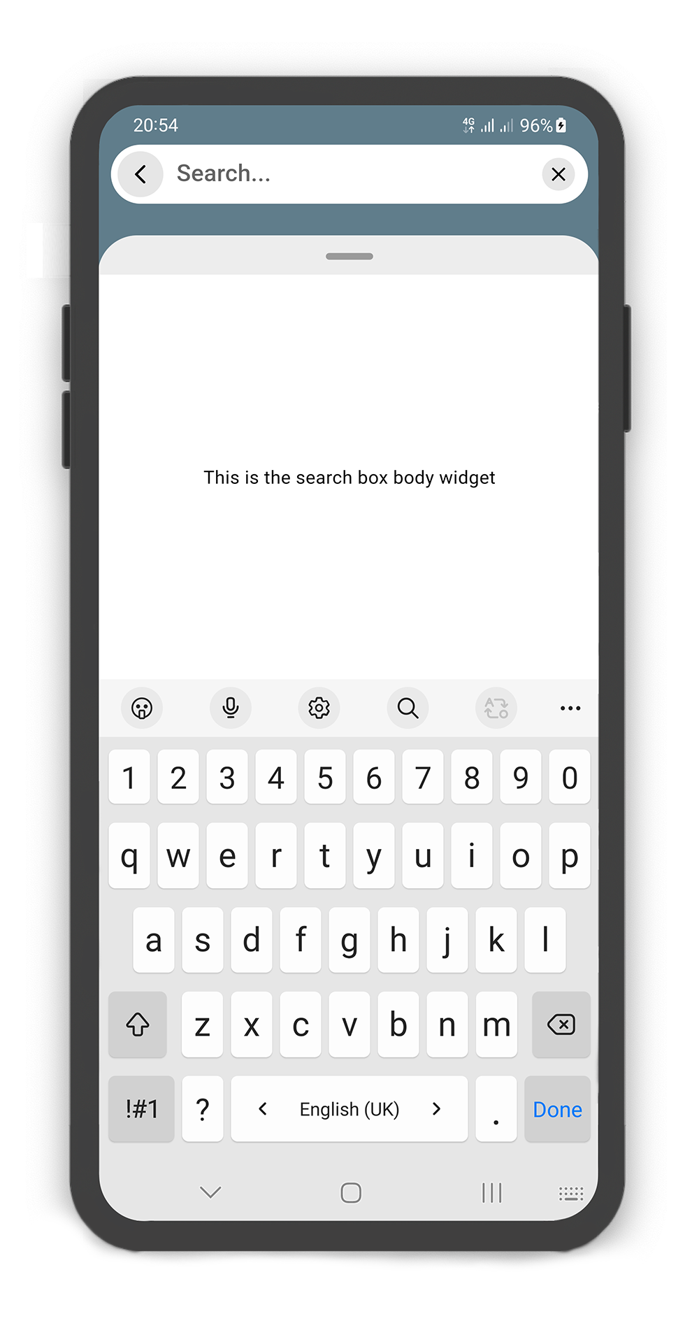
                child: Text("This is the search box body widget",
                  style: TextStyle(color: Colors.black),
                ),
              ),
            ),
            actions: [
              Container(
                margin: const EdgeInsets.fromLTRB(0, 0, 10, 0),
                child: SizedBox.fromSize(
                  size: const Size.fromRadius(25),
                  child: IconButton(
                    iconSize: 25,
                    icon: Icon(Icons.search, color: Colors.white, size: 27,),
                    onPressed: () {
                      textEditingController.text = "";
                      boxController.showSearchBox();
                    },
                  ),
                ),
              ),
            ]
        ),
      ),
    ),
  );
}
SearchBox Usage
Using the SearchBox
Manually change the SearchBox properties.
| Properties | Data Type | Description |
|---|---|---|
controller | TextEditingController | It can be used to control the state of search box text field. Gets a TextEditingController. |
leading | Icon | A Icon Widget that is placed in left of the search box text field. |
color | Color | color to fill the background of the SearchBox. |
inputDecoration | InputDecoration | decoration to show around the search box text field. |
borderRadius | BorderRadius | The corners of the search box are rounded by this. |
style | TextStyle | style for text of the SearchBox. |
body | Widget | A Widget that is placed in the sliding box (in search mode displays the search result). |
draggableBody | bool | In search mode, allows toggling of draggability of the sliding box. If set to false, the sliding box cannot be dragged up or down when search box visible. If set to true, search box invisible when dragging. |
 |  |
|---|
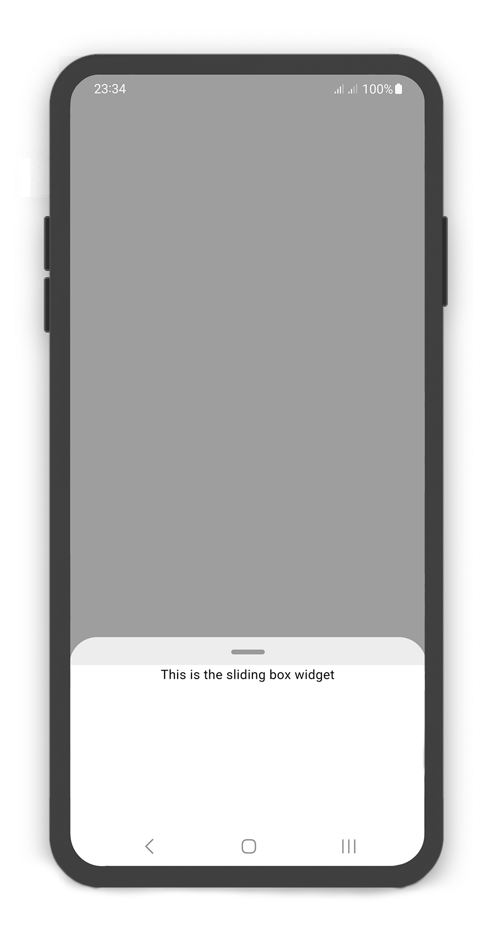
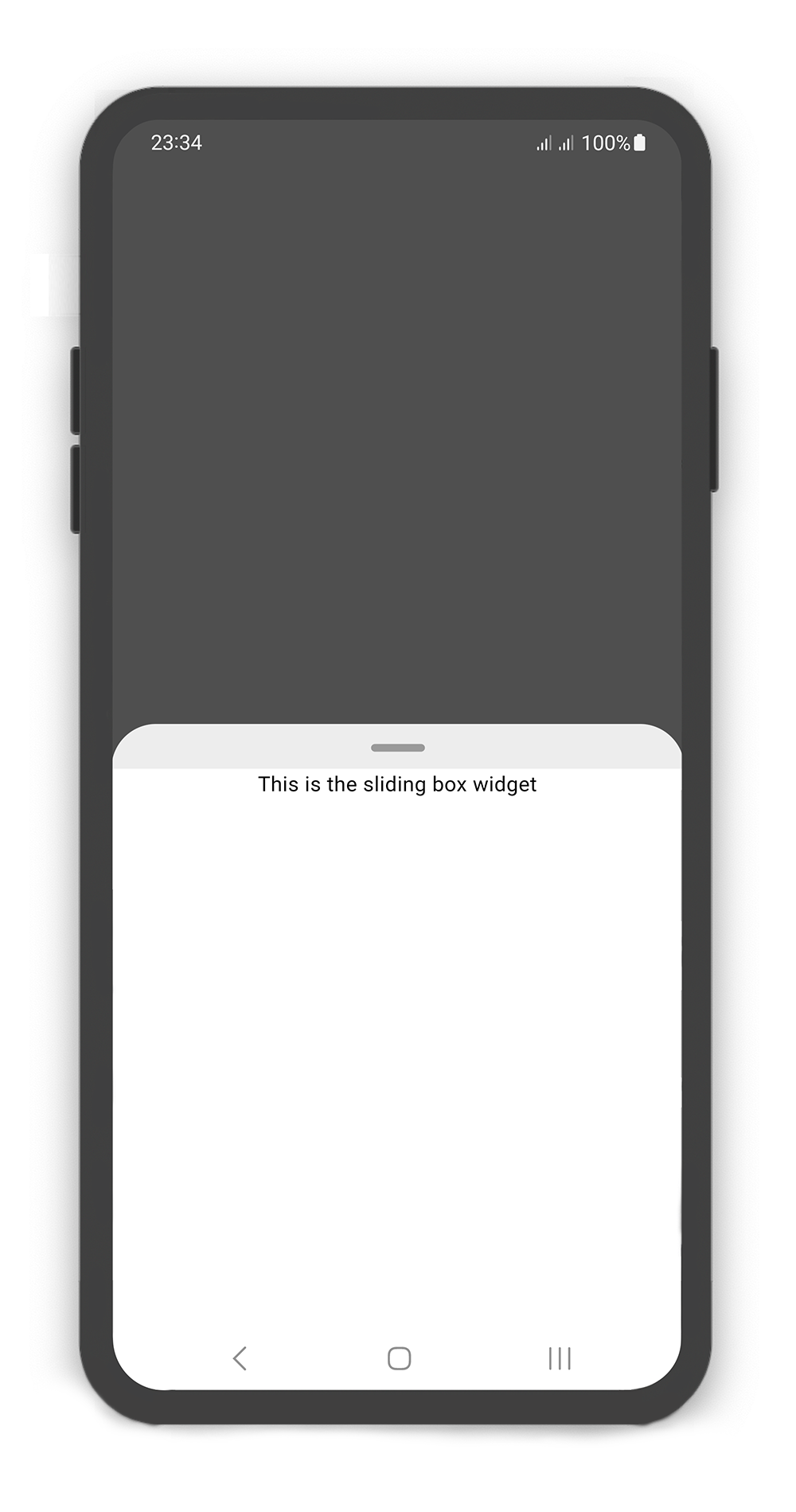
SlidingBox backdrop includes overlay: true
Customize overlayOpacity (a value between 0.0 and 1.0), default value is 0.5
@override
Widget build(BuildContext context) {
  return Scaffold(
    body: SlidingBox(
      body: const Center(
        child: Text("This is the sliding box widget",
          style: TextStyle(color: Colors.black),
        ),
      ),
      backdrop: Backdrop(
        overlay: true,
        overlayOpacity: 0.5,
        color: Colors.grey,
      ),
    ),
  );
}
 |  |
|---|
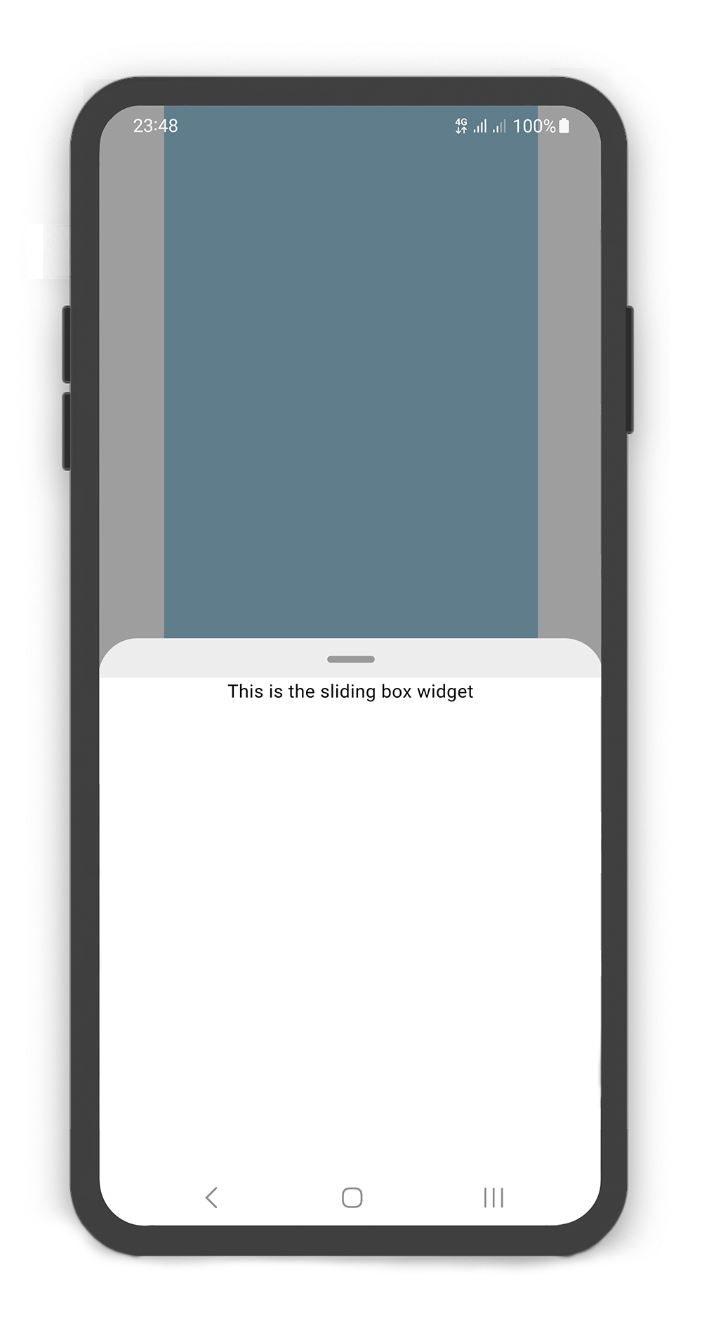
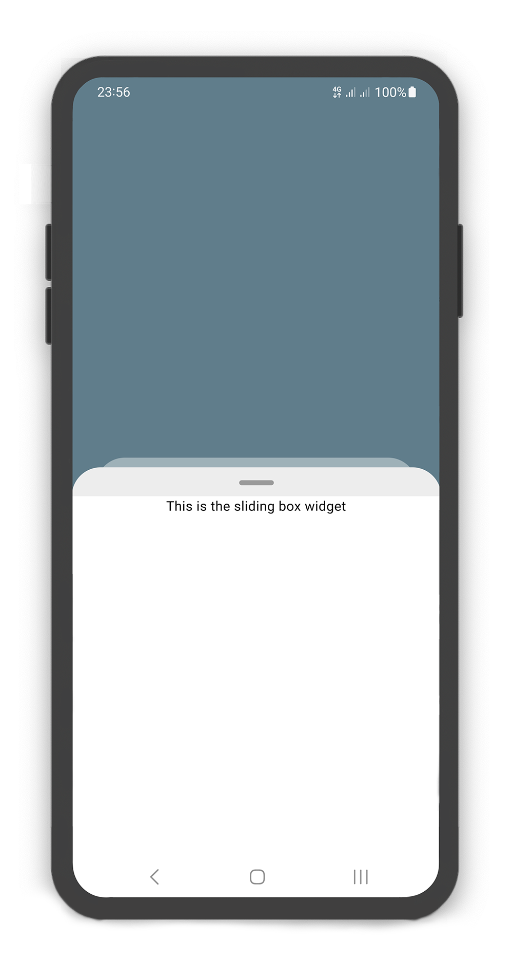
SlidingBox width and Backdrop width
@override
Widget build(BuildContext context) {
  return Scaffold(
    body: SlidingBox(
      width: MediaQuery.of(context).size.width - 50,
      minHeight: 200,
      maxHeight: 400,
      body: Center(
        child: Text("This is the sliding box widget",
        style: TextStyle(color: Colors.black),),
      ),
      backdrop: Backdrop(
        width: MediaQuery.of(context).size.width - 100,
        color: Colors.blueGrey,
      ),
    ),
  );
}
 |  |
|---|
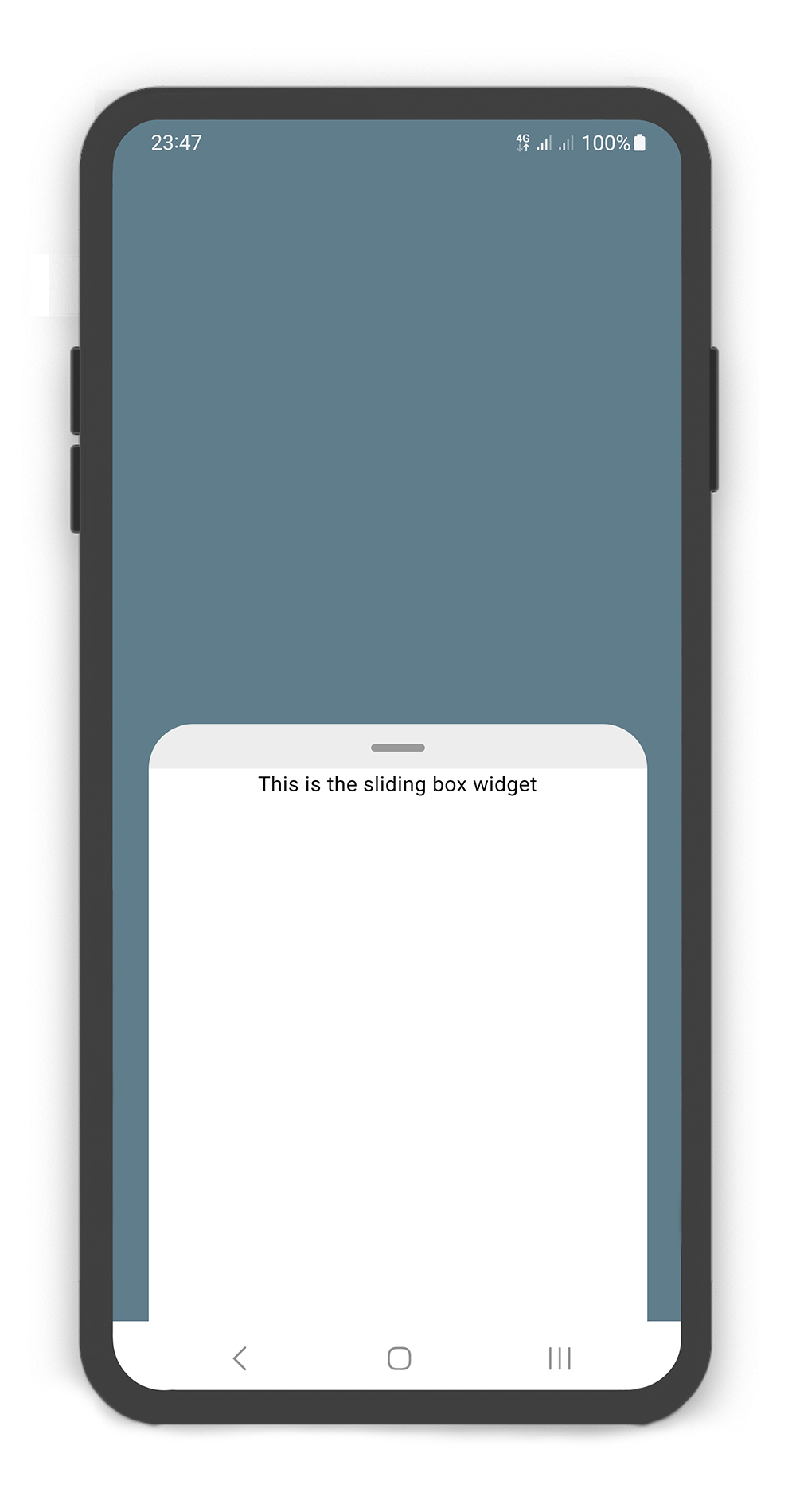
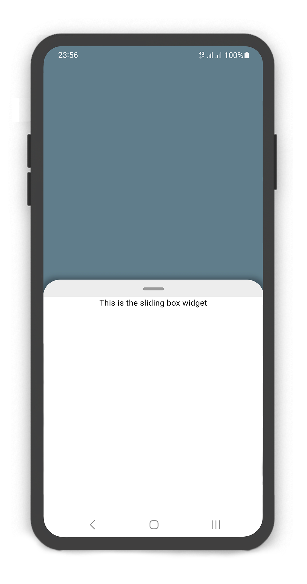
SlidingBox includes style: sheet, shadow, none
@override
Widget build(BuildContext context) {
  return Scaffold(
    body: SlidingBox(
      minHeight: 200,
      maxHeight: 400,
      style: BoxStyle.sheet, /// or BoxStyle.shadow (default is 'none')
      body: Center(
        child: Text("This is the sliding box widget",
          style: TextStyle(color: Colors.black),),
      ),
      backdrop: Backdrop(
        color: Colors.blueGrey,
      ),
    ),
  );
}
Box Controller
Using the BoxController
Manually change the SearchBox state. For better performance, use a BoxController as controller (recommended).
| Properties | Data Type | Description |
|---|---|---|
isAttached | bool | Determine if the boxController is attached to an instance of the SlidingBox (this property must be true before any other BoxController functions can be used). |
isBoxOpen | bool | Returns whether or not the box is open. |
isBoxClosed | bool | Returns whether or not the box is close. |
isBoxVisible | bool | Returns whether or not the box is visible. |
isSearchBoxVisible | bool | Returns whether or not the search box is visible. |
getPosition | bool | Returns box position (a value between 0.0 and 1.0). |
minHeight | double | Returns box minHeight. |
maxHeight | double | Returns box maxHeight. |
boxWidth | double | Returns box width. |
backdropWidth | double | Returns backdrop width. |
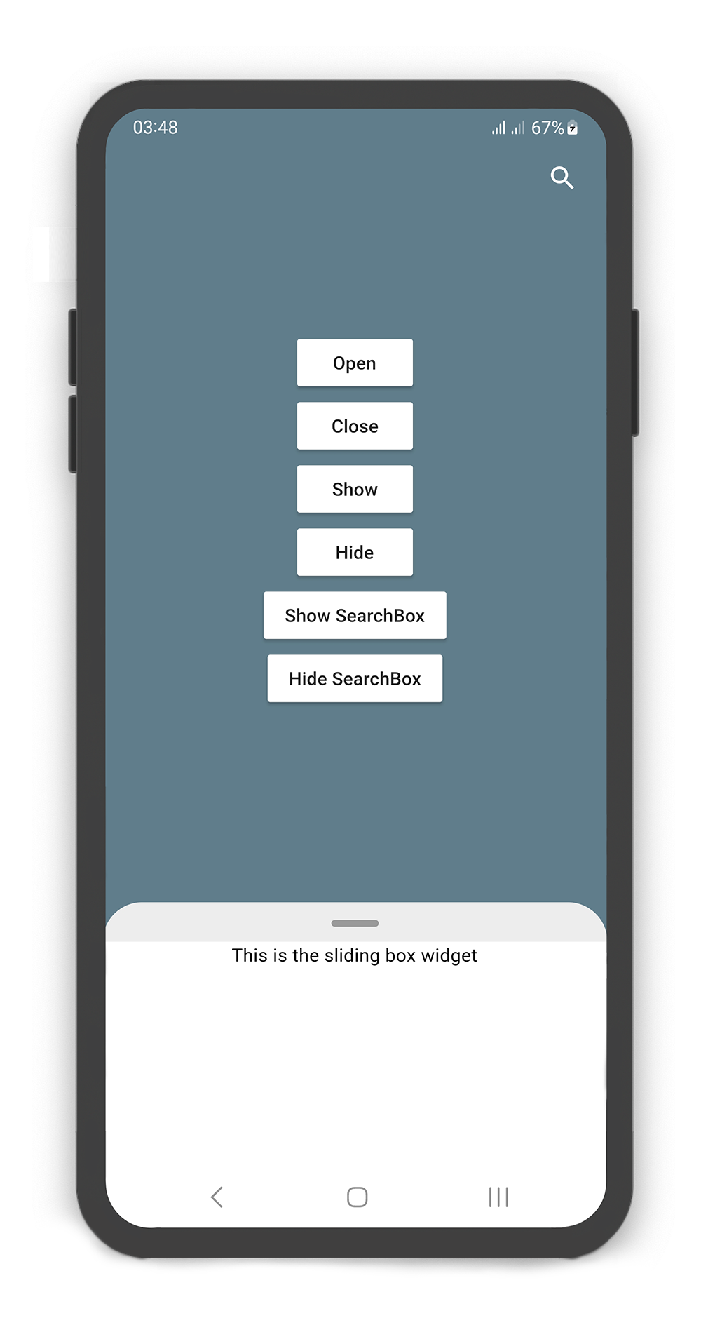
| Methods | Return Type | Description |
|---|---|---|
openBox() | Future<void> | Opens the sliding box with animation (i.e. to the maxHeight). |
closeBox() | Future<void> | Closes the sliding box with animation (i.e. to the minHeight). |
showBox() | Future<void> | Shows the sliding box (i.e. is visible). |
hideBox() | Future<void> | Hides the sliding box (i.e. is invisible). |
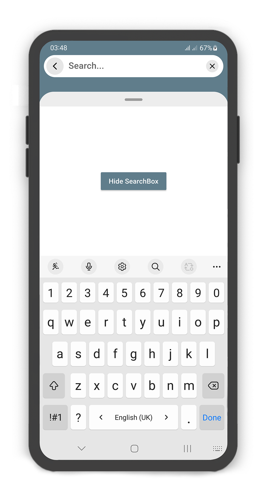
showSearchBox() | Future<void> | Shows the search box (i.e. is visible). |
hideSearchBox() | Future<void> | Hides the search box (i.e. is invisible). |
setPosition() | Future<void> | Sets the sliding box position with animation (a value between 0.0 and 1.0). |
setSearchBody() | Future<void> | Sets the search box body content. |
 |  |
|---|
BoxController boxController = BoxController();
TextEditingController textEditingController = TextEditingController();

@override
Widget build(BuildContext context) {
  return Scaffold(
    body: SlidingBox(
      controller: boxController,
      minHeight: 200,
      maxHeight: MediaQuery
          .of(context)
          .size
          .height - 100,
      body: const Center(
        child: Text("This is the sliding box widget",
          style: TextStyle(color: Colors.black),),
      ),
      collapsed: true,
      backdrop: Backdrop(
        color: Colors.blueGrey,
        appBar: BackdropAppBar(
            searchBox: SearchBox(
              controller: textEditingController,
              body: Center(
                child: MaterialButton(
                  child: Text("Hide SearchBox"),
                  onPressed: () {
                    boxController.hideSearchBox();
                    boxController.closeBox();
                  },
                  color: Colors.blueGrey,
                  textColor: Colors.white,
                ),
              ),
              draggableBody: true,
            ),
            actions: [
              Container(
                margin: const EdgeInsets.fromLTRB(0, 0, 10, 0),
                child: SizedBox.fromSize(
                  size: const Size.fromRadius(25),
                  child: IconButton(
                    iconSize: 25,
                    icon: Icon(Icons.search, color: Colors.white, size: 27,),
                    onPressed: () {
                      textEditingController.text = "";
                      boxController.showSearchBox();
                    },
                  ),
                ),
              ),
            ]
        ),
        body: SingleChildScrollView(
          child: SizedBox(
            width: MediaQuery
                .of(context)
                .size
                .width,
            height: MediaQuery
                .of(context)
                .size
                .height,
            child: Column(
              mainAxisAlignment: MainAxisAlignment.center,
              children: [
                MaterialButton(
                  child: Text("Open"),
                  onPressed: () => boxController.openBox(),
                  color: Colors.white,
                ),
                MaterialButton(
                  child: Text("Close"),
                  onPressed: () => boxController.closeBox(),
                  color: Colors.white,
                ),
                MaterialButton(
                  child: Text("Show"),
                  onPressed: () => boxController.showBox(),
                  color: Colors.white,
                ),
                MaterialButton(
                  child: Text("Hide"),
                  onPressed: () => boxController.hideBox(),
                  color: Colors.white,
                ),
                MaterialButton(
                  child: Text("Show SearchBox"),
                  onPressed: () => boxController.showSearchBox(),
                  color: Colors.white,
                ),
                MaterialButton(
                  child: Text("Hide SearchBox"),
                  onPressed: () => boxController.hideSearchBox(),
                  color: Colors.white,
                ),
              ],
            ),
          ),
        ),
      ),
    ),
  );
}
Body Builder
Using the bodyBuilder
When content overflow in body widget, scroll enable automatically and can using the body builder to manage and control scroll and box position.
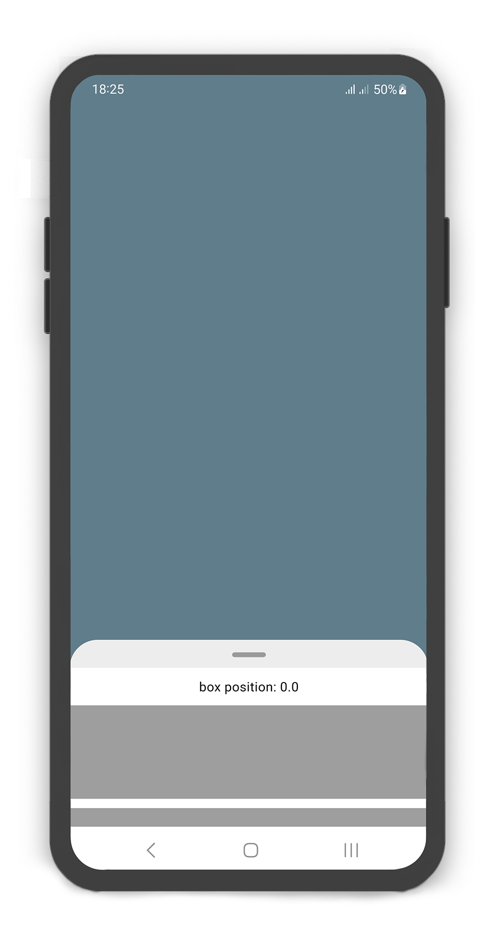 | 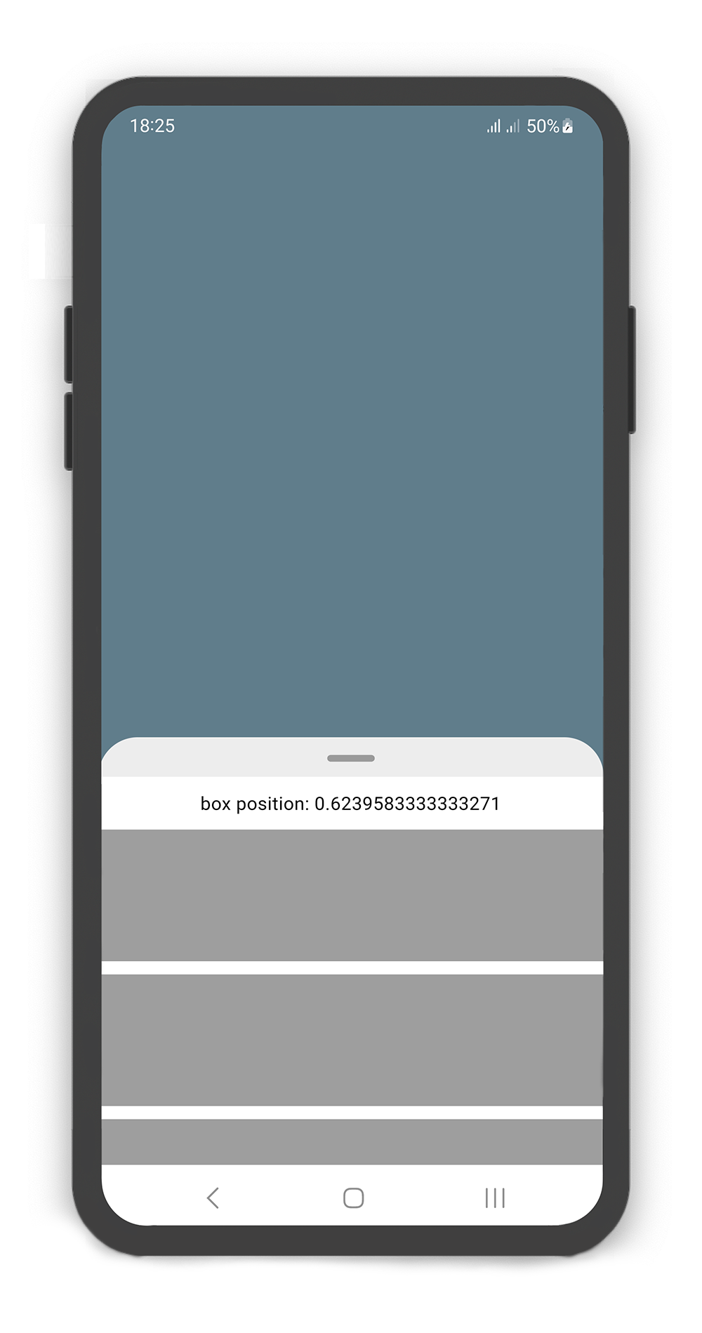 | 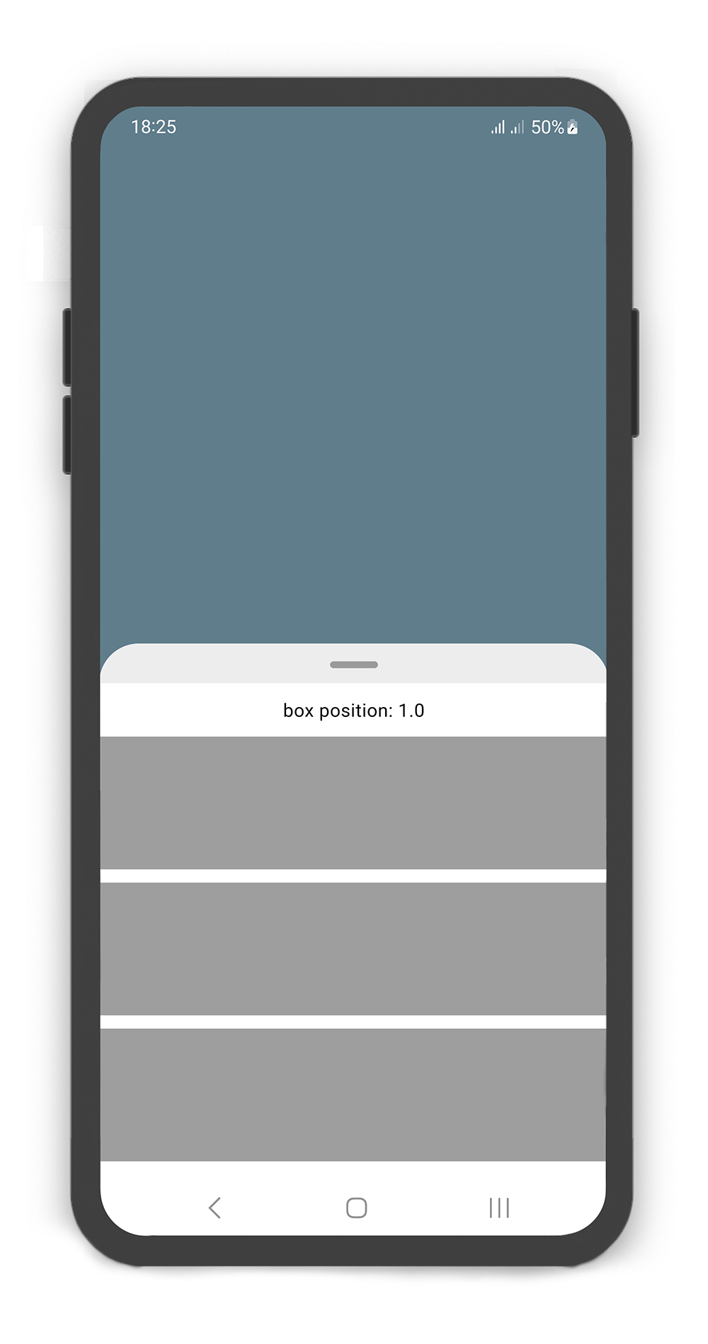 |
|---|
@override
Widget build(BuildContext context) {
  return Scaffold(
    body: SlidingBox(
      minHeight: 200,
      maxHeight: 400,
      bodyBuilder: (sc, pos) => _body(sc, pos),
      backdrop: Backdrop(
        color: Colors.blueGrey,
      ),
    ),
  );
}

_body(ScrollController sc, double pos) {
  sc.addListener(() {
    print("scrollController position: ${sc.position.pixels}");
  });
  return Column(
    children: [
      SizedBox(height: 10,),
      Center(
        child: Text("box position: $pos",
          style: TextStyle(color: Colors.black),),
      ),
      SizedBox(height: 10,),
      Container(color: Colors.grey, height: 100,),
      SizedBox(height: 10,),
      Container(color: Colors.grey, height: 100,),
      SizedBox(height: 10,),
      Container(color: Colors.grey, height: 100,),
      SizedBox(height: 10,),
      Container(color: Colors.grey, height: 100,),
    ],
  );
}
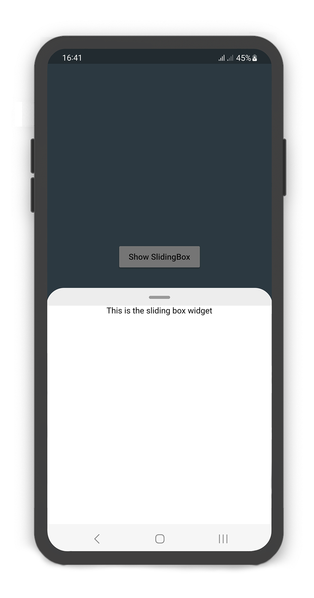
showSlidingBox Method
Using the showSlidingBox() method
Display a SlidingBox easily and simply. Just call showSlidingBox() method.
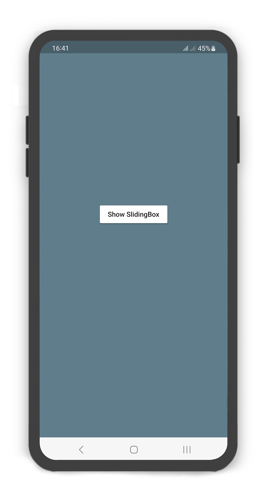 | 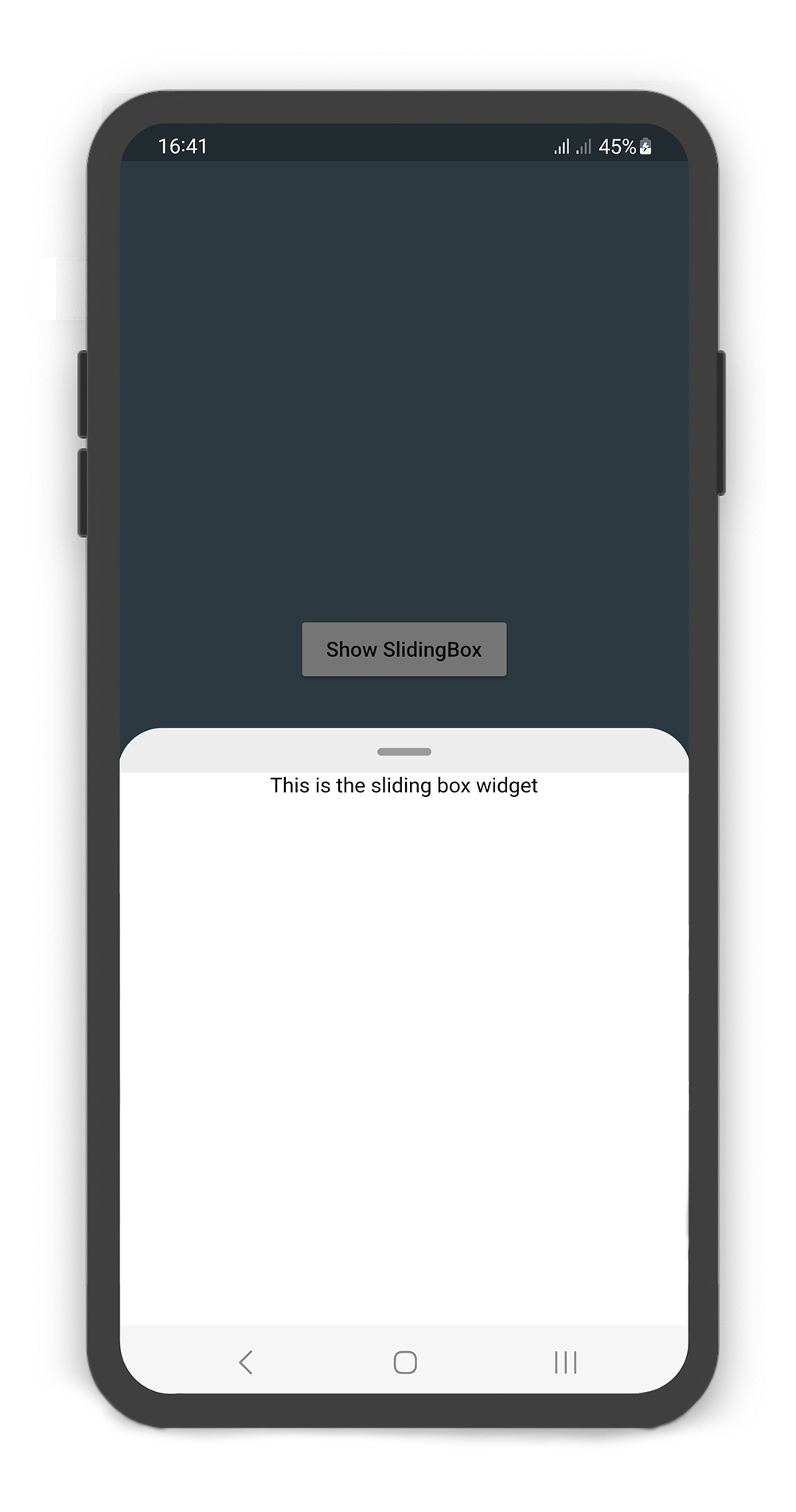 |
|---|
@override
Widget build(BuildContext context) {
  return Scaffold(
    backgroundColor: Colors.blueGrey,
    body: Center(
      child: MaterialButton(
        color: Colors.white,
        onPressed: () {
          /// Shows SlidingBox
          showSlidingBox(
              context: context,
              box: SlidingBox(
                body: const Center(
                  child: Text("This is the sliding box widget",
                    style: TextStyle(color: Colors.black),),
                ),
              )
          );
        },
        child: const Text("Show SlidingBox"),
      ),
    ),
  );
}