flutter_story 1.0.1
A flutter plugin for creating story (like Instagram, WhatsApp, Telegram, Facebook, etc) for all platforms.
Story for Flutter
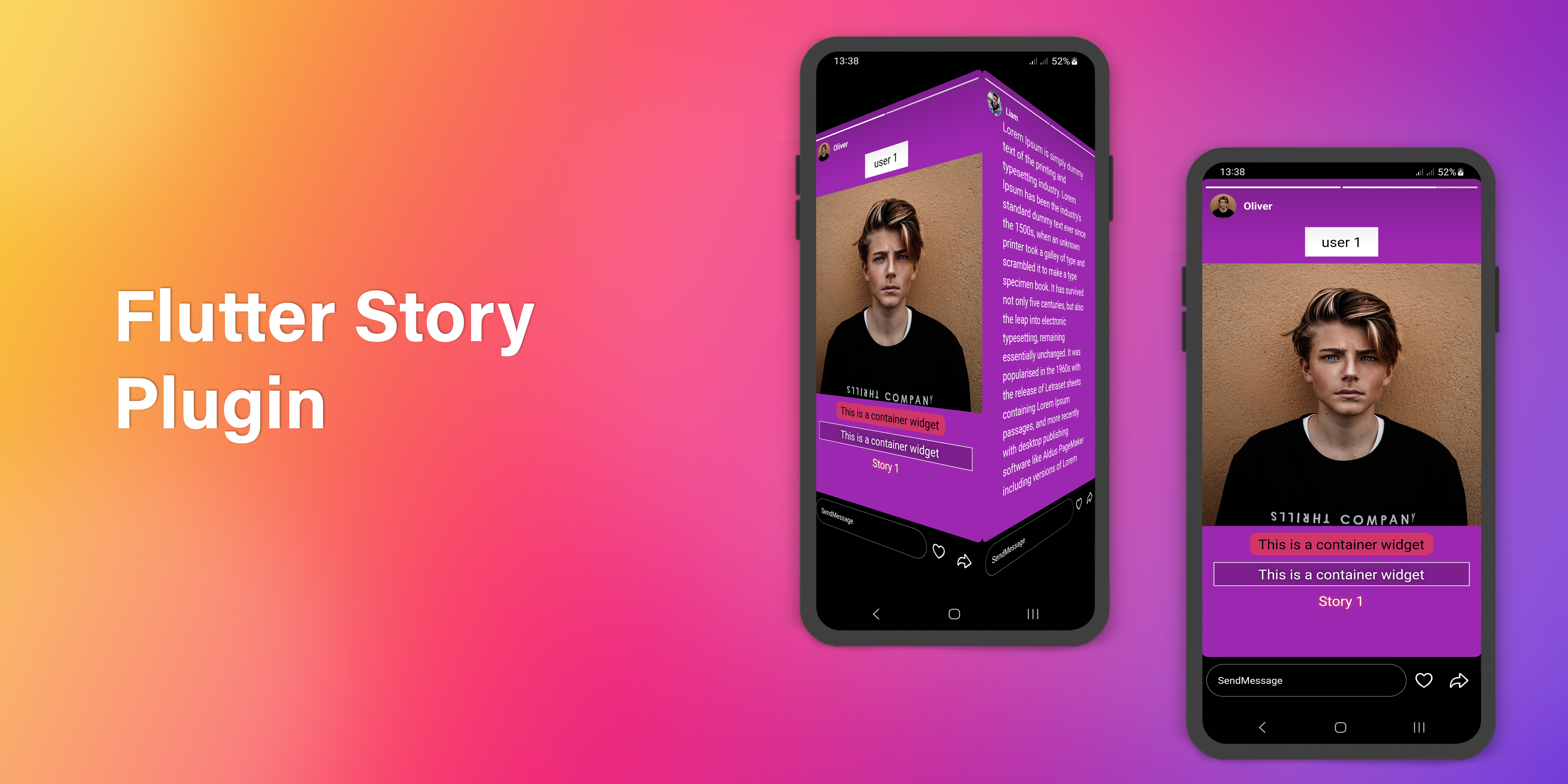





A flutter plugin for creating story (like Instagram, WhatsApp, Telegram, Facebook, etc) for all platforms.
Features
- Widget support on story (Image, Video, Text, etc).
- Pause, play, next, previous and drag with touch and story controller.
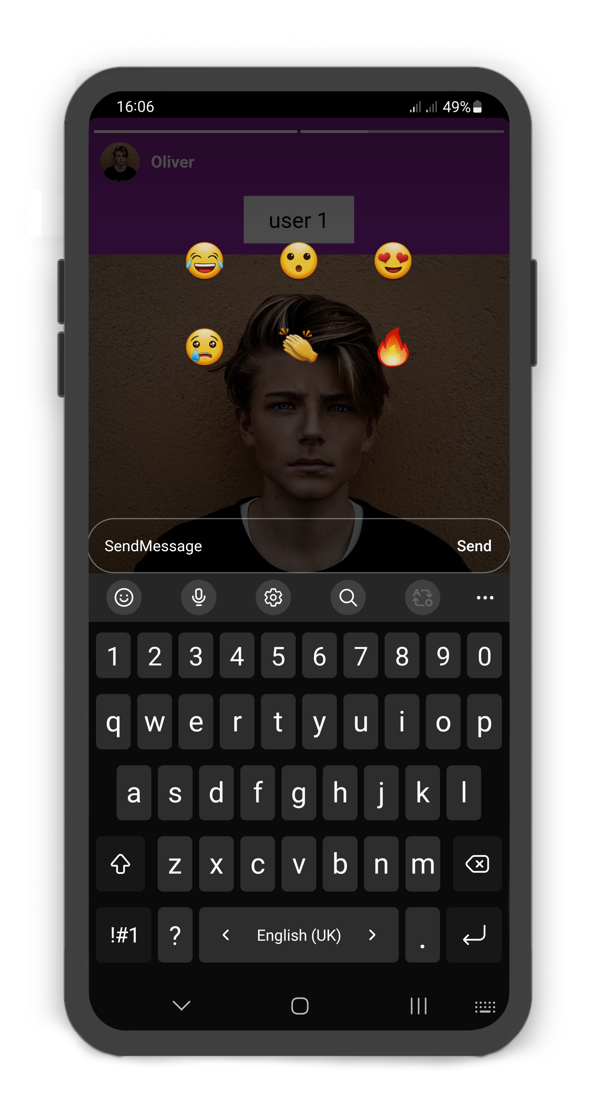
- Creating custom footer (with message box or custom widget), like and forward buttons.
- Animated progress indicator for each story card.
To see example of the following Story on a device or simulator:
cd example/
flutter run --release
Demo
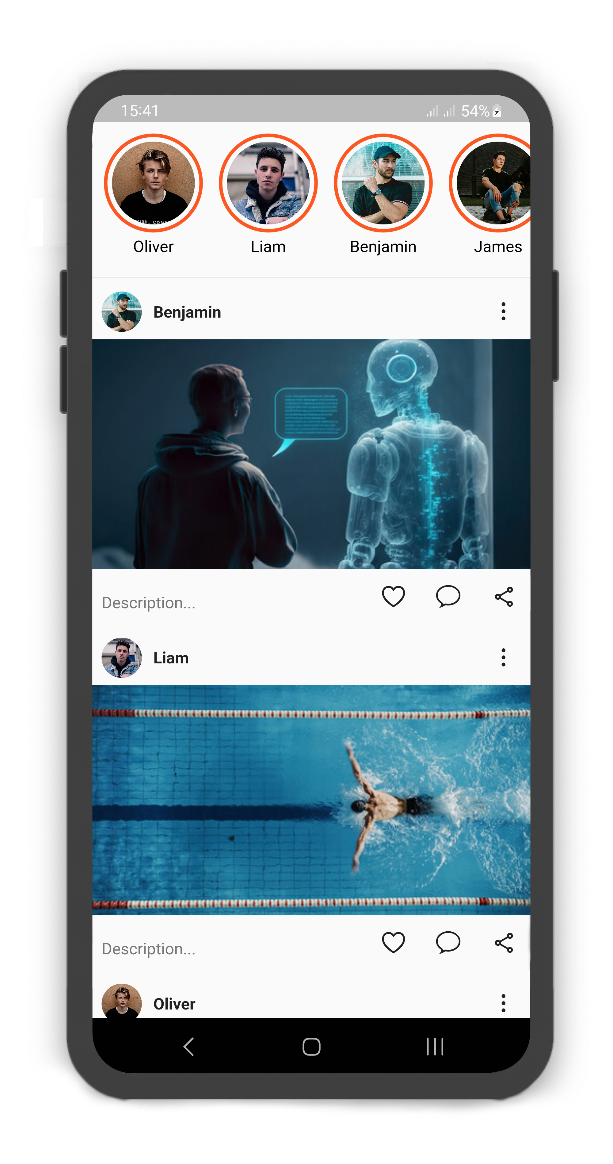
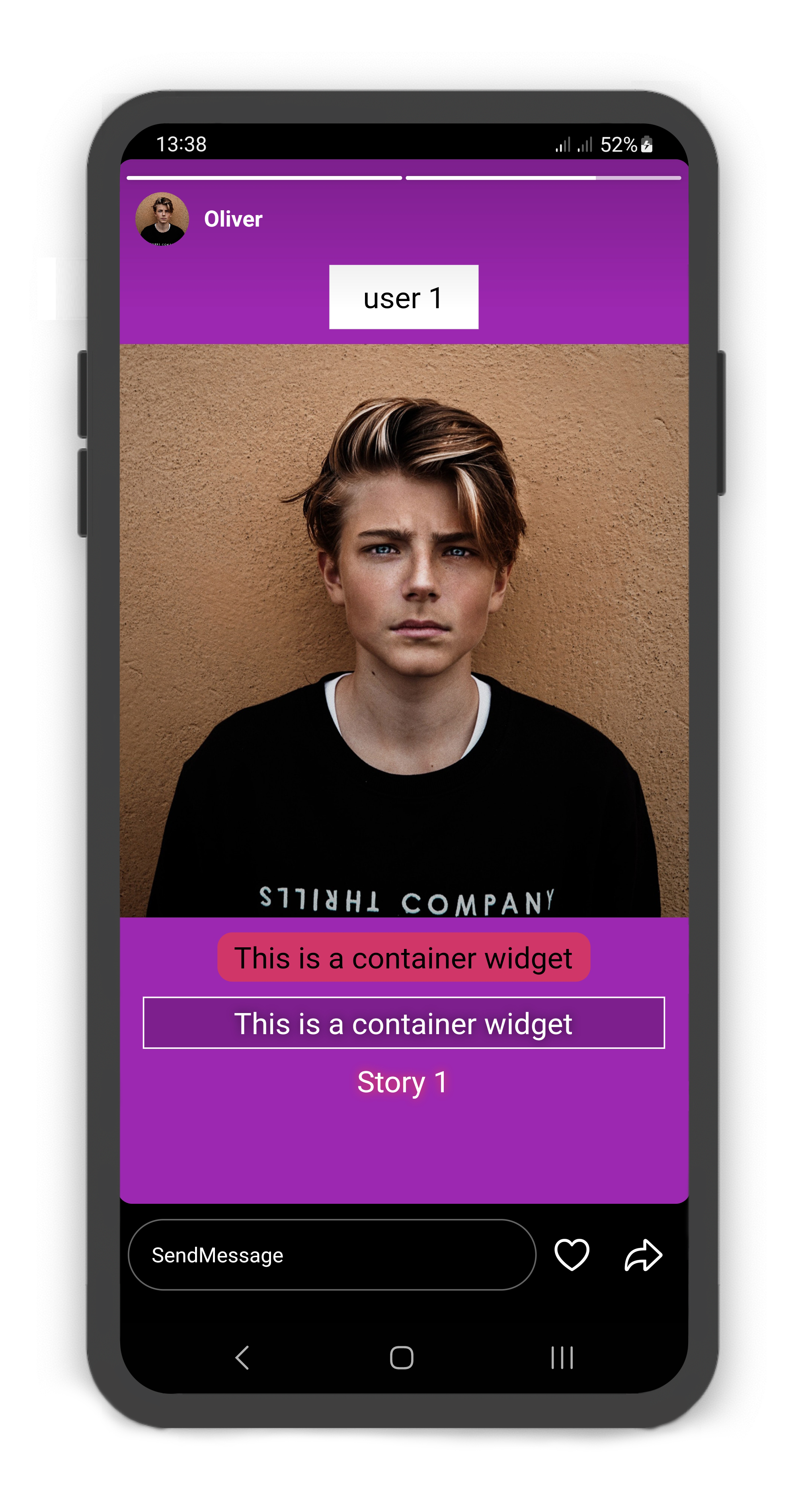
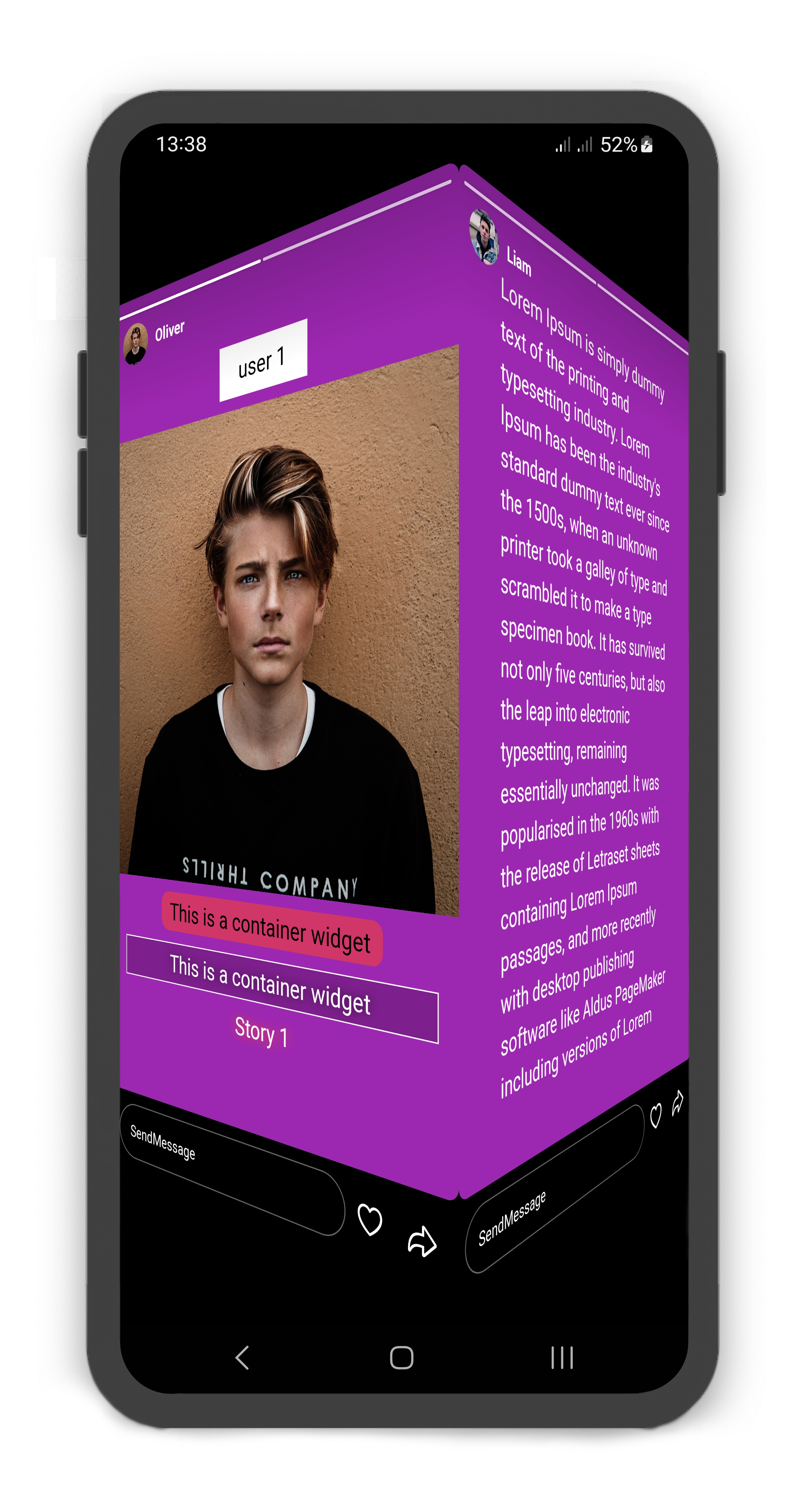

Source Link: example/lib/main.dart
Getting Started
- Installation
- Usage
- Custom Usage
- StoryUser Usage
- StoryCard Usage
- StoryCardFooter Usage
- StoryCardMessageBox Usage
- StoryCardLikeButton Usage
- StoryCardForwardButton Usage
- Story Controller
- Story Builder
Installation
Add flutter_story as a dependency in your pubspec.yaml file:
dependencies:
  flutter_story: ^1.0.1
Import the plugin package to your dart code
import 'package:flutter_story/flutter_story.dart';
Usage
 |  |
|---|
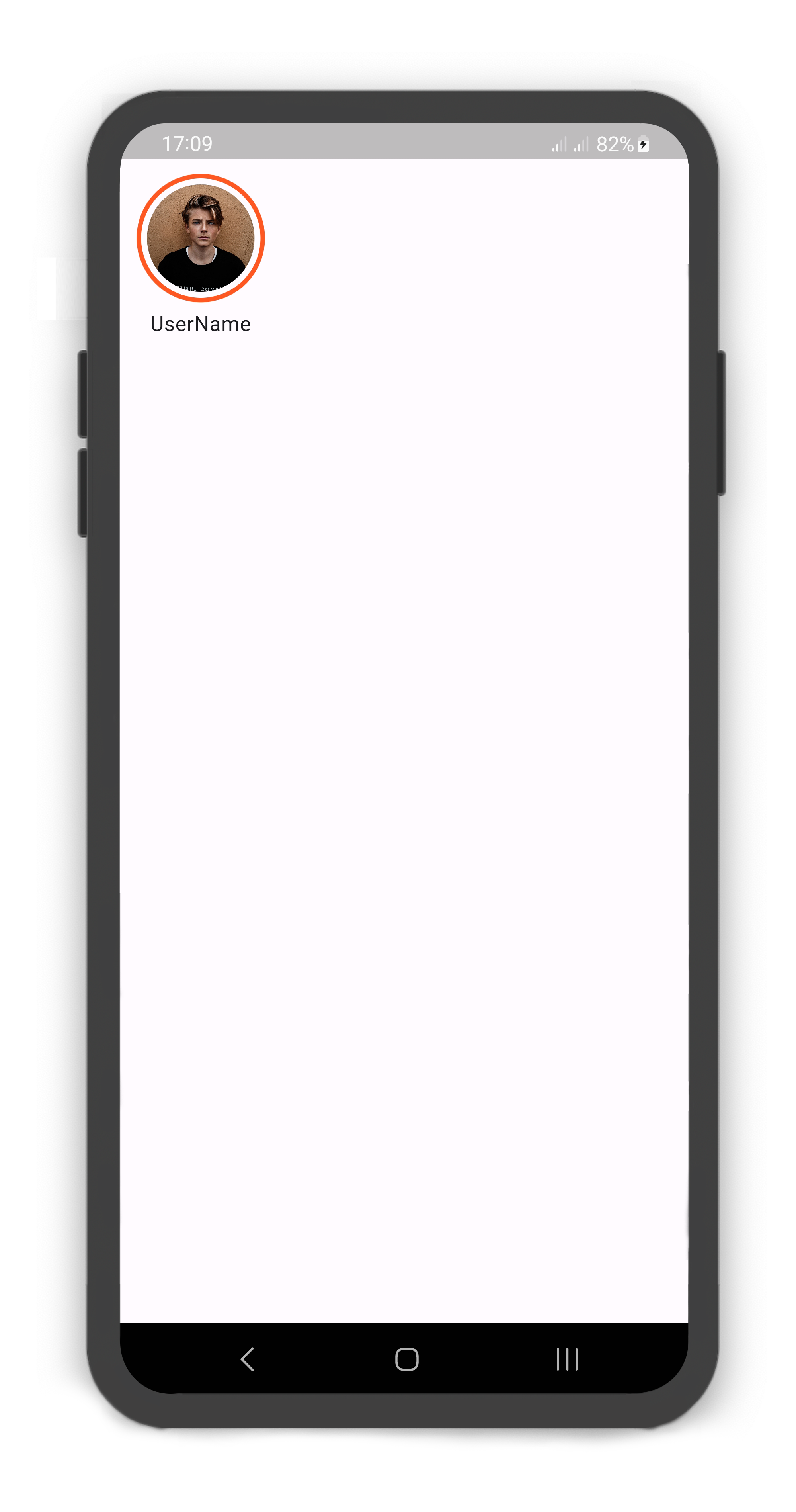
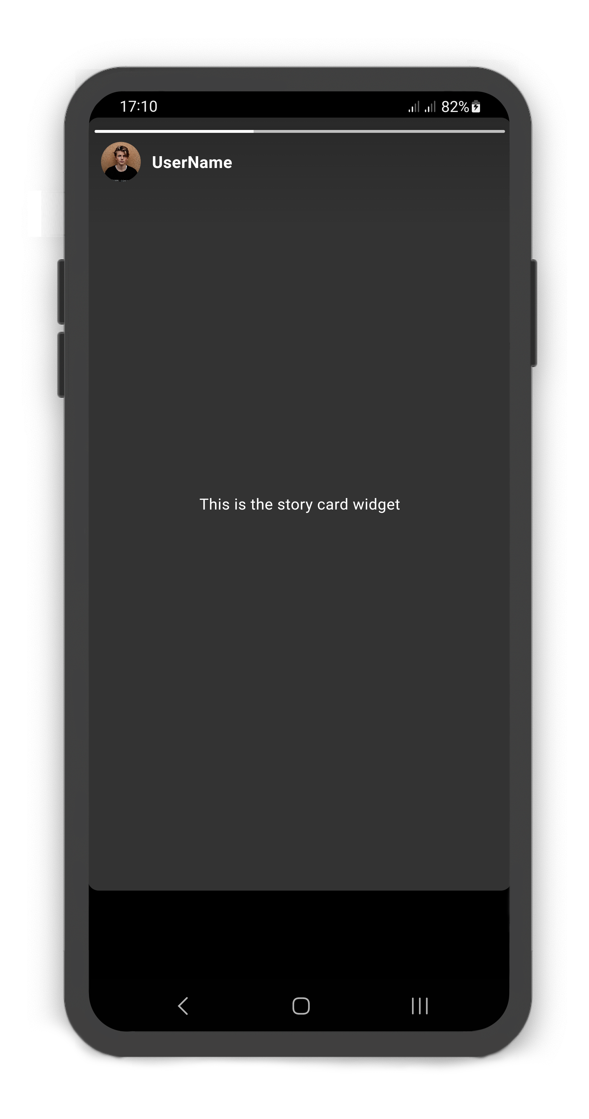
Simple usage
@override
Widget build(BuildContext context) {
  return Scaffold(
    body: SafeArea(
      child: Story(
        children: [
          StoryUser(
            avatar: Image.asset("assets/user_avatar.jpg"),
            label: const Text("UserName"),
            children: const [
              StoryCard(
                child: Center(
                  child: Text("This is the story card widget",
                    style: TextStyle(color: Colors.white),),
                ),
              )
            ],
          )
        ],
      ),
    ),
  );
}
Custom Usage
There are several options that allow for more control:
| Properties | Data Type | Description |
|---|---|---|
controller | StoryController | It can be used to control the state of Story. |
autoplay | bool | Allows autoplaying of Story. if set this to false, the Story does not play. |
height | double | The height of the Story. |
color | Color | The color to fill the Story. |
backgroundColor | Color | The color to fill the backgroundColor of the Story. |
padding | EdgeInsets | The padding of the Story. |
shrinkWrap | bool | Whether the extent of the scroll view in the scrollDirection should be determined by the contents being viewed. |
physics | ScrollPhysics | How the scroll view should respond to user input. |
reverse | bool | Whether the scroll view scrolls in the reading direction. |
scrollDirection | Axis | The Axis along which the scroll view's offset increases. Defaults to Axis.horizontal. |
scrollController | ScrollController | An object that can be used to control the position to which this scroll view is scrolled. |
children | List<StoryUser> | Creates a list of the StoryUser layout widget. |
itemBuilder | WidgetBuilder(StoryUser) | Creates a scrollable, linear array of widgets that are created on demand. |
sortByVisited | bool | If set to true, The list of Story sorts by StoryCard.visited. |
findChildIndexCallback | ChildIndexGetter | Called to find the new index of a child based on its key in case of reordering. |
itemCount | bool | The itemBuilder callback will be called only with indices greater than or equal to zero and less than itemCount. |
addAutomaticKeepAlives | bool | Whether to wrap each child in an AutomaticKeepAlive. Typically, children in lazy list are wrapped in AutomaticKeepAlive. |
addRepaintBoundaries | bool | Whether to wrap each child in a RepaintBoundary. Typically, children in a scrolling container are wrapped in repaint boundaries so that they do not need to be repainted as the list scrolls. |
addSemanticIndexes | bool | Whether to wrap each child in an IndexedSemantics. Typically, children in a scrolling container must be annotated with a semantic index in order to generate the correct accessibility announcements. |
StoryUser Usage
Using the StoryUser
Manually change the StoryUser properties.
| Properties | Data Type | Description |
|---|---|---|
userId | int | The userId of the StoryUser. |
width | double | The width of the StoryUser. |
height | double | The height of the StoryUser. |
margin | EdgeInsets | The margin of the StoryUser. |
avatarColor | Color | The color to fill the background of the StoryUser.avatar. |
borderWidth | double | Determines the width of the StoryUser border. |
borderColor | Color | Determines the color of the StoryUser border. |
visitedBorderColor | Color | Determines the color of the StoryCard border, when all StoryUser child visited. |
borderPadding | EdgeInsets | The padding of the StoryUser.avatar border. |
borderRadius | BorderRadius | If non-null, the corners of StoryUser are rounded by this. |
avatar | Widget | The avatar of the StoryUser. A Widget that is placed in the StoryUser.avatar. |
label | Text | A Text Widget that is placed in bottomCenter of the StoryUser.avatar. |
children | List<StoryCard> | Creates a StoryUser layout widget. By default, the non-positioned children of the StoryUser are aligned by their top left corners. |
onPressed | ValueChanged<int> | This callback is called when pressed on the StoryUser.avatar. Returns a index of the StoryUser list. |
onLongPressed | ValueChanged<int> | This callback is called when long pressed on the StoryUser.avatar. Returns a index of the StoryUser list. |
StoryCard Usage
Using the StoryCard
Manually change the StoryCard properties.
| Properties | Data Type | Description |
|---|---|---|
visited | bool | If set true, the next card is displayed and all previous cards must be set true. If all are set false, they will be displayed from the first card. If all are set true, they will be displayed from the first card and its borderColor change to StoryUser.borderColor. |
cardDuration | Duration | Determines the time to show the StoryCard. |
color | Color | The color of the StoryCard background. |
borderRadius | BorderRadius | If non-null, the corners of StoryCard are rounded by this. |
progressBarHeight | double | The progressBarHeight of the StoryCard tab bar. |
footer | StoryCardFooter | The footer of the StoryCard. A Widget that is placed in bottom of the StoryCard. |
childOverlay | Widget | A Widget that is placed on the StoryCard.child. |
child | Widget | Creates a StoryCard layout widget. |
onVisited | ValueChanged<int> | This callback is called when StoryCard is visited. Returns a card index of the StoryCard list. |
onDispose | ValueChanged<int> | This callback is called when StoryCard is dispose. Returns a card index of the StoryCard list. |
onPause | ValueChanged<int> | This callback is called when StoryCard is paused. Returns a card index of the StoryCard list. |
onResume | ValueChanged<int> | This callback is called when StoryCard is played. Returns a card index of the StoryCard list. |
onNext | ValueChanged<int> | This callback is called when next StoryCard is displayed. Returns a card index of the StoryCard list. |
onPrevious | ValueChanged<int> | This callback is called when previous StoryCard is displayed. Returns a card index of the StoryCard list. |
StoryCardFooter Usage
Using the StoryCardFooter
Manually change the StoryCardFooter properties.
| Properties | Data Type | Description |
|---|---|---|
messageBox | StoryCardMessageBox | If null, the child is displayed. |
likeButton | StoryCardLikeButton | If non-null, the likeButton is placed in right of the StoryCardMessageBox. |
forwardButton | StoryCardForwardButton | If non-null, the forwardButton is placed in right of the StoryCardMessageBox. |
child | Widget | Creates a StoryCardFooter layout widget. |
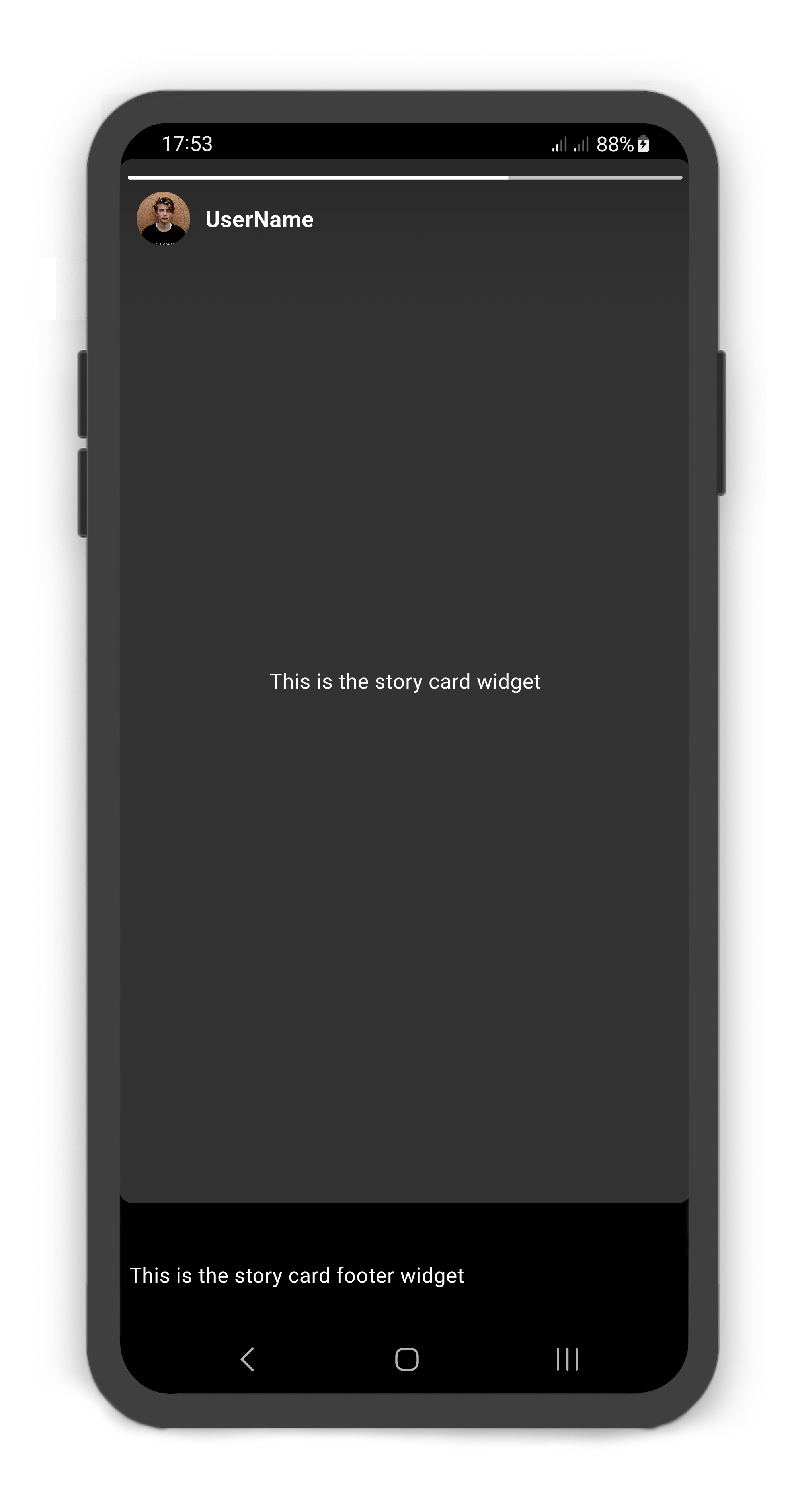
StoryCard includes footer: StoryCardFooter
@override
Widget build(BuildContext context) {
  return Scaffold(
    body: SafeArea(
      child: Story(
        children: [
          StoryUser(
            avatar: Image.asset("assets/user_avatar.jpg"),
            label: const Text("UserName"),
            children: const [
              StoryCard(
                footer: StoryCardFooter(
                  child: Text(
                    "This is the story card footer widget",
                    style: TextStyle(color: Colors.white),
                  ),
                ),
                child: Center(
                  child: Text(
                    "This is the story card widget",
                    style: TextStyle(color: Colors.white),
                  ),
                ),
              )
            ],
          )
        ],
      ),
    ),
  );
}
StoryCardMessageBox Usage
Using the StoryCardMessageBox
Manually change the StoryCardMessageBox properties.
| Properties | Data Type | Description |
|---|---|---|
color | Color | The text color of the StoryCardMessageBox. |
borderRadius | BorderRadius | If non-null, the corners of the StoryCardMessageBox are rounded by this. |
borderWidth | double | Determines the width of the StoryCardMessageBox border. |
hintText | String | The hintText of the StoryCardMessageBox. |
fontSize | double | The fontSize of the StoryCardMessageBox. |
child | Widget | Creates a layout widget on the StoryCard when the StoryCardMessageBox. |
onMessage | ValueChanged<StoryCardMessage> | This callback is called when previous StoryCard is displayed. Returns a StoryCardMessage that includes the card index and message. |
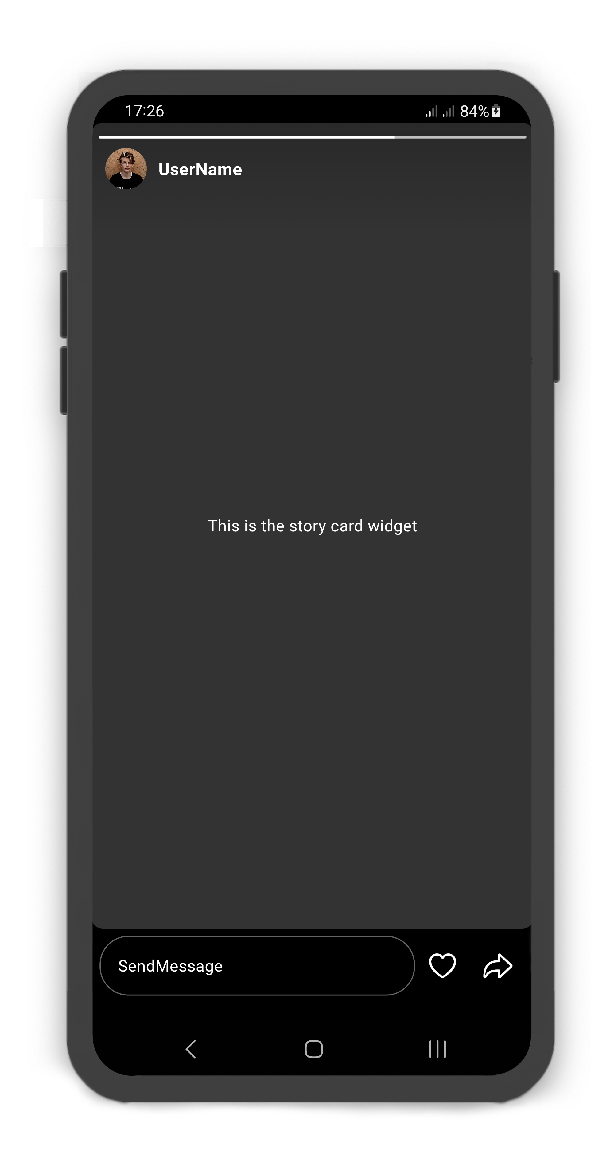
StoryCardFooter includes messageBox: StoryCardMessageBox
@override
Widget build(BuildContext context) {
  return Scaffold(
    body: SafeArea(
      child: Story(
        children: [
          StoryUser(
            avatar: Image.asset("assets/user_avatar.jpg"),
            label: const Text("UserName"),
            children: const [
              StoryCard(
                footer: StoryCardFooter(
                  messageBox: StoryCardMessageBox(),
                  likeButton: StoryCardLikeButton(),
                  forwardButton: StoryCardForwardButton(),
                ),
                child: Center(
                  child: Text(
                    "This is the story card widget",
                    style: TextStyle(color: Colors.white),
                  ),
                ),
              )
            ],
          )
        ],
      ),
    ),
  );
}
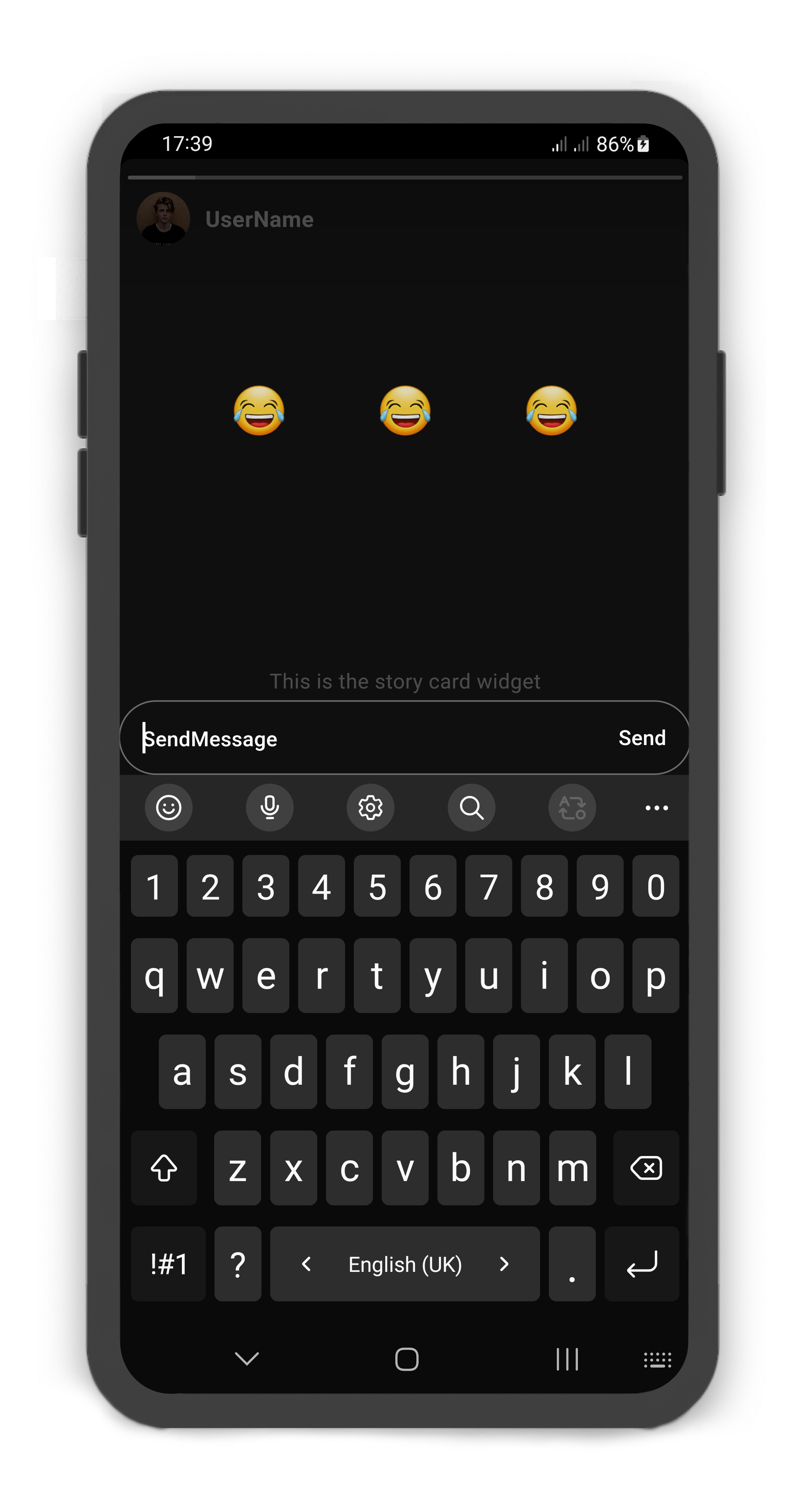
StoryCardMessageBox emojis
@override
Widget build(BuildContext context) {
  return Scaffold(
    body: SafeArea(
      child: Story(
        children: [
          StoryUser(
            avatar: Image.asset("assets/user_avatar.jpg"),
            label: const Text("UserName"),
            children: [
              StoryCard(
                footer: StoryCardFooter(
                  messageBox: StoryCardMessageBox(
                    child: Center(
                      child: Row(
                        mainAxisAlignment: MainAxisAlignment.center,
                        children: [
                          MaterialButton(
                            shape: const CircleBorder(),
                            child: const Text(
                              "😂",
                              style: TextStyle(fontSize: 32),
                            ),
                            onPressed: () {},
                          ),
                          const SizedBox(width: 10),
                          MaterialButton(
                            shape: const CircleBorder(),
                            child: const Text(
                              "😂",
                              style: TextStyle(fontSize: 32),
                            ),
                            onPressed: () {},
                          ),
                          const SizedBox(width: 10),
                          MaterialButton(
                            shape: const CircleBorder(),
                            child: const Text(
                              "😂",
                              style: TextStyle(fontSize: 32),
                            ),
                            onPressed: () {},
                          ),
                        ],
                      ),
                    ),
                  ),
                  likeButton: StoryCardLikeButton(),
                  forwardButton: StoryCardForwardButton(),
                ),
                child: const Center(
                  child: Text(
                    "This is the story card widget",
                    style: TextStyle(color: Colors.white),
                  ),
                ),
              )
            ],
          )
        ],
      ),
    ),
  );
}
StoryCardLikeButton Usage
Using the StoryCardLikeButton
Manually change the StoryCardLikeButton properties.
| Properties | Data Type | Description |
|---|---|---|
color | Color | The color of the StoryCardLikeButton. |
icon | IconData | A Icon Widget that is placed in right of the StoryCardMessageBox. Gets a IconData. |
iconSize | double | The iconSize of the StoryCardLikeButton. |
onLike | ValueChanged<StoryCardLike> | This callback is called when previous StoryCard is displayed. Returns a StoryCardLike that includes the card index and liked. |
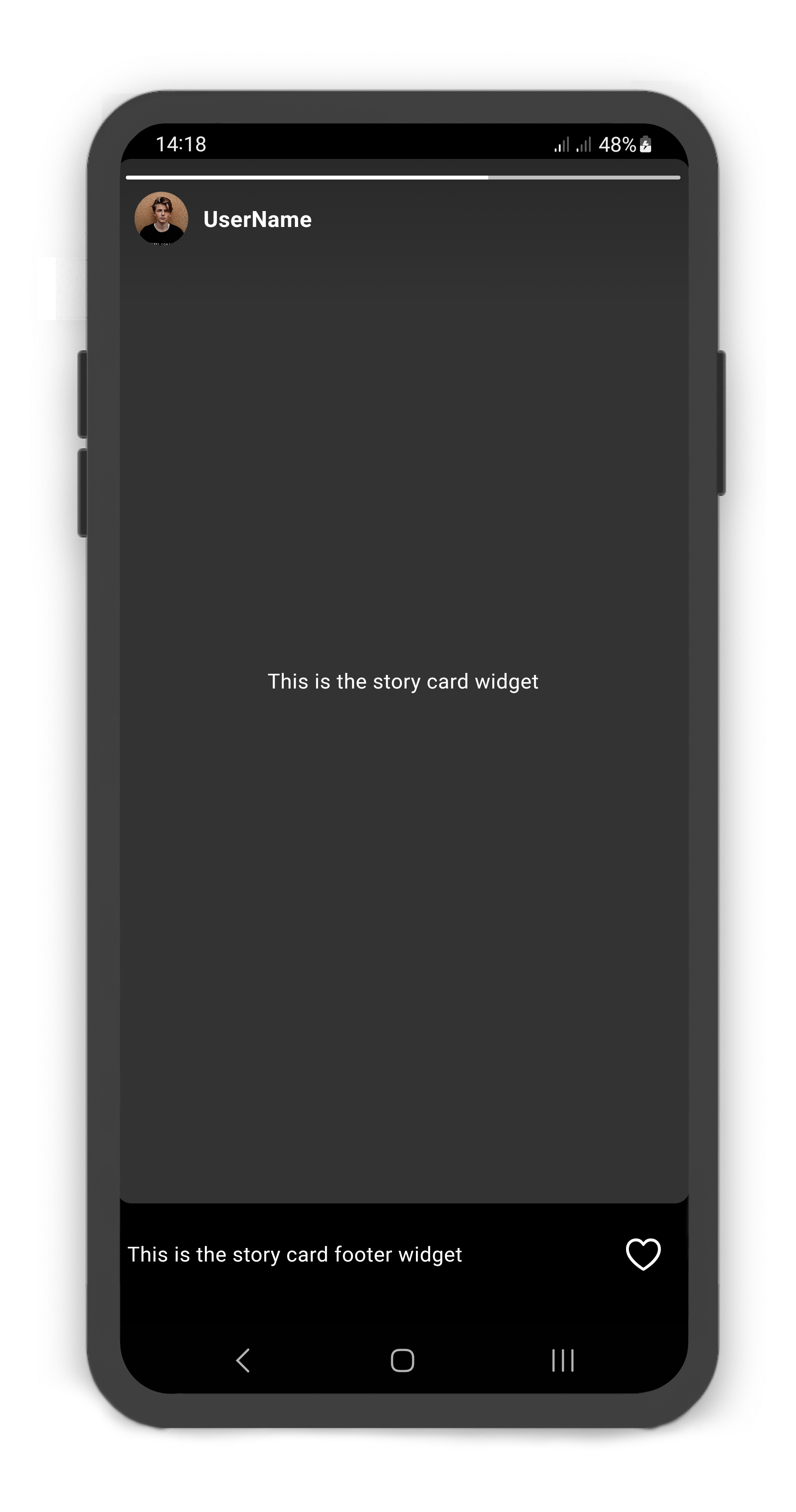
StoryCardFooter includes likeButton: StoryCardLikeButton
@override
Widget build(BuildContext context) {
  return Scaffold(
    body: SafeArea(
      child: Story(
        children: [
          StoryUser(
            avatar: Image.asset("assets/user_avatar.jpg"),
            label: const Text("UserName"),
            children: const [
              StoryCard(
                footer: StoryCardFooter(
                  likeButton: StoryCardLikeButton(),
                  child: Text(
                    "This is the story card footer widget",
                    style: TextStyle(color: Colors.white),
                  ),
                ),
                child: Center(
                  child: Text(
                    "This is the story card widget",
                    style: TextStyle(color: Colors.white),
                  ),
                ),
              )
            ],
          )
        ],
      ),
    ),
  );
}
StoryCardForwardButton Usage
Using the StoryCardForwardButton
Manually change the StoryCardForwardButton properties.
| Properties | Data Type | Description |
|---|---|---|
color | Color | The color of the StoryCardForwardButton. |
icon | IconData | A Icon Widget that is placed in right of the StoryCardMessageBox. Gets a IconData. |
iconSize | double | The iconSize of the StoryCardForwardButton. |
child | Widget | Creates a layout widget on the StoryCard. |
onForward | ValueChanged<int> | This callback is called when previous StoryCard is displayed. Returns a card index of the StoryCard list. |
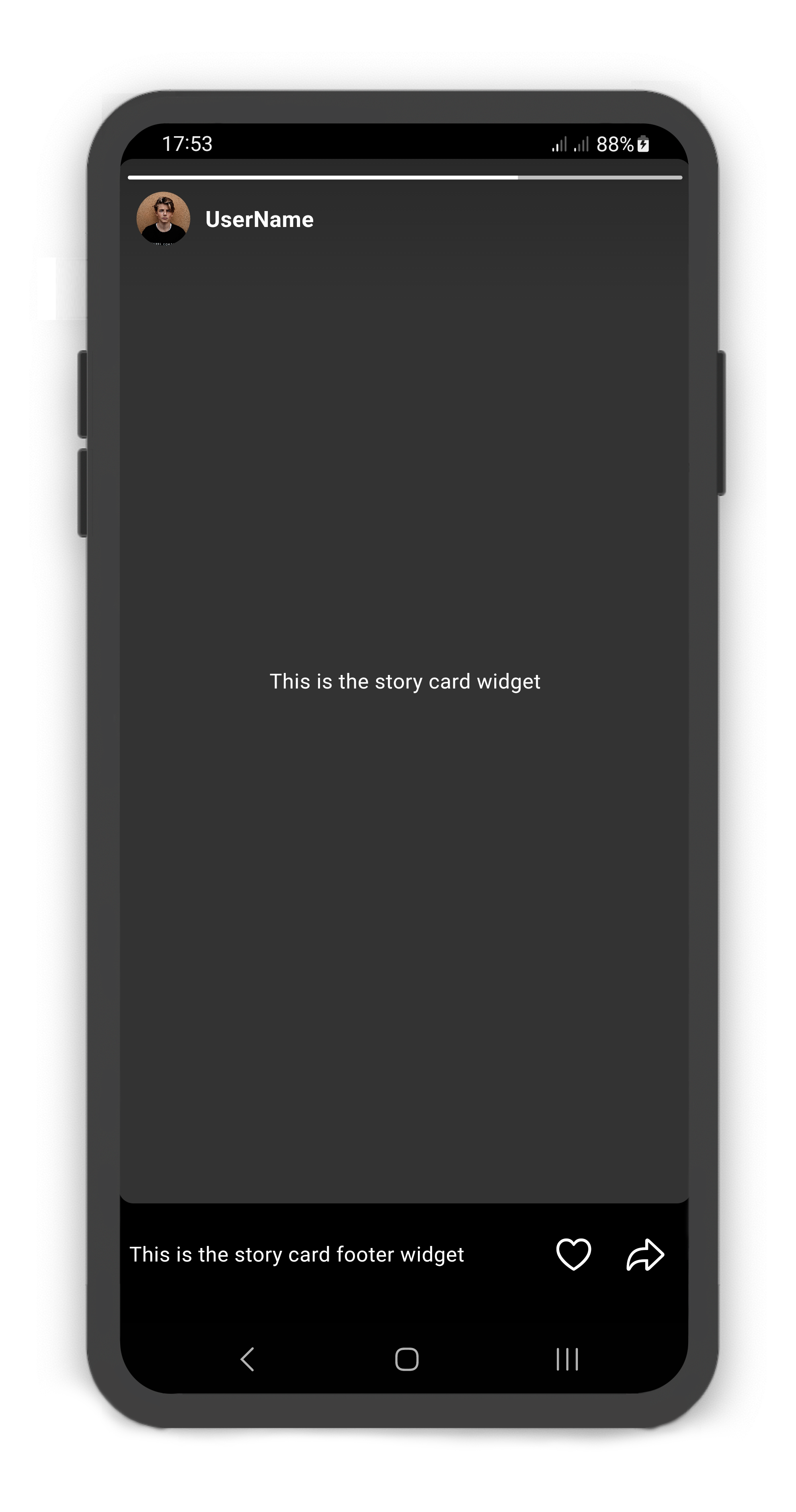
StoryCardFooter includes forwardButton: StoryCardForwardButton
@override
Widget build(BuildContext context) {
  return Scaffold(
    body: SafeArea(
      child: Story(
        children: [
          StoryUser(
            avatar: Image.asset("assets/user_avatar.jpg"),
            label: const Text("UserName"),
            children: const [
              StoryCard(
                footer: StoryCardFooter(
                  likeButton: StoryCardLikeButton(),
                  forwardButton: StoryCardForwardButton(),
                  child: Text(
                    "This is the story card footer widget",
                    style: TextStyle(color: Colors.white),
                  ),
                ),
                child: Center(
                  child: Text(
                    "This is the story card widget",
                    style: TextStyle(color: Colors.white),
                  ),
                ),
              )
            ],
          )
        ],
      ),
    ),
  );
}
StoryController
Using the StoryController
Manually change the Story state. For better performance, use a StoryController as controller (recommended).
| Properties | Data Type | Description |
|---|---|---|
isAttached | bool | Determine if the Story.controller is attached to an instance of the Story (this property must be true before any other StoryController functions can be used). |
isAutoplay | bool | Returns whether or not the Story is Autoplay. |
| Methods | Return Type | Description |
|---|---|---|
pauseStory() | void | Pauses the Story. |
playStory() | void | Plays the Story. |
closeStory() | void | Closes the Story. |
openStory() | void | Opens the Story. If the cardIndex null, default cardIndex is not StoryCard.visited. |
openStoryByUserId() | void | Opens the Story by StoryUser.userId. If the cardIndex null, default cardIndex is not StoryCard.visited. |
setStoryCardVisited() | void | Sets a value for the StoryCard.visited. |
setStoryCardVisitedByUserId() | void | Sets a value for the StoryCard.visited by StoryUser.userId. |
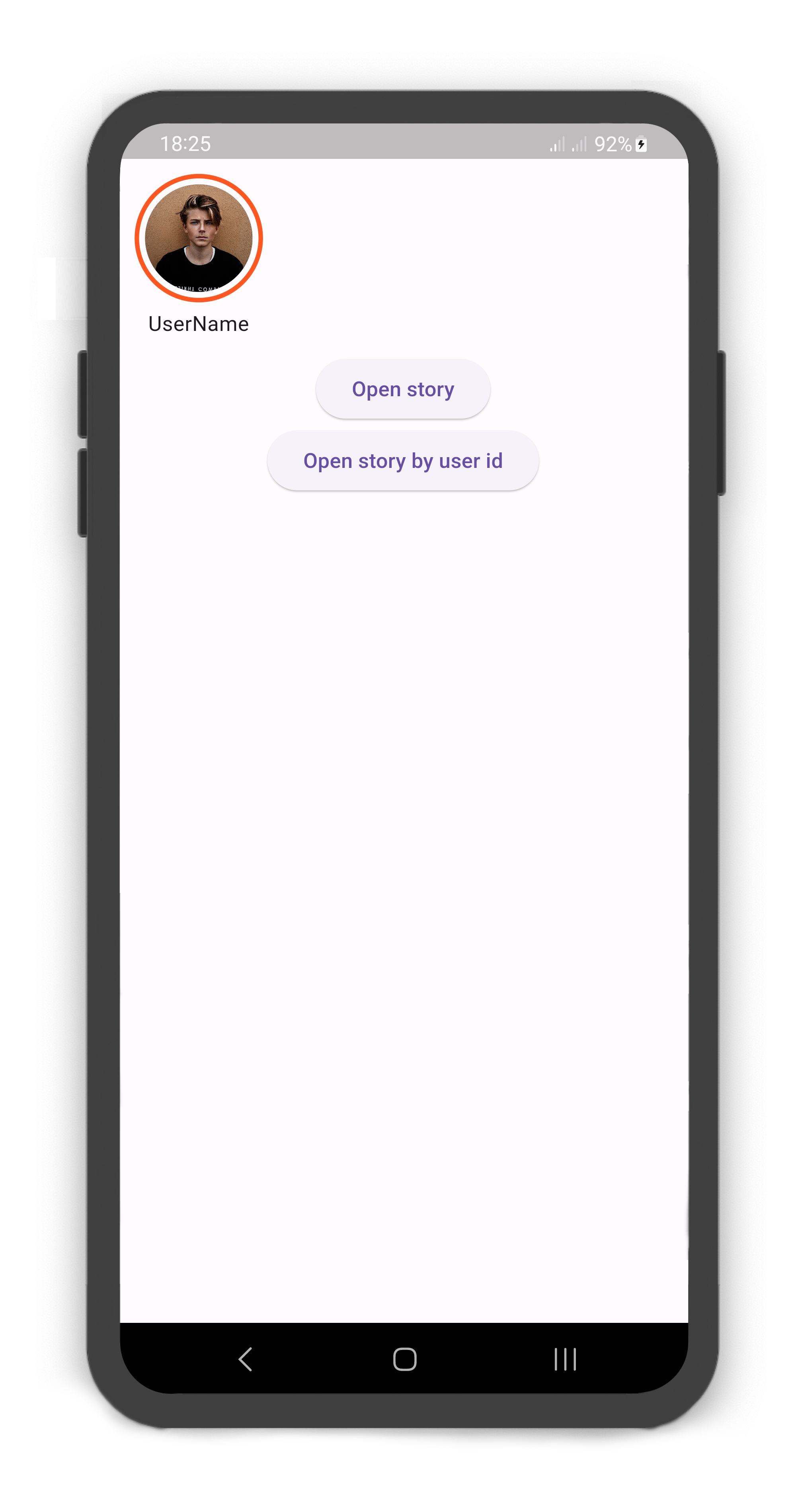 | 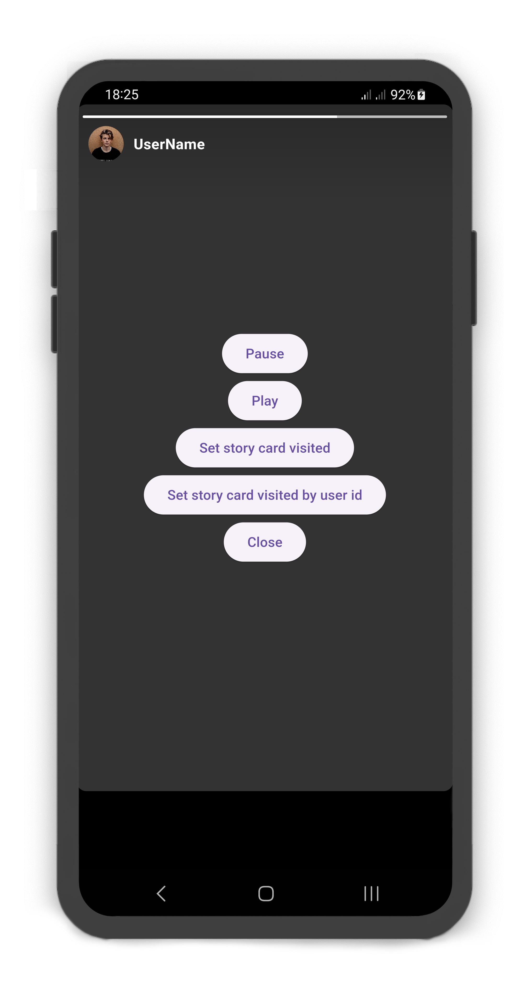 |
|---|
StoryController storyController = StoryController();

@override
Widget build(BuildContext context) {
  return Scaffold(
    body: SafeArea(
      child: Column(
        crossAxisAlignment: CrossAxisAlignment.start,
        children: [
          Story(
            controller: storyController,
            children: [
              StoryUser(
                userId: 1,
                avatar: Image.asset("assets/user_avatar.jpg"),
                label: const Text("UserName"),
                children: [
                  StoryCard(
                    childOverlay: Center(
                      child: Column(
                        mainAxisAlignment: MainAxisAlignment.center,
                        children: [
                          ElevatedButton(
                            onPressed: () => storyController.pauseStory(),
                            child: const Text("Pause"),
                          ),
                          ElevatedButton(
                            onPressed: () => storyController.playStory(),
                            child: const Text("Play"),
                          ),
                          ElevatedButton(
                            onPressed: () =>
                                storyController.setStoryCardVisited(
                                    storyIndex: 0,
                                    cardIndex: 0,
                                    visited: true),
                            child: const Text("Set story card visited"),
                          ),
                          ElevatedButton(
                            onPressed: () =>
                                storyController.setStoryCardVisitedByUserId(
                                    userId: 1, cardIndex: 0, visited: true),
                            child: const Text(
                                "Set story card visited by user id"),
                          ),
                          ElevatedButton(
                            onPressed: () => storyController.closeStory(),
                            child: const Text("Close"),
                          ),
                        ],
                      ),
                    ),
                  )
                ],
              )
            ],
          ),
          Center(
            child: Column(
              children: [
                ElevatedButton(
                  onPressed: () => storyController.openStory(context,
                      storyIndex: 0, cardIndex: 0),
                  child: const Text("Open story"),
                ),
                ElevatedButton(
                  onPressed: () => storyController.openStoryByUserId(context,
                      userId: 1, cardIndex: 0),
                  child: const Text("Open story by user id"),
                ),
              ],
            ),
          )
        ],
      ),
    ),
  );
}
StoryBuilder
Using the Story.builder
StoryController storyController = StoryController();
late List<StoryModel> stories;

@override
void initState() {
  super.initState();
  stories = getStories();
}

@override
void dispose() {
  super.dispose();
  storyController.dispose();
}

@override
Widget build(BuildContext context) {
  return Scaffold(
    body: SafeArea(
      child: Story.builder(
          controller: storyController,
          itemCount: stories.length,
          itemBuilder: (context, index) {
            return StoryUser(
              avatar: stories[index].avatar,
              label: stories[index].label,
              children: stories[index].cards == null
                  ? []
                  : stories[index].cards!.map((card) =>
                  StoryCard(
                    color: card.color,
                    cardDuration: card.duration,
                    childOverlay: card.childOverlay,
                    visited: card.visited,
                    onVisited: (cardIndex) {
                      setState(() {
                        card.visited = true;
                      });
                    },
                    child: card.child,
                  )).toList(),
            );
          }),
    ),
  );
}

List<StoryModel> getStories() {
  return [
    StoryModel(
        avatar: Image.asset("assets/user_avatar.jpg"),
        label: const Text("UserName"),
        cards: [
          StoryCardModel(
            child: const Center(
              child: Text(
                "This is the story card widget",
                style: TextStyle(color: Colors.white),
              ),
            ),
          )
        ]
    ),
  ];
}

class StoryModel {
  StoryModel({
    this.userId,
    this.avatar,
    this.label,
    this.cards,
  });

  int? userId;
  Widget? avatar;
  Text? label;
  List<StoryCardModel>? cards;
}

class StoryCardModel {
  StoryCardModel({
    this.visited = false,
    this.duration = const Duration(seconds: 2),
    this.color = const Color(0xff333333),
    this.childOverlay,
    this.child,
  });

  bool visited;
  Duration duration;
  Color color;
  Widget? childOverlay;
  Widget? child;
}