flutter_toggle_tab 1.5.1
SDKflutter
Platformandroidioswindowslinuxmacosweb
Library to create Beautiful and Customized Toggle Tab Widget on Flutter
Flutter Tab Toggle

A Beautiful and Simple Toggle Tab widget. It can be fully customized with desired icons, width, colors, text, corner radius, etc. It also maintains selection state.
Getting Started
In the pubspec.yaml of your flutter project, add the following dependency:
dependencies:
  flutter_toggle_tab: "^latestVersion"
Import it:
import 'package:flutter_toggle_tab/flutter_toggle_tab.dart';
Usage Examples
Basic tab/toggle switch

// Here default theme colors are used for activeBgColor, activeFgColor, inactiveBgColor and inactiveFgColor
FlutterToggleTab
(
  width: 90, // width in percent
  borderRadius: 30,
  height: 50,
  selectedIndex: _tabTextIndexSelected,
  selectedBackgroundColors: [Colors.blue, Colors.blueAccent],
  selectedTextStyle: TextStyle(
  color: Colors.white,
  fontSize: 18,
  fontWeight: FontWeight.w700),
  unSelectedTextStyle: TextStyle(
  color: Colors.black87,
  fontSize: 14,
  fontWeight: FontWeight.w500),
  dataTabs: _listTextTabToggle,
  selectedLabelIndex: (index) {
    setState(() {
        _tabTextIndexSelected = index;
    });
  },
  isScroll:false,
)
Basic tab/toggle switch with Custom Counter Widget

// Here default theme colors are used for activeBgColor, activeFgColor, inactiveBgColor and inactiveFgColor
FlutterToggleTab
(
  width: 90, // width in percent
  borderRadius: 30,
  height: 50,
  selectedIndex: _tabTextIndexSelected,
  selectedBackgroundColors: [Colors.blue, Colors.blueAccent],
  selectedTextStyle: TextStyle(
  color: Colors.white,
  fontSize: 18,
  fontWeight: FontWeight.w700),
  unSelectedTextStyle: TextStyle(
  color: Colors.black87,
  fontSize: 14,
  fontWeight: FontWeight.w500),
  dataTabs: _listTextTabToggleCounter,
  selectedLabelIndex: (index) {
    setState(() {
        _tabTextIndexSelected = index;
    });
  },
  isScroll:false,
)
Basic tab/toggle switch with Icon
FlutterToggleTab
(
  width: 50,
  borderRadius: 15,
  selectedTextStyle: TextStyle(
  color: Colors.white,
  fontSize: 18,
  fontWeight: FontWeight.w600),
  unSelectedTextStyle: TextStyle(
  color: Colors.blue,
  fontSize: 14,
  fontWeight: FontWeight.w400),
  dataTabs: _listGenderText,
  selectedIndex: _tabTextIconIndexSelected,
  selectedLabelIndex: (index) {
    setState(() {
      _tabTextIconIndexSelected = index;
    });
  },
)
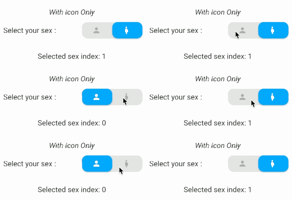
Basic tab/toggle switch with Icon Only and add margin on selected item

FlutterToggleTab
(
  width: 40,
  borderRadius: 15,
  selectedIndex: _tabIconIndexSelected,
  selectedTextStyle: TextStyle(
  color: Colors.white,
  fontSize: 18,
  fontWeight: FontWeight.w600),
  unSelectedTextStyle: TextStyle(
  color: Colors.grey,
  fontSize: 14,
  fontWeight: FontWeight.w400),
  dataTabs: _listIconTabToggle,
  selectedLabelIndex: (index) {
    setState(() {
      _tabIconIndexSelected = index;
    });
  },
  marginSelected: EdgeInsets.symmetric(horizontal: 4,vertical:4),
)
Update selected tab Programmatically
FlutterToggleTab
(
  width: 90,
  borderRadius: 15,
  selectedIndex: _tabSelectedIndexSelected,
  selectedTextStyle: TextStyle(
  color: Colors.white,
  fontSize: 18,
  fontWeight: FontWeight.w600),
  unSelectedTextStyle: TextStyle(
  color: Colors.grey,
  fontSize: 14,
  fontWeight: FontWeight.w400),
  dataTabs: _listTextSelectedToggle,
  selectedLabelIndex: (index) {
    setState(() {
      _tabSelectedIndexSelected = index;
    });
  },
)
Available Parameters
| Param | isRequired |
|---|---|
| List<DataTab> dataTabs | Yes |
| Function(int) selectedLabelIndex | Yes |
| TextStyle selectedTextStyle default:Theme.of(context).textTheme.bodyMedium, | No |
| TextStyle unSelectedTextStyle default:Theme.of(context).textTheme.bodyMedium, | No |
| int selectedIndex (listener for index selected) see on example | Yes |
| double width (in Percent of width Screen) default: 100 | No |
| double height (double) default: 45 | No |
| double iconSize | No |
| double borderRadius (double) default 30 | No |
| List<Color> selectedBackgroundColors default : [ Theme.of(context).primaryColor] | No |
| List<Color> unSelectedBackgroundColors default [ Color(0xffe0e0e0)] | No |
| Alignment begin default : Alignment.topCenter | No |
| Alignment end default : Alignment.bottomCenter | No |
| bool isScroll default : true | No |
| EdgeInsets marginSelected default : EdgeInsets.zero | No |
| bool isShadowEnable default : true | No |
| bool isInnerShadowEnable default : true | No |

|

|
Buy me coffee if you love my works ☕️