image_compare_slider 2.8.0
Easily compare two images with a slider and a draggable line/handle, fully customizable.
Image Compare Slider






Inspired by react-compare-slider, this package allows you to easily compare two images with a slider.
PR's are welcome!
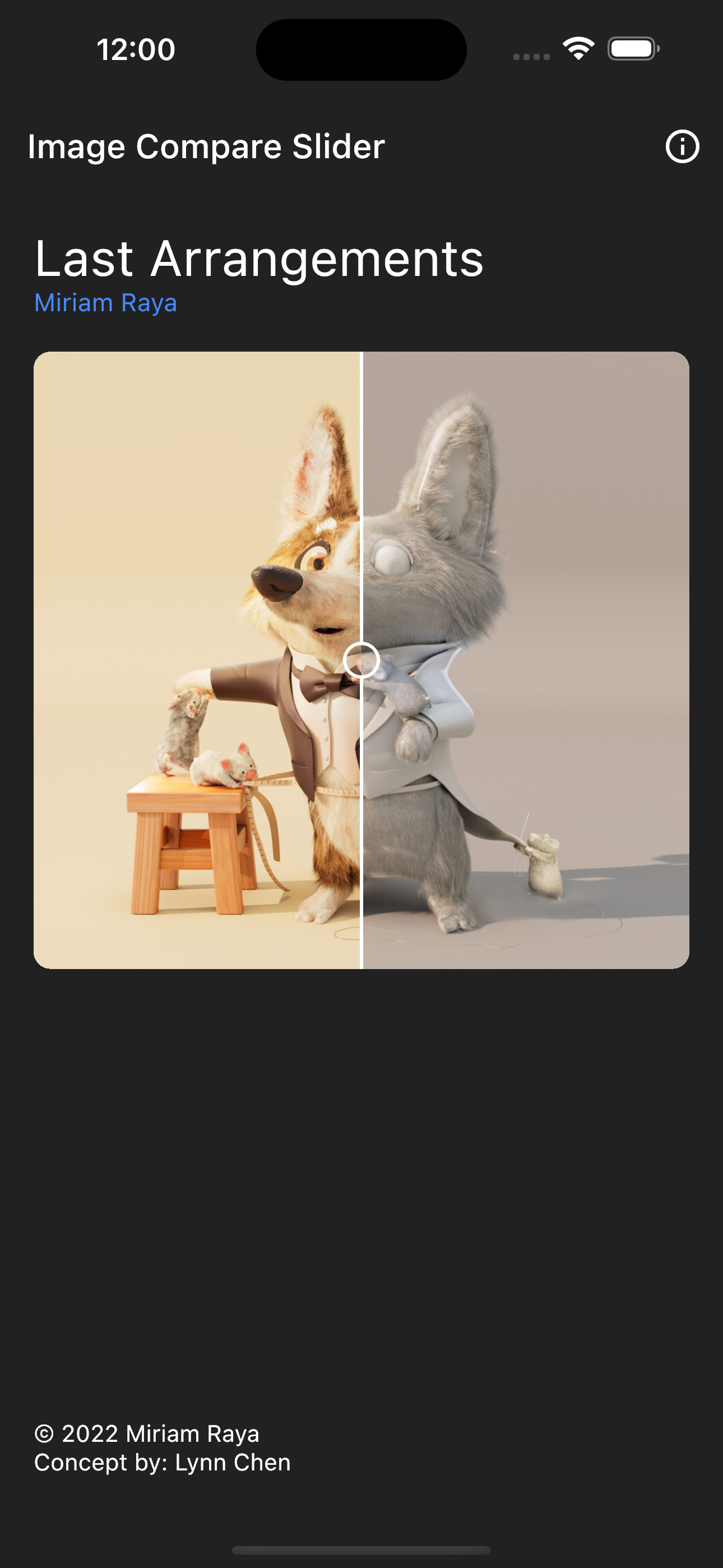
Installation 💻
❗ In order to start using Image Compare you must have the Dart SDK installed on your machine.
Add image_compare_slider to your pubspec.yaml:
dependencies:
  image_compare_slider:
Install it:
dart pub get
Import it:
import 'package:image_compare_slider/image_compare_slider.dart';
Use it:
//...
ImageCompareSlider(
  itemOne: const Image.asset('...'),
  itemTwo: const Image.network('...'),
)
//...
The widget its pretty simple and customizable, see:

Customization 🎨
You can customize the widget with the following parameters:
| Parameter | Type | Description |
|---|---|---|
itemOne | Image | The first image to compare |
itemTwo | Image | The second image to compare |
changePositionOnHover | bool | If the slider should change position when the mouse is over it |
handleSize | Size | The size of the handle |
handleRadius | BorderRadius | The radius of the handle |
fillHandle | bool | If the handle should be filled |
hideHandle | bool | If the handle should be hidden |
handlePosition | double | The position of the handle relative to the slider |
handleFollowsPosition | bool | If the handle should follow the position of the slider |
onPositionChange | void Function(double position)? | The callback to be called when the position changes |
direction | SliderDirection | The direction of the slider will clip the image |
dividerColor | Color | The color of the divider |
handleColor | Color | The color of the handle |
handleOutlineColor | Color | The color of the handle outline |
dividerWidth | double | The width of the divider |
itemOneBuilder | Widget Function(Widget child, BuildContext context)? | The wrapper for the first image |
itemTwoBuilder | Widget Function(Widget child, BuildContext context)? | The wrapper for the second image |
photoRadius | BorderRadiusGeometry | Radius of the photo. |
If you want to add some effects you can use the itemOneBuilder and itemTwoBuilder parameters to wrap the images with a ColorFilter or ImageFilter, or any other widget you want.
For example, to add a ImageFilter with a blur effect:
// ...
ImageCompareSlider(
  itemOne: const Image.asset('...'),
  itemTwo: const Image.asset('...'),
  itemOneBuilder: (child, context) => ImageFiltered(
  imageFilter: ImageFilter.blur(sigmaX: 2, sigmaY: 5),
    child: child,
  ),
)
// ...
Will result in:
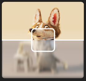
You can also pass any custom properties to the Image for itemOne and itemTwo, and most of the Image properties will be applied to the ImageCompareSlider widget.
For example, adding a colorBlendMode with a color to itemOne:
// ...
ImageCompareSlider(
  itemOne: const Image.asset('...', color: Colors.red, colorBlendMode: BlendMode.overlay),
  itemTwo: const Image.asset('...'),
)
// ...
Will result in:

Customizing the handle and divider is also possible:
// ...
ImageCompareSlider(
  itemOne: const Image.asset('...'),
  itemTwo: const Image.asset('...'),
  handleSize: Size(0.05, 0.05),
  handleRadius: const BorderRadius.all(Radius.circular(50)),
  fillHandle: true,
  dividerColor: Colors.black,
  dividerWidth: 10,
  handlePosition: 0.8,
  // ...
)
// ...
Will result in:

If you are having problems because height/width is not the same for both images, consider using Intrinsics in the builder:
// ...
ImageCompareSlider(
  itemOne: const Image.asset('...'),
  itemTwo: const Image.asset('...'),
  itemOneBuilder: (child, context) => IntrinsicHeight(child: child),
  itemTwoBuilder: (child, context) => IntrinsicHeight(child: child),
  // or
  itemOneBuilder: (child, context) => IntrinsicWidth(child: child),
  itemTwoBuilder: (child, context) => IntrinsicWidth(child: child),
)