morph_switch 1.0.3
A Flutter package for morphing animated switches/sliders with gradients, icons, and glass effects. Highly customizable shapes, sizes, and animations. Perfect for modern UIs.
MorphSwitch
Beautiful, animated, and highly customizable toggle switches and sliders for Flutter.
Instlation
Add to your pubspec.yaml:
dependencies:
  morph_switch: ^1.0.0
Then, run:
flutter pub get
Basic Usage
1- MorphSwith
import 'package:morphswitch/morphswitch.dart';

MorphSwitch(
  stateValue: _isActive,
  onBgColor: Colors.green,
  offBgColor: Colors.red,
  thumbOnIcon: Icons.check,
  thumbOffIcon: Icons.close,
  onSwitch: (value) => setState(() => _isActive = value),
),
2- MorphSlider
MorphSlider(
  stateValue: _isDark,
  onIcon: Icons.volume_up,
  offIcon: Icons.volume_off,
  onSwitch: (value) => setState(() => _isDark = value),
),
Customization
| Property | Description | Example Values |
|---|---|---|
thumbType | Thumb shape (circle, square) | ThumbType.circle |
switcherRadius | Border radius (per-corner) | SwitcherRadius.all(radius: 20) |
glassProperties | Glass effect | GlassProperties(sigma: 2.0) |
onBgImage/offBgImage | Background images | Paths.dayImg |
onLabel/offLabel | Background Text labels | onLabel: "ON" |
isVertical | Rotate the Switch 90° on x-axis | isVertical: true, |
imageTransitionStyle | Image Transition Style (fade, scale, none) | imageTransitionStyle: ImageTransitionStyle.fade, |
iconTransitionStyle | Icon Transition Style (fade, scale, none) | iconTransitionStyle: IconTransitionStyle.scale, |
switchCurve | Animation curve for all the animated properties | switchCurve: Curves.bounceOut, |
size | Preset size configuration | size: SwitcherSize.medium, |
textPadding | Gives the onLabel/offlabel extra width | textPadding: 20, |
Features
-
Smooth Animations: Rotation, scaling, sliding, and dynamic transitions.
-
Fully Customizable: Colors, gradients, borders, icons, labels, and shadows.
-
Multiple Thumb Types: Circle (ThumbType.circle), square (ThumbType.square), or icon-based.
-
Glass Morphism: Frosted-glass effect (GlassProperties).
-
Image/Gradient Backgrounds: Use assets or gradients for the switch background.
-
Flexible Layouts: Vertical/horizontal orientation, responsive sizing.
-
Predefined Sizes: From SwitcherSize.small to xxLarge.
As a developer, you can modify everything in this package. The switching algorithm is intentionally designed to be simple and easy to adapt to your needs.
Screenshots && Advanced example
Example 1
Code :
MorphSwitch(
  stateValue: testSwitcher11,
  onBgImage: Paths.dayImg,
  offBgImage: Paths.nightImg,
  switcherRadius: const SwitcherRadius.all(radius: 40.0),
  width: _screenWidth * .45,
  height: _screenHeight * .09,
  thumbRadius: 28.0,
  borderColor: Colors.white,
  thumbOnBgColor: const Color(0xFF77B254), //7B4019
  thumbOffBgColor: const Color(0xFF0D47A1),
  thumbOnIcon: Icons.light_mode,
  thumbOffIcon: Icons.dark_mode,
  thumbIconColor: testSwitcher11 ? Colors.yellow : const Color(0xFF64B5F6),
  thumbBorderColor: Colors.white,
  borderWidth: 2.0,
  boxShadow: <BoxShadow>[
    BoxShadow(
      blurRadius: 10.0,
      spreadRadius: 4.0,
      color: testSwitcher11 ? Colors.green.shade500 : Colors.blue.shade500,
      offset: const Offset(4, 4),
    ),
  ],
  onSwitch: (newValue) {
    setState(() => testSwitcher11 = newValue);
  },
),
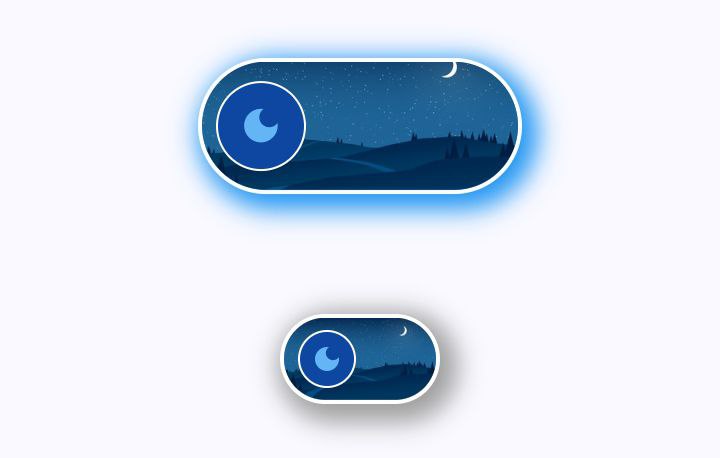
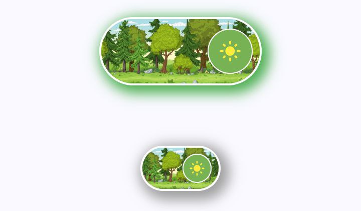
Customizable background image and and outter shaow with switching curve
Screenshots
| MorphSwitch off State | MorphSwitch on State |
|---|---|
 |  |
Example 2
Code:
              MorphSwitch(
                stateValue: testSwitcher9,
                width: _screenWidth * .9,
                height: _screenHeight * .07,
                thumbRadius: 25.0,
                switcherRadius: const SwitcherRadius.all(radius: 40.0),
                onBgColor: Colors.green,
                offBgColor: Colors.red,
                thumbOnBgColor: const Color(0xFF3eff8b),
                thumbOffBgColor: Colors.grey,
                thumbOnIcon: Icons.mood,
                thumbOffIcon: Icons.mood_bad,
                thumbIconColor: Colors.indigo,
                onBgIcon: Icons.credit_card,
                offBgIcon: Icons.credit_card_off,
                onSwitch: (newState) {
                  setState(() => testSwitcher9 = newState);
                },
                onSwipeLeft: (off) {
                  setState(() => testSwitcher9 = off);
                },
                onSwipeRight: (on) {
                  setState(() => testSwitcher9 = on);
                },
              ),
              _gapH,

              MorphSwitch(
                stateValue: testSwitcher9,
                width: _screenWidth * .7,
                height: _screenHeight * .07,
                thumbRadius: 25.0,
                switcherRadius: const SwitcherRadius.all(radius: 40.0),
                onBgColor: Colors.green,
                offBgColor: Colors.red,
                thumbOnBgColor: const Color(0xFF3eff8b),
                thumbOffBgColor: Colors.grey,
                thumbOnIcon: Icons.mood,
                thumbOffIcon: Icons.mood_bad,
                thumbIconColor: Colors.indigo,
                onLabel: "HAPPY",
                offLabel: "SAD",
                onLabelStyle: const TextStyle(fontWeight: FontWeight.bold),
                offLabelStyle: const TextStyle(fontWeight: FontWeight.bold),
                /* onBgIcon: Icons.credit_card,
                offBgIcon: Icons.credit_card_off, */
                onSwitch: (newState) {
                  setState(() => testSwitcher9 = newState);
                },
              ),

              _gapH,

              MorphSwitch(
                stateValue: testSwitcher9,
                width: _screenWidth * .5,
                height: _screenHeight * .07,
                thumbRadius: 25.0,
                switcherRadius: const SwitcherRadius.all(radius: 40.0),
                onBgColor: Colors.green,
                offBgColor: Colors.red,
                thumbOnBgColor: const Color(0xFF3eff8b),
                thumbOffBgColor: Colors.grey,
                thumbOnIcon: Icons.mood,
                thumbOffIcon: Icons.mood_bad,
                thumbIconColor: Colors.indigo,
                onBgIcon: Icons.notifications_active,
                offBgIcon: Icons.notifications_off,
                onSwitch: (newState) {
                  setState(() => testSwitcher9 = newState);
                },
              ),
Screenshots
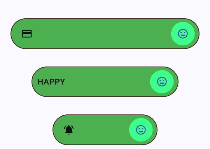
Customizable sizes for the
width,height, andthumbRadius
Example 3
Code:
              SizedBox(
                height: _screenHeight * .2,
                width: _screenWidth * .8,
                child: Stack(
                  alignment: Alignment.center,
                  children: <Widget>[
                    Positioned.fill(
                      child: ClipRRect(
                        borderRadius: BorderRadius.circular(20.0),
                        child: Image.asset(
                          Paths.testGlass,
                          fit: BoxFit.cover,
                        ),
                      ),
                    ),
                    Positioned(
                      child: MorphSwitch(
                        stateValue: testSwitcher12,
                        width: _screenWidth * .45,
                        height: _screenHeight * .09,
                        thumbRadius: 23.0,
                        thumbOffBgColor: const Color(0xFFcb9292),
                        thumbOnBgColor: const Color(0xFF780C28),
                        switcherRadius: const SwitcherRadius.all(radius: 50.0),
                        glassProperties: const GlassProperties(
                          sigma: 1.0,
                          applyGlassLayer: true,
                          color: Colors.black12,
                        ),
                        borderColor: const Color(0xFFE4EFE7),
                        onSwitch: (newValue) {
                          setState(() => testSwitcher12 = newValue);
                        },
                      ),
                    ),
                  ],
                ),
              ),
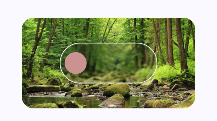
Screenshot
Example 4
Code:
              Row(
                mainAxisAlignment: MainAxisAlignment.spaceAround,
                children: <Widget>[
                  MorphSwitch(
                    stateValue: testSwitcher7,
                    size: SwitcherSize.large,
                    switcherRadius: const SwitcherRadius(
                      topLeft: 30.0,
                      bottomLeft: 30.0,
                      topRight: 15.0,
                      bottomRight: 15.0,
                    ),
                    applyThumbRotationAnimation: false,
                    switchCurve: Curves.easeOutQuart,
                    thumbType:
                        testSwitcher7 ? ThumbType.square : ThumbType.circle,
                    onLabel: "ON",
                    onLabelStyle: const TextStyle(
                      fontWeight: FontWeight.bold,
                      color: Colors.green,
                    ),
                    offLabel: "OFF",
                    offLabelStyle: const TextStyle(
                      fontWeight: FontWeight.bold,
                      color: Colors.red,
                    ),
                    thumbOnBgColor: Colors.green,
                    thumbOffBgColor: Colors.red,
                    onBgColor: const Color(0xFFb7cc92),
                    offBgColor: const Color(0xFFf19c79),
                    thumbOnIcon: Icons.volume_up_rounded,
                    thumbOffIcon: Icons.volume_down_rounded,
                    onSwitch: (newState) {
                      setState(() => testSwitcher7 = newState);
                    },
                  ),
                  _verticalDivider,
                  MorphSwitch(
                    stateValue: testSwitcher8,
                    size: SwitcherSize.large,
                    thumbOnBgColor: const Color(0xFF3eff8b),
                    thumbOffBgColor: const Color(0xFFb5838d),
                    thumbOnIcon: Icons.favorite,
                    thumbOffIcon: Icons.favorite_border,
                    onGradient: const LinearGradient(
                      colors: [
                        Color(0xFF3eff8b),
                        Color(0xFF31d843),
                        Color(0xFF38a700),
                        Color(0xFF386c0b),
                        Color(0xFFeaebf0),
                      ],
                      begin: Alignment.bottomLeft,
                      end: Alignment.topRight,
                    ),
                    durationInMs: 500,
                    offGradient: const LinearGradient(
                      colors: [
                        Color(0xFFb5838d),
                        Color(0xFFb5838d),
                        Color(0xFFe5989b),
                        Color(0xFFffb4a2),
                        Color(0xFFffcdb2),
                      ],
                      begin: Alignment.topRight,
                      end: Alignment.bottomLeft,
                    ),
                    thumbBorderWidth: 1.2,
                    thumbBorderColor: const Color(0xFF040303),
                    borderColor: const Color(0xFF040303),
                    switcherRadius: const SwitcherRadius(
                      topLeft: 30.0,
                      bottomLeft: 10.0,
                      topRight: 10.0,
                      bottomRight: 30.0,
                    ),
                    onSwitch: (newState) {
                      setState(() => testSwitcher8 = newState);
                    },
                  ),
                ],
              ),
Screenshot
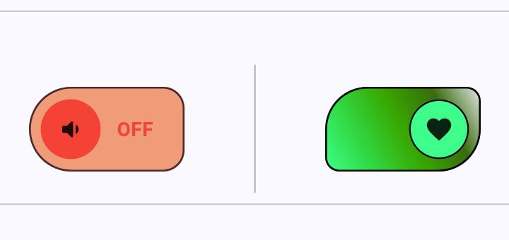
Customizable borderradius(
SwitcherRadius) and gradient backgroud
Example 5
Code :
// Vertical Switcher

              MorphSwitch(
                stateValue: testSwitcher10,
                switcherRadius: const SwitcherRadius.all(radius: 30.0),
                margin: const EdgeInsets.symmetric(vertical: 30),

                /*  height: context.screenHeight * .05,
                width: context.screenWidth * .3,
                thumpRadius: 10, */
                switchCurve: Curves.easeInExpo,
                onBgColor: const Color(0xFF57A6A1),
                offBgColor: const Color(0xFFA0153E),
                thumbOnIcon: Icons.all_inclusive_sharp,
                thumbOffIcon: Icons.account_balance_sharp,
                durationInMs: 700,
                onLabel: "Up",
                offLabel: "Down",
                onLabelStyle:
                    const TextStyle(fontSize: 20, fontWeight: FontWeight.bold),
                offLabelStyle:
                    const TextStyle(fontSize: 20, fontWeight: FontWeight.bold),
                textPadding: 25,
                width: _screenWidth * .35,
                height: _screenHeight * .07,
                thumbRadius: 25.0,
                isVertical: true,
                onSwitch: (newState) {
                  setState(() => testSwitcher10 = newState);
                },
              ),

// Vertical Slider

              MorphSlider(
                stateValue: testSwitcher15,
                margin: const EdgeInsets.symmetric(vertical: 30),
                isVertical: true,
                switchCurve:
                    !testSwitcher15 ? Curves.easeInOut : Curves.bounceOut,
                size: SwitcherSize.xxLarge,
                sliderRadius: 25.0,
                onIcon: Icons.cloud_upload,
                offIcon: Icons.cloud_download_rounded,
                sliderBorderWidth: 2.0,
                thumbBorderColor: const Color(0xFF4C4B16),
                thumbBorderWidth: 2.0,
                sliderBorderColor: const Color(0xFF4C4B16),
                onSliderColor: const Color(0xFFE6C767),
                offSliderColor: const Color(0xFFFFEEAD),
                onThumbColor: const Color(0xFFA66E38),
                offThumbColor: const Color(0xFFF2EED7),
                onSwitch: (newValue) {
                  setState(() => testSwitcher15 = newValue);
                },
              ),
Screenshote
| Vertical MorphSwitch | Vertical MorphSlider |
|---|---|
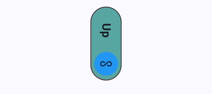 | 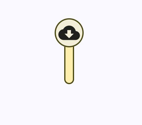 |
Rotate bothe Morphing Switch 90° on x-axis and match the icon rotation by -(pi / 2)
MorphSlider
Example 1
Code:
              Row(
                mainAxisAlignment: MainAxisAlignment.spaceAround,
                children: <Widget>[
                  MorphSlider(
                    stateValue: testSwitcher13,
                    offIcon: Icons.back_hand_outlined,
                    onIcon: Icons.back_hand_rounded,
                    thumbIconColor: Colors.white,
                    offSliderColor: const Color(0xFFEFEFEF),
                    onSliderColor: const Color(0xFF99BC85),
                    sliderBorderColor: Colors.grey,
                    sliderBorderWidth: 1.4,
                    size: SwitcherSize.large,
                    offThumbColor: const Color(0xFFA7D477),
                    thumbBorderColor: Colors.green,
                    sliderRadius: 20.0,
                    thumbBorderWidth: 1.6,
                    switchCurve: Curves.easeInBack,
                    durationInMs: 500,
                    onSwitch: (newValue) {
                      setState(() => testSwitcher13 = newValue);
                    },
                  ),
                  _verticalDivider,
                  MorphSlider(
                    stateValue: testSwitcher14,
                    size: SwitcherSize.large,
                    thumbType: ThumbType.square,
                    onIcon: Icons.document_scanner,
                    offIcon: Icons.document_scanner_outlined,
                    onThumbColor: const Color(0xFF780C28),
                    offThumbColor: const Color(0xFFcb9292),
                    offSliderColor: const Color(0xFFFBF6E9),
                    onSliderColor: const Color(0xFFF9C0AB),
                    sliderBorderColor: const Color(0xFFDF6D2D),
                    thumbIconColor: testSwitcher14 ? Colors.white : null,
                    thumbBorderColor: const Color(0xFFDF6D2D),
                    iconTransitionStyle: IconTransitionStyle.scale,
                    sliderRadius: 20.0,
                    applyThumbRotationAnimation: false,
                    onSwitch: (newValue) {
                      setState(() => testSwitcher14 = newValue);
                    },
                  ),
                ],
              ),
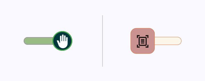
Screenshot
Contributing
Contributions are welcome! Whether you're fixing bugs, adding features, or just improving docs, your help makes MorphSwitch better for everyone.
-
Report Bugs : Found an issue? Open a bug report. Please include:
- Steps to reproduce
- Expected vs. actual behavior
-
Suggest Features : Have an idea? Start a discussion:
-
Explain the problem it solves
-
Share use cases or mockups
-
License
MIT © Mahmoud Nagy