otp_plus 1.0.9
SDKflutter
Platformandroidioswindowslinuxmacosweb
A Flutter package that auto-fills OTPs from SMS or other sources into text fields, enabling seamless user authentication and improving the sign-in experience.
otp_plus
A customizable Flutter OTP (One-Time Password) input widget package inspired by popular pin code
fields libraries. otp_plus offers enhanced flexibility, styling, and input management for OTP or
PIN entry, supporting both individual input boxes and paste detection with seamless input
distribution.
Features
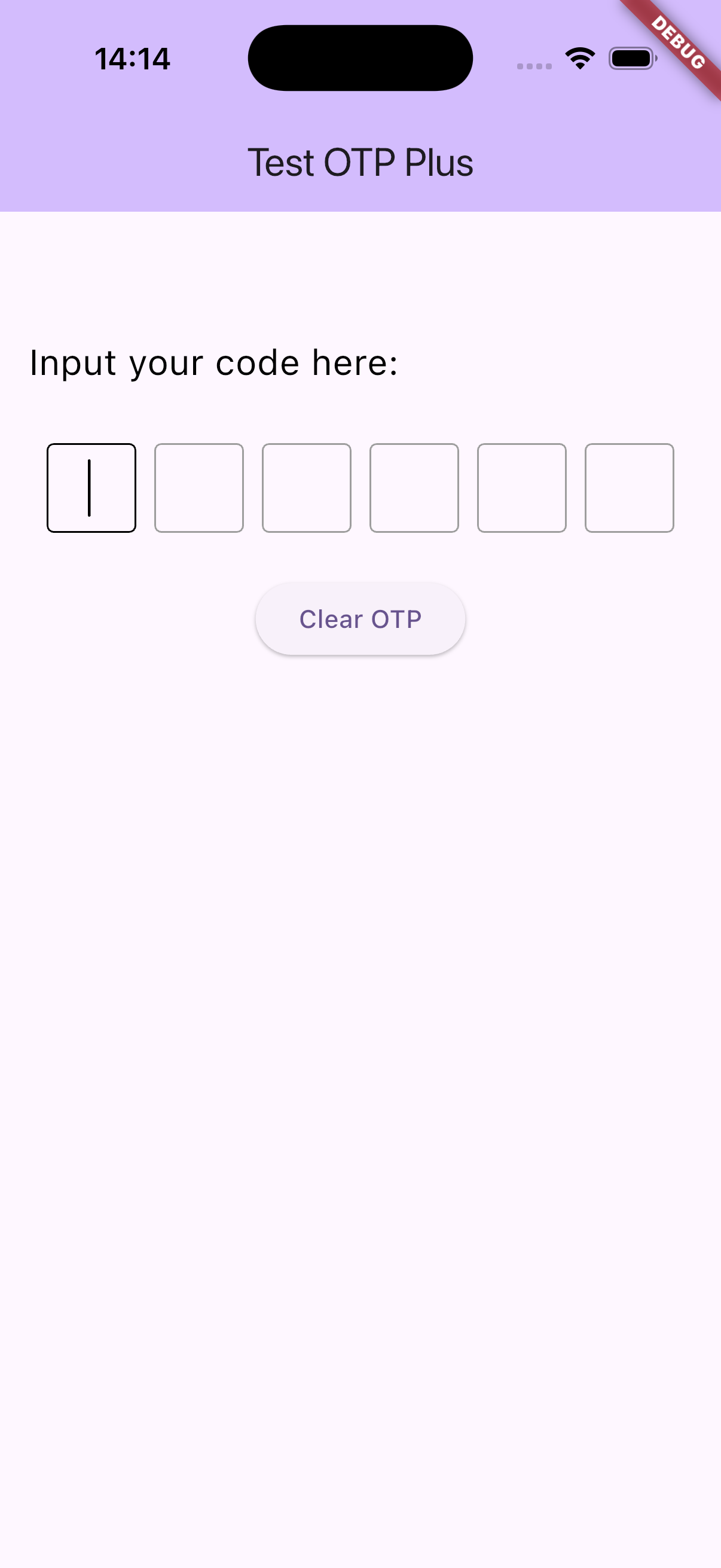
- Multiple OTP input fields with customizable length
- Paste support with automatic digit splitting across fields
- Obscured input option (e.g., for password-style OTP)
- Flexible styling: shape (square, underline, circle), size, spacing
- Keyboard navigation and backspace focus handling
- Customizable cursor appearance and behavior
- RTL and LTR text direction support
- Complete control over input decoration and text style
- Callback on OTP completion to easily handle entered codes
![OTP Plus Demo]
Installation
Add this to your pubspec.yaml:
dependencies:
  otp_plus: ^1.0.9
Then run:
flutter pub get
Usage
import 'package:flutter/material.dart';
import 'package:otp_plus/otp_plus_inputs.dart'; // Adjust the import path accordingly

class MyOtpScreen extends StatelessWidget {
  @override
  Widget build(BuildContext context) {
    return Scaffold(
      appBar: AppBar(title: Text('Enter OTP')),
      body: Center(
        child: OtpPlusInputs(
          size: 50,
          length: 6,
          shape: OtpFieldShape.square,
          textDirection: TextDirection.ltr,
          onChanged: (code) {
            debugPrint('On Changed : $code');
          },
          onSubmit: (code) {
            debugPrint('On Submit : $code');
          },
          //Add optional values here
          onCompleted: (code) {
            // Add OTP verification logic here
            debugPrint('OTP entered: $code');
          },
        ),
      ),
    );
  }
}
API Reference
OtpPlusInputs Parameters
| Parameter | Type | Description | Default |
|---|---|---|---|
shape | OtpFieldShape | Shape of each OTP input field (square, underline, circle). | Required |
length | int | Number of OTP digits to input. | Required |
textStyle | TextStyle? | Custom text style for digits inside each field. | null |
obscureText | bool | Whether to obscure the text (e.g., for passwords). | false |
obscuringCharacter | String | Character to display when text is obscured. | '*' |
horizontalSpacing | double | Horizontal spacing between each OTP input field. | 10 |
size | double | Width and height of each input box. | 50 |
verticalSpacing | double | Vertical spacing when fields wrap to the next line. | 10 |
textDirection | TextDirection | Text direction for the entire widget (ltr or rtl). | TextDirection.ltr |
cursorColor | Color | Color of the blinking cursor. | Colors.black |
enabled | bool? | Whether the input fields are enabled for interaction. | null (inherited from theme) |
ignorePointers | bool? | Whether to ignore pointer events (tap, drag, etc.) on the fields. | null |
cursorWidth | double | Width of the cursor. | 1.5 |
cursorHeight | double? | Height of the cursor. If null, uses default based on font. | null |
cursorRadius | Radius? | Radius for cursor corners (rounded cursor). | null |
cursorOpacityAnimates | bool? | Whether cursor opacity should animate (fade in/out). | null |
undoController | UndoHistoryController? | Controller to manage undo/redo history for text fields. | null |
textInputAction | TextInputAction? | Type of action button on the keyboard (e.g., next, done). | null |
textCapitalization | TextCapitalization | Capitalization behavior for input (e.g., none, characters, words). | TextCapitalization.none |
style | TextStyle? | Optional global text style override (applies to underlying TextField). | null |
strutStyle | StrutStyle? | Optional strut style to control line height and alignment. | null |
textAlign | TextAlign | Horizontal alignment of text within each field. | TextAlign.center |
textAlignVertical | TextAlignVertical | Vertical alignment of text within each field. | TextAlignVertical.center |
contentPadding | EdgeInsets? | Inner padding of each input field. | EdgeInsets.symmetric(horizontal: 10, vertical: 10) |
onComplete | void Function(String)? | Called when all fields are filled (OTP is complete). | null |
onChanged | void Function(String)? | Called whenever the OTP value changes (on any field update). | null |
onSubmit | void Function(String)? | Called when user submits (e.g., presses enter/done on keyboard). | null |
borderColor | Color? | Border color in default (unfocused, non-error) state. | Colors.grey |
focusedBorderColor | Color? | Border color when the field is focused. | Colors.black |
errorBorderColor | Color? | Border color when the field is in error state. | Colors.red |
pasteText | String? | Label text for the “Paste” option in context menu (long-press menu). | 'Paste' |
OtpFieldShape
Defines the visual style of the OTP input fields:
square: Square bordered fieldsunderline: Underline stylecircle: Circular bordered fields
Notes
- Paste handling currently does not support web platform due to clipboard API limitations.
- The widget automatically manages focus navigation between fields on input and backspace key presses.
- Use
onCompletedto capture the final OTP code when all fields are filled. - The widget uses
TextInputFormatterto restrict input to single digits.
Contribution
Contributions and improvements are welcome! Feel free to open issues or pull requests.
License
This project is licensed under the MIT License.