panara_dialogs 0.1.5
SDKflutter
Platformandroidioswindowslinuxmacosweb
PanaraDialogs is a Dialog UI Kit. A minimal but beautiful design for Flutter Dialogs.
Panara Dialogs


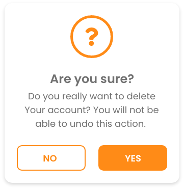
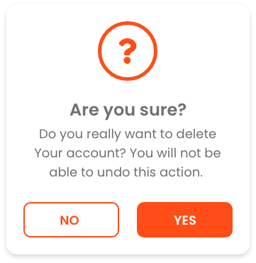
Panara Dialogs is a UI Kit for Dialog comes with 3 types of dialogs - Info Dialog, Confirmation Dialog both comes with 4 different variants as shown in below screenshots & Custom Dialog, with 7 different animations.
Preview
PanaraInfoDialog
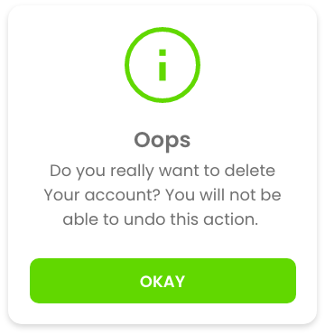
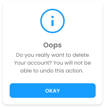
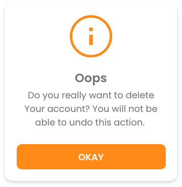
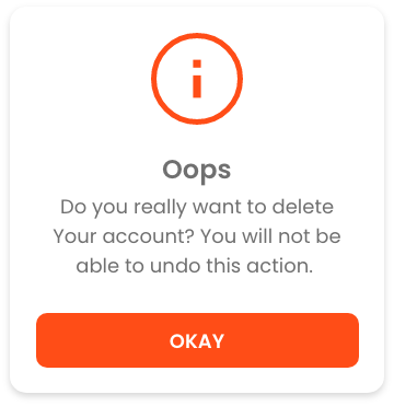
PanaraConfirmDialog


Getting started
Add the dependency in pubspec.yaml:
dependencies:
  panara_dialogs: ^0.1.5
Usage
Then you just have to import the package with
import 'package:panara_dialogs/panara_dialogs.dart';
Here is how you can use PanaraInfoDialog in your flutter project.
PanaraInfoDialog.show(
    context,
    title: "Hello",
    message: "This is the PanaraInfoDialog",
    buttonText: "Okay",
    onTapDismiss: () {
        Navigator.pop(context);
    },
    panaraDialogType: PanaraDialogType.normal,
    barrierDismissible: false, // optional parameter (default is true)
);
Properties of PanaraInfoDialog
| Property | Type | value |
|---|---|---|
| imagePath | String | path to your local assets image |
| title | String | any string value |
| message | String | any string value |
| buttonText | String | any string value |
| onTapDismiss | void Function() | function to decide what will happen onTap |
| panaraDialogType | PanaraDialogType | success, normal, warning, error, custom |
| color | Color | define your own color, by selecting panaraDialogType: PanaraDialogType.custom |
| textColor | Color | define your own text color |
| buttonTextColor | Color | define your own button text color |
| margin | EdgeInsets | define margin |
| padding | EdgeInsets | define padding |
| noImage | bool | If you don't want any image set it to true. it's false by default |
| barrierDismissible | bool | define if dialog is dismissible by tapping outside of dialog |
And Here is how you can use PanaraConfirmDialog in your flutter project.
PanaraConfirmDialog.show(
    context,
    title: "Hello",
    message: "This is the PanaraConfirmDialog",
    confirmButtonText: "Confirm",
    cancelButtonText: "Cancel",
    onTapCancel: () {
        Navigator.pop(context);
    },
    onTapConfirm: () {
        Navigator.pop(context);
    },
    panaraDialogType: PanaraDialogType.normal,
    barrierDismissible: false, // optional parameter (default is true)
);
Properties of PanaraConfirmDialog
| Property | Type | value |
|---|---|---|
| imagePath | String | path to your local assets image |
| title | String | any string value |
| message | String | any string value |
| confirmButtonText | String | any string value |
| cancelButtonText | String | any string value |
| onTapConfirm | void Function() | function to decide what will happen onTap confirm |
| onTapCancel | void Function() | function to decide what will happen onTap cancel |
| panaraDialogType | PanaraDialogType | success, normal, warning, error, custom |
| color | Color | define your own color, by selecting panaraDialogType: PanaraDialogType.custom |
| textColor | Color | define your own text color |
| buttonTextColor | Color | define your own button text color |
| margin | EdgeInsets | define margin |
| padding | EdgeInsets | define padding |
| noImage | bool | If you don't want any image set it to true. it's false by default |
| barrierDismissible | bool | define if dialog is dismissible by tapping outside of dialog |
Here is how you can use PanaraCustomDialog in your flutter project.
PanaraCustomDialog.show(
    context,
    children: [
        Text(
            "Hello",
            style: TextStyle(
                fontSize: 20,
            ),
            textAlign: TextAlign.center,
        ),
        Text(
            "This is the PanaraCustomDialog",
            style: TextStyle(
                    fontSize: 16
                ),
            textAlign: TextAlign.center,
        ),
        // Add your own widgets here
    ],
    mainAxisAlignment: MainAxisAlignment.center,
    crossAxisAlignment: CrossAxisAlignment.center,
    backgroundColor: Colors.white,
    margin: EdgeInsets.all(20),
    padding: EdgeInsets.all(20),
    barrierDismissible: false, // optional parameter (default is true)
);
Properties of PanaraCustomDialog
| Property | Type | value |
|---|---|---|
| children | List<Widget> | define your own widgets |
| mainAxisAlignment | MainAxisAlignment | start, center, end |
| crossAxisAlignment | CrossAxisAlignment | start, center, end |
| backgroundColor | Color | define background color |
| margin | EdgeInsets | define margin |
| padding | EdgeInsets | define padding |
| barrierDismissible | bool | define if dialog is dismissible by tapping outside of dialog |
Animations for Both Dialogs
This are static methods for both Dialog Class.
| method | Animation |
|---|---|
showAnimatedFromLeft() | slide animation from left |
showAnimatedFromRight() | slide animation from right |
showAnimatedFromTop() | slide animation from top |
showAnimatedFromBottom() | slide animation from bottom |
showAnimatedGrow() | grow animation from center |
showAnimatedShrink() | shrink animation from center |
showAnimatedFade() | fade animation |
Feedback
Please feel free to give me any feedback or file issue helping support this plugin !