protonimage 1.1.2
Flutter package for smooth image loading, featuring shimmer and fade-in effects, ensuring a seamless user experience.
protonimage
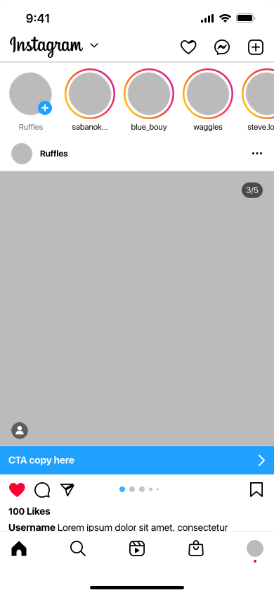
Protonimage is a Flutter package that provides a customizable image widget with built-in shimmer loading effect.
A Flutter plugin for preloading images.
| Android | iOS | Linux | macOS | Web | Windows | |
|---|---|---|---|---|---|---|
| Support | SDK 16+ | 12.0+ | Any | 10.14+ | Any | Windows 10+ |
About
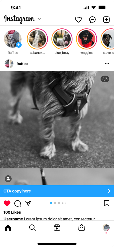
Protonimage offers a convenient way to display images in your Flutter applications with the added benefit of a shimmer loading effect, giving your UI a polished and professional look. It allows you to easily load images from network URLs, customize the appearance, and control the loading process.
Screenshots
| Shimmer | Feed |
|---|---|
 |  |
Features
- Customizable Shimmer Effect: Easily add a shimmer loading effect to your images.
- Flexible Configuration: Adjust height, aspect ratio, border radius, and more.
- Network Image Support: Load images from network URLs effortlessly.
- Fit Options: Control how the image is inscribed into the widget with BoxFit.
- Fallback Background Color: Specify a fallback color while the image is loading.
- Tested: The widget is thoroughly tested with unit tests to ensure reliability.
Installation
With Dart:
dart pub add protonimage
With Flutter:
flutter pub add protonimage
This will add a line like this to your package's pubspec.yaml (and run an implicit flutter pub get):
dependencies:
  protonimage: ^1.0.0  # Replace with the latest version
Alternatively, your editor might support flutter pub get. Check the docs for your editor to learn more.
Import it
Now in your Dart code, you can use:
import 'package:protonimage/protonimage.dart';
Usage
The easiest way to use this library via top-level function format(date):
Quick Usage
import 'package:flutter/material.dart';
import 'package:protonimage/protonimage.dart';

void main() {
  runApp(MyApp());
}

class MyApp extends StatelessWidget {
  @override
  Widget build(BuildContext context) {
    return Scaffold(
      appBar: AppBar(
        title: Text('ProtonImage Example'),
      ),
      body: Center(
        child: ProtonImage(
          path: 'https://example.com/image.jpg',
          height: 200,
          radius: 20,
        ),
      ),
    );
  }
}
Customization
ProtonImage(
  path: 'https://example.com/image.jpg',
  height: 200,
  radius: 20,
  aspectRatio: 16 / 9,
  baseColor: Colors.white24,
  highlightColor: Colors.white54,
  backgroundColor: Colors.white,
)
Customization Options
The "Customization Options" section outlines properties to customize image widgets, covering image source, dimensions, border radius, aspect ratio, shimmer effect colors, loading background color, and gradient overlay.
| Property | Description |
|---|---|
path | The URL or path of the image to be displayed. |
height | The height of the image widget. |
radius | The border radius for rounded corners. |
aspectRatio | The aspect ratio of the image (width/height). |
baseColor | The base color of the shimmer effect. |
highlightColor | The highlight color of the shimmer effect. |
backgroundColor | The background color while the image is loading. |
overlayGradient | The gradient overlay to be applied on the image. |
Image Overlay
ProtonImage(
  path: 'https://example.com/image2.jpg',
  height: 200,
  radius: 20,
  overlayGradient: LinearGradient(
    begin: Alignment.bottomRight,
    stops: const [0.1, 0.8],
    colors: [
      Colors.black45.withOpacity(.1),
      Colors.black45.withOpacity(.0),
    ],
  ),
)
Available Gradients Overlay
| Gradient Type | Description |
|---|---|
LinearGradient | A linear gradient that transitions along a straight line. |
RadialGradient | A radial gradient that transitions outward from the center. |
SweepGradient | A gradient that follows the perimeter of a circle. |
Popular Aspect Ratios
| Aspect Ratio | Description |
|---|---|
1:1 | Square |
16:9 | Widescreen |
4:3 | Standard TV |
3:2 | Classic Photography |
21:9 | Ultra-Widescreen |
9:16 | Portrait (for mobile) |
3:4 | Portrait (for photography) |
Examples
For more examples and usage, please refer to the example directory.
Contributing
Contributions are welcome! If you encounter any issues or have suggestions for improvements, please open an issue or submit a pull request on GitHub.