pull_down_button 0.10.2
A package that implements Pull-Down Button from iOS 14 in Flutter. Highly customizable.
Pull-Down Button from iOS 14 for Flutter




pull_down_button is an attempt to bring Pop-Up and Pull-Down Buttons from iOS 14+ to Flutter with some additional customisation options.
This package only tries to visually replicate the native counterpart, some parts might be somewhat different.
Contents:
PullDownButton
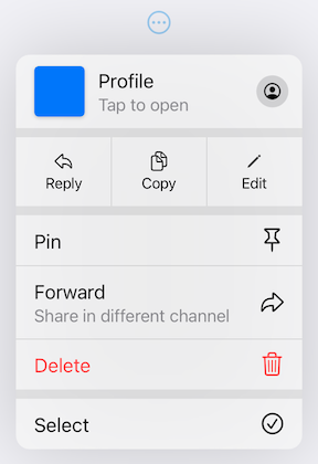
PullDownButton is a widget used to show the pull-down menu.
While the pull-down menu is opened, the button from where this menu was called will have lower opacity.
PullDownButton(
  itemBuilder: (context) => [
    PullDownMenuItem(
      title: 'Menu item',
      onTap: () {},
    ),
    const PullDownMenuDivider(),
    PullDownMenuItem(
      title: 'Menu item 2',
      onTap: () {},
    ),
  ],
  buttonBuilder: (context, showMenu) => CupertinoButton(
    onPressed: showMenu,
    padding: EdgeInsets.zero,
    child: const Icon(CupertinoIcons.ellipsis_circle),
  ),
);
Properties table
| Properties | Description |
|---|---|
| itemBuilder | Called when the button is pressed to create the items to show in the menu. |
| buttonBuilder | Builder that provides BuildContext as well as showMenu function to pass to any custom button widget. |
| onCanceled | Called when the user dismisses the pull-down menu. |
| position | Whether the pull-down menu is positioned above, over, or under the pull-down menu button. |
| itemsOrder | Whether the pull-down menu orders its items from itemBuilder in downward or upwards way. |
| buttonAnchor | Whether the pull-down menu is anchored to the center, left, or right side of buttonBuilder. |
| menuOffset | Additional offset for the pull-down menu if the menu's desired position. |
| scrollController | A custom menu scroll controller. |
| animationBuilder | Custom animation for buttonBuilder when the pull-down menu is opening or closing. |
| routeTheme | The theme of the pull-down menu box. |
| animationAlignmentOverride | Custom animation alignment used to override default one. |
| useRootNavigator | Whether to use the root navigator to show the pull-down menu. |
| routeSettings | Optional route settings for the pull-down menu. |
PullDownMenuItem
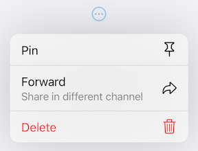
PullDownMenuItem is a widget used to create cupertino-style pull-down menu item.
PullDownMenuItem(
  onTap: () {},
  title: 'Pin',
  icon: CupertinoIcons.pin,
),
PullDownMenuItem(
  title: 'Forward',
  subtitle: 'Share in different channel',
  onTap: () {},
  icon: CupertinoIcons.arrowshape_turn_up_right,
),
PullDownMenuItem(
  onTap: () {},
  title: 'Delete',
  isDestructive: true,
  icon: CupertinoIcons.delete,
),
Properties table
| Properties | Description |
|---|---|
| onTap | The action this item represents. |
| tapHandler | Handler to resolve how onTap callback is used. |
| enabled | Whether the user is permitted to tap this item. |
| title | Title of this PullDownMenuItem. |
| subtitle | Subtitle of this PullDownMenuItem. |
| icon | Trailing icon of this PullDownMenuItem. |
| iconColor | Trailing icon's color. |
| iconWidget | Custom trailing widget. |
| isDestructive | Whether this item represents destructive action. |
| itemTheme | The theme of the menu item. |
PullDownMenuItem.selectable
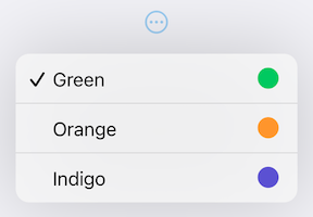
PullDownMenuItem.selectable is a widget used to create cupertino-style pull-down menu item with selection state.
PullDownMenuItem.selectable(
  onTap: () {},
  selected: true,
  title: 'Green',
  icon: CupertinoIcons.circle_fill,
  iconColor: CupertinoColors.systemGreen.resolveFrom(context),
),
PullDownMenuItem.selectable(
  onTap: () {},
  selected: false,
  title: 'Orange',
  icon: CupertinoIcons.circle_fill,
  iconColor: CupertinoColors.systemOrange.resolveFrom(context),
),
PullDownMenuItem.selectable(
  onTap: () {},
  selected: false,
  title: 'Indigo',
  icon: CupertinoIcons.circle_fill,
  iconColor: CupertinoColors.systemIndigo.resolveFrom(context),
),
Properties table
PullDownMenuItem.selectable uses all of PullDownMenuItem properties as well as a boolean value selected, to indicate whether the menu item is selected or not.
PullDownMenuActionsRow
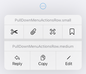
PullDownMenuActionsRow is a widget used to create cupertino-style pull-down menu row of actions
(small or medium size).
PullDownMenuActionsRow.medium(
  items: [
    PullDownMenuItem(
      onTap: () {},
      title: 'Reply',
      icon: CupertinoIcons.arrowshape_turn_up_left,
    ),
    PullDownMenuItem(
      onTap: () {},
      title: 'Copy',
      icon: CupertinoIcons.doc_on_doc,
    ),
    PullDownMenuItem(
      onTap: () {},
      title: 'Edit',
      icon: CupertinoIcons.pencil,
    ),
  ],
),
PullDownMenuItem is used to populate PullDownMenuActionsRow.items.
Depending on PullDownMenuActionsRows size, PullDownMenuItem might be either icon only or icon and title in a vertical array.
| Properties | Description |
|---|---|
| items | List of PullDownMenuItem. |
PullDownMenuDivider
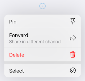
PullDownMenuDivider.large is a widget used to create cupertino-style pull-down menu large divider.
There is no need in adding PullDownMenuDivider by hand, pull-down menu does it automatically!
PullDownMenuTitle
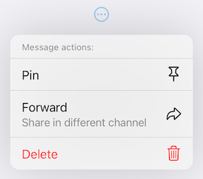
PullDownMenuTitle is a widget used to create cupertino-style pull-down menu title (usually at the top of menu).
const PullDownMenuTitle(title: Text('Menu title')),
| Properties | Description |
|---|---|
| title | Title widget. |
| titleStyle | Title widget text style. |
PullDownMenuHeader
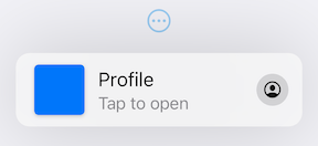
PullDownMenuHeader is a widget used to create cupertino-style pull-down menu document header (usually at the top of menu).
PullDownMenuHeader(
  leading: ColoredBox(
    color: CupertinoColors.systemBlue.resolveFrom(context),
  ),
  title: 'Profile',
  subtitle: 'Tap to open',
  onTap: () {},
  icon: CupertinoIcons.profile_circled,
),
Properties table
| Properties | Description |
|---|---|
| onTap | The action this header represents. |
| tapHandler | Handler to resolve how onTap callback is used. |
| leading | Leading widget of this PullDownMenuItem. |
| leadingBuilder | Custom leading widget of PullDownMenuHeader. |
| title | Title of this PullDownMenuItem. |
| subtitle | Subtitle of this PullDownMenuItem. |
| itemTheme | The theme of the menu item. |
| icon | Trailing icon of this PullDownMenuItem. |
| iconWidget | Custom trailing widget. |
showPullDownMenu
An alternative way of displaying pull-down menu via a function call.
onPressed: () async {
  /* get tap position and / or do something before opening menu */

  await showPullDownMenu(
    context: context,
    items: [...],
    position: position,
  );
}
Properties table
| Properties | Description |
|---|---|
| context | For looking up Navigator for the menu. |
| items | List of PullDownMenuEntry widgets. |
| position | The Rect is used to align the top of the menu with the top of the position rectangle. |
| itemsOrder | Whether the popup menu orders its items from itemBuilder in a downward or upwards way. |
| menuOffset | Additional offset for the pull-down menu if the menu's desired position. |
| scrollController | A custom menu scroll controller. |
| onCanceled | Called when the user dismisses the pull-down menu. |
| routeTheme | The theme of the pull-down menu box. |
| useRootNavigator | Whether to use the root navigator to show the pull-down menu. |
| routeSettings | Optional route settings for the pull-down menu. |
PullDownMenu
Another alternative way of displaying the pull-down menu as a simple widget, with no animations or adding routes to the navigation stack.
PullDownMenu(
  items: [
    PullDownMenuItem(
      title: 'Menu item',
      onTap: () {},
    ),
    const PullDownMenuDivider(),
    PullDownMenuItem(
      title: 'Menu item 2',
      onTap: () {},
    ),
  ]
),
Properties table
| Properties | Description |
|---|---|
| items | List of PullDownMenuEntry widgets. |
| scrollController | A custom menu scroll controller. |
| routeTheme | The theme of pull-down menu box. |
Theming
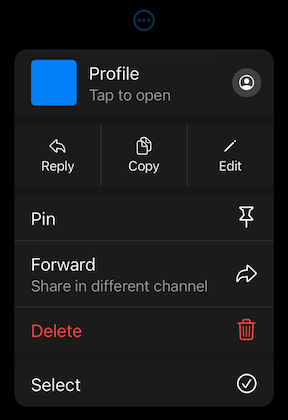
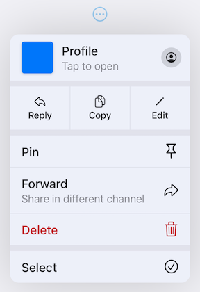
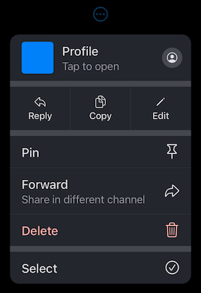
This package also provides additional customization. By default, the iOS 16 theme is used, but it is also possible to override defaults with widget properties (see above) or with PullDownButtonTheme theme extension.
| Light Theme | Dark Theme |
|---|---|
|  |
PullDownButtonTheme
To use PullDownButtonTheme define it in your ThemeData as follows:
ThemeData(
  ...,
  extensions: [
    PullDownButtonTheme(
      routeTheme: PullDownMenuRouteTheme(
        backgroundColor: Colors.grey,
      ),
      itemTheme: PullDownMenuItemTheme(
        destructiveColor: Colors.red,
      ),
      dividerTheme: PullDownMenuDividerTheme(
        dividerColor: Colors.black,
      ),
    ),
  ],
),
PullDownButtonTheme uses a set of sub-themes (for items, dividers, the menu itself, etc.) to define the needed theme. See below for every property each sub-theme provides.
PullDownButtonTheme
| Properties | Description |
|---|---|
| routeTheme | Menu container theme (PullDownMenuRouteTheme). |
| itemTheme | PullDownMenuItem theme (PullDownMenuItemTheme). |
| dividerTheme | PullDownMenuDivider theme (PullDownMenuDividerTheme). |
| titleTheme | PullDownMenuTitle theme (PullDownMenuTitleTheme). |
PullDownMenuRouteTheme
| Properties | Description |
|---|---|
| backgroundColor | The background color of the pull-down menu. |
| borderRadius | The border radius of the pull-down menu. |
| shadow | The pull-down menu shadow. |
| width | Pull-down menu width. |
| accessibilityWidth | Pull-down menu accessibility width. |
backgroundColor usually has opacity in the range of 0.7-0.8 so that menu has a blur effect.
If backgroundColor is fully opaque (opacity set to 1), no blur effect will be applied.
PullDownMenuItemTheme
| Properties | Description |
|---|---|
| destructiveColor | Color for destructive action. |
| checkmark | Checkmark icon. |
| textStyle | PullDownMenuItem text style. |
| subtitleStyle | PullDownMenuItem subtitle text style. |
| iconActionTextStyle | PullDownMenuItem text style inside of PullDownMenuActionsRow. |
| onHoverBackgroundColor | On hover color of PullDownMenuItem. |
| onPressedBackgroundColor | On pressed color of PullDownMenuItem. |
| onHoverTextColor | On hover color of text of PullDownMenuItem. |
PullDownMenuDividerTheme
| Properties | Description |
|---|---|
| dividerColor | Small divider color. |
| largeDividerColor | Large divider color. |
largeDividerColor is usually lighter than dividerColor.
PullDownMenuTitleTheme
| Properties | Description |
|---|---|
| style | PullDownMenuTitle text style. |
PullDownButtonInheritedTheme
If defining PullDownButtonTheme in ThemeData is not possible, for example, if you are using CupertinoApp, you can use PullDownButtonInheritedTheme:
CupertinoApp(
  builder: (context, child) => PullDownButtonInheritedTheme(
    data: const PullDownButtonTheme(
      ...
    ),
    child: child!,
  ),
  home: ...,
),
Here is an example of using PullDownButtonTheme with Material 3 color scheme colors
(generated from CupertinoColors.systemBlue with ColorScheme.fromSeed) from Material 3 Menu specs.
| Custom Material 3 light theme | Custom Material 3 dark theme |
|---|---|
 |  |
Contributions
Feel free to contribute to this project.
Please file feature requests and bugs at the issue tracker.
If you fixed a bug or implemented a feature by yourself, feel free to send a pull request.