responsive_ui 3.0.1
responsive ui Flutter package helps you to create a responsive and Nested responsive widget. Works on android, iOs, Web with both portrait and landscape mode.
Responsive UI

responsive_ui package helps you to create a responsive widget and Nested responsive widgets. Works on all Platforms.
Getting Started
Live demo : https://bharathraj-e.github.io/responsive_ui/ Have a look!
It works as same as Bootstrap / Materialize Row Column method, Splitting screen into 12 columns and placing widget by combining column based on screen size.
    Responsive(
        children: <Widget>[
            Div(
                division:Division(
                    colS: 5,
                    offsetL: 2,
                ),
                child: Card(child: Icon(Icons.game))
            ),
            Div(
                division:Division(
                    colS: 12,
                    colM: 6,
                    colL: 4,
                ),
                child: Text('responsive ui')
            )
        ]
    )
Widgets
The Responsive UI Package contains two simple widgets.
- Div()
- Responsive()
1. Div()
| Arguments | inputs | if null / default to |
|---|---|---|
child | Widget | required |
division | Division | if null defaluts to Division() |
Divison() intakes column sizes and offSets.
| Arguments | inputs | if null / default to |
|---|---|---|
colXS | (int) 0-12 | 12 |
colS | (int) 0-12 | colXS value |
colM | (int) 0-12 | ColS value |
colL | (int) 0-12 | ColM value |
colXL | (int) 0-12 | ColL value |
offsetXS | (int) 0-12 | 0 |
offsetS | (int) 0-12 | 0 |
offsetM | (int) 0-12 | 0 |
offsetL | (int) 0-12 | 0 |
offsetXL | (int) 0-12 | 0 |
(XS = Extra Small, S = small, M = medium, L = large, XL = Extra Large)
-
0 - 0.0 width (gone) (replaced with
SizedBox.shrink()) -
12 - full width (provided by
parent widgetnot screen width) -
Parent widgetshould not be ahorizontal scrolltype widget -
To offset, simply add
offsetS/offsetM/offsetLto the Div() widget withcolS/colM/colLrespectively. -
Offset works for their respective column sizes.
2. Responsive()
Responsive intakes List<Widget> or List<Div> with default column/screen size for each widget can be declared.
| Arguments | inputs | if null / default |
|---|---|---|
children | List | not null / required / empty[] |
alignment | WrapAlignment | WrapAlignment.start |
runAlignment | WrapAlignment | WrapAlignment.start |
crossAxisAlignment | WrapCrossAlignment | WrapCrossAlignment.start |
runSpacing | double | 0.0 |
Note
-
Responsivewidget is aWrapwidget. -
Responsive&Div()widget needFinite widthto work. -
Div()works withvertical scrollnot inhorizontal scroll, as it calculations are base on width only. -
Div()works as expected when it placed as a direct child ofResponsive()widget's children. -
Sum of the
offsetand the respectivecolshould be <= to12
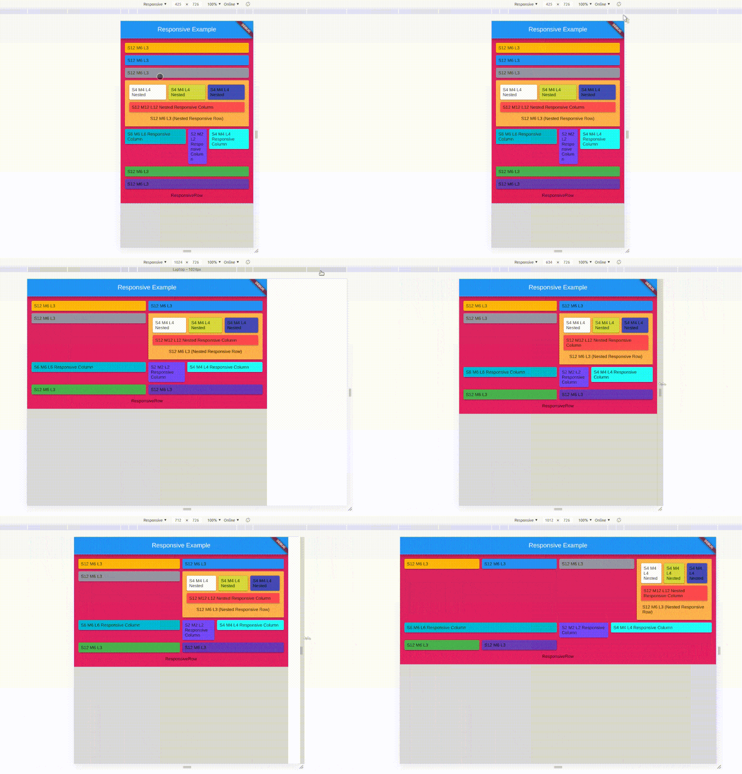
Nested Responsive
Place a Responsive() widget into a Div().
The nested Responsive() widget takes the width provided by parent Div() widget and not the screen width
sample
Screen Types
| Type | Default Size |
|---|---|
| Xtra small | < 375.0 |
| Small | 375.0 - 596.0 |
| Medium | 596.0 - 897.0 |
| Large | 897.0 - 1232.0 |
| Xtra Large | >1232.0 |
Override / Set your default size
Yes, now you can set your own breakpoints, that applies to all the Responsive & Div widgets.
void main() {
  // sample 1
  Responsive.setGlobalBreakPoints(400.0, 600.0, 997.0, 1380.0);
  // Sample 2
  Responsive.setGlobalBreakPoints(0, 596.0, 897.0, 1232.0);
  // Since the first value is 0 : colXS is always neglected
  runApp(const MyApp());
}
responsive_ui is made simply using Wrap() and LayoutBuilder() with a bits of logics.