sai_custom_widgets 0.0.1
A collection of customizable and reusable Flutter widgets to simplify UI development. This package includes widgets for layout gaps, state management with GetX, and more to help developers build responsive and dynamic UIs easily.
Sai Custom Widgets
Sai Custom Widgets is a Flutter package that provides a collection of highly customizable widgets designed to simplify your development process. It includes custom buttons, text fields, dropdowns, switches, date pickers, and platform-specific list tiles.
Features
- Custom Date Picker: A customizable date picker with a builder pattern.
- Custom Buttons: Buttons with multiple styles such as standard, outlined, and text buttons.
- Searchable Dropdown: Dropdown with a search feature to quickly find and select items.
- Custom Switch: A platform-adaptive switch with customizable behavior.
- Custom Text Fields: Easy-to-validate text fields with password support.
- Platform-Specific List Tiles: List tiles that adapt to both iOS and Android design principles.
Getting Started
Installation
To get started with sai_custom_widgets, add it to your pubspec.yaml:
dependencies:
  sai_custom_widgets: ^1.0.0
Example Usage
Here’s an example of how to use the package in your Flutter app:
- Custom Date Picker
- Custom Button
- Custom Switch
- Custom Text Field
Preview
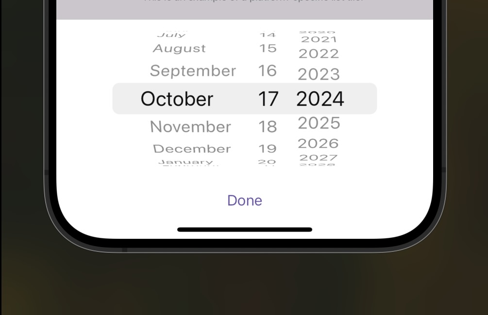
Custom Date Picker
The CustomDatePickerWidget allows you to select a date within a range and handle the selected date.
Example:
CustomDatePickerWidget.builder(
initialDate: DateTime.now(),
firstDate: DateTime(2000),
lastDate: DateTime(3000),
onDateSelected: (date) {
    print("Date selected: $date");
},
builder: (context, date) {
    return Text("Selected Date: $date");
},
);
Parameters:
| Parameter | Type | Description |
|---|---|---|
initialDate | DateTime | The initial selected date. |
firstDate | DateTime | The earliest selectable date. |
lastDate | DateTime | The latest selectable date. |
onDateSelected | Function(DateTime) | Callback when a date is selected. |
builder | Widget Function() | Custom builder function to display selected date. |
Custom Button
The CustomButton is a button widget with several customizable options like loading state, disabled state, and outlined style.
Preview

Example:
CustomButton(
text: "Press Me",
 onPressed: () {
    print("Button Pressed");
},
);
Parameters:
| Parameter | Type | Description |
|---|---|---|
text | String | The text displayed inside the button. |
onPressed | VoidCallback? | Callback triggered when the button is pressed. |
isLoading | bool | If true, shows a loading spinner. Default: false. |
isDisabled | bool | If true, disables the button. Default: false. |
isOutlined | bool | If true, makes the button outlined. Default: false. |
isIcon | bool | If true, shows a Icon with the title |
loadingWidget | Widget | Implement a custom loading widget |
fullLoading | bool | If true make the title hide while loading |
Custom Outlined Button
The CustomOutlinedButton is an outlined version of the button.
Preview

Example:
CustomOutlinedButton(
text: "Outlined Button",
onPressed: () {
    print("Outlined Button Pressed");
},
);
Parameters:
| Parameter | Type | Description |
|---|---|---|
text | String | The text displayed inside the button. |
onPressed | VoidCallback? | Callback triggered when the button is pressed. |
isLoading | bool | If true, shows a loading spinner. Default: false. |
isDisabled | bool | If true, disables the button. Default: false. |
Custom Text Button
The CustomTextButton is a text-only version of the button, similar to TextButton in Flutter.
Example:
CustomTextButton(
text: "Text Button",
onPressed: () {
    print("Text Button Pressed");
},
);
Parameters:
| Parameter | Type | Description |
|---|---|---|
text | String | The text displayed inside the button. |
onPressed | VoidCallback? | Callback triggered when the button is pressed. |
isLoading | bool | If true, shows a loading spinner. Default: false. |
isDisabled | bool | If true, disables the button. Default: false. |
Searchable Dropdown
The SearchableDropdown widget provides a dropdown list that supports search functionality.
Example:
SearchableDropdown.builder(
hintText: 'Select a Fruit',
items: ['Apple', 'Banana', 'Orange'],
selectedItem: null,
onChanged: (value) {
    print('Selected: $value');
},
onSearch: (text) {
    print('Searching for: $text');
},
builder: (context, selectedItem) {
    return Text(selectedItem ?? 'Select a Fruit');
},
);
Parameters:
| Parameter | Type | Description |
|---|---|---|
hintText | String | The hint text to display before selection. |
items | List<String> | The list of selectable items. |
selectedItem | String? | The currently selected item (nullable). |
onChanged | Function(String?) | Callback when an item is selected. |
onSearch | Function(String) | Callback when a search query is entered. |
builder | Widget Function(BuildContext, String?) | Custom builder for displaying the selected item. |
Custom Switch
The CustomSwitch is a customizable switch widget that adapts to both Android and iOS platform styles.
Example:
CustomSwitch.builder(
onSwitch: (value) {
    print("Switch value: $value");
},
initialValue: false,
builder: (context, isSwitched, inChange) {
    return GestureDetector(
      onTap: () {
        inChange(!isSwitched);
      },
      child: Text("Switch is $isSwitched"),
    );
},
);
Parameters:
| Parameter | Type | Description |
|---|---|---|
initialValue | bool | The initial state of the switch. |
onSwitch | Function(bool) | Callback when the switch state changes. |
builder | Widget Function(...) | A builder function to customize the switch UI. |
Custom Text Field
The CustomTextField is a highly customizable text field with support for validators, password fields, and more.
Example:
CustomTextField(
hintText: "Enter your name",
onChanged: (value) {
    print("Name: $value");
},
);
Parameters:
| Parameter | Type | Description |
|---|---|---|
hintText | String | The placeholder text inside the text field. |
controller | TextEditingController? | Controls the text being edited. |
isPassword | bool | If true, hides the input text. Default: false. |
onChanged | Function(String)? | Callback triggered when the text is changed. |
validators | List<ValidatorRule>? | A list of validation rules to apply to the input. |
onSubmitted | Function(String)? | Callback triggered when the user submits the input. |
Platform Native List Tile
The PlatformNativeListTile is a platform-specific list tile widget that adapts to both iOS and Android.
Example:
PlatformNativeListTile(
title: "List Tile",
subtitle: "This is a subtitle",
leading: Icon(Icons.person),
onTap: () => print("Tile Tapped"),
);
Parameters:
| Parameter | Type | Description |
|---|---|---|
title | String | The title text for the tile. |
subtitle | String? | The subtitle text for the tile. |
leading | Widget | The leading widget, typically an icon. |
trailing | Widget? | The trailing widget, typically an icon or arrow. |
onTap | VoidCallback | Callback when the tile is tapped. |
Platform Native List Section
The PlatformNativeListSection groups several list tiles together, platform-adaptively.
Example:
PlatformNativeListSection(
sectionHeader: "Section 1",
tiles: [
    PlatformNativeListTile(
      title: "Tile 1",
      subtitle: "Subtitle 1",
      leading: Icon(Icons.account_circle),
      trailing: Icon(Icons.arrow_forward_ios),
      onTap: () {
        print("Tile 1 tapped");
      },
    ),
    PlatformNativeListTile(
      title: "Tile 2",
      subtitle: "Subtitle 2",
      leading: Icon(Icons.email),
      trailing: Icon(Icons.arrow_forward_ios),
      onTap: () {
        print("Tile 2 tapped");
      },
    ),
],
 padding: const EdgeInsets.all(8.0),
);
Parameters:
| Parameter | Type | Description |
|---|---|---|
sectionHeader | String? | The header text of the section. |
tiles | List<PlatformNativeListTile> | List of platform-native list tiles to display. |
padding | EdgeInsetsGeometry? | Optional padding around the list section. |