shimmer_progress_bar 1.0.1
A customizable linear progress bar with animation, shimmer effect, and percentage indicator for Flutter.
Shimmer Progress Bar
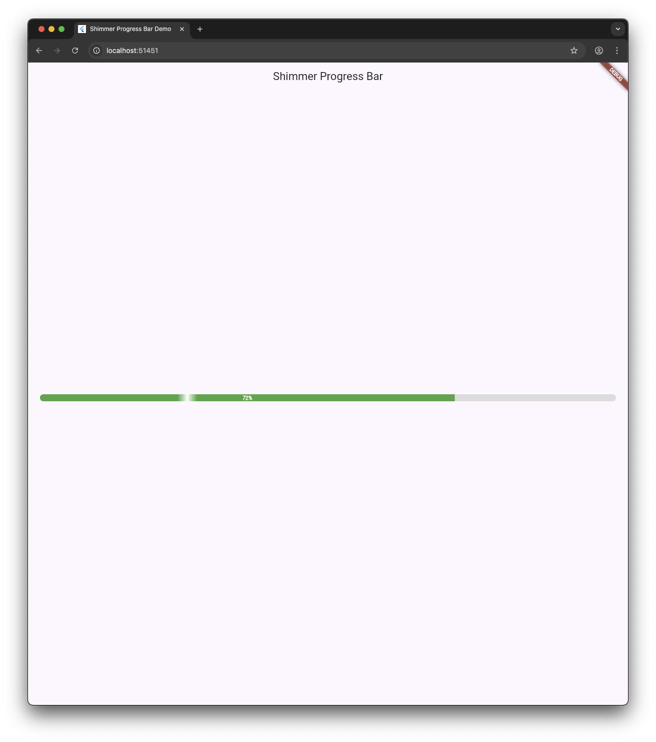
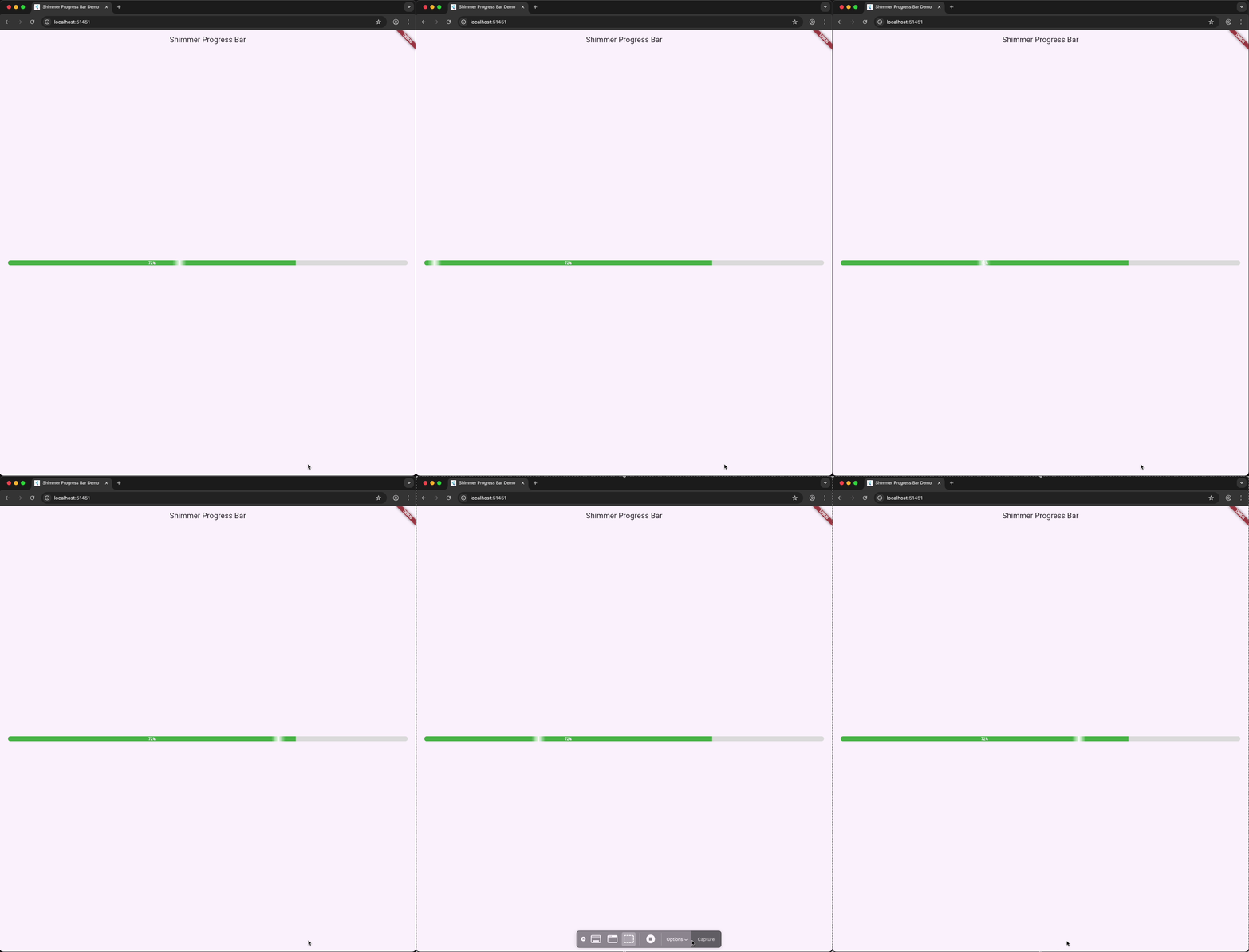
A highly customizable and animated linear progress bar widget for Flutter with a built-in shimmer effect and percentage indicator. Ideal for loading states, visual feedback, and active processes in modern mobile and web apps.
📱 Android
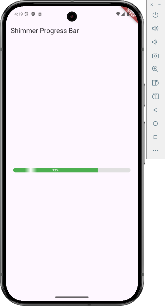
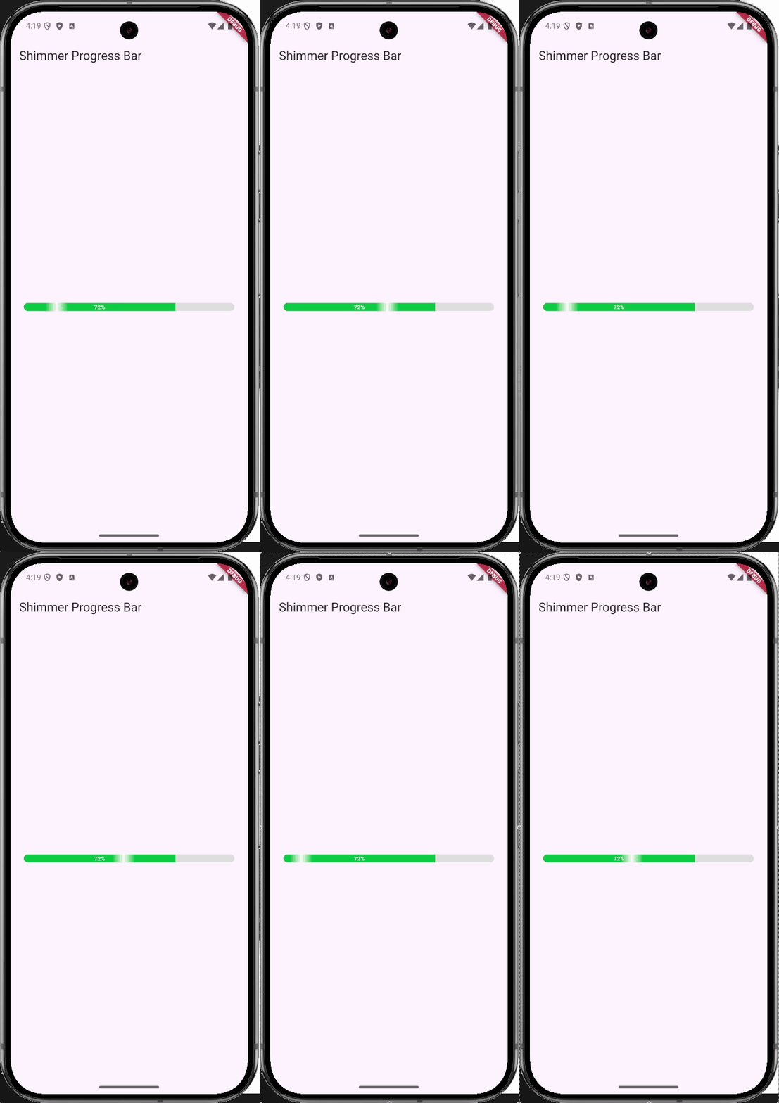
🍎 iOS
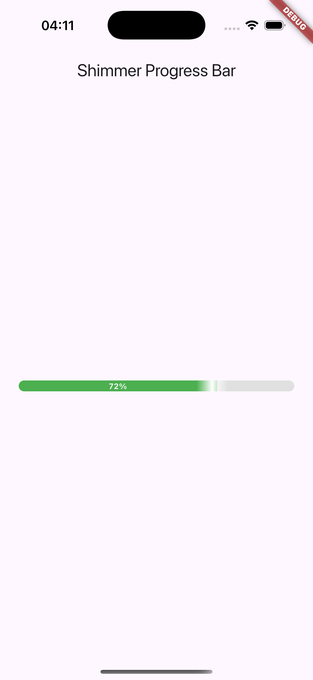
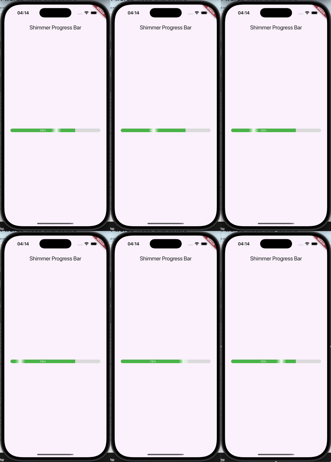
🌐 Web
✨ Features
- 🌈 Animated fill with smooth transitions
- ✨ Optional shimmer effect for active progress
- 📊 Configurable percentage display (center or near progress tip)
- 🎨 Customizable colors, dimensions, and text styles
- ♿ Accessibility with screen reader semantics
- 🧩 Theme-aware, semantic-friendly, and animation-sensitive
- 🕵️ Efficient: shimmer stops when off-screen
- 🧰 Respects system "reduced motion" settings
- ✅ Lightweight and easy to integrate
🚀 Getting Started
Installation
Add this to your pubspec.yaml:
dependencies:
  shimmer_progress_bar: ^1.0.0
Then run:
flutter pub get
Import
import 'package:shimmer_progress_bar/shimmer_progress_bar.dart';
🧪 Example
ShimmerProgressBar(
  value: 0.65, // 65%
  height: 14.0,
  valueColor: Colors.blueAccent,
  backgroundColor: Colors.grey.shade300,
  shimmerColor: Colors.white,
  showShimmer: true,
  showPercentage: true,
  alignPercentageToTip: false,
  percentTextStyle: TextStyle(fontSize: 10, fontWeight: FontWeight.bold),
  semanticsLabel: 'Loading progress',
)
🔧 Parameters
| Property | Type | Default | Description |
|---|---|---|---|
value | double | required | Progress value between 0.0 and 1.0 |
height | double | 12.0 | Height of the progress bar |
borderRadius | double | 20.0 | Rounded corners |
valueColor | Color | Colors.green | Fill color of the bar |
backgroundColor | Color | Color(0xFFE0E0E0) | Background color |
shimmerColor | Color | Color.fromARGB(80, 255, 255, 255) | Color of the shimmer gradient |
shimmerWidth | double | 30.0 | Width of the shimmer sweep |
shimmerDuration | Duration | Duration(seconds: 2) | Duration of shimmer cycle |
showShimmer | bool | true | Whether to show shimmer animation |
animationDuration | Duration | Duration(milliseconds: 300) | Bar fill animation duration |
showPercentage | bool | true | Display percentage inside the bar |
alignPercentageToTip | bool | false | Align percentage near the progress tip instead of center |
percentTextStyle | TextStyle? | Custom fallback | Style for percentage text |
percentageFontColor | Color | Colors.white | Default color for text if no TextStyle is set |
minWidthForPercentage | double | 35.0 | Minimum width before showing percentage |
percentageBuilder | Widget Function(BuildContext, int) | null | Custom widget for percentage display |
includeSemantics | bool | true | Wrap in a Semantics widget for accessibility |
semanticsLabel | String? | 'Progress bar' | Custom label for screen readers |
onProgressComplete | VoidCallback? | null | Called once when value reaches 100% |
respectReducedMotion | bool | true | Auto-disables shimmer on "reduce motion" settings |
♿ Accessibility
- Uses
Semanticsto support screen readers - Describes current progress (e.g., "75 percent complete")
- Honors system reduced motion preferences
includeSemantics: falsedisables it if needed
🧪 Tests
This package currently ships without automated tests, but I plan to add comprehensive widget and integration tests in future updates.
Contributions are welcome! If you're interested in helping write or improve tests, feel free to submit a pull request 🙌
📦 Contributing
Found a bug or want to contribute a feature? Feel free to open an issue or submit a PR — especially for tests, improvements, and edge case handling. Let's make this better together 🚀!
🙌 Support My Work
If you find this project helpful, consider supporting me:


📄 License
MIT License. See LICENSE file for details.
❤️ Maintained by
Walid Kambagha
GitHub • LinkedIn
Designed for beautiful loading states and modern UI needs ✨