slide_to_submit_button 1.0.3
SDKflutter
Platformandroidioswindowslinuxmacosweb
A customizable slide-to-submit button with animation and styling options.
Slide To Submit
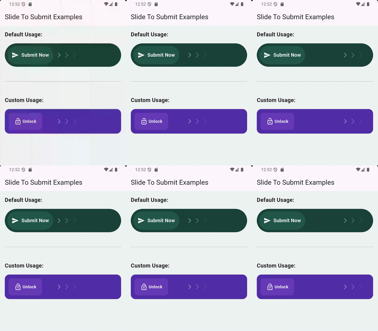
A highly customizable and animated slide-to-submit button for your Flutter applications. This widget provides a sleek and intuitive way for users to confirm actions.
✨ Features
- Smooth sliding animation
- Bouncy return animation on release
- Customizable text and styling
- Callback on successful submission
- Animated arrow indicator
🚀 Getting Started
Installation
In your pubspec.yaml file, add the following dependency:
dependencies:
  slide_to_submit: ^1.0.0
Then, run:
flutter pub get
🔧 Usage
Here's a simple example of how to use the SlideToSubmit:
import 'package:flutter/material.dart';
import 'package:slide_to_submit/slide_to_submit.dart';

void main() {
  runApp(const MyApp());
}

class MyApp extends StatelessWidget {
  const MyApp({super.key});

  @override
  Widget build(BuildContext context) {
    return MaterialApp(
      home: Scaffold(
        appBar: AppBar(
          title: const Text('Slide To Submit Example'),
        ),
        body: Center(
          child: SlideToSubmit(
            onSubmit: (controller) {
              // controller.reset(); // Reset the slider after submission
              // controller.done(); // Dispose the controller if no longer needed
              print("Submitted!");
            },
          ),
        ),
      ),
    );
  }
}
🎨 Customization
The SlideToSubmit widget offers two constructors: a default constructor for quick use and a custom constructor for full control.
Default Constructor
| Property | Type | Description |
|---|---|---|
onSubmit | VoidCallback | Required. Callback triggered on successful submission. |
text | String? | Optional label inside the slider. |
textStyle | TextStyle | Style for the slider text. |
sliderIcon | IconData? | Icon shown in the slider. |
sliderIconColor | Color | Colour of the icon inside the slider. |
backgroundColor | Color | Background color of the full widget. |
foregroundColor | Color | Foreground (slider) color. |
borderRadius | BorderRadius | Corner radius for both background and slider. |
height | double | Total height of the widget. |
sliderWidth | double | Width of the draggable slider. |
threshold | double | Ratio of slide distance needed to trigger submit (0.0 to 1.0). |
bounceDuration | Duration | Duration of bounce-back animation when not submitted. |
showArrow | bool | Whether to show an animated arrow hint. |
padding | EdgeInsetsGeometry | Padding around the widget. |
Custom Constructor (SlideToSubmit.custom)
Use this when you want to design your own slider widget.
| Property | Type | Description |
|---|---|---|
onSubmit | VoidCallback | Required. Callback triggered on successful submission. |
slider | Widget | Required. Your own custom slider widget. |
sliderWidth | double | Width of your custom slider. |
backgroundDecoration | BoxDecoration | Decoration for the outer container. |
foregroundDecoration | BoxDecoration | Decoration for the slider. |
hint | Widget? | Optional hint like an arrow or label. |
height | double | Height of the widget. |
threshold | double | Ratio of slide distance needed to trigger submit. |
bounceDuration | Duration | Duration of bounce-back animation. |
padding | EdgeInsetsGeometry | Padding around the widget. |
📷 Screenshots
💡 Example
Check out the example/ directory for a full working implementation.
🛠️ Contributing
This package is open source. Contributions are welcome!
- Fork the repository
- Create a feature branch
- Commit your changes
- Open a pull request
📄 License
MIT © Abdullah Al Mamun
👥 Maintainer
Made with ❤️ using Flutter.