super_cupertino_navigation_bar 2.1.2
Elevate your Flutter app's aesthetics with a collapsible app bar, stylish search bar animation, and versatile design inspired by iOS.
Super Cupertino Navigation Bar V2
Flutter Extension








Super Cupertino Navigation Bar
As a developer passionate about Apple UI/UX designs, I felt that Flutter lacked sufficient support for a widget that I wanted to develop. CupertinoSliverNavigationBar does not provide support for a search bar and a bottom app bar. Additionally, even if you were to add them as Slivers, creating a built-in animation and, furthermore, implementing Apple transition animations during page transitions would be challenging. This plugin frees you from this burden.
| Floated Large Title | Pinned Large Title | Only Large Title |
|---|---|---|
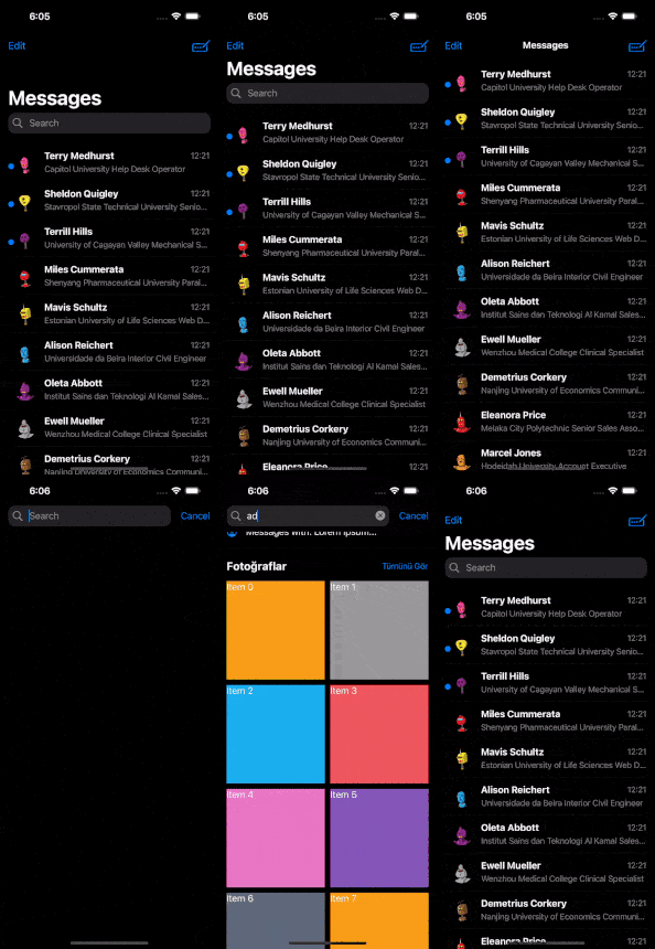 | 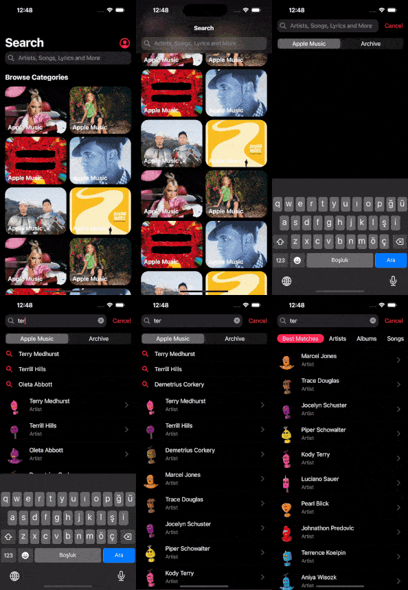 | 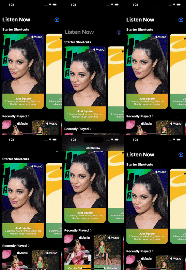 |
| Normal Navbar Floated | Normal Navbar Pinned | Only Navbar |
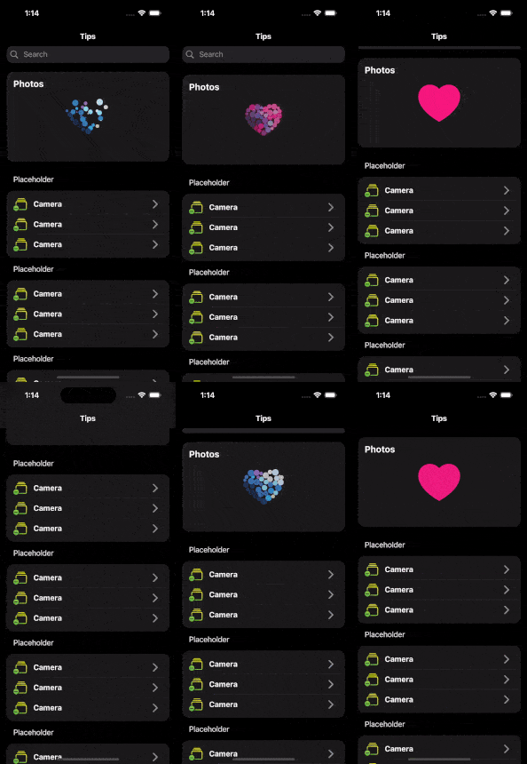 | 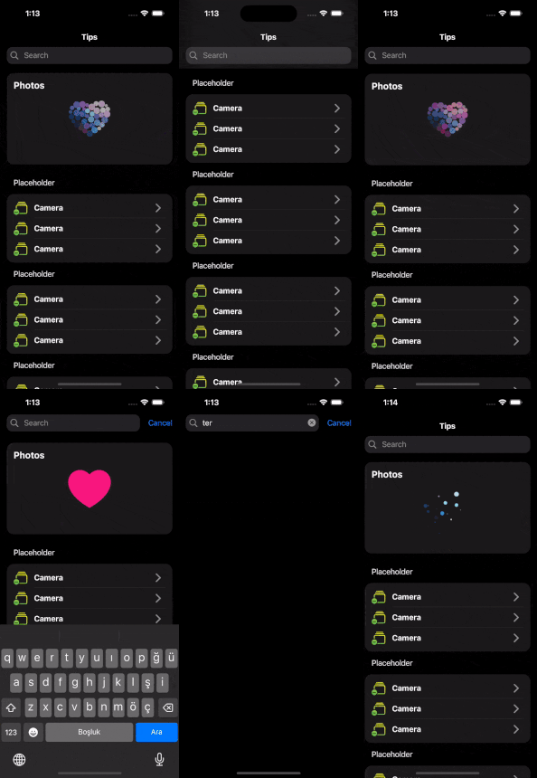 |  |
| Large Title, SearchBar and Bottom | Large Title and Bottom |
|---|---|
 |  |
🚀🚀 WEB DEMO 🚀🚀
Before the table of content, hereby, you can find all of example from here. Enjoy!
It's been necessary from the beginning, and I just did it.

Why Should You Use Super Cupertino Navigation Bar?
Using SuperScaffold provides several advantages and additional features compared to the standard Scaffold in Flutter. Here are some reasons why you might consider using SuperScaffold:
-
Configurability:
SuperScaffoldallows you to easily configure and customize various parts of the app bar, including the title, large title, search bar, and bottom bar. This provides flexibility in adapting the app bar to the specific design requirements of your application. -
Search Bar Integration: With
SuperScaffold, you can integrate a search bar (SuperSearchBar) directly into the app bar, complete with customizable behavior, animation, and callbacks for handling user input. -
Large Title Support: The
SuperLargeTitlefeature enables the use of large titles in the app bar, which can be particularly useful in applications with a prominent navigation hierarchy. -
Bottom Bar Options: The
SuperAppBarBottomfeature allows you to add a bottom bar below the app bar, providing additional space for interactive elements or navigation controls. -
Consistent Theming:
SuperScaffoldincludes theming options to ensure a consistent look and feel throughout your application. You can customize colors, borders, and other visual aspects easily.
Okay! Let's dive deep!
Examples
Before the table of content, hereby, you can find all of example from here. Enjoy!
Super Cupertino Navigation Bar
SuperScaffold
- Additional Features and Customization Options
- SuperAppBar
- SuperLargeTitle
- SuperSearchBar
- SuperAppBarBottom
Getting Started
Add dependency
dependencies:
  super_cupertino_navigation_bar: latest_version
Add import package
import 'package:super_cupertino_navigation_bar/super_cupertino_navigation_bar.dart';
Easy to use
Scaffold(
  backgroundColor: Theme.of(context).scaffoldBackgroundColor,
  body: SuperScaffold(
      appBar: SuperAppBar(
        title: Text("Hello SuperScaffold"),
        largeTitle: SuperLargeTitle(
          enabled: true,
          largeTitle: "Welcome",
        ),
        searchBar: SuperSearchBar(
          enabled: true,
          onChanged: (query) {
            // Search Bar Changes
          },
          onSubmitted: (query) {
            // On Search Bar submitted
          },
          searchResult: /* ... */,
          // Add other search bar properties as needed
        ),
        bottom: SuperAppBarBottom(
          enabled: true,
          height: 40,
          child: YourCustomBottomWidget(), // Any widget of yours
        ),
      ),
      body: SingleChildScrollView( // You can use CustomScrollView or any Widget desired
        child: Column(
          children: [
              Card(
                // Playground card
                // Add your onTap logic for Playground card
              ),
              Card(
                // List of example cards
                // Add your ListView.separated logic for example cards
              ),
            ],
          ),
        ),
    );
SuperScaffold
SuperScaffold is an extended version of the Flutter Scaffold widget with additional features and customization options.
Additional Features and Customization Options
stretch: Iftrue, theSuperScaffoldwill stretch to occupy the available space.transitionBetweenRoutes: Iftrue, enables transition animations between routes.appBar: An instance ofSuperAppBarfor customizing the app bar.onCollapsed: A callback function invoked when the app bar is collapsed.scrollController: A custom scroll controller for the body of theSuperScaffold.body: body attribute can now be any widget you want. SingleChildScrollView, CustomScrollView or etc...
Feel free to use this extended SuperScaffold in your Flutter application for enhanced customization and additional features. Adjust the parameters according to your application's requirements.
SuperAppBar
SuperAppBar is a customizable Flutter widget that extends the functionality of the default AppBar. It provides enhanced features such as a search bar, large title, and additional customization options.
Parameters
| Parameter | Description | Default Value |
|---|---|---|
title | The main title of the app bar. If a Text widget is provided, it ensures that a default style is set if none is provided. | - |
actions | Additional widgets to display on the app bar, typically icons or buttons. | - |
height | The height of the app bar. | kToolbarHeight |
leadingWidth | The width of the leading widget. | - |
leading | A widget to display before the title. If automaticallyImplyLeading is true, this widget will represent the back button. | - |
automaticallyImplyLeading | Whether to automatically include a leading widget (typically a back button). | true |
titleSpacing | The space between the leading widget and the title. | 15 |
previousPageTitle | The title of the previous page when using the back button. | "Back" |
alwaysShowTitle | Whether to always show the title, regardless of whether it fits within the app bar. | false |
searchBar | An optional SuperSearchBar widget for search functionality. | - |
largeTitle | An optional SuperLargeTitle widget for displaying a large title. | - |
bottom | An optional SuperAppBarBottom widget for additional content at the bottom of the app bar. | - |
backgroundColor | The background color of the app bar. | - |
bottomBorder | The border at the bottom of the app bar. | - |
shadowColor | The color of the app bar's shadow. | - |
Example Usage
SuperAppBar(
  title: Text("My App"),
  actions: const [Icon(Icons.search), Icon(Icons.more_vert)],
  previousPageTitle: "Home",
  searchBar: SuperSearchBar(),
  largeTitle: SuperLargeTitle(),
  bottom: SuperAppBarBottom(),
  backgroundColor: Colors.black,
  bottomBorder: const BorderSide(color: Colors.grey, width: 1),
  shadowColor: Colors.grey,
);
Feel free to customize the SuperAppBar based on your specific design requirements in your Flutter application!
SuperLargeTitle
SuperLargeTitle is a Flutter widget designed to display a large and prominent title. It offers customization options for styling and layout.
Parameters:
| Parameter | Description | Default Value |
|---|---|---|
enabled | Whether the large title is enabled or disabled. | true |
largeTitle | The text to be displayed as the large title. | "Hello Super Human" |
actions | A list of additional widgets or actions to be displayed next to the large title. | null |
textStyle | The style of the large title text. | See default values below |
height | The height of the large title. | kToolbarHeight |
padding | The padding around the large title. | EdgeInsets.symmetric(horizontal: 15.0) |
Example Usage
SuperLargeTitle(
  enabled: true, // default value is true
  largeTitle: "Super Human",
  actions: [
    IconButton(
      icon: Icon(Icons.settings),
      onPressed: () {
        // Handle settings button press
      },
    ),
    IconButton(
      icon: Icon(Icons.search),
      onPressed: () {
        // Handle search button press
      },
    ),
  ],
  textStyle: TextStyle(
    color: Colors.blue,
    fontSize: 40.0,
    fontWeight: FontWeight.bold,
  ),
)
Feel free to customize the SuperLargeTitle in your Flutter application to create visually appealing and informative large titles.
SuperSearchBar
SuperSearchBar is a customizable Flutter widget that provides a flexible and feature-rich search bar for your application. It includes various options for styling, behavior, and interaction.
Parameters:
| Parameter | Description | Default Value |
|---|---|---|
cancelButtonText | The text displayed on the cancel button. | "Cancel" |
cancelTextStyle | The style of the cancel button's text. | TextStyle(color: CupertinoColors.systemBlue) |
placeholderTextStyle | The style of the placeholder text. | TextStyle(color: CupertinoColors.systemGrey) |
placeholderText | The placeholder text displayed in the search bar. | "Search" |
prefixIcon | The icon displayed as a prefix in the search bar. | Icon(CupertinoIcons.search) |
actions | Additional actions displayed in the search bar. Type SuperAction | [] |
scrollBehavior | The scroll behavior of the search bar. | SearchBarScrollBehavior.floated |
height | The height of the search bar. | 35.0 |
padding | The padding of the search bar. | EdgeInsets.symmetric(horizontal: 15.0) |
animationBehavior | The animation behavior of the search bar. | SearchBarAnimationBehavior.top |
animationDuration | The duration of the search bar animation. | Duration(milliseconds: 250) |
searchResult | The widget displayed as a search result. | Text(".", style: TextStyle(color: Colors.transparent)) |
resultBehavior | The visibility behavior of the search result. | SearchBarResultBehavior.visibleOnFocus |
enabled | Whether the search bar is enabled or disabled. | true |
textStyle | The style of the text entered in the search bar. | TextStyle() |
onChanged | Callback function triggered when the text in the search bar changes. | - |
onFocused | Callback function triggered when the search bar gains or loses focus. | - |
onSubmitted | Callback function triggered when the user submits the search bar. | - |
searchController | The TextEditingController for controlling the text in the search bar. | - |
searchFocusNode | The FocusNode for controlling the focus state of the search bar. | - |
backgroundColor | The background color of the search bar. | CupertinoColors.tertiarySystemFill |
resultColor | The color of the search result. | - |
Example Usage:
SuperSearchBar(
  enabled: true,
  resultBehavior: SearchBarResultBehavior.visibleOnInput,
  onChanged: (query) {
    // Handle changes in the search bar
    print("Search bar changed: $query");
  },
  onSubmitted: (query) {
    // Handle submission of the search bar
    print("Search bar submitted: $query");
  },
),
Feel free to integrate and customize the SuperSearchBar in your Flutter application to create a powerful and visually appealing search experience! Adjust the parameters according to your application's requirements.
SuperAction
| Parameter | Description | Default Value |
|---|---|---|
child | The widget to be displayed. | - |
behavior | The behavior of the widget based on SuperActionBehavior. | visibleOnFocus |
Enums
SearchBarScrollBehavior
enum SearchBarScrollBehavior {
  pinned,
  floated,
}
SearchBarAnimationBehavior
enum SearchBarAnimationBehavior {
  top,
  steady,
}
SearchBarResultBehavior
enum SearchBarResultBehavior {
  visibleOnFocus,
  visibleOnInput,
  neverVisible,
}
SuperActionBehavior
enum SuperActionBehavior {
  alwaysVisible,
  visibleOnFocus,
  visibleOnUnFocus,
}
Feel free to integrate and customize the SuperSearchBar in your Flutter application to create a powerful and visually appealing search experience!
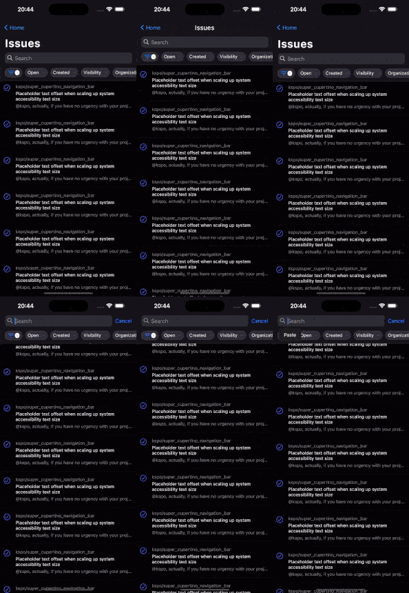
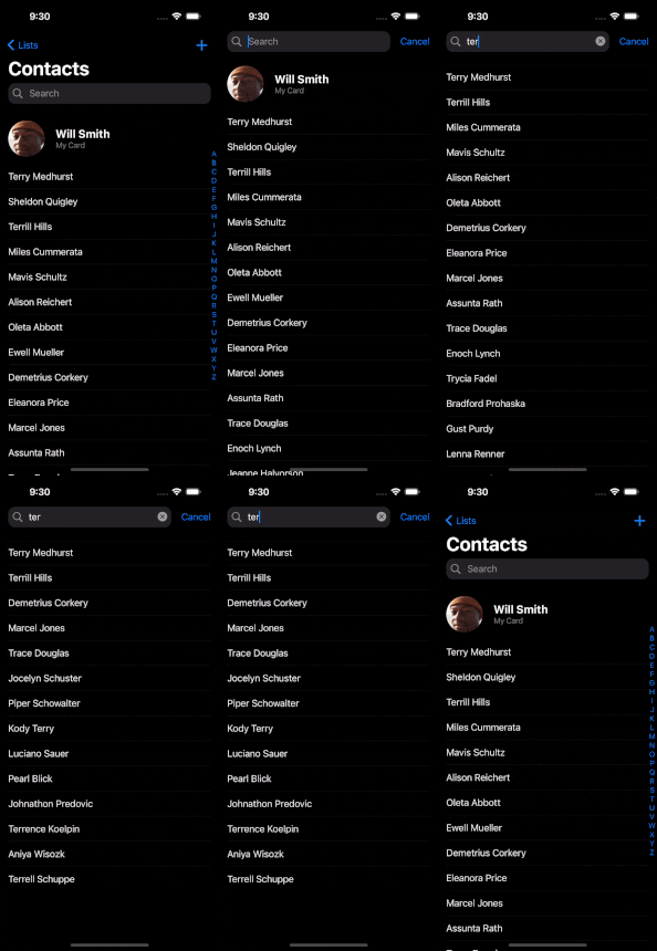
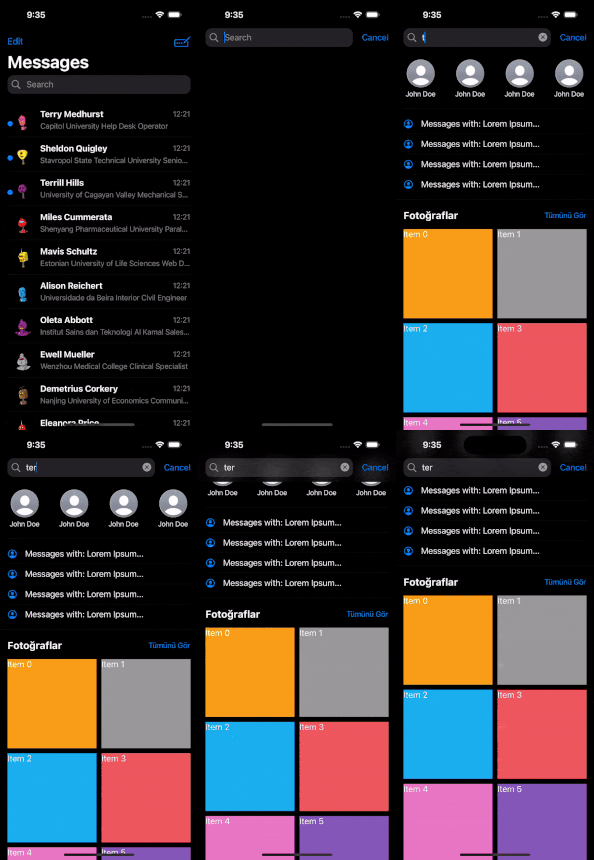
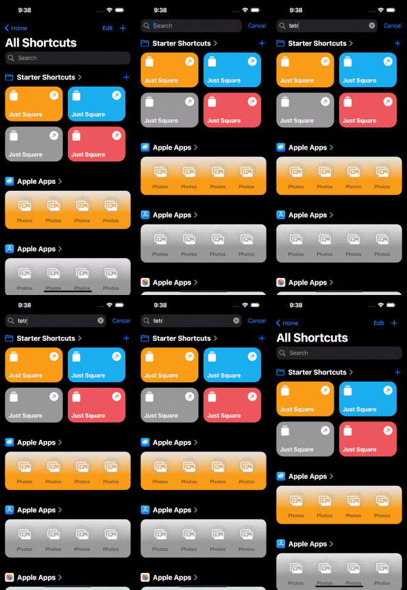
Let's look at expected behaviour;
| SearchBarResultBehavior.visibleOnInput | SearchBarResultBehavior.visibleOnFocus | NeverShowResultScreen |
|---|---|---|
 |  |  |
SuperAppBarBottom
SuperAppBarBottom is a Flutter widget designed to provide additional content at the bottom of the SuperAppBar. It offers customization options for content, height, visibility, and color.
Parameters:
| Parameter | Description | Default Value |
|---|---|---|
child | The widget or content to be displayed at the bottom of the SuperAppBar. | SizedBox() |
height | The height of the content at the bottom. | 35 |
enabled | Whether the SuperAppBarBottom is enabled or disabled. | false |
color | The background color of the SuperAppBarBottom. | Colors.transparent |
Example Usage
SuperAppBarBottom(
  child: Row(
    mainAxisAlignment: MainAxisAlignment.spaceEvenly,
    children: [
      IconButton(
        icon: Icon(Icons.home),
        onPressed: () {
          // Handle home button press
        },
      ),
      IconButton(
        icon: Icon(Icons.notifications),
        onPressed: () {
          // Handle notifications button press
        },
      ),
      IconButton(
        icon: Icon(Icons.person),
        onPressed: () {
          // Handle profile button press
        },
      ),
    ],
  ),
  height: 50.0,
  enabled: true,
  color: Colors.blue,
)
Feel free to customize the SuperAppBarBottom in your Flutter application to add additional functionality or navigation options to your app bar.
Questions
Ask a question and ping me "k.s poyraz"
Found an issue or have a proposal?
Contribute and Provide Feedback
If you wish to contribute to this project, take a look at my GitHub repository and report any issues or bugs. You can help me further improve the project!
License
This package is licensed under the MIT License. For detailed information, check the LICENSE file.