zap_sizer 0.0.3
Zap Sizer is a Flutter utility package designed to simplify responsive design and sizing in Flutter applications. It provides widgets and extensions for building adaptive UIs that seamlessly adjust to different devices, screen sizes, and orientations. Enhance your Flutter app's responsiveness with Zap Sizer.
Zap Sizer
Zap Sizer is a powerful Flutter package designed to simplify responsive design by adapting your UI dynamically based on screen size, device type, and orientation. Whether you're building for mobile, tablet, desktop, or web, Zap Sizer provides precise control and flexibility to scale and render widgets properly across all devices.
🔧 Getting Started
Add Zap Sizer to your Flutter project:
dependencies:
  zap_sizer:
Then wrap your root widget or screen widget with ZapSizer to initialize the device configuration:
ZapSizer(
  builder: (context, constraints) {
    return MaterialApp(
      home: HomePage(),
    );
  },
);
📱 DeviceData Class
DeviceData is a utility class that stores information about the current device, including screen size, orientation, platform, and resolution.
🔄 Initialization
DeviceData is automatically initialized when you wrap your widget tree with ZapSizer.
ZapSizer(
  builder: (context, constraints) {
    print(DeviceData.deviceType); // Android, iOS, Web, etc.
    print(DeviceData.screenType); // mobile, tablet, desktop
    return YourApp();
  },
);
🧾 Attributes
| Property | Type | Description |
|---|---|---|
deviceType | DeviceType | Current platform: Android, iOS, Web, macOS, etc. |
screenType | ScreenType | Type of screen based on width: mobile, tablet, desktop |
orientation | DeviceOrientation | Current screen orientation: portrait or landscape |
width | double | Screen width in logical pixels |
height | double | Screen height in logical pixels |
pixelRatio | double | Number of physical pixels per logical pixel |
aspectRatio | double | Ratio of width to height |
dotsPerInch | double | DPI calculated from device pixel ratio (≈160×ratio) |
isDarkMode | bool | Whether the current theme is dark |
isMobile | bool | True if screen is mobile-sized |
isTablet | bool | True if screen is tablet-sized |
isDesktop | bool | True if screen is desktop-sized |
🧱 AdaptiveBuilder Widget
The AdaptiveBuilder widget lets you build custom UIs based on the current device and screen configuration.
✅ Usage
AdaptiveBuilder(
  builder: (context, device, orientation, screenType) {
    return Column(
      children: [
        Text('Device: \$device'),
        Text('Orientation: \$orientation'),
        Text('Screen Type: \$screenType'),
      ],
    );
  },
);
🧠 AdaptiveWidget Widget
This widget renders different UIs depending on the platform and screen size.
✅ Usage
AdaptiveWidget(
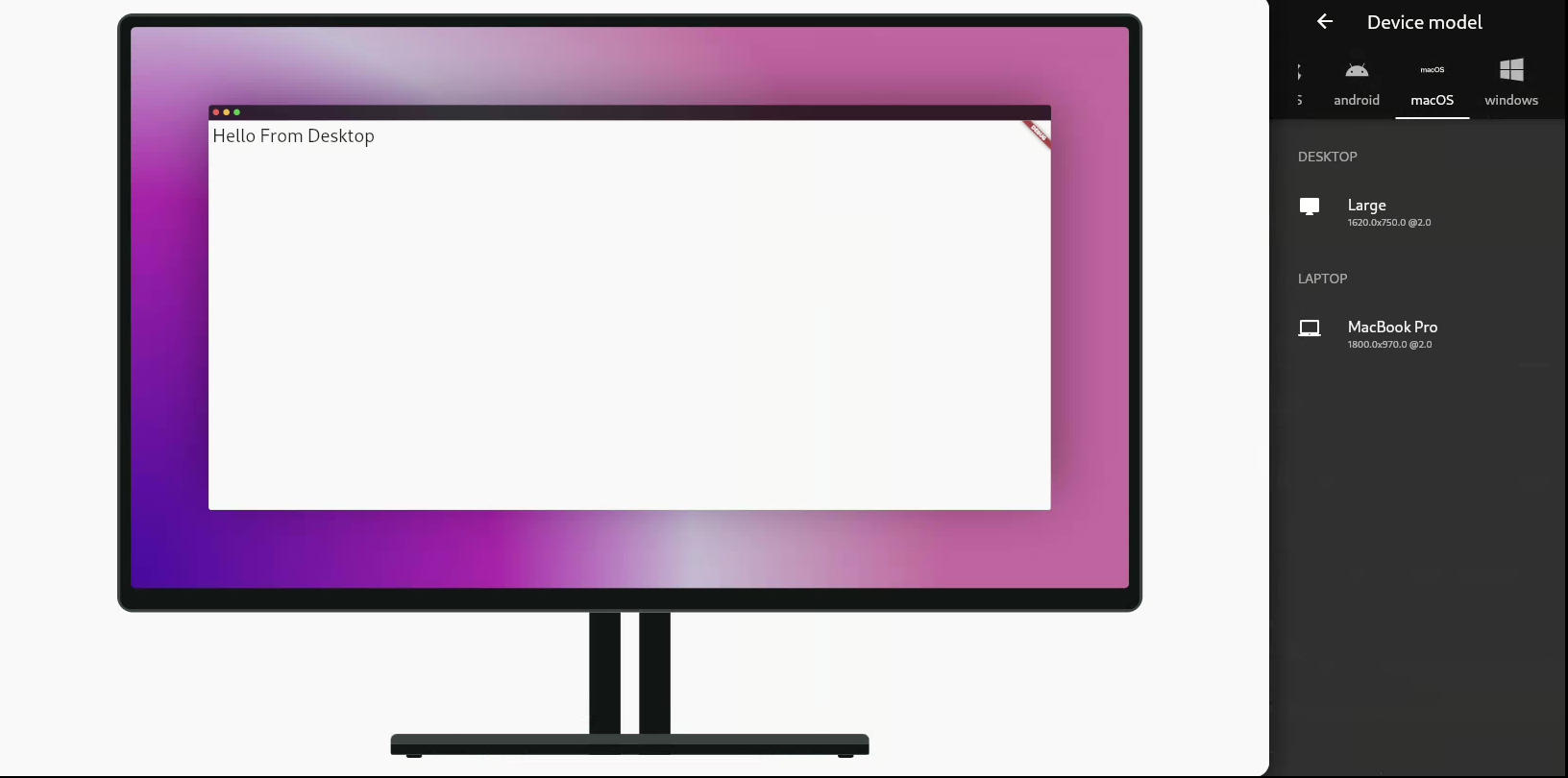
  desktop: Text("Hello from Desktop"),
  tablet: Text("Hello from Tablet"),
  mobile: Text("Hello from Mobile"),
  android: Text("Hello from Android"),
  ios: Text("Hello from iOS"),
  notSupportedWidget: Text("Not Supported"),
);
📏 ZapResponsive Extension
The ZapResponsive extension adds smart measurement units directly to any number (num) type.
✅ Usage
double height = 50.0.h; // 50% of screen height
double width = 30.0.w;  // 30% of screen width
double fontSize = 16.0.sp; // Scaled font size
double mm = 10.0.mm;    // Convert inches to millimeters
📦 Methods
| Method | Returns | Description |
|---|---|---|
.h | double | Percentage of screen height |
.w | double | Percentage of screen width |
.sp | double | Scaled font size based on width, height, and pixel ratio |
.dp | double | Value multiplied by device pixel ratio |
.cm | double | Convert inches to centimeters (1 inch = 2.54 cm) |
.mm | double | Convert inches to millimeters (1 inch = 25.4 mm) |
.Q | double | Convert inches to Japanese Q units (1 inch = 101.6 Q) |
.pc | double | Convert inches to picas (1 inch = 6 pc) |
.pt | double | Convert inches to points (1 inch = 72 pt) |
🔬 Example
ZapSizer(
  builder: (context, constraints) {
    return Scaffold(
      appBar: AppBar(title: Text("Zap Sizer Example")),
      body: AdaptiveBuilder(
        builder: (context, device, orientation, screen) {
          return Center(
            child: Container(
              width: 80.w,
              height: 30.h,
              color: Colors.blue,
              child: Text(
                "Responsive Text",
                style: TextStyle(fontSize: 24.sp),
              ),
            ),
          );
        },
      ),
    );
  },
);
✅ Benefits
- 🔁 Adaptive layouts with minimal code
- 🧠 Device-specific logic simplified
- 🖥️ Responsive units for sizes, fonts, and spacing
- 📱 Works on mobile, desktop, web, tablets
- 🎯 Accurate DPI and physical unit support (mm, cm, etc.)
📌 Notes
- Always wrap your app or screen with
ZapSizerbefore using other features. - Works seamlessly with any Flutter layout or theme.
- Can be extended with custom screen type breakpoints if needed.