cb_image_editor 1.0.1
A Flutter image editor: Seamlessly enhance your images with user-friendly editing features.




The ProImageEditor is a Flutter widget designed for image editing within your application. It provides a flexible and convenient way to integrate image editing capabilities into your Flutter project.
Table of contents
Preview
| Frosted-Glass-Design | WhatsApp-Design |
|---|---|
|
|
| Paint-Editor | Text-Editor |
|---|---|
|
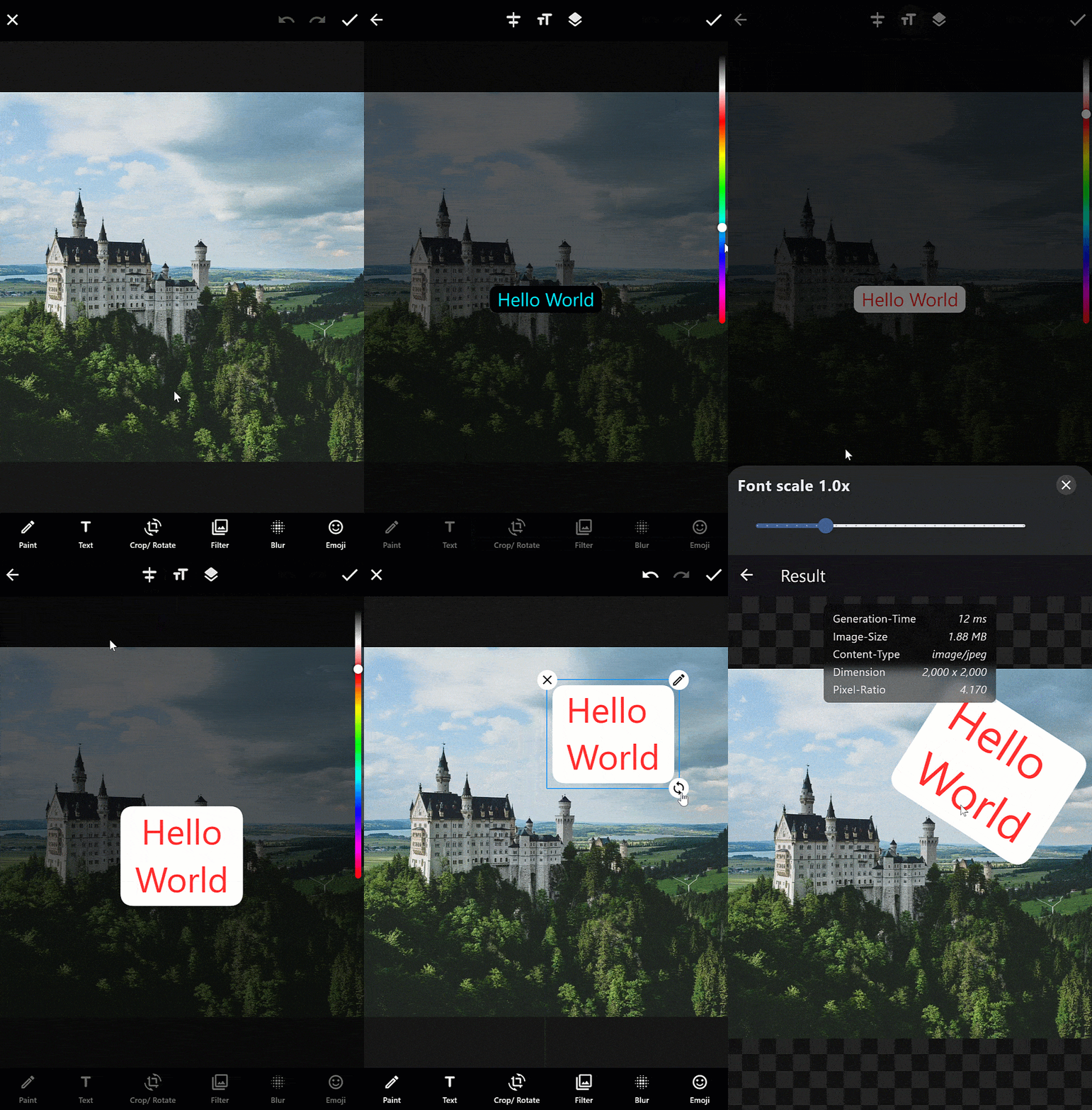
|
| Crop-Rotate-Editor | Filter-Editor |
|---|---|
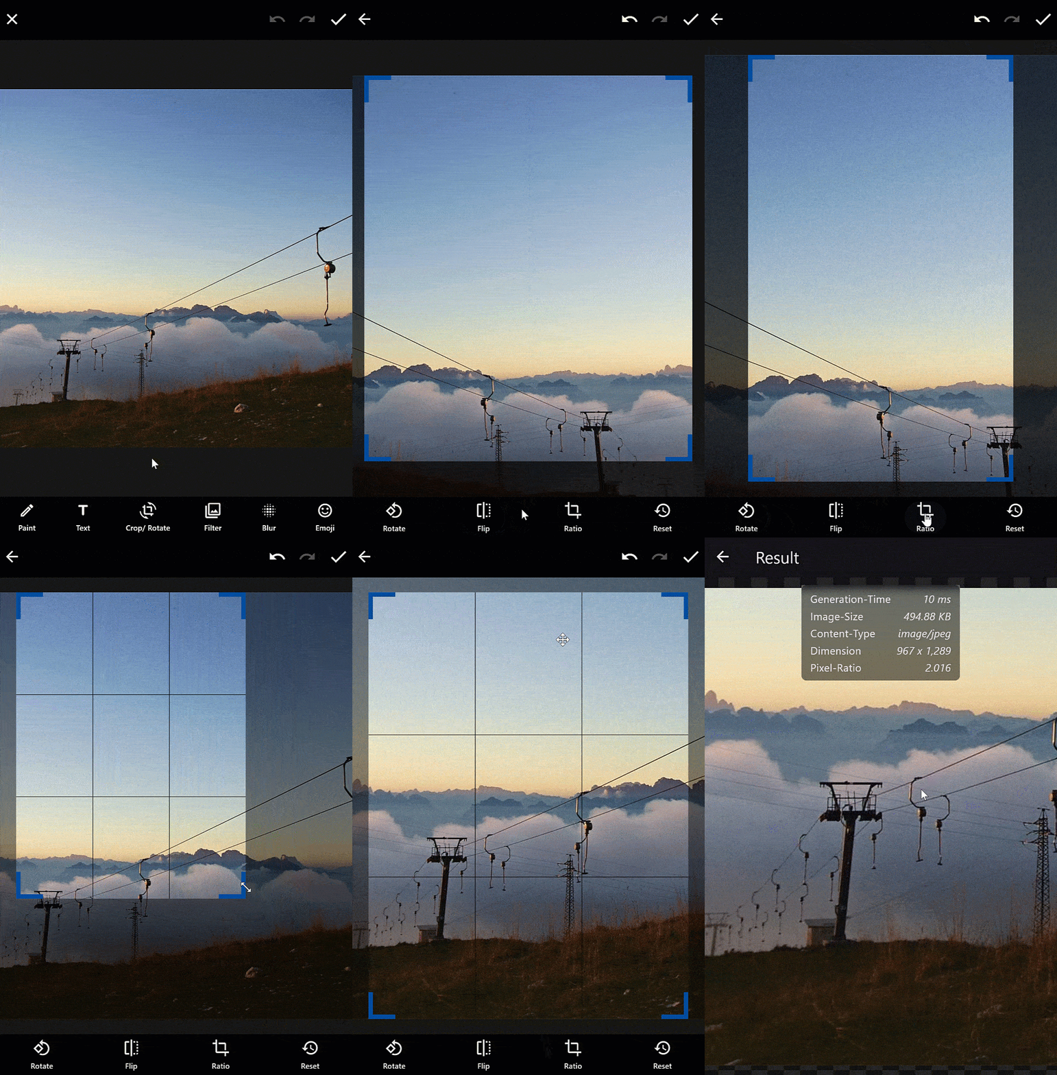
|
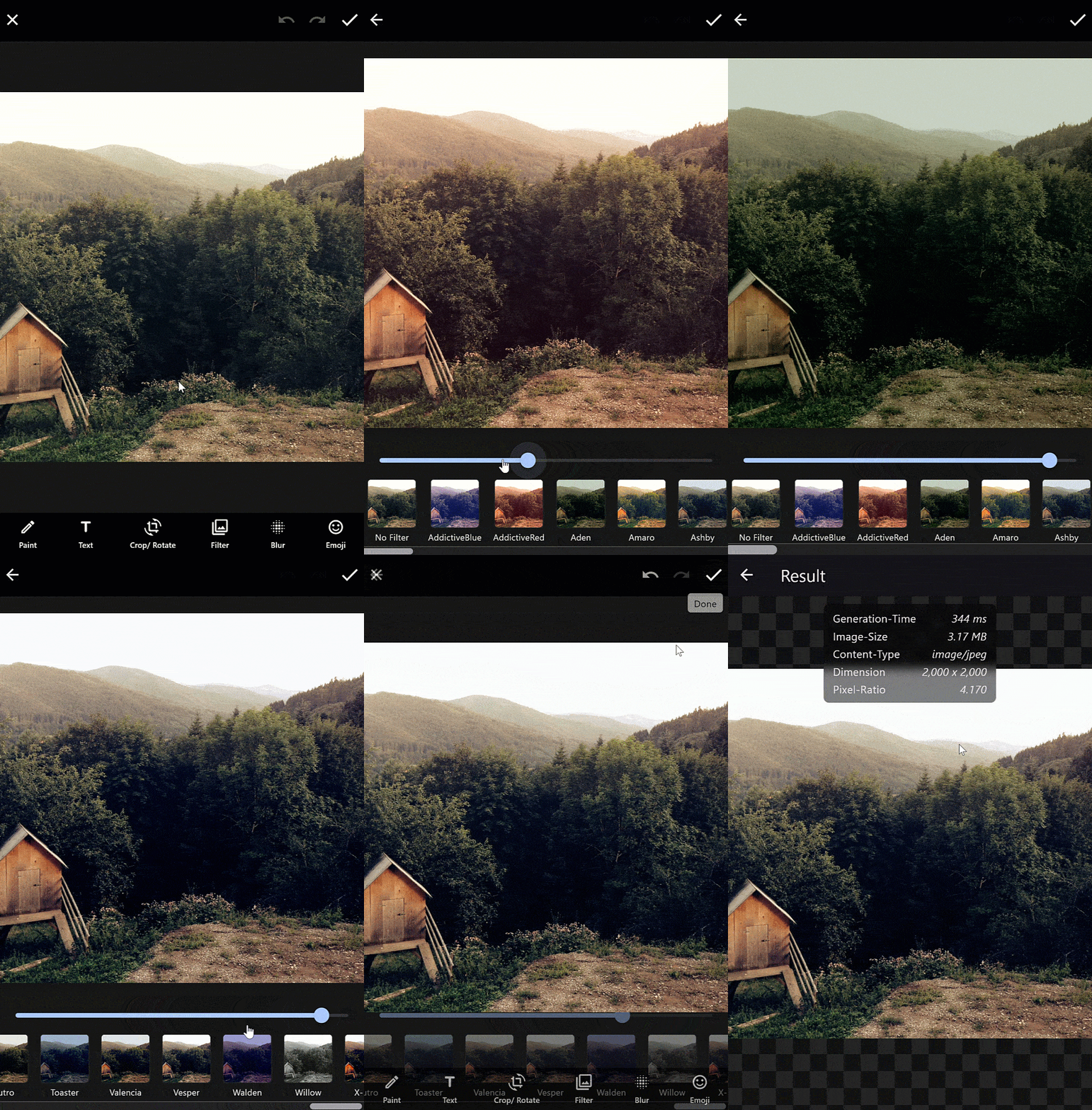
|
| Emoji-Editor | Sticker/ Widget Editor |
|---|---|
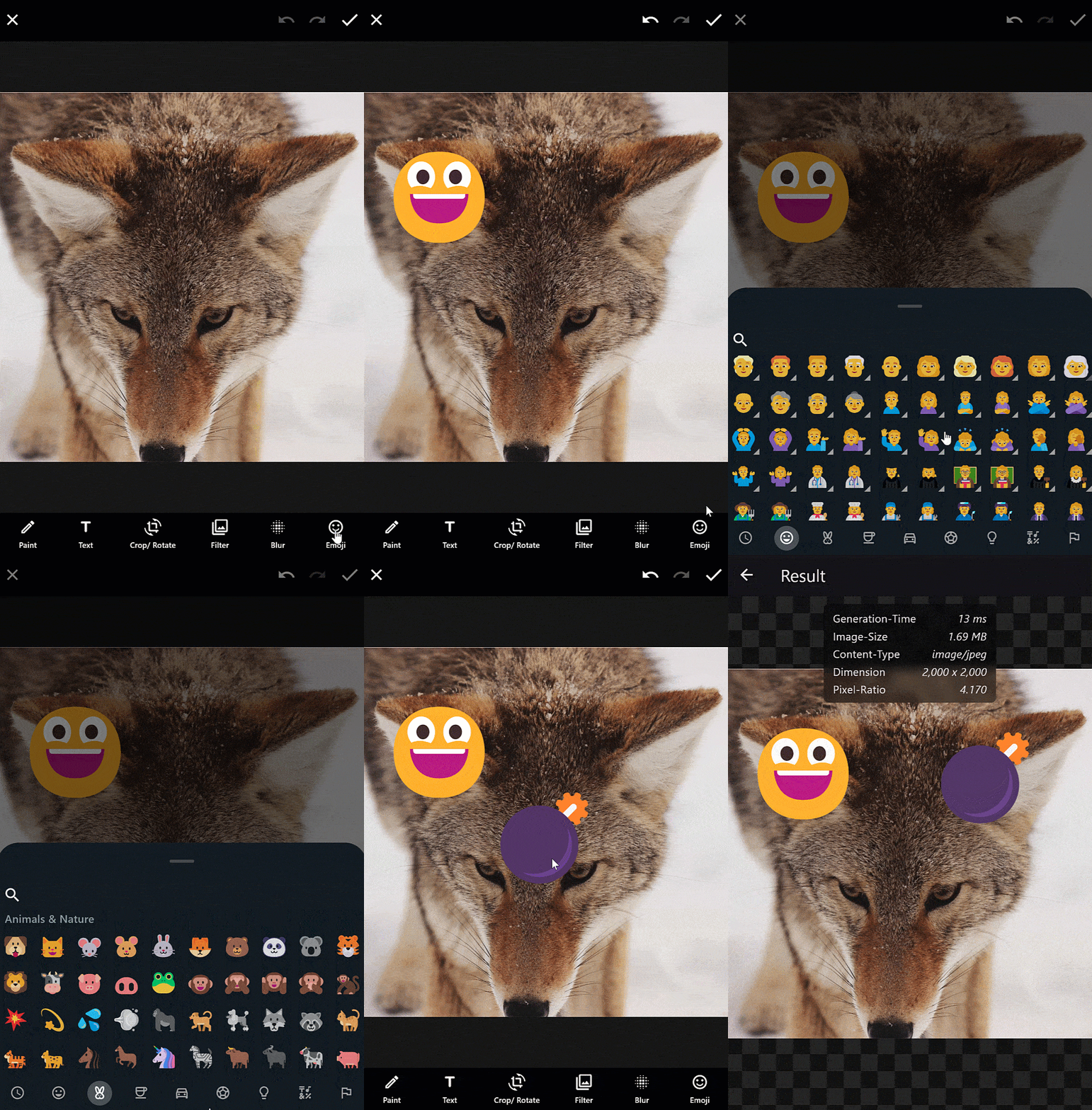
|
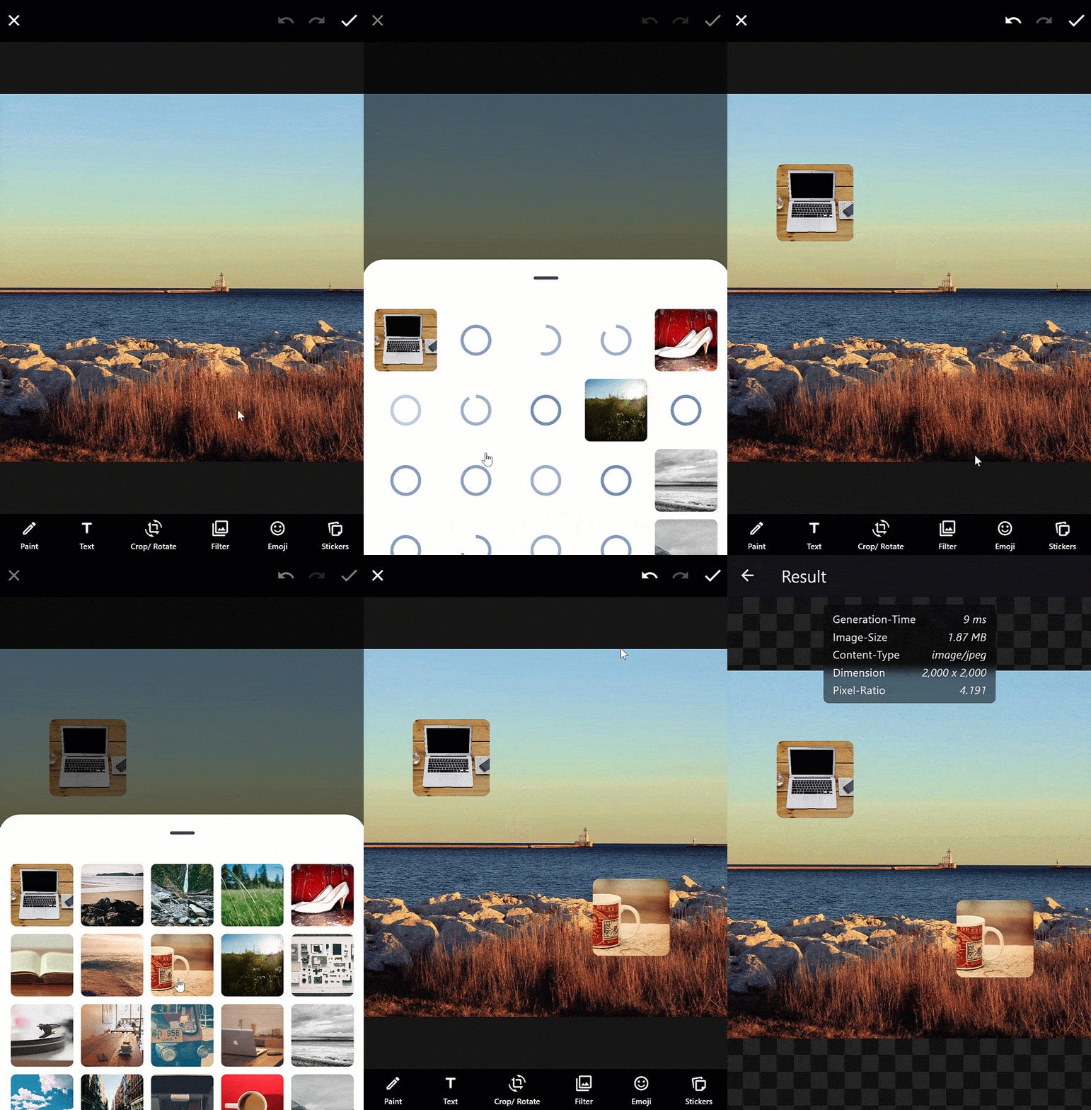
|
| Blur-Editor | - |
|---|---|
|
|
Features
- ✅ Multiple-Editors
- ✅ Painting-Editor
- ✅ Color picker
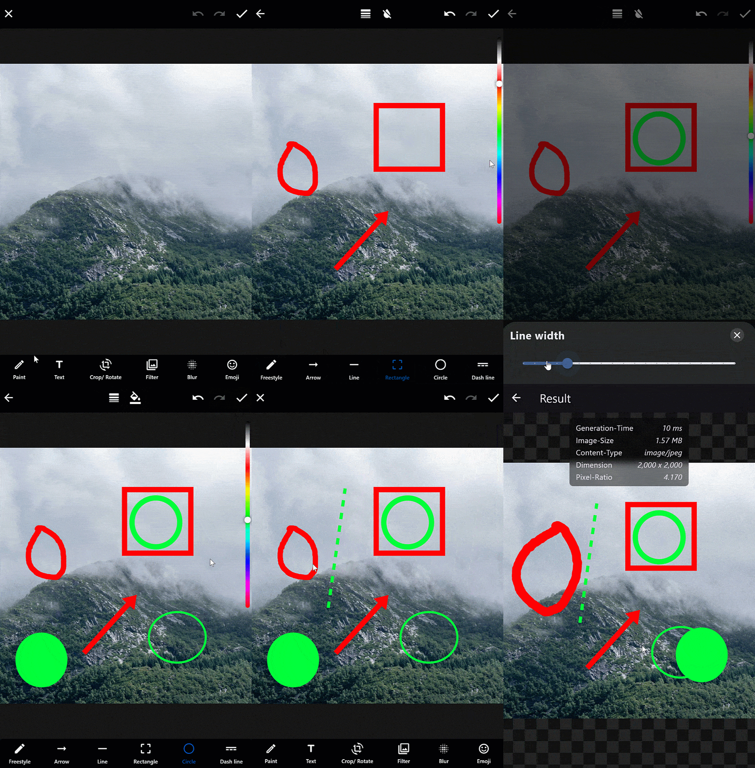
- ✅ Multiple forms like arrow, rectangle, circle and freestyle
- ✅ Text-Editor
- ✅ Color picker
- ✅ Align-Text => left, right and center
- ✅ Change Text Scale
- ✅ Multiple background modes like in whatsapp
- ✅ Crop-Rotate-Editor
- ✅ Rotate
- ✅ Flip
- ✅ Multiple aspect ratios
- ✅ Reset
- ✅ Double-Tap
- ✅ Round cropper
- ✅ Filter-Editor
- ✅ Blur-Editor
- ✅ Emoji-Picker
- ✅ Sticker-Editor
- ✅ Painting-Editor
- ✅ Multi-Threading
- ✅ Use isolates for background tasks on Dart native devices
- ✅ Use web-workers for background tasks on Dart web devices
- ✅ Automatically set the number of active background processors based on the device
- ✅ Manually set the number of active background processors
- ✅ Undo and redo function
- ✅ Use your image directly from memory, asset, file or network
- ✅ Each icon can be changed
- ✅ Any text can be translated "i18n"
- ✅ Many custom configurations for each subeditor
- ✅ Custom theme for each editor
- ✅ Selectable design mode between Material and Cupertino
- ✅ Reorder layer level
- ✅ Movable background image
- ✅ WhatsApp Theme
- ✅ Frosted-Glass Theme
- ✅ Interactive layers
- ✅ Helper lines for better positioning
- ✅ Hit detection for painted layers
- ✅ Zoomable paint and main editor
- ✅ Improved layer movement and scaling functionality for desktop devices
Planned features
- ✨ Painting-Editor
- New painting style which pixelates the background
- Freestyle Painter with improved performance and hitbox
- ✨ Text-Editor
- Text-layer with an improved hit-box and ensure it's vertically centered on all devices
- ✨ Emoji-Editor
- Preload emojis in web platforms
- ✨ AI Futures => Perhaps integrating Adobe Firefly
Getting started
Android
To enable smooth hit vibrations from a helper line, you need to add the VIBRATE permission to your AndroidManifest.xml file.
<uses-permission android:name="android.permission.VIBRATE"/>
OpenHarmony
To enable smooth hit vibrations from a helper line, you need to add the VIBRATE permission to your project's module.json5 file.
"requestPermissions": [
    {"name" :  "ohos.permission.VIBRATE"},
]
Web
If you're displaying emoji on the web and want them to be colored by default (especially if you're not using a custom font like Noto Emoji), you can achieve this by adding the useColorEmoji: true parameter to your flutter_bootstrap.js file, as shown in the code snippet below:
Show code example
{{flutter_js}}
{{flutter_build_config}}

_flutter.loader.load({
    serviceWorkerSettings: {
        serviceWorkerVersion: {{flutter_service_worker_version}},
    },
    onEntrypointLoaded: function (engineInitializer) {
      engineInitializer.initializeEngine({
        useColorEmoji: true, // add this parameter
        renderer: 'canvaskit'
      }).then(function (appRunner) {
        appRunner.runApp();
      });
    }
});
The HTML renderer can cause problems on some devices, especially mobile devices. If you don't know the exact type of phone your customers will be using, it is recommended to use the Canvas renderer.
To enable the Canvaskit renderer by default for better compatibility with mobile web devices, you can do the following in your flutter_bootstrap.js file.
Show code example
{{flutter_js}}
{{flutter_build_config}}

_flutter.loader.load({
    serviceWorkerSettings: {
        serviceWorkerVersion: {{flutter_service_worker_version}},
    },
    onEntrypointLoaded: function (engineInitializer) {
      engineInitializer.initializeEngine({
        useColorEmoji: true,
        renderer: 'canvaskit' // add this parameter
      }).then(function (appRunner) {
        appRunner.runApp();
      });
    }
});
By making this change, you can enhance filter compatibility and ensure a smoother experience on older Android phones and various mobile web devices.
You can view the full web example here.
iOS, macOS, Linux, Windows
No further action is required.
Usage
Import first the image editor like below:
import 'package:pro_image_editor/pro_image_editor.dart';
Open the editor in a new page
void _openEditor() {
  Navigator.push(
    context,
    MaterialPageRoute(
      builder: (context) => ProImageEditor.network(
        'https://picsum.photos/id/237/2000',
        callbacks: ProImageEditorCallbacks(
          onImageEditingComplete: (Uint8List bytes) async {
            /*
              Your code to handle the edited image. Upload it to your server as an example.
              You can choose to use await, so that the loading-dialog remains visible until your code is ready, or no async, so that the loading-dialog closes immediately.
              By default, the bytes are in `jpg` format.
            */
            Navigator.pop(context);
          },
        ),
      ),
    ),
  );
}
Show the editor inside of a widget
@override
Widget build(BuildContext context) {
    return Scaffold(
        body: ProImageEditor.network(
          'https://picsum.photos/id/237/2000',
           callbacks: ProImageEditorCallbacks(
             onImageEditingComplete: (Uint8List bytes) async {
               /*
                 Your code to handle the edited image. Upload it to your server as an example.
                 You can choose to use await, so that the loading-dialog remains visible until your code is ready, or no async, so that the loading-dialog closes immediately.
                 By default, the bytes are in `jpg` format.
                */
               Navigator.pop(context);
             },
          ),
        ),
    );
}
Own stickers or widgets
To display stickers or widgets in the ProImageEditor, you have the flexibility to customize and load your own content. The buildStickers method allows you to define your own logic for loading stickers, whether from a backend, assets, or local storage, and then push them into the editor. The example here demonstrates how to load images that can serve as stickers and then add them to the editor.
Frosted-Glass design
To use the "Frosted-Glass-Design" you can follow the example here
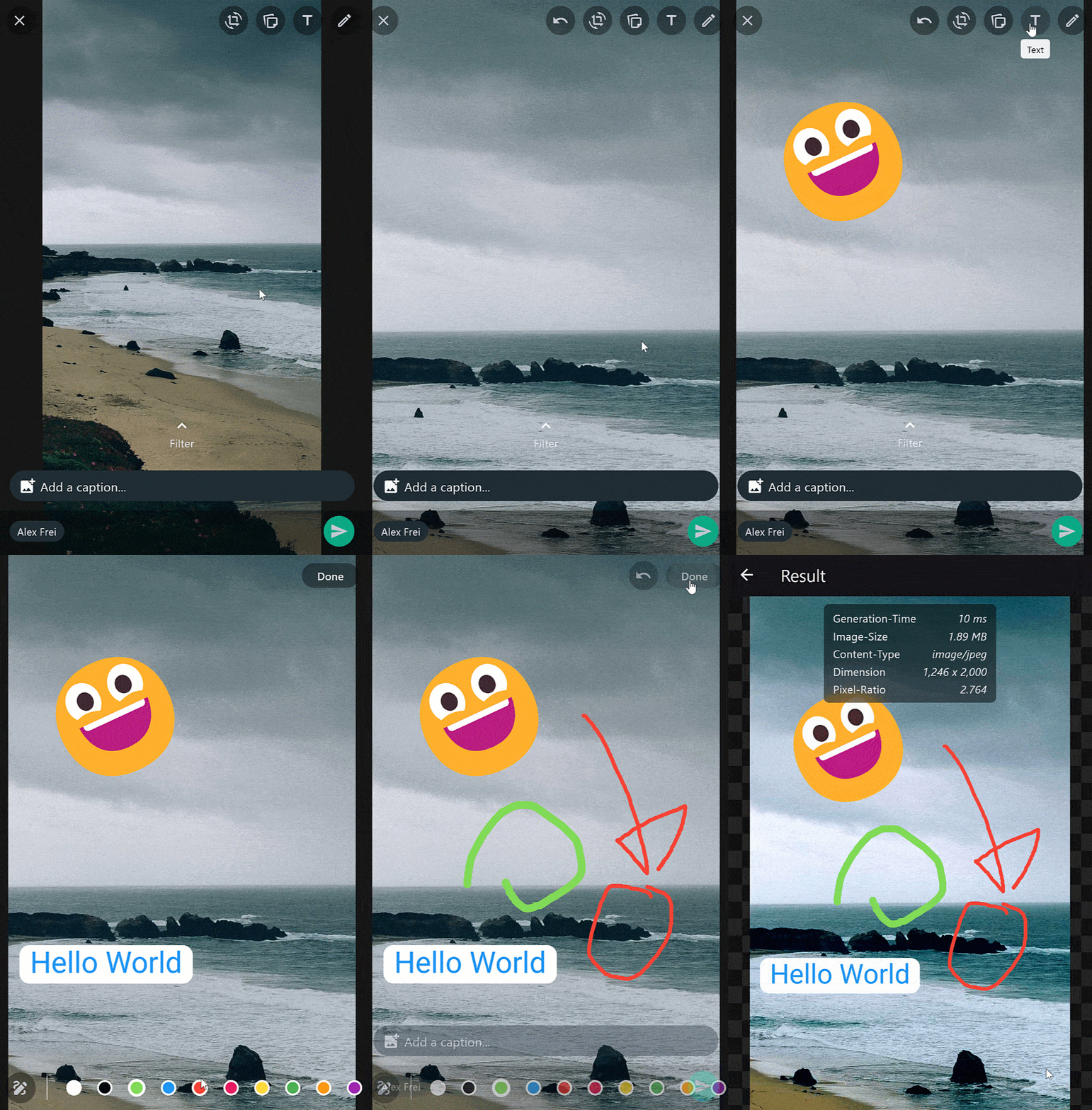
WhatsApp design
The image editor offers a WhatsApp-themed option that mirrors the popular messaging app's design. The editor also follows the small changes that exist in the Material (Android) and Cupertino (iOS) version.
You can see the complete example here
Highly configurable
Customize the image editor to suit your preferences. Of course, each class like I18nTextEditor includes more configuration options.
Show code example
return Scaffold(
    appBar: AppBar(
      title: const Text('Pro-Image-Editor')
    ),
    body: ProImageEditor.network(
        'https://picsum.photos/id/237/2000',
            key: _editor,
            callbacks: ProImageEditorCallbacks(
              onImageEditingComplete: (Uint8List bytes) async {
                /*
                  Your code to handle the edited image. Upload it to your server as an example.
                  You can choose to use await, so that the loading-dialog remains visible until your code is ready, or no async, so that the loading-dialog closes immediately.
                  By default, the bytes are in `jpg` format.
                */
                Navigator.pop(context);
              },
            ),
            configs: ProImageEditorConfigs(
              activePreferredOrientations: [
                  DeviceOrientation.portraitUp,
                  DeviceOrientation.portraitDown,
                  DeviceOrientation.landscapeLeft,
                  DeviceOrientation.landscapeRight,
              ],
              i18n: const I18n(
                  various: I18nVarious(),
                  paintEditor: I18nPaintingEditor(),
                  textEditor: I18nTextEditor(),
                  cropRotateEditor: I18nCropRotateEditor(),
                  filterEditor: I18nFilterEditor(filters: I18nFilters()),
                  emojiEditor: I18nEmojiEditor(),
                  stickerEditor: I18nStickerEditor(),
                  // More translations...
              ),
              helperLines: const HelperLines(
                  showVerticalLine: true,
                  showHorizontalLine: true,
                  showRotateLine: true,
                  hitVibration: true,
              ),
              customWidgets: const ProImageEditorCustomWidgets(),
              imageEditorTheme: const ImageEditorTheme(
                  layerHoverCursor: SystemMouseCursors.move,
                  helperLine: HelperLineTheme(
                      horizontalColor: Color(0xFF1565C0),
                      verticalColor: Color(0xFF1565C0),
                      rotateColor: Color(0xFFE91E63),
                  ),
                  paintingEditor: PaintingEditorTheme(),
                  textEditor: TextEditorTheme(),
                  cropRotateEditor: CropRotateEditorTheme(),
                  filterEditor: FilterEditorTheme(),
                  emojiEditor: EmojiEditorTheme(),
                  stickerEditor: StickerEditorTheme(),
                  background: Color.fromARGB(255, 22, 22, 22),
                  loadingDialogTextColor: Color(0xFFE1E1E1),
                  uiOverlayStyle: SystemUiOverlayStyle(
                  statusBarColor: Color(0x42000000),
                  statusBarIconBrightness: Brightness.light,
                  systemNavigationBarIconBrightness: Brightness.light,
                  statusBarBrightness: Brightness.dark,
                  systemNavigationBarColor: Color(0xFF000000),
                  ),
              ),
              icons: const ImageEditorIcons(
                  paintingEditor: IconsPaintingEditor(),
                  textEditor: IconsTextEditor(),
                  cropRotateEditor: IconsCropRotateEditor(),
                  filterEditor: IconsFilterEditor(),
                  emojiEditor: IconsEmojiEditor(),
                  stickerEditor: IconsStickerEditor(),
                  closeEditor: Icons.clear,
                  doneIcon: Icons.done,
                  applyChanges: Icons.done,
                  backButton: Icons.arrow_back,
                  undoAction: Icons.undo,
                  redoAction: Icons.redo,
                  removeElementZone: Icons.delete_outline_rounded,
              ),
              paintEditorConfigs: const PaintEditorConfigs(),
              textEditorConfigs: const TextEditorConfigs(),
              cropRotateEditorConfigs: const CropRotateEditorConfigs(),
              filterEditorConfigs: FilterEditorConfigs(),
              emojiEditorConfigs: const EmojiEditorConfigs(),
              stickerEditorConfigs: StickerEditorConfigs(
                enabled: true,
                buildStickers: (setLayer) {
                  return ClipRRect(
                    borderRadius: const BorderRadius.vertical(top: Radius.circular(20)),
                    child: Container(
                      color: const Color.fromARGB(255, 224, 239, 251),
                      child: GridView.builder(
                        padding: const EdgeInsets.all(16),
                        gridDelegate: const SliverGridDelegateWithMaxCrossAxisExtent(
                          maxCrossAxisExtent: 150,
                          mainAxisSpacing: 10,
                          crossAxisSpacing: 10,
                        ),
                        itemCount: 21,
                        shrinkWrap: true,
                        itemBuilder: (context, index) {
                          Widget widget = ClipRRect(
                            borderRadius: BorderRadius.circular(7),
                            child: Image.network(
                              'https://picsum.photos/id/${(index + 3) * 3}/2000',
                              width: 120,
                              height: 120,
                              fit: BoxFit.cover,
                            ),
                          );
                          return GestureDetector(
                            onTap: () => setLayer(widget),
                            child: MouseRegion(
                              cursor: SystemMouseCursors.click,
                              child: widget,
                            ),
                          );
                        },
                      ),
                    ),
                  );
                },
              ),
              designMode: ImageEditorDesignModeE.material,
              heroTag: 'hero',
              theme: ThemeData(
                  useMaterial3: true,
                  colorScheme: ColorScheme.fromSeed(
                  seedColor: Colors.blue.shade800,
                  brightness: Brightness.dark,
                  ),
              ),
        ),
    )
);
Custom AppBar
Customize the AppBar with your own widgets. The same is also possible with the BottomBar.
Show code example
import 'dart:async';
import 'package:flutter/material.dart';
import 'package:pro_image_editor/pro_image_editor.dart';
class Demo extends StatefulWidget {
const Demo({super.key});
@override
State<Demo> createState() => DemoState();
}
class DemoState extends State<Demo> {
final _editorKey = GlobalKey<ProImageEditorState>();
late StreamController _updateAppBarStream;
@override
void initState() {
_updateAppBarStream = StreamController.broadcast();
super.initState();
}
@override
void dispose() {
_updateAppBarStream.close();
super.dispose();
}
@override
Widget build(BuildContext context) {
return ProImageEditor.network(
'https://picsum.photos/id/237/2000',
key: _editorKey,
callbacks: ProImageEditorCallbacks(
onImageEditingComplete: (Uint8List bytes) async {
/*
Your code to handle the edited image. Upload it to your server as an example.
You can choose to use await, so that the loading-dialog remains visible until your code is ready, or no async, so that the loading-dialog closes immediately.
By default, the bytes are in `jpg` format.
*/
Navigator.pop(context);
},
onUpdateUI: () {
_updateAppBarStream.add(null);
},
),
configs: ProImageEditorConfigs(
customWidgets: ImageEditorCustomWidgets(
appBar: AppBar(
automaticallyImplyLeading: false,
foregroundColor: Colors.white,
backgroundColor: Colors.black,
actions: [
StreamBuilder(
stream: _updateAppBarStream.stream,
builder: (_, __) {
return IconButton(
tooltip: 'Cancel',
padding: const EdgeInsets.symmetric(horizontal: 8),
icon: const Icon(Icons.close),
onPressed: _editorKey.currentState?.closeEditor,
);
}),
const Spacer(),
IconButton(
tooltip: 'Custom Icon',
padding: const EdgeInsets.symmetric(horizontal: 8),
icon: const Icon(
Icons.bug_report,
color: Colors.white,
),
onPressed: () {},
),
StreamBuilder(
stream: _updateAppBarStream.stream,
builder: (_, __) {
return IconButton(
tooltip: 'Undo',
padding: const EdgeInsets.symmetric(horizontal: 8),
icon: Icon(
Icons.undo,
color: _editorKey.currentState?.canUndo == true ? Colors.white : Colors.white.withAlpha(80),
),
onPressed: _editorKey.currentState?.undoAction,
);
},
),
StreamBuilder(
stream: _updateAppBarStream.stream,
builder: (_, __) {
return IconButton(
tooltip: 'Redo',
padding: const EdgeInsets.symmetric(horizontal: 8),
icon: Icon(
Icons.redo,
color: _editorKey.currentState?.canRedo == true ? Colors.white : Colors.white.withAlpha(80),
),
onPressed: _editorKey.currentState?.redoAction,
);
},
),
StreamBuilder(
stream: _updateAppBarStream.stream,
builder: (_, __) {
return IconButton(
tooltip: 'Done',
padding: const EdgeInsets.symmetric(horizontal: 8),
icon: const Icon(Icons.done),
iconSize: 28,
onPressed: _editorKey.currentState?.doneEditing,
);
}),
],
),
appBarPaintingEditor: AppBar(
automaticallyImplyLeading: false,
foregroundColor: Colors.white,
backgroundColor: Colors.black,
actions: [
StreamBuilder(
stream: _updateAppBarStream.stream,
builder: (_, __) {
return IconButton(
padding: const EdgeInsets.symmetric(horizontal: 8),
icon: const Icon(Icons.arrow_back),
onPressed: _editorKey.currentState?.paintingEditor.currentState?.close,
);
}),
const SizedBox(width: 80),
const Spacer(),
StreamBuilder(
stream: _updateAppBarStream.stream,
builder: (_, __) {
return IconButton(
padding: const EdgeInsets.symmetric(horizontal: 8),
icon: const Icon(
Icons.line_weight_rounded,
color: Colors.white,
),
onPressed: _editorKey.currentState?.paintingEditor.currentState?.openLineWeightBottomSheet,
);
}),
StreamBuilder(
stream: _updateAppBarStream.stream,
builder: (_, __) {
return IconButton(
padding: const EdgeInsets.symmetric(horizontal: 8),
icon: Icon(
_editorKey.currentState?.paintingEditor.currentState?.fillBackground == true
? Icons.format_color_reset
: Icons.format_color_fill,
color: Colors.white,
),
onPressed: _editorKey.currentState?.paintingEditor.currentState?.toggleFill);
}),
const Spacer(),
IconButton(
tooltip: 'Custom Icon',
padding: const EdgeInsets.symmetric(horizontal: 8),
icon: const Icon(
Icons.bug_report,
color: Colors.white,
),
onPressed: () {},
),
StreamBuilder(
stream: _updateAppBarStream.stream,
builder: (_, __) {
return IconButton(
tooltip: 'Undo',
padding: const EdgeInsets.symmetric(horizontal: 8),
icon: Icon(
Icons.undo,
color: _editorKey.currentState?.paintingEditor.currentState?.canUndo == true ? Colors.white : Colors.white.withAlpha(80),
),
onPressed: _editorKey.currentState?.paintingEditor.currentState?.undoAction,
);
}),
StreamBuilder(
stream: _updateAppBarStream.stream,
builder: (_, __) {
return IconButton(
tooltip: 'Redo',
padding: const EdgeInsets.symmetric(horizontal: 8),
icon: Icon(
Icons.redo,
color: _editorKey.currentState?.paintingEditor.currentState?.canRedo == true ? Colors.white : Colors.white.withAlpha(80),
),
onPressed: _editorKey.currentState?.paintingEditor.currentState?.redoAction,
);
}),
StreamBuilder(
stream: _updateAppBarStream.stream,
builder: (_, __) {
return IconButton(
tooltip: 'Done',
padding: const EdgeInsets.symmetric(horizontal: 8),
icon: const Icon(Icons.done),
iconSize: 28,
onPressed: _editorKey.currentState?.paintingEditor.currentState?.done,
);
}),
],
),
appBarTextEditor: AppBar(
automaticallyImplyLeading: false,
backgroundColor: Colors.black,
foregroundColor: Colors.white,
actions: [
StreamBuilder(
stream: _updateAppBarStream.stream,
builder: (_, __) {
return IconButton(
padding: const EdgeInsets.symmetric(horizontal: 8),
icon: const Icon(Icons.arrow_back),
onPressed: _editorKey.currentState?.textEditor.currentState?.close,
);
}),
const Spacer(),
IconButton(
tooltip: 'Custom Icon',
padding: const EdgeInsets.symmetric(horizontal: 8),
icon: const Icon(
Icons.bug_report,
color: Colors.white,
),
onPressed: () {},
),
StreamBuilder(
stream: _updateAppBarStream.stream,
builder: (_, __) {
return IconButton(
onPressed: _editorKey.currentState?.textEditor.currentState?.toggleTextAlign,
icon: Icon(
_editorKey.currentState?.textEditor.currentState?.align == TextAlign.left
? Icons.align_horizontal_left_rounded
: _editorKey.currentState?.textEditor.currentState?.align == TextAlign.right
? Icons.align_horizontal_right_rounded
: Icons.align_horizontal_center_rounded,
),
);
}),
StreamBuilder(
stream: _updateAppBarStream.stream,
builder: (_, __) {
return IconButton(
onPressed: _editorKey.currentState?.textEditor.currentState?.toggleBackgroundMode,
icon: const Icon(Icons.layers_rounded),
);
}),
const Spacer(),
StreamBuilder(
stream: _updateAppBarStream.stream,
builder: (_, __) {
return IconButton(
padding: const EdgeInsets.symmetric(horizontal: 8),
icon: const Icon(Icons.done),
iconSize: 28,
onPressed: _editorKey.currentState?.textEditor.currentState?.done,
);
}),
],
),
appBarCropRotateEditor: AppBar(
automaticallyImplyLeading: false,
backgroundColor: Colors.black,
foregroundColor: Colors.white,
actions: [
StreamBuilder(
stream: _updateUIStream.stream,
builder: (_, __) {
return IconButton(
padding: const EdgeInsets.symmetric(horizontal: 8),
icon: const Icon(Icons.arrow_back),
onPressed: editorKey.currentState?.cropRotateEditor.currentState?.close,
);
}),
const Spacer(),
IconButton(
tooltip: 'My Button',
color: Colors.amber,
padding: const EdgeInsets.symmetric(horizontal: 8),
icon: const Icon(
Icons.bug_report,
color: Colors.amber,
),
onPressed: () {},
),
StreamBuilder(
stream: _updateUIStream.stream,
builder: (_, __) {
return IconButton(
tooltip: 'Undo',
padding: const EdgeInsets.symmetric(horizontal: 8),
icon: Icon(
Icons.undo,
color: editorKey.currentState!.cropRotateEditor.currentState!.canUndo ? Colors.white : Colors.white.withAlpha(80),
),
onPressed: editorKey.currentState!.cropRotateEditor.currentState!.undoAction,
);
}),
StreamBuilder(
stream: _updateUIStream.stream,
builder: (_, __) {
return IconButton(
tooltip: 'Redo',
padding: const EdgeInsets.symmetric(horizontal: 8),
icon: Icon(
Icons.redo,
color: editorKey.currentState!.cropRotateEditor.currentState!.canRedo ? Colors.white : Colors.white.withAlpha(80),
),
onPressed: editorKey.currentState!.cropRotateEditor.currentState!.redoAction,
);
}),
StreamBuilder(
stream: _updateUIStream.stream,
builder: (_, __) {
return IconButton(
padding: const EdgeInsets.symmetric(horizontal: 8),
icon: const Icon(Icons.done),
iconSize: 28,
onPressed: editorKey.currentState!.cropRotateEditor.currentState!.done,
);
}),
],
),
appBarFilterEditor: AppBar(
automaticallyImplyLeading: false,
backgroundColor: Colors.black,
foregroundColor: Colors.white,
actions: [
StreamBuilder(
stream: _updateAppBarStream.stream,
builder: (_, __) {
return IconButton(
padding: const EdgeInsets.symmetric(horizontal: 8),
icon: const Icon(Icons.arrow_back),
onPressed: _editorKey.currentState?.filterEditor.currentState?.close,
);
}),
const Spacer(),
IconButton(
tooltip: 'Custom Icon',
padding: const EdgeInsets.symmetric(horizontal: 8),
icon: const Icon(
Icons.bug_report,
color: Colors.white,
),
onPressed: () {},
),
StreamBuilder(
stream: _updateAppBarStream.stream,
builder: (_, __) {
return IconButton(
padding: const EdgeInsets.symmetric(horizontal: 8),
icon: const Icon(Icons.done),
iconSize: 28,
onPressed: _editorKey.currentState?.filterEditor.currentState?.done,
);
}),
],
),
),
),
);
}
}
Upload to Firebase or Supabase
Firebase example
ProImageEditor.asset(
  'assets/demo.png',
  callbacks: ProImageEditorCallbacks(
    onImageEditingComplete: (bytes) async {
      try {
        String path = 'your-storage-path/my-image-name.jpg';
        Reference ref = FirebaseStorage.instance.ref(path);

        /// In some special cases detect firebase the contentType wrong,
        /// so we make sure the contentType is set to jpg.
        await ref.putData(bytes, SettableMetadata(contentType: 'image/jpg'));
      } on FirebaseException catch (e) {
        debugPrint(e.message);
      }
      if (mounted) Navigator.pop(context);
    },
  ),
);
Supabase example
final _supabase = Supabase.instance.client;

ProImageEditor.asset(
  'assets/demo.png',
  callbacks: ProImageEditorCallbacks(
    onImageEditingComplete: (bytes) async {
      try {
        String path = 'your-storage-path/my-image-name.jpg';
        await _supabase.storage.from('my_bucket').uploadBinary(
              path,
              bytes,
              retryAttempts: 3,
            );
      } catch (e) {
        debugPrint(e.toString());
      }
      if (mounted) Navigator.pop(context);
    },
  ),
);
Import-Export state history
The state history from the image editor can be exported and imported. However, it's important to note that the crop and rotate feature currently only allows exporting the final cropped image and not individual states. Additionally, all sticker widgets are converted into images and saved in that format during the export process.
Export example
 await _editor.currentState?.exportStateHistory(
    // All configurations are optional
    configs: const ExportEditorConfigs(
      exportPainting: true,
      exportText: true,
      exportCropRotate: false,
      exportFilter: true,
      exportEmoji: true,
      exportSticker: true,
      historySpan: ExportHistorySpan.all,
    ),
  ).toJson(); // or => toMap(), toFile()
Import example
 _editor.currentState?.importStateHistory(
    // or => fromMap(), fromJsonFile()
    ImportStateHistory.fromJson(
      /* Json-String from your exported state history */,
      configs: const ImportEditorConfigs(
        mergeMode: ImportEditorMergeMode.replace,
        recalculateSizeAndPosition: true,
      ),
    ),
  );
Initial import example
If you wish to open the editor directly with your exported state history, you can do so by utilizing the import feature. Simply load the exported state history into the editor, and it will recreate the previous editing session, allowing you to continue where you left off.
ProImageEditor.memory(
  bytes,
  key: _editor,
  callbacks: ProImageEditorCallbacks(
    onImageEditingComplete: (Uint8List bytes) async {
      /*
        Your code to handle the edited image. Upload it to your server as an example.
        You can choose to use await, so that the loading-dialog remains visible until your code is ready, or no async, so that the loading-dialog closes immediately.
        By default, the bytes are in `jpg` format.
      */
      Navigator.pop(context);
    },
  ),
  configs: ProImageEditorConfigs(
    stateHistoryConfigs: StateHistoryConfigs(
      initStateHistory: ImportStateHistory.fromJson(
        /* Json-String from your exported state history */,
        configs: const ImportEditorConfigs(
          mergeMode: ImportEditorMergeMode.replace,
          recalculateSizeAndPosition: true,
        ),
      ),
    ),
  ),
);
Documentation
Interactive layers
Each layer, whether it's an emoji, text, or painting, is interactive, allowing you to manipulate them in various ways. You can move and scale layers using intuitive gestures. Holding a layer with one finger enables you to move it across the canvas. Holding a layer with one finger and using another to pinch or spread allows you to scale and rotate the layer.
On desktop devices, you can click and hold a layer with the mouse to move it. Additionally, using the mouse wheel lets you scale the layer. To rotate a layer, simply press the 'Shift' or 'Ctrl' key while interacting with it.
Editor Widget
| Property | Description |
|---|---|
byteArray | Image data as a Uint8List from memory. |
file | File object representing the image file. |
assetPath | Path to the image asset. |
networkUrl | URL of the image to be loaded from the network. |
configs | Configuration options for the image editor. |
callbacks | Callbacks for the image editor. |
Constructors
ProImageEditor.memory
Creates a ProImageEditor widget for editing an image from memory.
ProImageEditor.file
Creates a ProImageEditor widget for editing an image from a file.
ProImageEditor.asset
Creates a ProImageEditor widget for editing an image from an asset.
ProImageEditor.network
Creates a ProImageEditor widget for editing an image from a network URL.
ProImageEditorConfigs
| Property Name | Description | Default Value |
|---|---|---|
i18n | Internationalization settings for the Image Editor. | I18n() |
helperLines | Configuration options for helper lines in the Image Editor. | HelperLines() |
customWidgets | Custom widgets to be used in the Image Editor. | ImageEditorCustomWidgets() |
imageEditorTheme | Theme settings for the Image Editor. | ImageEditorTheme() |
icons | Icons to be used in the Image Editor. | ImageEditorIcons() |
paintEditorConfigs | Configuration options for the Paint Editor. | PaintEditorConfigs() |
textEditorConfigs | Configuration options for the Text Editor. | TextEditorConfigs() |
cropRotateEditorConfigs | Configuration options for the Crop and Rotate Editor. | CropRotateEditorConfigs() |
filterEditorConfigs | Configuration options for the Filter Editor. | FilterEditorConfigs() |
blurEditorConfigs | Configuration options for the Blur Editor. | BlurEditorConfigs() |
emojiEditorConfigs | Configuration options for the Emoji Editor. | EmojiEditorConfigs() |
stickerEditorConfigs | Configuration options for the Sticker Editor. | StickerEditorConfigs() |
designMode | The design mode for the Image Editor. | ImageEditorDesignModeE.material |
theme | The theme to be used for the Image Editor. | null |
heroTag | A unique hero tag for the Image Editor widget. | 'Pro-Image-Editor-Hero' |
layerInteraction | Configuration options for the layer interaction behavior. | LayerInteraction() |
stateHistoryConfigs | Holds the configurations related to state history management. | StateHistoryConfigs() |
imageGenerationConfigs | Holds the configurations related to image generation. | ImageGeneratioConfigs() |
ProImageEditorCallbacks
| Property Name | Description | Default Value |
|---|---|---|
onImageEditingStarted | A callback function that is triggered when the image generation is started. | null |
onImageEditingComplete | A callback function that will be called when the editing is done, returning the edited image as Uint8List with the format jpg. | null |
onThumbnailGenerated | A callback function that is called when the editing is complete and the thumbnail image is generated, along with capturing the original image as a raw ui.Image. If used, it will disable the onImageEditingComplete callback. | null |
onCloseEditor | A callback function that will be called before the image editor closes. | null |
mainEditorCallbacks | Callbacks from the main editor. | null |
paintEditorCallbacks | Callbacks from the paint editor. | null |
textEditorCallbacks | Callbacks from the text editor. | null |
cropRotateEditorCallbacks | Callbacks from the crop-rotate editor. | null |
filterEditorCallbacks | Callbacks from the filter editor. | null |
blurEditorCallbacks | Callbacks from the blur editor. | null |
i18n
| Property Name | Description | Default Value |
|---|---|---|
paintEditor | Translations and messages specific to the painting editor. | I18nPaintingEditor() |
various | Translations and messages for various parts of the editor. | I18nVarious() |
layerInteraction | Translations and messages for layer interactions. | I18nLayerInteraction() |
textEditor | Translations and messages specific to the text editor. | I18nTextEditor() |
filterEditor | Translations and messages specific to the filter editor. | I18nFilterEditor() |
blurEditor | Translations and messages specific to the blur editor. | I18nBlurEditor() |
emojiEditor | Translations and messages specific to the emoji editor. | I18nEmojiEditor() |
stickerEditor | Translations and messages specific to the sticker editor. | I18nStickerEditor() |
cropRotateEditor | Translations and messages specific to the crop and rotate editor. | I18nCropRotateEditor() |
doneLoadingMsg | Message displayed while changes are being applied. | Changes are being applied |
importStateHistoryMsg | Message displayed during the import of state history. If the text is empty, no loading dialog will be shown. | Initialize Editor |
cancel | Text for the "Cancel" action. | Cancel |
undo | Text for the "Undo" action. | Undo |
redo | Text for the "Redo" action. | Redo |
done | Text for the "Done" action. | Done |
remove | Text for the "Remove" action. | Remove |
i18n paintEditor
| Property Name | Description | Default Value |
|---|---|---|
bottomNavigationBarText | Text for the bottom navigation bar item that opens the Painting Editor. | Paint |
freestyle | Text for the "Freestyle" painting mode. | Freestyle |
arrow | Text for the "Arrow" painting mode. | Arrow |
line | Text for the "Line" painting mode. | Line |
rectangle | Text for the "Rectangle" painting mode. | Rectangle |
circle | Text for the "Circle" painting mode. | Circle |
dashLine | Text for the "Dash line" painting mode. | Dash line |
lineWidth | Text for the "Line width" tooltip. | Line width |
toggleFill | Text for the "Toggle fill" tooltip. | Toggle fill |
undo | Text for the "Undo" button. | Undo |
redo | Text for the "Redo" button. | Redo |
done | Text for the "Done" button. | Done |
back | Text for the "Back" button. | Back |
smallScreenMoreTooltip | The tooltip text displayed for the "More" option on small screens. | More |
i18n textEditor
| Property | Description | Default Value |
|---|---|---|
bottomNavigationBarText | Text for the bottom navigation bar item | 'Text' |
inputHintText | Placeholder text displayed in the text input field | 'Enter text' |
done | Text for the "Done" button | 'Done' |
back | Text for the "Back" button | 'Back' |
textAlign | Text for the "Align text" setting | 'Align text' |
fontScale | Text for the "Font Scale" setting | 'Font Scale' |
backgroundMode | Text for the "Background mode" setting | 'Background mode' |
smallScreenMoreTooltip | Tooltip text for the "More" option on small screens | 'More' |
i18n cropRotateEditor
| Property Name | Description | Default Value |
|---|---|---|
bottomNavigationBarText | Text for the bottom navigation bar item that opens the Crop and Rotate Editor. | Crop/ Rotate |
rotate | Text for the "Rotate" tooltip. | Rotate |
flip | Text for the "Flip" tooltip. | Flip |
ratio | Text for the "Ratio" tooltip. | Ratio |
back | Text for the "Back" button. | Back |
cancel | Text for the "Cancel" button. | Cancel |
done | Text for the "Done" button. | Done |
reset | Text for the "Reset" button. | Reset |
undo | Text for the "Undo" button. | Undo |
redo | Text for the "Redo" button. | Redo |
smallScreenMoreTooltip | The tooltip text displayed for the "More" option on small screens. | More |
i18n filterEditor
| Property | Description | Default Value |
|---|---|---|
applyFilterDialogMsg | Text displayed when a filter is being applied | 'Filter is being applied.' |
bottomNavigationBarText | Text for the bottom navigation bar item | 'Filter' |
back | Text for the "Back" button in the Filter Editor | 'Back' |
done | Text for the "Done" button in the Filter Editor | 'Done' |
filters | Internationalization settings for individual filters | I18nFilters() |
i18n blurEditor
| Property | Description | Default Value |
|---|---|---|
applyBlurDialogMsg | Text displayed when a filter is being applied | 'Blur is being applied.' |
bottomNavigationBarText | Text for the bottom navigation bar item | 'Blur' |
back | Text for the "Back" button in the Blur Editor | 'Back' |
done | Text for the "Done" button in the Blur Editor | 'Done' |
i18n emojiEditor
| Property Name | Description | Default Value |
|---|---|---|
bottomNavigationBarText | Text for the bottom navigation bar item that opens the Emoji Editor. | Emoji |
noRecents | Text which shows there are no recent selected emojis. | No Recents |
search | Hint text in the search field. | Search |
i18n stickerEditor
| Property | Description | Default Value |
|---|---|---|
bottomNavigationBarText | Text for the bottom navigation bar item that opens the Sticker Editor. | 'Stickers' |
i18n various
| Property | Description | Default Value |
|---|---|---|
loadingDialogMsg | Text for the loading dialog message. | 'Please wait...' |
closeEditorWarningTitle | Title for the warning message when closing the Image Editor. | 'Close Image Editor?' |
closeEditorWarningMessage | Warning message when closing the Image Editor. | 'Are you sure you want to close the Image Editor? Your changes will not be saved.' |
closeEditorWarningConfirmBtn | Text for the confirmation button in the close editor warning dialog. | 'OK' |
closeEditorWarningCancelBtn | Text for the cancel button in the close editor warning dialog. | 'Cancel' |
helperLines
| Property | Description | Default Value |
|---|---|---|
showVerticalLine | Specifies whether to show the vertical helper line. | true |
showHorizontalLine | Specifies whether to show the horizontal helper line. | true |
showRotateLine | Specifies whether to show the rotate helper line. | true |
hitVibration | Controls whether haptic feedback is enabled when a layer intersects with a helper line. When set to true, haptic feedback is triggered when a layer's position or boundary intersects with a helper line, providing tactile feedback to the user. This feature enhances the user experience by providing feedback on layer alignment. By default, this option is set to true, enabling haptic feedback for hit detection with helper lines. You can set it to false to disable haptic feedback. | true |
imageEditorTheme
| Property Name | Description | Default Value |
|---|---|---|
helperLine | Theme for helper lines in the image editor. | HelperLineTheme() |
paintingEditor | Theme for the painting editor. | PaintingEditorTheme() |
textEditor | Theme for the text editor. | TextEditorTheme() |
cropRotateEditor | Theme for the crop & rotate editor. | CropRotateEditorTheme() |
filterEditor | Theme for the filter editor. | FilterEditorTheme() |
blurEditor | Theme for the blur editor. | BlurEditorTheme() |
emojiEditor | Theme for the emoji editor. | EmojiEditorTheme() |
stickerEditor | Theme for the sticker editor. | StickerEditorTheme() |
background | Background color for the image editor in the overview. | imageEditorBackgroundColor |
bottomBarBackgroundColor | Background color for the BottomBar in the overview. | Color(0xFF000000) |
appBarBackgroundColor | Background color for the AppBar in the overview. | Color(0xFF000000) |
appBarForegroundColor | Foreground color for the AppBar in the overview. | Color(0xFFFFFFFF) |
loadingDialogTheme | Theme for the loading dialog. | LoadingDialogTheme() |
adaptiveDialogTheme | Theme for the adaptive dialog. | AdaptiveDialogTheme() |
uiOverlayStyle | Defines the system UI overlay style for the image editor. | SystemUiOverlayStyle(...) |
layerInteraction | Theme for the layer interaction settings. | ThemeLayerInteraction() |
Theme paintingEditor
| Property Name | Description | Default Value |
|---|---|---|
appBarBackgroundColor | Background color of the app bar in the painting editor. | imageEditorAppBarColor |
appBarForegroundColor | Foreground color (text and icons) of the app bar. | Color(0xFFE1E1E1) |
background | Background color of the painting editor. | imageEditorBackgroundColor |
bottomBarColor | Background color of the bottom navigation bar. | imageEditorAppBarColor |
bottomBarActiveItemColor | Color of active items in the bottom navigation bar. | imageEditorPrimaryColor |
bottomBarInactiveItemColor | Color of inactive items in the bottom navigation bar. | Color(0xFFEEEEEE) |
lineWidthBottomSheetColor | Color of the bottom sheet used to select line width. | Color(0xFF252728) |
Theme textEditor
| Property Name | Description | Default Value |
|---|---|---|
appBarBackgroundColor | Background color of the app bar in the text editor. | imageEditorAppBarColor |
bottomBarBackgroundColor | Background color of the bottom bar in the text editor. | Color(0xFF000000) |
appBarForegroundColor | Foreground color (text and icons) of the app bar. | Color(0xFFE1E1E1) |
background | Background color of the text editor. | Color(0x9B000000) |
inputHintColor | Color of input hints in the text editor. | Color(0xFFBDBDBD) |
inputCursorColor | Color of the input cursor in the text editor. | imageEditorPrimaryColor |
Theme cropRotateEditor
| Property Name | Description | Default Value |
|---|---|---|
appBarBackgroundColor | Background color of the app bar in the crop and rotate editor. | imageEditorAppBarColor |
appBarForegroundColor | Foreground color (text and icons) of the app bar. | Color(0xFFE1E1E1) |
bottomBarBackgroundColor | Background color of the bottom app bar. | imageEditorAppBarColor |
bottomBarForegroundColor | Foreground color (text and icons) of the bottom app bar. | Color(0xFFE1E1E1) |
aspectRatioSheetBackgroundColor | Background color of the bottom sheet for aspect ratios. | Color(0xFF303030) |
aspectRatioSheetForegroundColor | Foreground color of the bottom sheet for aspect ratios. | Color(0xFFFAFAFA) |
background | Background color of the crop and rotate editor. | imageEditorBackgroundColor |
cropCornerColor | Color of the crop corners. | imageEditorPrimaryColor |
helperLineColor | Color of the helper lines when moving the image. | Color(0xFF000000) |
cropOverlayColor | Color of the overlay area atop the image when the cropping area is smaller than the image. | Color(0xFF000000) |
Theme filterEditor
| Property Name | Description | Default Value |
|---|---|---|
appBarBackgroundColor | Background color of the app bar in the filter editor. | imageEditorAppBarColor |
appBarForegroundColor | Foreground color (text and icons) of the app bar. | Color(0xFFE1E1E1) |
background | Background color of the filter editor. | imageEditorBackgroundColor |
previewTextColor | Color of the preview text. | Color(0xFFE1E1E1) |
Theme blurEditor
| Property | Description | Default Value |
|---|---|---|
appBarBackgroundColor | Background color of the app bar in the blur editor. | imageEditorAppBarColor (Default theme value) |
appBarForegroundColor | Foreground color (text and icons) of the app bar. | Color(0xFFE1E1E1) |
background | Background color of the blur editor. | imageEditorBackgroundColor (Default theme value) |
Theme emojiEditor
| Property Name | Description | Default Value |
|---|---|---|
skinToneConfig | Configuration for the skin tone, configuring the appearance and behavior of skin tones for emojis. | SkinToneConfig(...) |
bottomActionBarConfig | Configuration for the bottom action bar, configuring its appearance and behavior. | BottomActionBarConfig(...) |
searchViewConfig | Configuration for the search view, configuring its appearance and behavior. | null |
categoryViewConfig | Configuration for the category view, configuring its appearance and behavior. | null |
emojiViewConfig | Configuration for the emoji view, configuring its appearance and behavior. | null |
textStyle | Custom emoji text style to apply to emoji characters in the grid. | DefaultEmojiTextStyle |
swapCategoryAndBottomBar | Determines whether to swap the positions of the category view and the bottom action bar. | true |
Theme stickerEditor
| Property | Description | Default Value |
|---|
Theme helperLine
| Property | Description | Default Value |
|---|---|---|
horizontalColor | Color of horizontal helper lines. | Color(0xFF1565C0) (Blue) |
verticalColor | Color of vertical helper lines. | Color(0xFF1565C0) (Blue) |
rotateColor | Color of rotation helper lines. | Color(0xFFE91E63) (Pink) |
icons
| Property Name | Description | Default Value |
|---|---|---|
closeEditor | The icon for closing the editor without saving. | Icons.clear |
doneIcon | The icon for applying changes and closing the editor. | Icons.done |
backButton | The icon for the back button. | Icons.arrow_back |
applyChanges | The icon for applying changes in the editor. | Icons.done |
undoAction | The icon for undoing the last action. | Icons.undo |
redoAction | The icon for redoing the last undone action. | Icons.redo |
removeElementZone | The icon for removing an element/layer like an emoji. | Icons.delete_outline_rounded |
paintingEditor | Icons for the Painting Editor component. | IconsPaintingEditor(...) |
textEditor | Icons for the Text Editor component. | IconsTextEditor(...) |
cropRotateEditor | Icons for the Crop and Rotate Editor component. | IconsCropRotateEditor(...) |
filterEditor | Icons for the Filter Editor component. | IconsFilterEditor(...) |
blurEditor | Icons for the Blur Editor component. | IconsBlurEditor(...) |
emojiEditor | Icons for the Emoji Editor component. | IconsEmojiEditor(...) |
stickerEditor | Icons for the Sticker Editor component. | IconsStickerEditor(...) |
layerInteraction | Icons for the layer interaction settings. | IconsLayerInteraction(...) |
icons paintingEditor
| Property Name | Description | Default Value |
|---|---|---|
bottomNavBar | The icon for the bottom navigation bar. | Icons.edit_outlined |
lineWeight | The icon for adjusting line weight. | Icons.line_weight_rounded |
fill | The icon representing a filled background. | Icons.format_color_fill |
noFill | The icon representing an unfilled (transparent) background. | Icons.format_color_reset |
freeStyle | The icon for the freehand drawing tool. | Icons.edit |
arrow | The icon for the arrow drawing tool. | Icons.arrow_right_alt_outlined |
line | The icon for the straight line drawing tool. | Icons.horizontal_rule |
rectangle | The icon for the rectangle drawing tool. | Icons.crop_free |
circle | The icon for the circle drawing tool. | Icons.lens_outlined |
dashLine | The icon for the dashed line drawing tool. | Icons.power_input |
icons textEditor
| Property Name | Description | Default Value |
|---|---|---|
bottomNavBar | The icon for the bottom navigation bar. | Icons.title_rounded |
alignLeft | The icon for aligning text to the left. | Icons.align_horizontal_left_rounded |
alignCenter | The icon for aligning text to the center. | Icons.align_horizontal_center_rounded |
alignRight | The icon for aligning text to the right. | Icons.align_horizontal_right_rounded |
fontScale | The icon for changing font scale. | Icons.format_size_rounded |
resetFontScale | The icon for resetting font scale to preset value. | Icons.refresh_rounded |
backgroundMode | The icon for toggling background mode. | Icons.layers_rounded |
icons cropRotateEditor
| Property Name | Description | Default Value |
|---|---|---|
bottomNavBar | The icon to be displayed in the bottom navigation bar. | Icons.crop_rotate_rounded |
rotate | The icon for the rotate action. | Icons.rotate_90_degrees_ccw_outlined |
aspectRatio | The icon for the aspect ratio action. | Icons.crop |
flip | The icon for the flip action. | Icons.flip |
reset | The icon for the reset action. | Icons.restore |
icons filterEditor
| Property | Description | Default Value |
|---|---|---|
bottomNavBar | Icon for bottom navigation bar | Icons.filter |
icons blurEditor
| Property | Description | Default Value |
|---|---|---|
bottomNavBar | Icon for bottom navigation bar | Icons.blur_on |
icons emojiEditor
| Property | Description | Default Value |
|---|---|---|
bottomNavBar | Icon for bottom navigation bar | Icons.sentiment_satisfied_alt_rounded |
icons stickerEditor
| Property | Description | Default Value |
|---|---|---|
bottomNavBar | Icon for bottom navigation bar | Icons.layers_outlined |
paintEditorConfigs
| Property Name | Description | Default Value |
|---|---|---|
enabled | Indicates whether the paint editor is enabled. | true |
hasOptionFreeStyle | Indicating whether the free-style drawing option is available. | true |
hasOptionArrow | Indicating whether the arrow drawing option is available. | true |
hasOptionLine | Indicating whether the line drawing option is available. | true |
hasOptionRect | Indicating whether the rectangle drawing option is available. | true |
hasOptionCircle | Indicating whether the circle drawing option is available. | true |
hasOptionDashLine | Indicating whether the dash line drawing option is available. | true |
showColorPicker | Indicating whether the color picker is visible. | true |
canToggleFill | Indicating whether the fill option can be toggled. | true |
canChangeLineWidth | Indicating whether the line width can be changed. | true |
initialFill | Indicates the initial fill state. | false |
freeStyleHighPerformanceScaling | Enables high-performance scaling for free-style drawing. | true on mobile, false on desktop |
freeStyleHighPerformanceMoving | Enables high-performance moving for free-style drawing. | true on mobile-web |
freeStyleHighPerformanceHero | Enables high-performance hero-animations for free-style drawing. | false |
initialPaintMode | Indicates the initial paint mode. | PaintModeE.freeStyle |
strokeWidthOnChanged | A callback function that will be called when the stroke width changes. | null |
textEditorConfigs
| Property Name | Description | Default Value |
|---|---|---|
enabled | Indicates whether the text editor is enabled. | true |
canToggleTextAlign | Determines if the text alignment options can be toggled. | true |
canChangeFontScale | Determines if the font scale can be changed. | true |
canToggleBackgroundMode | Determines if the background mode can be toggled. | true |
initFontSize | The initial font size for text. | 24.0 |
initialTextAlign | The initial text alignment for the layer. | TextAlign.center |
initFontScale | The initial font scale for text. | 1.0 |
maxFontScale | The max font scale for text. | 3.0 |
minFontScale | The min font scale for text. | 0.3 |
initialBackgroundColorMode | The initial background color mode for the layer. | LayerBackgroundColorModeE.backgroundAndColor |
customTextStyles | Allow users to select a different font style. | null |
cropRotateEditorConfigs
| Property Name | Description | Default Value |
|---|---|---|
enabled | Indicates whether the editor is enabled. | true |
canRotate | Indicating whether the image can be rotated. | true |
canFlip | Indicating whether the image can be flipped. | true |
canChangeAspectRatio | Indicating whether the aspect ratio of the image can be changed. | true |
canReset | Indicating whether the editor can be reset. | true |
transformLayers | Layers will also be transformed like the crop-rotate image. | true |
enableDoubleTap | Enables double-tap zoom functionality when set to true. | true |
reverseMouseScroll | Determines if the mouse scroll direction should be reversed. | false |
reverseDragDirection | Determines if the drag direction should be reversed. | false |
roundCropper | The cropper is round and not rectangular, optimal for cutting profile images. | false |
initAspectRatio | The initial aspect ratio for cropping. | null (use CropAspectRatios.custom) |
maxScale | The maximum scale allowed for the view. | 7 |
mouseScaleFactor | The scaling factor applied to mouse scrolling. | 0.1 |
doubleTapScaleFactor | The scaling factor applied when double-tapping. | 2 |
aspectRatios | The allowed aspect ratios for cropping. | See below (list of aspect ratios) |
animationDuration | The duration for the animation controller that handles rotation and scale animations. | Duration(milliseconds: 250) |
cropDragAnimationDuration | The duration of drag-crop animations. | Duration(milliseconds: 400) |
fadeInOutsideCropAreaAnimationDuration | Fade in animation from content outside the crop area. | Duration(milliseconds: 350) |
rotateAnimationCurve | The curve used for the rotation animation. | Curves.decelerate |
scaleAnimationCurve | The curve used for the scale animation, triggered when the image needs to resize due to rotation. | Curves.decelerate |
cropDragAnimationCurve | The animation curve used for crop animations. | Curves.decelerate |
fadeInOutsideCropAreaAnimationCurve | The animation curve used for the fade in animation from content outside the crop area. | Curves.decelerate |
rotateDirection | The direction in which the image will be rotated. | RotateDirection.left |
desktopCornerDragArea | Defines the size of the draggable area on corners of the crop rectangle for desktop devices. | 7 |
mobileCornerDragArea | Defines the size of the draggable area on corners of the crop rectangle for mobile devices. | kMinInteractiveDimension |
filterEditorConfigs
| Property Name | Description | Default Value |
|---|---|---|
enabled | Indicates whether the filter editor is enabled. | true |
showLayers | Show also layers in the editor. | true |
filterList | A list of color filter generators to apply to an image. | null (default contains all filters) |
blurEditorConfigs
| Property Name | Description | Default Value |
|---|---|---|
enabled | Indicates whether the blur editor is enabled. | true |
showLayers | Show also layers in the editor. | true |
maxBlur | Maximum blur value. | 2.0 |
emojiEditorConfigs
| Property Name | Description | Default Value |
|---|---|---|
enabled | Indicates whether the emoji editor is enabled. | true |
initScale | The initial scale for displaying emojis. | 5.0 |
checkPlatformCompatibility | Verify that emoji glyph is supported by the platform (Android only). | true |
emojiSet | Custom emojis; if set, overrides default emojis provided by the library. | defaultEmojiSet |
stickerEditorConfigs
| Property Name | Description | Default Value |
|---|---|---|
enabled | Indicates whether the sticker editor is enabled. | false |
initWidth | The initial width of the stickers in the editor. | 100 |
buildStickers | A callback that builds the stickers. | required |
imageGenerationConfigs
| Property Name | Description | Default Value |
|---|---|---|
allowEmptyEditCompletion | Whether the callback onImageEditingComplete is called with empty editing. | false |
generateIsolated | Allows image generation to run in an isolated thread, preventing any impact on the UI. On web platforms, it runs in a separate web worker. Disabling this will also disable captureImagesInBackground. | true |
generateImageInBackground | Captures the final image after each change, significantly speeding up the editor. On Dart native platforms, it runs on an isolate thread; on Dart web, it runs on a web worker. | true |
generateOnlyImageBounds | Determines whether to capture only the content within the boundaries of the image when editing is complete. If set to true, it crops all content outside the image boundaries, returning only the content overlaid on the image. | true |
processorConfigs | Configuration configs for background processors. | ProcessorConfigs() |
stateHistoryConfigs
| Property Name | Description | Default Value |
|---|---|---|
stateHistoryLimit | The maximum number of states that can be stored in the history. Setting a very high value can potentially overload the system's RAM. | 1000 |
initStateHistory | Holds the initial state history of the Image Editor. | null |
Contributing
I welcome contributions from the open-source community to make this project even better. Whether you want to report a bug, suggest a new feature, or contribute code, I appreciate your help.
Bug Reports and Feature Requests
If you encounter a bug or have an idea for a new feature, please open an issue on my GitHub Issues page. I will review it and discuss the best approach to address it.
Code Contributions
If you'd like to contribute code to this project, please follow these steps:
- Fork the repository to your GitHub account.
- Clone your forked repository to your local machine.
git clone https://github.com/hm21/pro_image_editor.git
Included Packages
This package uses several Flutter packages to provide a seamless editing experience. A big thanks to the authors of these amazing packages. Here’s a list of the packages we used in this project:
From these packages, only a small part of the code is used, with some code changes that better fit to the image editor.